20 Hottest Trends To Watch Out For in 2013
All throughout 2012 there was an enormous surge in new web design trends. Some of you may remember my earlier post on web design trends going into 2012. Now we can see many of these ideas have come to fruition, and even adopted further increasing levels of novelty. In this article, I would like to delve into 20 more design trends for the new 2013 year.
The design influence is merely a reflection of our culture and expectations for user interfaces. Ideally, these trends represent favorable ideas in the web design community. However, designers will always have their own opinions when it comes to design terms, so take these ideas with a grain of salt.
If you are interested, keep your eyes peeled for examples of these trends and techniques.
Web Design Trends for 2014
After spending hours online at different websites, you tend to pick up discernable trends in design. Over the... Read more
1. Responsive Layouts
This topic was my first point in the 2012 trend article, however I feel that responsive web design has been changing to ultimately come to a threshold where layouts are designed to match all forms of digital media. The idea is to support all devices from laptops, desktops, smartphones, tablets, and anything released in the future.
You could think of this trend more like a uniform web design where the goal is to have a single set of codes which run perfectly on all environments. Responsive websites are often thought to cater towards mobile browsers, but that isn’t the sole purpose.
You can have a responsive website which also adds brilliant illustrations and graphics into the layout when the browser window is larger.
Recommended Reading: Responsive Web Design series of articles.
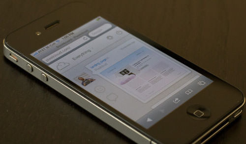
2. Retina Support
Along with responsive support for website layouts, I have also seen a dramatic rise in people building for retina devices. Apple first engineered this idea with the iPhone 4 and has since applied this screen display onto their other devices, including the iPad and some MacBooks.

Retina screens are basically twice as dense as any average LCD. So they are the same number of physical pixels, but digitally twice as many pixels can be fitted into the same physical space.
This means pixel-perfect web designers supporting retina devices will need to create two sets of images. First you need to sample your image at double the resolution, then save a “standard” version at half the size. The larger image will be scaled down to the standard resolution and will look very crisp on retina screens.
One of my favorite tools for responsive web design is retina.js. This is a JavaScript library for automatically displaying @2x retina copies of images whenever your user is browsing on a retina device.
Although this won’t detect CSS background images, it is still the most handy resource as opposed to coding everything in media queries.
3. Fixed Header Bars
Using the CSS position: fixed; property is a great way to staple a header bar onto your website. As visitors scroll down your page, this will offer constant support for navigation and a trip back to the home page. This trend has been around for a while but now we are seeing this in full force.

Fixed headers are so interesting because they can work on practically any website. This includes social networks, blogs, and even design studios or private companies. The design is very trendy and looks great paired with most layouts. But aside from the aesthetics, this bar also provides an exceptional user experience without needing to look very far to navigate the website.
4. Large Photo Backgrounds
Photographers or even fans of photography will definitely enjoy this design trend. I have seen countless showcases discussing the ideas of big oversized photography in the background. It’s an excellent way to capture your visitor’s attention and it can look great when done properly.

I am often fond of big photographs since they can be pleasing on the eyes. When blended into your layout, this design technique can give your website a major edge in marketing. On this topic, I always consider the ever popular design portfolio of Kerem Suer. This unique background photo behaves as custom branding for everybody who lands on his website.

5. CSS Transparency
The new CSS3 properties have allowed for opacity edits on any webpage element. This means you have control to generate transparency in any modern web browser – no Photoshop required! This trend of web design transparency was recently discussed on Codrops with some very enlivening talking points.

One excellent example is on the Squarespace Blog where the central wrapper is given a background: transparent property. Typically this can be used to generate some other background from repeating patterns, or to setup the background using internal elements.
Another interesting design technique for manipulating transparency is through rgba() color syntax. When designing in CSS, you have the option of specifying colors using Red, Green, Blue, and Alpha-Transparency values. So using the syntax rgba(255,255,255,0.6) would generate the color white at only 60% opacity. This is certainly a design trend we can expect continuing into 2013 and beyond.
6. Minimalist Landing Pages
Anybody who has spent some time researching markets will understand that selling on the Internet is just plain smart. You have access to a large consumer base from anywhere in the world. Additionally, you can sell products which are not even physical, such as videos or creative resources.

Creating a landing page online is all about capturing new leads for your product or service. New trends are following the idea of minimalism: keep everything simple and focus on your core product.
This is exemplified on the PictoPro webpage which offers a beautiful resource for cheap icons. The page is fairly crafty using vector icons as a background effect. But all the text is easy to read and it’s basically a one-click checkout process. You cannot get much simpler than that.
Recommended Reading: Beautiful Landing Pages: Tips And Examples
7. Digital QR Codes
The abundance of mobile smartphones has led to a surge of QR Code apps. This stands for Quick Response Code and has developed from the older UPC barcodes. You will find these tagged everywhere from restaurants to event venues and automobile sales lots.

But very recently, I have found a couple of websites with these codes built right into the design. This isn’t something you would normally consider since they are often found in print. But QR codes could become trendy as data transmission becomes quicker over time. You can see a brilliant example of this technique on Keith Cakes contact page.
Read Also: A Look Into: Product Marketing With Quick Response (QR) Code
8. Social Media Badges
Marketing is one of the ultimate determining factors in a website’s success or failure. Social media and viral marketing are exploding in many different websites. Digg used to reign popular in this domain but has since conceded to rivals like Reddit. But these are not the only two popular resources for sharing stories online.

You can check practically any social community for sharing badges and will likely find a great solution. You can position these badges pinned to blog posts and articles anywhere in your layout. These are still used actively by readers and fans who want to share content quickly on places like Facebook, Twitter, or even LinkedIn.
9. Detailed Illustrations
Newer design trends are all about catching and holding one’s attention. I feel that illustrations perform this task brilliantly. The problem is finding a designer who can make such impeccable works of art, or even teaching yourself.

Illustrations can be used in many various ways to bring about different moods in your website. Look around the Internet, and you will find many different website galleries and showcases focusing on digital illustrations. You can see these artistic works eventually blend into its website branding almost perfectly. MailChimp is probably the most definitive example with its trademark chimp mail carrier.
Recommended Reading: 50 Beautiful Hand-Drawn Web Design
10. Infinite Scrolling
Infinite scroll loading has been around for at least a few years. But this technique hadn’t really hit mainstream until this year and I’m sure it will continue into 2013.

Pinterest has adopted this loading technique for their layout and it works beautifully. You can search anything and the results page will continually load as you scroll down. Pagination is basically a non-issue and doesn’t even work as a detriment into the user experience. Talk about designing for simplicity!
But another great example and possibly my favorite example is on Tumblr. You can blog and reblog photos from other people you follow which all appear on your Dashboard. So after logging into your account, all the most recent posts will scroll infinitely down the page.
This is an excellent technique which does not work on every layout, but for the right websites, this can look and behave phenomenally.
11. Homepage Feature Tours
Sliding image presentations and demo videos are both very common with new products on the web. Landing pages and startups often try to entice potential users with these informational goodies. And they can often work very well, if you know how to construct something that looks good on a webpage.

Looking back over 2012, I would say my favorite example of this trend is on MediaFire’s homepage. The entire top portion of the page rotates between a series of slides. They each explain what you can do on MediaFire and how their features compare with other websites.
What helps this demonstration stand out is also their use of big graphics and icons. This is another trend which will not work on all websites, only for certain products you can draw in loads of attention.
12. Sliding Webpage Panels
Dynamic websites used to be very popular when Flash and ActionScript were all the rage. Now, dynamic effects have moved into the realm of JavaScript/jQuery, and this has in turn affected the way designers build websites. Sliding panels is just one technique I happen to really enjoy and would expect to see more in 2013.

But if you can handle them with responsive design techniques or an alternate mobile site, then this is a really cool effect worth trying out.
13. Mobile Navigation Toggle
When speaking of responsive design, one of the most difficult questions is how to build a solid navigation. You want to give your readers direct access to all your important links, without flooding the page making it unreadable. It is also a good idea to keep your responsive navigation hidden away until it’s needed.

Enter this beautiful design trend of mobile navigation toggle menus. The Treehouse Blog is merely one example of this technique which looks brilliant on your smartphone. And even in your web browser! But there are dozens of websites and design studios who have adopted this trend for their own responsive layouts.
What I like most about the toggled navigation is that you can design menus in so many various forms. You can have links drop down from the top, or slide down, or push content over from the left or right side. Designers have so many options to play with and there is plenty of time for UI experiments.
Read Also: Mobile App Design/Dev: Building Navigation With JQuery
14. Fullscreen Typography
Earlier I mentioned using big oversized photographs in the background of website layouts. This trend can be extended to focus on typography as well: designing your webpage text so it fills the entirety of the browser. Some users may find this annoying. But this is not often the case if the layout is fitted perfectly for super-large text.

Alex Pierce has a great website layout which does focus deeply on typography. You can see this includes rich text effects using CSS3 properties. Additionally, the website is very easy to navigate, and many of the other page elements appear oversized as well.
Big text with unique font styles can stand out just as much as oversized photography. And I am sure this will see more design critiques moving into the new year.
Recommended Reading: Showcase Of Web Designs With Beautiful Typography
15. APIs and Open Source
Open source software has been around for decades and has been changing the web since its inception. But over the course of 2012, I have noticed more open source software pertaining to webpage widgets, layouts, and dynamic effects. Typically we could also be talking about free website templates, layouts, or CMS software such as WordPress.

Open APIs and resources like Github allow designers to not only prototype layouts, but also animations and effects on the page. jQuery has a practically uncountable number of plugins for free download to be found all over the Web.
And I am honestly not expecting the amount of open source projects to slow down anytime soon. This truly is the greatest era to be getting started and advancing your knowledge in the field of creating websites.
16. Deep Box Shadows
I discussed CSS3 box shadows in our previous post written for 2012, and this trend has proven to be very accurate. In fact, I now almost always expect to see box shadows infused with elements in modern web designs. The effects look amazing and they rarely detract from the aesthetics except when overused.

I believe the problems that designers had to face years ago stemmed from box shadows being too difficult to implement. Back a few years, this effect would require some type of JavaScript or direct background images created in Photoshop. Now box shadows can be generated with a few lines in CSS.
17. CSS3 Animations
The CSS3 transition property and all the related browser prefixes offers CSS dynamic effects just like JavaScript. Designers can now animate effects on the page based on different CSS properties. I have seen a lot of nice hover effects and form input fields using these transitions the right way.

Another excellent and very inspiring example comes from a CSS alerts tutorial on Codrops. Notice how you can setup various times and settings for the animations.
This is definitely a trend which offers some promise in the coming months and years with lots of room to advance. I am confident that newer web designers will give rise to booming animations all created without the use of scripting.
18. Vertical Navigation
I was not a big fan of this layout style when I first started noticing different websites adopting this trend. However, over this past year I have seen more designers creating elegant solutions with the vertical rhythm still intact. And when done properly, vertical website layouts can be affluent with content and design taste.

The portfolio on Riot Industries is a great example for newer web designers. Check out how the navigation links work and how the portfolio entries are dynamic on hover effects. Also, the border textures really show a dividing line between the left and right columns.
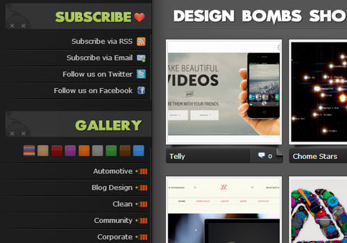
This textured effect is apparent in other vertical layouts as well, such as the CSS gallery Design Bombs.
19. Single-Page Web Design
Single page design is a big topic and covered under many different categories. Obviously there have been single-page websites since the creation of the World Wide Web. But over the recent years we have seen this trend evolve to sport a more natural user experience.

I think the website design for Cage App is possibly one great example of many trends listed in this article. They are utilizing a single-page layout brilliantly with content split up by horizontal containers. But you will also notice the very top of the page features a blurred background photo effect.
Plus as you scroll down the page, the navigation bar actually stays fixed at the top of your window. Incorporating other popular design trends into a single-page layout is one solution for drawing attention from visitors and making one captivating website design.
20. Circular Design Elements
The trend of circles within website layouts is something newer and has been given a lot of attention recently. Designers like circles because they are clean, neat, and generally fit into any layout block. You can build patterns and even fix your page elements into circular designs (eg. user avatars, share buttons, post dates, etc).

The portfolio of Lucia Soto is basically one terrific example of circular web design. The website is built dynamically so you are panning horizontally to different segments in the page. You will notice some cute vector artwork dotted along the sidelines as well. Web designers crave these extra tidbits in page layouts because they ooze uniqueness.
Final Thoughts
User interface design is one of the most complex topics when building digital products. This rings especially true for website layouts, trying to match navigations and content styles for a successful user experience. These design trends aim to point designers in the right direction.
I hope you may consider some of these ideas and think about how they do affect modern day websites. You can find examples of these emerging trends, in smaller businesses to global companies and all other websites in-between. If you are thinking ahead of the curve and want to share some insight on design trends in 2013, just drop a comment in our post discussion area.