6 Strategies for Creating Engaging and Informative Product Graphics
Note: This post was first published on the Dec 13, 2011.
Web designers have mastered the art of using marketing techniques effectively. While captivating textual content is important, images play a crucial role in catching your visitors’ attention. Unlike demo videos, they don’t need sound and can convey crucial information in just seconds. Crafting informative images for websites involves several key techniques.
These techniques range from highlighting features, zooming in on screenshots, making price comparisons, to showcasing other detailed aspects. Web designers often employ information graphics to showcase a variety of products like new apps, software, video games, and more, especially in technology fields.
Below, we’ll share tips and real-life examples of stunning product graphics that are both beautiful and information-rich.
1. Enhance Your Content with Images
Informative images should complement, not replace, your webpage content. They should highlight key points and make them more understandable to your audience. For instance, creating a mini-demo to pinpoint crucial elements in a tutorial can significantly maintain your reader’s interest. With a blend of informative graphics and screenshots, explaining each step becomes much easier.
Demonstrating software tutorials, like Photoshop tutorials, can be challenging in text alone. Visitors often form quick first impressions of your content. Web Designer Wall’s tutorial on creating CSS3 rounded images is an excellent example, featuring a useful graphic with labels and a close-up of the effect.
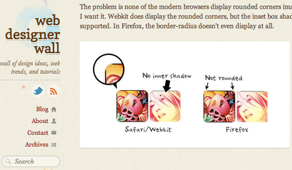
This image on the original article page offers a clearer idea of the end result. Including a small demo link along with demo images is a smart move. You’re more likely to engage your audience with a well-labeled demonstration shot.
Avoid using images just to fill space in your post. Start by explaining your methods or ideas without visuals. Then, review your content and add detailed graphics where necessary, especially if a tutorial becomes more complex and needs visual aids. Examples could include creating a website database or designing table datasets.
2. Emphasize Key Features
With the plethora of features in each software or technology, it’s impractical to detail each one. Overloading your graphic with too many labels can overwhelm visitors. It’s better to focus on the most interesting features and use labels for deeper explanations.
When crafting label content, steer clear of boring language. For example, if you’re showcasing an application’s latest version, trivial changes like color schemes might not intrigue your audience. Instead, focus on benefits like a new interface panel or multi-user connectivity. These are abstract features that are not immediately apparent just by looking at the product.
Explaining these features clearly can significantly influence visitor response. It makes them feel respected as savvy consumers, potentially nudging them towards purchasing your software or product.
An illustrative example is the Mozilla Firefox update page.
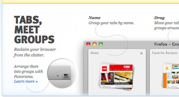
The design uses dotted lines to draw attention to new features. All label text is in HTML tags, not just a single image, making it more accessible for search engines and mobile users.
Also, note the “Learn More” link with the Panorama feature. This is a best practice for information graphics, offering deeper insights into complex features on a different page.
Informative graphics should tease and showcase product features, providing opportunities to explore more in-depth information on external pages.
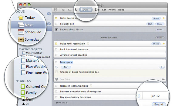
3. Clear and Subtle Labels
Labels play a crucial role in informative product graphics. They help visitors understand different aspects of your product, whether it’s software, websites, or mobile apps. While tables and lists have their place, detailed labels become necessary for explaining product features. Identifying key areas for labeling is essential.
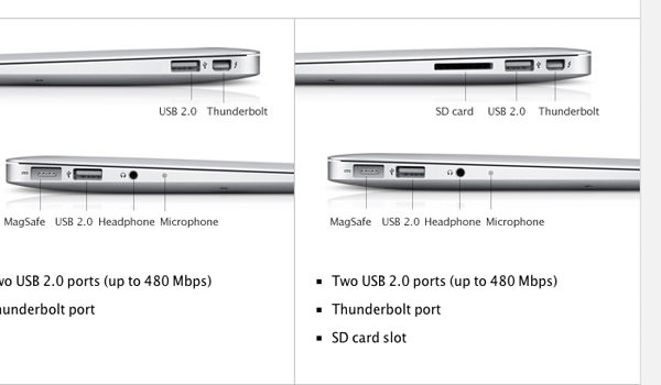
Apple’s approach to labels exemplifies simplicity and effectiveness, a technique evident across their product range. While their features and specs are similar to other brands, Apple’s graphic presentation is exceptionally compelling.
Simplifying the process is key. Product graphics are an integral part of website design, applicable across diverse products, from fertilizer to bed sheets to trading cards. While Apple excels in simple yet effective graphics, they’re not alone. Exploring businesses within your niche can reveal various approaches to informative labeling and graphics.
4. Dynamic Content in Imagery
For web developers who want to go beyond a simple labeled graphic, creating a dynamic and interactive experience can be key. Imagine designing a series of steps to guide visitors through a mini product demo on a small section of your webpage.
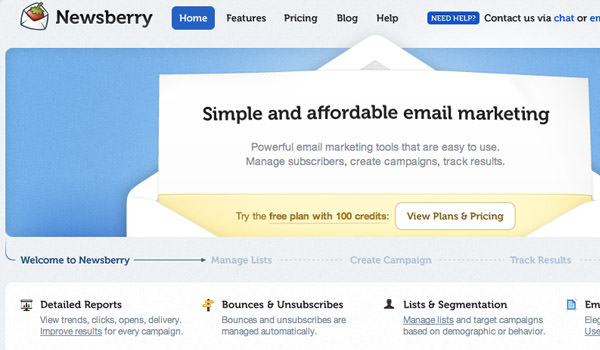
The website of Newsberry serves as a great example. Their homepage features a section with mini-navigation, showcasing a five-step process with different screenshots and descriptions. This introductory content is designed to clearly explain the product’s purpose and functionality, complete with demo links.
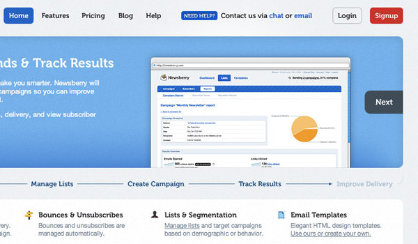
As you browse through their content, you’ll notice many slides display screenshots within a browser frame. This is a simple yet effective way to present web application screens, using a background image to encase your screenshots.
5. Vivid Screenshots and Product Photos
Even with excellent labels and features, the quality of screenshots and photos is crucial for showcasing your product effectively. With tools available on Windows and Mac OS X, capturing high-quality screenshots is straightforward. Pairing these with editing tools like Photoshop, you can create engaging feature demos.
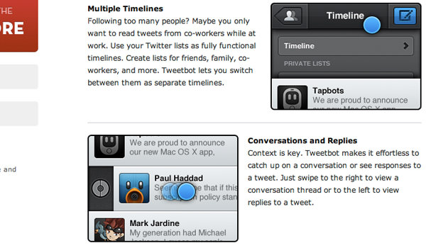
For complex products, consider assembling a series of images. Take the example from Tweetbot’s website, where blue circles indicate interactive elements in the app. Instead of a cluttered single image, a jQuery image gallery can be used to showcase multiple aspects of your product, providing a richer experience for visitors.
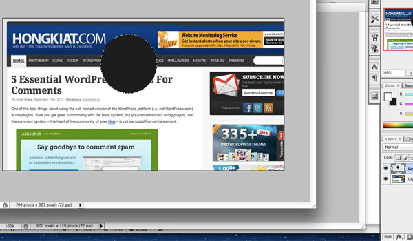
After capturing screenshots at 100% zoom, you might face challenges fitting them into your website’s layout. A solution is to use magnification to scale down the overall image while highlighting key areas in detail, a technique more common in software than physical products. Below, I’ll detail how to create this effect.
6. Creating a “Zoom Lens” Effect
Let’s explore how to create a magnifying glass effect in Adobe Photoshop. This effect can be replicated in other graphics editors, though the steps may vary slightly.
A prime example is the Things for Mac app homepage. Here, the app is scaled down with a drop shadow, but key areas are magnified within a circle, simulating a lens effect with added inner glow for realism. This technique effectively highlights important features while fitting within the webpage’s layout.
Bonus: “Zoom Lens” Effect Photoshop Tutorial
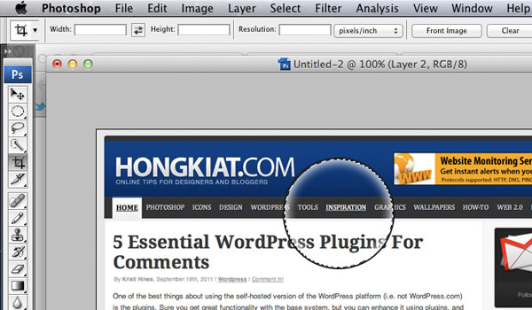
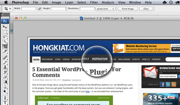
Start by selecting a screenshot for your graphic. After cropping it to focus on the desired area and resizing to fit your website’s content area, create a new layer above this background. Make a circular selection (holding shift for proportion) and fill it with any color.
Step 1
With the circle still selected, reduce the fill percentage to 0% in the layers panel. Add a 1px-2px black stroke and a white inner glow under layer FX. Adjust the opacity to control the lighting effect.
Step 2
On your background layer, with the circle still selected, copy the area using ctrl (For Mac users, it’s command/cmd key) + c. Create a new layer between the background and magnifying circle, and paste. You can also duplicate the layer with ctrl+j. Use ctrl + t to open the transform tool and scale the new layer, maintaining proportions with shift and center with alt.
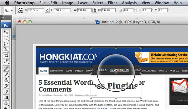
Step 3
Reactivate the circle selection on the magnifying glass layer, ensuring you’re on the duplicated background layer. Invert the selection with Ctrl + Shift + i and delete the excess. Add a drop shadow from the layer FX menu for added effect. You can also draw a thin line and use the Liquify Filter (Filter > Liquify) to create a handle.
Conclusion
To create compelling product graphics, remember the basics: visitors want to quickly grasp what you’re selling. The clearest way to convey this is through well-crafted screenshots or detailed graphics, with labels as a secondary but crucial element to highlight key features.
Combining these techniques can lead to greater visibility and conversion, especially when featured prominently on your homepage. These strategies are ideal for those starting in graphic and web design. While we’ve covered several ideas, we’re eager to hear your insights and experiences in the discussion area below!