30 Tips for a Nicer Looking Website
When launching new projects, it’s common to overlook updating older blogs and websites. This article offers 30 practical ideas to enhance your website’s user-friendliness. These suggestions include both front-end design improvements and intuitive UI strategies, as well as HTML5 coding techniques to aid web parsers in categorizing your content effectively.
Not every website will require these updates, but they are here to inspire developers to think about design and aesthetics. With the ease of building responsive website layouts that look great on any device, let’s explore how we can beautify our sites.
Read Also: 50 Clean, Simple and Minimalist Website Designs
UX Testing
While I don’t always conduct tests on my website launches, it’s a highly valuable practice. Observing how users interact with your website can reveal a lot. You can use tools like Google Analytics or other third-party resources for user experience studies.

The insights gained from user experience testing are invaluable. It helps web developers identify problematic or improvable areas on their websites. Don’t hesitate to seek feedback from friends and colleagues as well; real human input can be just as enlightening as digital data.
Read Also: Useful Web Usability Testing Tools
Whitespace
Whitespace refers to the space between elements on a page. While some users might be comfortable with a compact layout, consider your broader audience, especially those who aren’t as tech-savvy.
Identify areas needing more space either through split A/B testing and user feedback, or experiment to see what works best.
Read Also: 50 Clean, Simple and Minimalist Website Designs
Web Fonts
Dynamic web fonts free designers from being limited to standard font families. With faster internet connections, using 3rd party font stylesheets doesn’t significantly impact loading times.

Google Webfonts is an excellent resource for fonts, accessible even without a Google account. The setup process is straightforward, allowing you to incorporate custom Google fonts into your site quickly.
Read Also: 100 Free Fonts for Commercial Projects
CSS3 Shadows
Using shadows can significantly enhance your layout. The box-shadow effect adds depth to divs and boxes. Additionally, the text-shadow property can make your typography stand out. For example, using white shadows for dark text and vice versa can create a striking effect.
Read Also: 10 Creative Techniques Using CSS3 Box Shadow
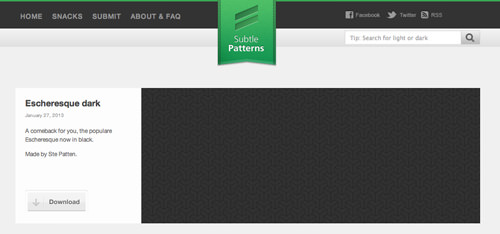
Textures & Repeating Patterns
While color schemes alone can be effective, adding textures and patterns can make your website truly distinctive. Tools like Noise Texture Generator can create dynamic tiled backgrounds. For patterns, Subtle Patterns offers a vast collection of free textures.
Read Also: 20 Pattern Tutorials For Seamless Repeating Background
CSS3 Gradient Backgrounds
CSS3 gradients are a popular choice for adding visual interest to backgrounds without needing graphic design software. These gradients can be applied to various elements like navigation bars and footers, enhancing the overall design.
Read Also: CSS3 Linear Gradients
Textures & Repeating Patterns
Standard color schemes are fine for many websites, but adding textures and repeating patterns can make yours stand out. A great tool for this is Noise Texture Generator, which works in any browser and allows you to easily create tiled background images.
Another excellent resource for patterns is Subtle Patterns. They offer a vast collection of free downloadable textures to enhance your website’s background.
Read Also: 20 Pattern Tutorials For Seamless Repeating Background
CSS3 Gradient Backgrounds
CSS3 gradients are a popular choice for creating engaging backgrounds without needing graphic design tools. These gradients can be used in various site elements, like navigation bars and footers, adding a dynamic visual touch to your layout.
Read Also: CSS3 Linear Gradients
Bootstrap
Twitter’s Bootstrap is a leading frontend UI framework that includes a wide range of pre-formatted page objects like buttons, form inputs, and columns. It’s commonly used in landing pages for new applications and by open source developers for demo pages of their libraries or plugins.

Bootstrap’s versatility means it can be integrated into almost any website. It’s particularly useful for quickly creating UI designs for specific purposes like landing pages, product demos, or mobile app websites.
Related:
HTML5 Kickstart
HTML5 Kickstart by 99Lime is another frontend UI library, focusing on design aesthetics more than common HTML5 layouts. It offers a variety of elements like gradient buttons and dropdown menus. While not as popular as Bootstrap, it’s still a valuable tool for web developers.

Try experimenting with HTML5 Kickstart in a small project to see if its UI elements fit your needs. It can be a time-saver for certain types of projects.
jQuery UI
Animations, sliders, and dynamic elements on websites often use the jQuery library. Its companion library, jQuery UI, is frequently overlooked but can enhance your website with customizable animations and effects.
jQuery UI allows you to modify the easing aspect of page animations, providing customization for dropdowns, slideshows, and more. Visit their easing demo page to explore various animation styles.
Related:
- How to Style jQuery UI Accordion
- Volume Controller with jQuery UI Slider
- Customizing and Theming jQuery UI Datepicker
- Drag and Drop with jQuery UI Sortable
Extravagant Background Photos
Fullscreen background images are a popular trend in web design. If you can find a high-resolution photo that complements your website’s theme, it can significantly enhance your layout. Such backgrounds are eye-catching and can convey the essence of your website’s content.

For a quick implementation, consider the jQuery Backstretch plugin, which scales background images responsively. Alternatively, for those preferring CSS methods, the CSS3 full-page image technique on CSS-Tricks is a great resource.
Read Also: Large Background Images in Web Design: Tips and Examples
Menu Icons
Incorporating custom icons into your website’s menu can significantly enhance its appeal and usability. While standard text links are functional, adding unique icons for each menu item can make navigation more engaging and visually distinct.
Updated Color Scheme
Refreshing your website’s color scheme doesn’t necessarily mean a complete overhaul. Introducing new colors into existing elements like links, headers, and toolbars can reinvigorate your site’s appearance. Tools like Color Scheme Designer can assist in finding complementary colors to enhance your design.

Read Also: Basics Behind Color Theory for Web Designer
Enhanced Browser Support
Ensuring your website is compatible with various browsers, including legacy ones like Internet Explorer 6-8, can improve its accessibility. While these older browsers are less common, they still appear in usage statistics. Tools like IETester can help in testing your website across different browser versions, including older Internet Explorer editions.

Fitted Typography
Reviewing and updating the typography of your website can make it more readable and visually appealing, especially on larger screens. The concept of “fitted typography” involves styling text to harmoniously integrate with your site’s design. Quick updates to your text styles can make a significant difference in your website’s overall look.
Read Also: Showcase of Web Designs with Beautiful Typography
Social Media Sharing
Integrating social media sharing badges from networks like Facebook, Twitter, Reddit, and Pinterest can enhance user engagement. These badges allow visitors to share content directly from your website. Some sites use a floating badge design that scrolls with the user, ensuring the sharing options are always visible without obstructing content. For additional insights, consider exploring our post on social media toolbars.
User Discussion
If you’re using a Content Management System (CMS) like WordPress or Drupal, incorporating comment forms is straightforward. But for static webpages, setting up a database for comments is more challenging. Thankfully, with open-source advancements, developers can now integrate systems like Disqus.

Disqus simplifies the management of comments, reducing the hassle of spam. It allows users to sign in with social media accounts or directly through your site. It’s even an attractive alternative for WordPress users who prefer it over Akismet, thanks to the Disqus Comment System plugin.
Read Also: Top 3rd Party Commenting Systems – Reviewed
Expanding the Footer Area
Smaller websites often have modest footers with basic copyright information and essential links. However, modern web design trends are leaning towards larger footers packed with links and information, a common sight in startup and corporate websites. While it’s not necessary for every design, rethinking your footer to include more content could enhance your website’s user experience.
Responsive Images
Today, responsive and fluid images are a must in web design. Static image sizes can disrupt the layout when resizing browser windows. The popular fix is setting width: 100% for all images using CSS, ensuring they adapt fluidly within their containers.

Improving Menu Accessibility
Getting navigation right from the start is rare. It’s worth revisiting your navigation systems to explore improvements, particularly in implementing sub-menu links. While sidebars and content areas might use accordion menus, horizontal navigation bars could benefit from dropdowns or sliding sub-menus. The key is ensuring quick and easy access to menu links for a seamless user experience.
Read Also: Coding a Graceful Breadcrumb Navigation Menu in CSS3
Utilizing Semantic Microformats and Microdata
Microformats and the newer Microdata specification enrich your HTML with additional metadata. This extra information enhances content relatability on your page and plays a crucial role in how search engines like Google rank your website in various searches, including images and videos.

One of the most recognized Microdata formats is Schema.org. Their website offers extensive information for integrating semantic schema markup into your HTML. Supported by major search engines, this Schema syntax is pivotal for the future of semantic metadata design.
Optimizing Navigation Link Placement
While fixed content navigation works for some sites, larger business websites or portfolios might need a different approach. Sometimes, certain links are too prominent, while others are hard to find. It’s beneficial to navigate your site as a visitor would. Identify which links are most engaging and consider adding new ones like website history, team information, contact details, privacy policies, or press releases. Gathering user feedback can also highlight a need for new or revised content.
Implementing a ‘Back to Top’ Link
For websites with long pages, a ‘Back to Top’ link is essential. This feature, commonly found in many websites, helps users avoid the hassle of scrolling up manually. Ideally, this link should float alongside your content or be placed in the footer, as seen in our Hongkiat implementation.

Customizing Code and Pre Tags
Many developers overlook certain page elements like ‘pre’ tags or inline code tags in their initial website stylesheets. These tags are crucial for displaying preformatted source code. While not all websites need them, it’s good practice to style these elements in preparation for any future requirements.
Setting Image Width and Height Attributes
Updating image width and height attributes can be a time-consuming task, depending on the number of images on your site. Images without these attributes initially display as tiny squares, causing the webpage and scrollbar to jump as they load. This update is particularly beneficial for sites with numerous images. Additionally, there are CSS techniques for responsive images that work with fixed attributes, as outlined here.
Enhancing JavaScript Notifications
JavaScript offers various dialog boxes, including alert boxes with just an OK button, confirmation alerts with yes/no options, and prompt boxes for user input. All these can be customized with alertify.js, a small open-source library. It allows for easy setup and customization to match your site’s CSS style, enhancing your frontend user experience.

Implementing Responsive Media Queries
Adding responsive media queries to your stylesheet, or a separate responsive.css file, is simpler than it seems. These queries enable your site to adapt to various screen sizes, from desktop monitors to tablets and smartphones.
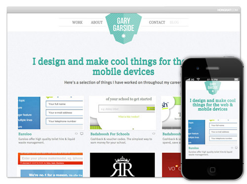
Responsive design isn’t just about adjusting the entire layout. Sometimes, it’s about hiding elements like sidebars or large footers on smaller screens. You can find more information and tips in our responsive web tutorials.
Building Affiliate Links
In the vast world of similar websites, cooperation can be more beneficial than competition. Reach out to websites in your niche for affiliate link exchanges. This not only fosters a community atmosphere but also benefits both parties in terms of traffic and Google’s domain credibility through authoritative backlinks.
Using Icon-Based Fonts
Inspired by an article on 24ways about icon fonts and data attributes, it’s clear that icon-based fonts are shaping the future of web design. These fonts are versatile, perfect for navigation menus, lists, and general content.
You can easily integrate these fonts into your website with @font-face, offering a more semantic design approach than PNG icons and eliminating the need for third-party font hosting services like Typekit.
Enhancing Images with Box Shadows
To retain visitors, your website’s design must be as compelling as its content. Consider adding a class to your images that includes a small box shadow, borders, and padding. This will make your images stand out and enhance the overall aesthetic of your site.
Read Also: 10 Creative Techniques Using CSS3 Box Shadow
Creating Alternate Stylesheets
When designing a website, remember to cater to various devices and media types like desktops, laptops, tablets, smartphones, and even projection and print media. If your audience frequently uses these media types, consider developing alternate stylesheets, like print.css, or incorporating them into your existing styles. This attention to detail will be appreciated by your users and isn’t overly time-consuming.
Final Thoughts
These tips are intended to assist creative designers and frontend developers in enhancing their websites. Most of these ideas can be implemented quickly, in about 15-30 minutes to 1-2 hours. Regularly updating your website with new trends and CSS3 features like native browser shadows, animations, and rounded corners is a good practice. Feel free to share your questions or ideas in the post discussion area.