How to Customize and Theme the jQuery UI Datepicker
jQuery UI is very user-friendly and is popular on many websites needing interactive features.
In this post, we’ll explore one of its features, the Datepicker widget.
We’ll learn how to customize the calendar theme, so you can create a theme that matches your overall design. However, you need a basic understanding of JavaScript and familiarity with CSS before following this tutorial.
If you’re ready, let’s get started.
The Assets
Let’s prepare some essential assets for the calendar.
First, the calendar design will refer to this PSD file from Premium Pixels. So, download it first to help us pick the sample colors we need. Then, download two patterns from Subtle Patterns that we will use as the background of our calendar. In this example, we decided to use the following patterns: black denim and dark leather.

We will also need a web development tool like Firebug to inspect element classes/ids generated by the jQuery UI.
Well, I think we’ve had enough preparation. Now let’s go to the first step.
Step 1: jQuery UI Datepicker
First, go to the jQuery UI download page. Here, you’ll see several options: UI Core, Widgets, Interactions, and Effects.
We should deselect all the components because we don’t need all of them.
Then, in the Widgets section, select only the datepicker. The jQuery UI will automatically select the necessary dependencies, and then you can download the file.
Link all the downloaded files — except the CSS — to your HTML blank document as follows:
<script type="text/javascript" src="js/jquery-1.7.1.min.js"></script>
<script type="text/javascript" src="js/jquery-ui-1.8.18.custom.min.js"></script>
Step 2: Customizing the Datepicker
In this step, we will configure a datepicker with the following options:
<script type="text/javascript">
 $(function(){
   $('#datepicker').datepicker({
     inline: true,
     showOtherMonths: true,
     dayNamesMin: ['Sun', 'Mon', 'Tue', 'Wed', 'Thu', 'Fri', 'Sat'],
   });
 });
</script>
The above code will instruct jQuery to display the calendar on an element with the datepicker id. So, we need to add the following div tag with the — datepicker ID — in the body section to form the calendar:
<div id="datepicker"></div>
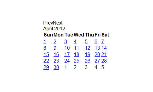
Now, the calendar should have been generated and will appear plain without any styles but still functional.
Step 3: The Styles
Now let’s begin styling the calendar. We will start by normalizing all the elements and creating a new stylesheet. In this example, we name it datepicker.css. Then, link them all to the HTML document.
<link href="css/normalize.css" rel="stylesheet" type="text/css"/>
<link href="css/datepicker.css" rel="stylesheet" type="text/css"/>
Next, we will first attach a background to the body so our HTML doesn’t look too plain.
body {
  background: url('../img/darkdenim3.png') repeat 0 0 #555;
}
Next, we will specify the datepicker’s width, position it in the center, and add a drop shadow to give a prominent effect to the calendar.
.ui-datepicker {
  width: 216px;
  height: auto;
  margin: 5px auto 0;
  font: 9pt Arial, sans-serif;
  -webkit-box-shadow: 0px 0px 10px 0px rgba(0, 0, 0, .5);
  -moz-box-shadow: 0px 0px 10px 0px rgba(0, 0, 0, .5);
  box-shadow: 0px 0px 10px 0px rgba(0, 0, 0, .5);
}
We will also remove the default underline decoration from every anchor tag.
.ui-datepicker a {
  text-decoration: none;
}
The calendar in jQuery UI is formed with a table. So, let’s add 100% width for the table, so it will have the same maximum width as the wrapper above; that is 216px.
.ui-datepicker table {
  width: 100%;
}
Styling the Header Section
The datepicker has a header section containing Month & Year of the calendar. This section will have the dark leather texture we’ve downloaded before, with slightly white font color and a 1px white shadow at the top.
.ui-datepicker-header {
  background: url('../img/dark_leather.png') repeat 0 0 #000;
  color: #e0e0e0;
  font-weight: bold;
  -webkit-box-shadow: inset 0px 1px 1px 0px rgba(250, 250, 250, 0.2);
  -moz-box-shadow: inset 0px 1px 1px 0px rgba(250, 250, 250, 0.2);
  box-shadow: inset 0px 1px 1px 0px rgba(250, 250, 250, 0.2);
  text-shadow: 1px -1px 0px #000;
  filter: dropshadow(color=#000, offx=1, offy=-1);
  line-height: 30px;
  border-width: 1px 0 0 0;
  border-style: solid;
  border-color: #111;
}
Next, let’s center the Month position.
.ui-datepicker-title {
  text-align: center;
}
Replace the Next and Prev text with the sprite arrow images sliced from the PSD.
.ui-datepicker-prev, .ui-datepicker-next {
  display: inline-block;
  width: 30px;
  height: 30px;
  text-align: center;
  cursor: pointer;
  background-image: url('../img/arrow.png');
  background-repeat: no-repeat;
  line-height: 600%;
  overflow: hidden;
}
Then, adjust the arrow position respectively.
.ui-datepicker-prev {
  float: left;
  background-position: center -30px;
}
.ui-datepicker-next {
  float: right;
  background-position: center 0px;
}
While the day names section is wrapped within a thead, based on our design reference, it will have a slightly white gradient. To simplify our task, we will use this tool to generate the gradient code:
.ui-datepicker thead {
  background-color: #f7f7f7;
  background-image: -moz-linear-gradient(top, #f7f7f7 0%, #f1f1f1 100%);
  background-image: -webkit-gradient(linear, left top, left bottom, color-stop(0%,#f7f7f7), color-stop(100%,#f1f1f1));
  background-image: -webkit-linear-gradient(top, #f7f7f7 0%,#f1f1f1 100%);
  background-image: -o-linear-gradient(top, #f7f7f7 0%,#f1f1f1 100%);
  background-image: -ms-linear-gradient(top, #f7f7f7 0%,#f1f1f1 100%);
  background-image: linear-gradient(top, #f7f7f7 0%,#f1f1f1 100%);
  filter: progid:DXImageTransform.Microsoft.gradient( startColorstr='#f7f7f7', endColorstr='#f1f1f1',GradientType=0 );
  border-bottom: 1px solid #bbb;
}
The day names text will have a dark grey color of #666666 and will also have a thin white text-shadow to give it a pressed effect.
.ui-datepicker th {
  text-transform: uppercase;
  font-size: 6pt;
  padding: 5px 0;
  color: #666666;
  text-shadow: 1px 0px 0px #fff;
  filter: dropshadow(color=#fff, offx=1, offy=0);
}
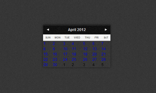
At this point, the calendar will appear like this:
Styling the Dates
The calendar dates are wrapped within td or table data. So, we will set the padding to 0 to remove the spaces between the td and give it a right border of 1px.
.ui-datepicker tbody td {
  padding: 0;
  border-right: 1px solid #bbb;
}
Except for the last td, which will not have a right border. We set the right border to 0 for this.
.ui-datepicker tbody td:last-child {
  border-right: 0px;
}
The table row will be almost the same. It will have a 1px border bottom except for the last row.
.ui-datepicker tbody tr {
  border-bottom: 1px solid #bbb;
}
.ui-datepicker tbody tr:last-child {
  border-bottom: 0px;
}
Styling the Default, Hover, and Active State
In this step, we will define the date hover and active styles. We will first define the date default state by specifying the dimensions, centering the date text position, adding gradient color, and inner white shadow.
.ui-datepicker td span, .ui-datepicker td a {
  display: inline-block;
  font-weight: bold;
  text-align: center;
  width: 30px;
  height: 30px;
  line-height: 30px;
  color: #666666;
  text-shadow: 1px 1px 0px #fff;
  filter: dropshadow(color=#fff, offx=1, offy=1);
}
.ui-datepicker-calendar .ui-state-default {
  background: #ededed;
  background: -moz-linear-gradient(top, #ededed 0%, #dedede 100%);
  background: -webkit-gradient(linear, left top, left bottom, color-stop(0%,#ededed), color-stop(100%,#dedede));
  background: -webkit-linear-gradient(top, #ededed 0%,#dedede 100%);
  background: -o-linear-gradient(top, #ededed 0%,#dedede 100%);
  background: -ms-linear-gradient(top, #ededed 0%,#dedede 100%);
  background: linear-gradient(top, #ededed 0%,#dedede 100%);
  filter: progid:DXImageTransform.Microsoft.gradient( startColorstr='#ededed', endColorstr='#dedede',GradientType=0 );
  -webkit-box-shadow: inset 1px 1px 0px 0px rgba(250, 250, 250, .5);
  -moz-box-shadow: inset 1px 1px 0px 0px rgba(250, 250, 250, .5);
  box-shadow: inset 1px 1px 0px 0px rgba(250, 250, 250, .5);
}
.ui-datepicker-unselectable .ui-state-default {
  background: #f4f4f4;
  color: #b4b3b3;
}
When you hover over the date, it will turn slightly white.
.ui-datepicker-calendar .ui-state-hover {
  background: #f7f7f7;
}
When the date is in an active state, it will have the following styles.
.ui-datepicker-calendar .ui-state-active {
  background: #6eafbf;
  -webkit-box-shadow: inset 0px 0px 10px 0px rgba(0, 0, 0, .1);
  -moz-box-shadow: inset 0px 0px 10px 0px rgba(0, 0, 0, .1);
  box-shadow: inset 0px 0px 10px 0px rgba(0, 0, 0, .1);
  color: #e0e0e0;
  text-shadow: 0px 1px 0px #4d7a85;
  filter: dropshadow(color=#4d7a85, offx=0, offy=1);
  border: 1px solid #55838f;
  position: relative;
  margin: -1px;
}
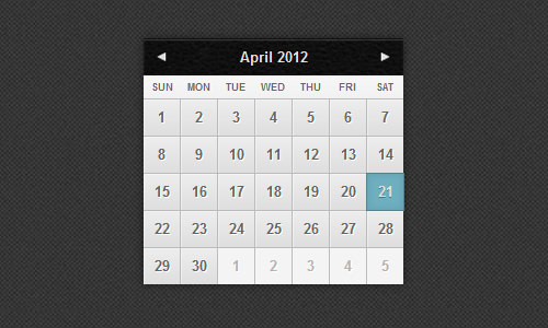
Now, the calendar should look much better.
Fixing the Position
At this point, look at the date carefully. When you click on the date in the first or last column, you will notice that the active state is overflowing a pixel off the calendar edge.
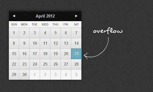
So here, we will make some small fixes.
First, we will decrease the date width to 29px, and set the right margin of the last column and the left margin of the first column to 0 to reverse the -1px margin we have set previously for the active state.
.ui-datepicker-calendar td:first-child .ui-state-active {
  width: 29px;
  margin-left: 0;
}
.ui-datepicker-calendar td:last-child .ui-state-active {
  width: 29px;
  margin-right: 0;
}
The date at the last row of the calendar will also have a similar treatment.
.ui-datepicker-calendar tr:last-child .ui-state-active {
  height: 29px;
  margin-bottom: 0;
}
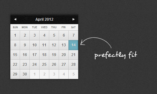
Now, let’s see the result. The calendar now looks beautiful and fits perfectly as our design reference. You can see the demo and download the source to examine the code from the links below the image.
Bonus: Extend the Calendar
Today, we have learned quite a lot about how to create a custom theme for jQuery UI Datepicker. But you shouldn’t stop here, as there are still many things that can be extended from this datepicker. Depending on your jQuery and CSS proficiency, you can extend the calendar to be like this – a text input with an overlay datepicker.

Further Reading
For further reading on jQuery UI, you can read the complete documentation here:
Final Thoughts
Thank you for reading and following this tutorial. I hope you find it useful. If you have any feedback or would like to add things that might be missing from this tutorial, feel free to point it out in the comment section below. Thanks again.