Working with Bootstrap Plugin: Modal Window
Bootstrap has gained a lot popularity among web designers and developers, in this site BuiltWithBootstrap you can see that there are many sites that have adopted Bootstrap as the foundation of their website or webapps.
In our previous post we walked through some UI Components in Bootstrap. This time, in this post we are going to explore, Bootstrap Plugins.
As we mentioned before, Bootstrap comes with a number of custom jQuery plugins that work seamlessly with each other. So, we don’t have to rely on third-party plugins which may have script clashes.
In this post we are going to explore the following plugin that attracts me most: Modal Window.
iziModal.js – A Truly Dynamic Modal Window jQuery Plugin
Most modal windows seem to distract and annoy the visitor with opt-in fields and unwanted deals. These modals... Read more
Setting Up The Document
Before we can run these plugins, make sure that all the necessary files have been included in our document, as follows:
<link rel="stylesheet" href="css/bootstrap.css">
<script src="js/jquery.js" type="text/javascript"></script>
<script src="js/bootstrap.js" type="text/javascript"></script>
Since it is a jQuery plugin, don’t forget to also include the jQuery library, otherwise it won’t work. If all is set, we are good to go.
The Modal Window
Using Modal is the better method to get attention from users versus using pop-up windows which could be blocked by the browsers. Let’s see the following example:
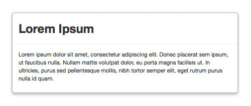
The modal window in Bootstrap is simply defined as modal class. We can add several sections in it, like the content and the header, each can be contained with a div and respectively assigned with these classes modal-body and modal-header.
<div id="modal" class="modal">
	<div class="modal-header">
		<h2>Lorem Ipsum</h2>
	</div>
	<div class="modal-body">
		<p>Lorem ipsum dolor sit amet, consectetur adipiscing elit. Donec placerat sem ipsum, ut faucibus nulla.
		Nullam mattis volutpat dolor, eu porta magna facilisis ut. In ultricies, purus sed pellentesque mollis, nibh
		tortor semper elit, eget rutrum purus nulla id quam.</p>
	</div>
</div>
We haven’t done any fancy stuff here. Thus, this markup will give only the following result in the browser.
Assigning The Trigger
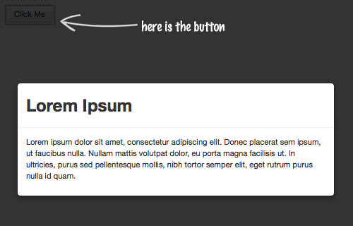
Furthermore, let’s say we want this modal window to only show with a click as the trigger, we need to do the following. First, we add hide class in the div to hide the modal window, like so:
<div id="modal" class="modal hide">
	<div class="modal-header">
		<h2>Lorem Ipsum</h2>
	</div>
	<div class="modal-body">
		<p>Lorem ipsum dolor sit amet, consectetur adipiscing elit.
		Donec placerat sem ipsum, ut faucibus nulla. Nullam mattis volutpat
		dolor, eu porta magna facilisis ut. In ultricies, purus sed pellentesque
		mollis, nibh tortor semper elit, eget rutrum purus nulla id quam.</p>
	</div>
</div>
Then, anywhere on the Web page, we add a button link.
<a href="#modal" role="button" class="btn" data-toggle="modal">Click Me</a>
Notice the data- attribute in the button, it’s a new attribute added in HTML5 specification, and in this case we use this attribute to target our modal window.
Lastly, to activate the modal, place this jQuery line.
$('#modal').modal();
Go back to the browser and refresh. You should see the modal window now hidden and we have the button in there. Now, when we click on the button, the modal window will pop up instanteneously.
The Close Button
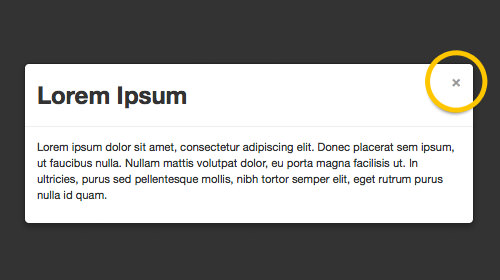
There is a constraint though. How do we hide the modal window?. To do so, we need to put a button element inside the modal window header:
<button type="button" class="close" data-dismiss="modal" aria-hidden="true">×</button>
In this button we also added a data- attribute that pointed to the modal window. That’s it, all other things like the class and the function have been taken care of and once we click on this button, the window should be hidden.
Fade Effect
Now, let’s make the modal window fancier. In this case, we are going to add the fade effect. To do so, we simply add fade class in in the div, as follows.
<div id="modal" class="modal hide fade">
	<div class="modal-header">
		<button type="button" class="close" data-dismiss="modal" aria-hidden="true">×</button>
		<h2>Lorem Ipsum</h2>
	</div>
	<div class="modal-body">
		<p>Lorem ipsum dolor sit amet, consectetur adipiscing elit.
		Donec placerat sem ipsum, ut faucibus nulla. Nullam mattis volutpat
		dolor, eu porta magna facilisis ut. In ultricies, purus sed pellentesque
		mollis, nibh tortor semper elit, eget rutrum purus nulla id quam.</p>
	</div>
</div>
Now, instead of showing up instantly, the modal window will slide down and fade in, then when close the window it will do the opposite, slide up and fade out. Most of these effect is done through the CSS3 new properties.
Bonus Tip
The Modal window plugin in Bootstrap is easy to implement. But, can we use it for other than the Bootstrap framework? Fortunately, Bootstrap has provided an option to download only necessary parts of Bootstrap. So, if you need only this plugin for your non-Bootstrap website, here is what you can do:
In Bootstrap website, go to Customization page. In this page, uncheck all the options and select only the following:
- Buttons style under Base CSS.
- Modals under JS Components.
- Modal under jQuery plugins.
That way, our files will not be bloated with other library codes that are not necessary.