Getting Started with Twitter Bootstrap
Building a website from the ground up is very hard. Even some people who are able to code in web languages like JavaScript, HTML and CSS would find difficulties in the process. Fortunately, a few Twitter developers and designers are aware of this situation and had launched a framework called Bootstrap to make life easier for web designers and developers.
And, in this post, we are going to look into Bootstrap and try out a few of the features provided, to see how this framework can speed up our web development process.
Utilizing Bootstrap
Bootstrap is a very powerful framework for front-end development, and is equipped with a bunch of features we need to develop a fully functional website faster and easier without having to build it from scratch. Some of the features included in Bootstrap are:
- CSS grid for creating responsive layout
- CSS base for typography, buttons, forms, tables and images
- User interface components such as navigation, progress bars, alerts, pagination, breadcrumbs, etc. with consistent and modern styles
- jQuery plugins to build an interactive experience on the website
Now, we assume that you have downloaded Bootstrap and have all the assets on set including the JavaScript and the CSS as follows:
 <link rel="stylesheet" href="css/bootstrap.css">
 <script src="js/bootstrap.min.js" type="text/javascript"></script>
We can start trying out some of these features.
CSS Base: Button
Bootstrap has Base CSS that consists of styles for some fundamental HTML elements including the <button> element. Button is a common element found in a website and in Bootstrap the button style is applied with btn class;
<button type="button" class="btn">Default Button</button>
This markup results in the following presentation which is the default style for a button;

We can also apply additional classes to define the button’s role;
 <button type="button" class="btn btn-success">Button</button>
 <button type="button" class="btn btn-warning">Button</button>
 <button type="button" class="btn btn-danger">Button</button>
Depending on the role, each button will be given a different color:

CSS Terminologies Explained
CSS has become the most popular language for front-end design and has amazing abilities with the release of... Read more
The Bootstrap style is built with LESS. We have actually covered LESS a couple of times before, and if you have familiar with this CSS preprocessor, we suggest you use it instead of using regular CSS; that way the styles will be much more configurable.
For example, let’s say the color of the “success button” above doesn’t fit quite well with our design; we can simply change the variables provided in variables.less file, like so;
 @btnSuccessBackground: #bce895; //#62c462;
 @btnSuccessBackgroundHighlight: #a0cd78; //#51a351;
Since the other arguments such as the shadows and gradients have been pre-configured, the styles will be automatically adjusted and will result in the following presentation;

Effective Tips and Tools for Working with LESS
In our previous tutorial on using LESS to design a navigation bar, we explored the practical use of... Read more
User Interface Components
Bootstrap also provides some reusable UI components for navigation, pagination, progress bars, buttons and many more. Adding these components are also as easy as styling the buttons in previous sections and, in this example, we will enhance those buttons and put them into a group of buttons, like so;
 <div class="btn-group">
 <button type="button" class="btn btn-success">Button</button>
 <button type="button" class="btn btn-warning">Button</button>
 <button type="button" class="btn btn-danger">Button</button>
 </div>
Notice our buttons are now wrapped inside a <div> with btn-group class, this will result in the following presentation;

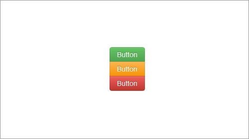
We can also add this an extra class, btn-group-vertical to flow the button vertically;
 <div class="btn-group btn-group-vertical">
 <button type="button" class="btn btn-success">Button</button>
 <button type="button" class="btn btn-warning">Button</button>
 <button type="button" class="btn btn-danger">Button</button>
 </div>
jQuery Plugins
I still remember when I first created a static website and have to jump around from one website to another to find a suitable plugin to apply an interactive feature on the website. You need not experience the same roundaround with Bootstrap as it comes with several jQuery plugins like Accordion, Modal, Tooltip, Popup, Tab and many more.
In the following example, we are going to apply Tooltip Plugin from Bootstrap.
 <p id="container">Jujubes icing oat cake
 <a href="#" rel="tooltip" title="a Lolipop Tiramissu?">lollipop tiramisu</a>.
 Tiramisu sesame snaps croissant chupa chups chupa chups chocolate cake candy sugar plum
 jelly beans. Lollipop pudding jelly sweet jujubes cookie pudding. Oat cake topping gummi
 bears oat cake. Muffin jelly-o cake sesame snaps ice cream cotton candy.</p>
Notice that we have added a link with rel and title attribute on it. This is the link that will show a tooltip when we hover over it. To activate the tooltip we can simply add the following script;
 $('#container').tooltip({
 selector: "a[rel=tooltip]"
 });
This script will target every link under #container with rel=tooltip;

As we can see, adding Tooltip with Bootstrap plugins are fairly straightforward and unlike the olden days (where sometimes we can run into conflict and errors when applying several different plugins), these plugins – Tooltip, Popup, Tabs, etc – can work flawlessly all together.
Customization
Bootstrap is a huge framework; in certain circumstances this could be just too much. For that reason, Bootstrap also provides a dedicated page for customization. There are a few things we can customize in this page starting from the color variables to the plugins that we need.

Now Read: 80 Twitter Tools for Almost Everything
