Responsive Headers & Logos – Tips and Pitfalls
The concept of responsive web design has permeated the web, and become a staple for frontend developers. There’s no denying the value of responsive design in the modern world, but there is some difficulty in fully understanding how to design responsive layouts properly.
The subject could go on at length because there are so many unique areas of a website, but focusing on individual elements can help you better understand the goals of a user and how those goals can be achieved with responsive design.
I’d like to cover design tips for headers, logos, and navigation menus, as they pertain to responsive design. Take these suggestions as they apply to your own work, and be sure to design your interfaces with user behavior in mind.
Read Also: 50 Useful Responsive Web Design Tools for Web Designers
Thinner Navbars
On large screens, it’s normal to have big headers, perhaps even oversized headers with multi-level link tiers. But smaller screens do not have the same space and should be restricted as needed.
Since native mobile apps typically have fixed headers, this is common practice in responsive design too. A fixed header should also shrink down when on smaller devices: this leaves more room for content but still gives readers a direct access to the header & navigation.
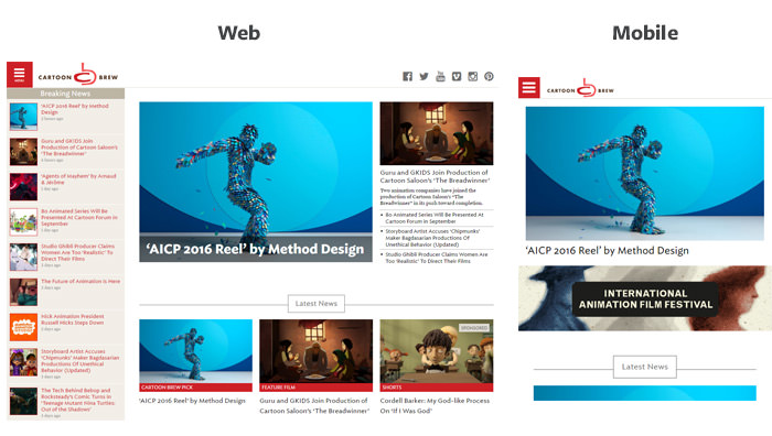
Take for example the Cartoon Brew layout on a full-size monitor, and on a mobile device.
At the 600px breakpoint, the navigation shrinks to almost half its height on the page. This makes both the logo and the clickable nav menu smaller, but they’re much more proportional to the relative screen space.
Also, consider that Cartoon Brew has a dropdown box as a responsive menu on a mobile screen. This means it overlays content on the page when opened, so it’s important to leave plenty of space for this.
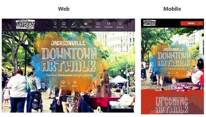
A similar example can be found on the Jacksonville Art Walk website. The top navbar stays fixed while scrolling but shrinks down on smaller devices. This is better for responsive design because the thinner navbar leaves more room for content on a smaller mobile screen.
Each link in the navbar has a related icon attached to the text link. This looks great on a widescreen monitor, but it’s too detailed for smaller screens.
The Art Walk navigation changes to a dropdown menu with fixed links around the 770px breakpoint. The icons are hidden in the dropdown menu because they’d be too small and too cramped on smaller devices.
When designing a responsive header always consider overall screen space while styling the navbar. If you don’t want the header to stay fixed, that’s totally fine, but you still might want to shrink it a bit to save room at the top of the page.
Iconify The Logo
Most logos incorporate some text and an icon or graphic to represent the brand. This means you can always iconify (yes it’s a real word) this kind of logos down to a symbol of its full version.
This is a powerful technique for responsive headers because there isn’t always enough room for a full logo. You do lose some of the glitz & glamour of a full-size logo, but that’s the price you might have to pay for a clean, responsive layout.
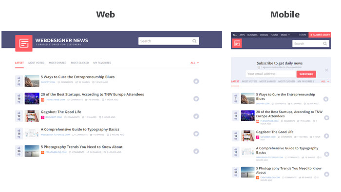
Check out the logo for Web Designer News and see how it changes as you resize the browser.
Maybe not everyone will recognize that icon when first visiting the site, but thanks to pattern recognition, this isn’t a huge problem.
People have been on the Internet long enough to know that the top-left corner of the page is typically reserved for a logo. This small pink icon is also used in the favicon, so it’s easy to make some conclusions without digging too far into the site.
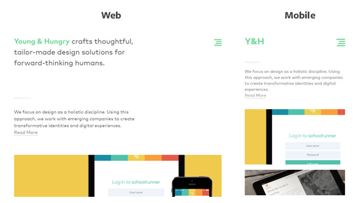
You don’t always need to rely on graphics for this condensed logo technique. The header of Young And Hungry uses bright green text for the logo which eventually condenses to the text "Y&H".
Granted, this may not work for every site if the branding isn’t easy to recognize as single letters. But it goes to show that logos can be made simpler into both graphics & text, and both variants take up less space on smaller screens.
Handling Fullscreen Backgrounds
Many landing pages use full screen backgrounds to draw more attention. This is a powerful technique but often works best on large monitors.
So, how do you handle this on a smaller screen? Generally, designers either remove the background image past a certain breakpoint, or the image itself gets realigned to fit in the window.
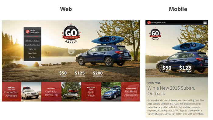
<Cap Radio Raffle uses this technique on its home page. The background image keeps the focal point in view at all times, no matter how much the screen is resized.
This kind of solution typically requires some CSS positioning, but it’s really simple when you get the hang of it. Just keep the focal point in view at all times, and resize the image container to fit in proportion with the device.
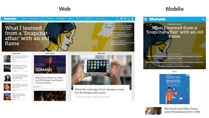
Beyond large backgrounds for aesthetic reasons, you might also use large images for page content. Mashable’s home page uses a featured image background for the top story which spans the entire layout.
Their responsive layout compresses the image while keeping a central focal point. It’s difficult to do this because the featured image changes when the story changes, so photos must be curated carefully. Mashable’s solution is still a great method of handling full-screen photos for blogs & magazine layouts when designed properly.
Simplify The Navigation
When revamping for smaller screens, keep as many links as possible in the navigation, and make it easily accessible. This means you may need to ditch a few links if you have multi-tiered dropdown menus.
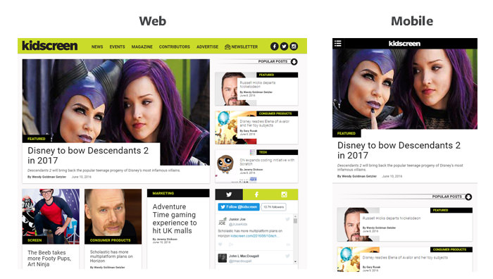
Although if you have the right strategy, it is still possible to keep all dropdowns intact. For example Kidscreen uses a flyout menu with small arrow icons indicating sublinks in the responsive menu.
Many people argue against the hamburger menu but I’ve come to accept it as a necessary item for lengthy nav menus. It simply works and has become widely understood by most smartphone users as "the menu button".
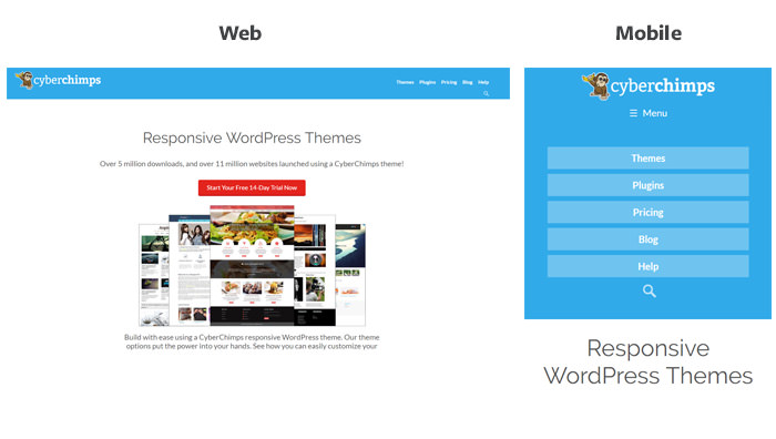
In fact, you’d be hard-pressed to find a responsive site that doesn’t rely on the three-bar hamburger menu. CyberChimps is a great example that uses a vertical dropdown rather than a slide-in.
The navigation structure for CyberChimps gets rearranged to slide down on top of the page. The menu drops from above with large block elements for links.
With more area to click and larger link text, the process of navigating pages becomes much simpler. Aim to follow this philosophy with your entire responsive header, and your designs will improve drastically.
Build Your Own
With these tips at your disposal, it should be no trouble building useable responsive headers. While there are plenty of tools to help you out, the only way to really understand is through practice.
So take these techniques with you and start building websites! I’ve also listed a handful of further resources for responsive headers that you can check out below.
- Create a Basic Mobile CSS Responsive Navigation Menu (teamtreehouse.com)
- Best Practice for Responsive Website Header (ux.stackexchange.com)
- How can I make my header image properly responsive? (stackoverflow.com)