Coding a Graceful Breadcrumb Navigation Menu in CSS3
Navigation menus and links are possibly the most important interface elements in a web layout. These are the only outlets for users to travel between pages and interact with all the content you’ve created. Breadcrumb offers similar functionality with the added benefit of tracking your current position. You’ll be able to display all the previous link paths as the user traverses your site hierarchy.
In this tutorial, we’ll be creating a brilliant breadcrumb navigation menu with some CSS3 effects. This has been tested to work in all major CSS3-compliant browsers; even older browsers that don’t support CSS3 will still render it properly in most cases.
Before we dive into code, we’ll talk a bit about the functionality of our breadcrumb. Full tutorial at a jump!
Offering the Trail
A breadcrumb trail is no more complex than any other menu. Our styles will utilize many more complex CSS properties than most examples, yet our bare-bones template is still in place to guide users from one page to another.

In this example, we will be recreating a similar style as the Google support menu. You can view their menu on the Gmail support page to get an idea of where we’re heading. Ultimately, we want to provide our best user experience for all users, regardless of their Operating System or browser software; thus, I’ve built 2 different code examples to support graceful degradation among older browsers.
The first is built using custom background images and proper CSS alignments. All of the hover events and active events are pre-built with just a few CSS styles, but users who have images turned off will not be able to experience these effects! This is why I’ve also constructed a similar-looking menu with CSS gradients, rounded corners, and box shadows.
If you’re nervous about supporting both styles, you can choose between them for your own site. Most visitors will be using images by default, but dig through your website analytics tool if you want more precise visitor data.
Enough words, let’s jump into the project! We’ll start by constructing the basic HTML framework and move into different styling effects. First of all, you need to download the image required for the project.
Bare-Bones HTML
I’m starting my document with the standard HTML5 page template. This includes the default doctype, linked CSS, and all the basic elements. I’ve added the code below if you want to start your own document this way. Note that it shouldn’t affect how your breadcrumb is displayed, so feel free to use your own page template if you wish.
<!DOCTYPE html>
<html lang="en">
<head>
    <meta http-equiv="Content-Type" content="text/html; charset=utf-8" />
    <title>Default Page</title>
    <link rel="stylesheet" type="text/css" href="css/style.css" />
</head>

<body>

</body>
</html>

<p>I'll split the code into two different blocks. The First block with images is built with a slightly different manner, followed by our menu without images. Each set is given its own <strong>ID</strong> so we can identify the content much easier. If you're also a fan of jQuery you can use the <strong>#ID selector</strong> to manipulate all the internal DOM elements.</p>

<!-- with images -->
<div id="breadcrumb">
    <ul class="crumbs">
        <li class="first"><a href="#" style="z-index:9;"><span></span>Blog Home</a></li>
        <li><a href="#" style="z-index:8;">Archives</a></li>
        <li><a href="#" style="z-index:7;">2011 Writing</a></li>
        <li><a href="#" style="z-index:6;">Tips for jQuery Development in HTML5</a></li>
    </ul>
</div>
First, we have a containing div with the id “breadcrumb“. In the demo file, I’ve used this to separate our code and move it across the page with some added margins. You could remove this outer div, but you’ll have to re-style everything to fit the new template. It really doesn’t hurt to leave a container since you’ll be able to control the positioning much easier.
Internally, I’ve built the breadcrumbs using an unordered list. There are so many unique ways to customize styled HTML lists, and breadcrumbs are just one of them. You may notice I’ve given the initial list item a class of “first“. This is needed for some extra padding to keep the menu items in line. Additionally, a small span block is added so we have a proper left border that doesn’t overlap the background image.
Additionally, each anchor link is planted with a decreasing number for the z-index property. Using images, we’ll need to have each of our links overlap to display the breadcrumb arrow properly. The easiest way to accomplish this is adjusting z-index so each link overlays the next. I started with 9 and worked down from there, but if you have more links in your menu, just begin with a higher integer.
Menu Without Images
To gracefully degrade our breadcrumb, we need a secondary set of HTML list items. If you’re trying to fall back on a single navigation, you could use jQuery to detect the browser agent and apply an ID accordingly. Unfortunately, this isn’t always reliable (for certain mobile users, for example). Another solution is to include an IE-specific stylesheet and hide or show whichever menu works best – but of course, this option is for Internet Explorer only.
<!-- graceful degrade -->
<div id="breadcrumb2">
    <ul class="crumbs2">
        <li class="first"><a href="#">Blog Home</a></li>
        <li><a href="#">Archives</a></li>
        <li><a href="#">2011 Writing</a></li>
        <li class="last"><a href="#">Tips for jQuery Development in HTML5</a></li>
    </ul>
</div>
breadcrumb2 is our new ID used to target the menu without images. Keeping with this pattern, I’ve used crumbs2 as the class for the unordered list. Note that the reason we’re using classes is for its simplicity to duplicate these menus, so when you want a few different breadcrumbs on your page, with these classes this won’t ever become a problem.
We have kept the .first class but additionally appended .last class onto the final list item. Without images, we cannot duplicate the arrows for each item of the navigation menu, thus I’ve used some rounded corners to spice up the secondary menu. .first class and .last manipulate the border radius at the very edges of our menu to create a really cool web 2.0-looking style.
CSS Sliding Background Images
For some of the simpler effects, I’ve coupled both breadcrumbs together when building properties. This is useful as it not only saves some space, but when going back to edit styles it’s easier to customize your own look.
For both #breadcrumb and #breadcrumb2, I’ve set list-style: none; so all internal items will not have markers. You could leave these if you like the effect, but I found HTML becomes tiresome to work around and it’s a lot easier to create new icons. So let’s start with our .crumbs class.
.crumbs {
    display: block;
}

.crumbs li {
    display: inline;
}

.crumbs li.first {
    padding-left: 8px;
}

.crumbs li a,
.crumbs li a:link,
.crumbs li a:visited {
    color: #666;
    display: block;
    float: left;
    font-size: 12px;
    margin-left: -13px;
    padding: 7px 17px 11px 25px;
    position: relative;
    text-decoration: none;
}

.crumbs li a {
    background-image: url('../img/bg-crumbs.png');
    background-repeat: no-repeat;
    background-position: 100% 0;
    position: relative;
}

.crumbs li a:hover {
    color: #333;
    background-position: 100% -48px;
    cursor: pointer;
}

.crumbs li a:active {
    color: #333;
    background-position: 100% -96px;
}

.crumbs li.first a span {
    height: 29px;
    width: 3px;
    border-left: 1px solid #d9d9d9;
    position: absolute;
    top: 0px;
    left: 0px;
}
We set our unordered list to block so nothing else creeps up around the area. Notice the list items are displayed inline while each anchor link is given much more room to spread out. We want all of the space in our menu to be clickable so this requires building our anchors as block elements.
I’ve used an image called bg-crumbs.png for the background. This is known as a simple sprite sheet in CSS, or alternatively a sliding doors technique. This means when the user hovers or clicks on a link we shift the background position to display the updated style. This single image contains all 3 of the designs we need to create the breadcrumb backgrounds at different positions, so we can use the background-position property to relocate based on user interaction.
Custom Effects with CSS3
The original breadcrumb design is much simpler to create. This is noticeable since a lot of the CSS properties are more basic than you would imagine, but now we begin to focus on duplicating these effects with only CSS3!
The individual styles take up a lot of space so I’ll break them down into 2 code blocks.
.crumbs2 {
    display: block;
    margin-left: 27px;
    padding: 0;
    padding-top: 10px;
}

.crumbs2 li {
    display: inline;
}

.crumbs2 li a,
.crumbs2 li a:link,
.crumbs2 li a:visited {
    color: #666;
    display: block;
    float: left;
    font-size: 12px;
    padding: 7px 16px 7px 19px;
    position: relative;
    text-decoration: none;
    border: 1px solid #d9d9d9;
    border-right-width: 0px;
}

.crumbs2 li a {
    background-image: -webkit-gradient(linear, left bottom, left top, color-stop(0.45, rgb(241, 241, 241)), color-stop(0.73, rgb(245, 245, 245)));
    background-image: -moz-linear-gradient(center bottom, rgb(241, 241, 241) 45%, rgb(245, 245, 245) 73%);

    /* For Internet Explorer 5.5 - 7 */
    filter: progid:DXImageTransform.Microsoft.gradient(startColorstr=#f1f1f1, endColorstr=#f5f5f5);

    /* For Internet Explorer 8 */
    -ms-filter: "progid:DXImageTransform.Microsoft.gradient(startColorstr=#f1f1f1, endColorstr=#f5f5f5)";
}

.crumbs2 li.first a {
    border-top-left-radius: 5px;
    -moz-border-radius-topleft: 5px;
    -webkit-border-top-left-radius: 5px;
}

.crumbs2 li.last a {
    border-right-width: 1px;
    border-bottom-right-radius: 5px;
    -moz-border-radius-bottomright: 5px;
    -webkit-border-bottom-right-radius: 5px;
}
The .crumbs2 menu is using CSS gradients to duplicate the background effects. If you are unfamiliar with these, I highly recommend CSS Tricks’ guide on CSS3 Gradients, which should get you up to using CSS3 gradients efficiently. They have included a few more properties for Microsoft and Opera browsers, but these are not fully supported in all cases. I haven’t included them in the demo code here – but it’s good to understand all of the options.
-webkit-gradient and -moz-linear-gradient are the core solutions which do most of the work. I’ve included legacy code for older versions of Internet Explorer, but it’s not guaranteed to display properly all the time (we are using powerful image rendering techniques, after all). Notice that I’ve set both RGB and hex color codes between the background properties. You could stick to one method or the other if you’re more comfortable.
The border radius code is only applied to our secondary breadcrumb navigation. This gives a neat effect on the top left and bottom right of our entire breadcrumb menu. The bar appears to almost pop off the page – truly a fantastic effect on browsers which support the styles, but these only cover default states for our links. Now, let’s build hover effects similar to the images we’ve used above.
CSS3 Borders and Shadows
Whenever a user hovers over a link, we want to update a few things. First, we need to darken the border colors on top and bottom of our active element. This can be seen in the images as well for both hover and active states.
.crumbs2 li a:hover {
    border-top-color: #c4c4c4;
    border-bottom-color: #c4c4c4;

    background-image: -webkit-gradient(linear, left bottom, left top, color-stop(0.45, rgb(241, 241, 241)), color-stop(0.73, rgb(248, 248, 248)));
    background-image: -moz-linear-gradient(center bottom, rgb(241, 241, 241) 45%, rgb(248, 248, 248) 73%);

    /* For Internet Explorer 5.5 - 7 */
    filter: progid:DXImageTransform.Microsoft.gradient(startColorstr=#f8f8f8, endColorstr=#f1f1f1);

    /* For Internet Explorer 8 */
    -ms-filter: "progid:DXImageTransform.Microsoft.gradient(startColorstr=#f8f8f8, endColorstr=#f1f1f1)";

    color: #333;

    -moz-box-shadow: 0px 2px 2px #e8e8e8;
    -webkit-box-shadow: 0px 2px 2px #e8e8e8;
    box-shadow: 0px 2px 2px #e8e8e8;
}

.crumbs2 li a:active {
    border-top-color: #c4c4c4;
    border-bottom-color: #c4c4c4;

    background-image: -webkit-gradient(linear, left bottom, left top, color-stop(0.45, rgb(224, 224, 224)), color-stop(0.73, rgb(235, 235, 235)));
    background-image: -moz-linear-gradient(center bottom, rgb(224, 224, 224) 45%, rgb(235, 235, 235) 73%);

    /* For Internet Explorer 5.5 - 7 */
    filter: progid:DXImageTransform.Microsoft.gradient(startColorstr=#ebebeb, endColorstr=#e0e0e0);

    /* For Internet Explorer 8 */
    -ms-filter: "progid:DXImageTransform.Microsoft.gradient(startColorstr=#ebebeb, endColorstr=#e0e0e0)";

    box-shadow: -1px 1px 1px 0px #dadada inset;
    -webkit-box-shadow: -1px 1px 1px 0px #dadada inset;
    -moz-box-shadow: -1px 1px 1px 0px #dadada inset;

    color: #333;
}
I’m using the exact same gradient code as we’ve used above, but this time the colors are much different if you noticed our RGB values. Each of the states will darken text color to #333, yet other descriptors have been changed slightly to correspond with user commands.
On hover, you’ll see a shiny embossed effect which, coupled with darkened borders, gives the page popup styles. If you click and hold, you’ll get into the active state which features a darkened background gradient. This effect causes the buttons to look like they are actually “pressed” into the page.
We’re also applying box-shadow properties from the new CSS3 specs. -webkit, -moz, and default styles are used with the same settings. Hovering displays a light shadow coming out from the bottom of the selected link. When active, the shadow will be formed on the top, right, and bottom borders. This effect is created with the inset keyword added to the end of each box-shadow property line. Again, CSS Tricks is your best friend here with an awesome article on box-shadow, as it talks about the syntax and its proper usage in CSS3.
Bonus: More Styles
In addition to the tutorial code, I’ve included extra background images with adapted color schemes. I’ve sampled from the original backgrounds and used Adobe Photoshop to create a few variations which you may apply to your own website.
These bonus files are included in the source file, which you can download in .zip archive format in the section below.
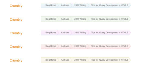
You can check out the image above to get an idea of what I’m talking about. If you need a specific color scheme, pop open Photoshop > Image > Adjustments > Hue/Saturation to modify the color scheme to match your own template. Remember to check the Colorize option in the Hue/Saturation pane if the color didn’t change at all.
Conclusion
This tutorial should have gotten you familiar with some of the newer CSS3 techniques. We’ve created two fantastic breadcrumb menus styled in a similar manner and built it in a way that it can degrade gracefully in older browsers. Additionally, I’ve offered my demo code and some bonus images for you to play around with.
Do you particularly like the styles we’ve constructed here? Or maybe you have questions or ideas on how to improve the tutorial code? Please share your thoughts with us in the discussion area below, and don’t forget to download the source files so you can play with the demo!
More CSS3 Tutorials
Craving for more CSS3? Below are our articles for you to understand CSS3 theoretically and practically!
- CSS3: Create A RSS Feed Logo
- CSS3: Create A Search Field
- CSS3: Create An AJAX Contact Form
- CSS3: Building HTML5/CSS3 Webpages
Note: This post was first published on the Nov 14, 2011.