A/B Test Results and Case Studies for UX Design
The process of split testing is not as complicated as you may think. You contrive a specific goal, such as gaining more visitors onto another sub-page or generating more signups. Then, you create various alterations of said webpage and track analytics for which version performs better.
These tests are often done privately with Internet marketing firms, but recently there’s been a lot more available data on blogs.
Today, I’ll share some case studies related to A/B testing for website performance. The results are quite insightful but remember that not every website is the same, because the audience and traffic sources generally differ in key areas.
Each website should be examined as its own entity and user experience trends are greatly dependent on other elements in the page (navigation, content width, font size, etc).
So methods which work for another site may not work exactly for yours. However, the beauty of A/B testing is that you can always attempt new goals and determine what’s holding you back. Now, let’s take a look.
Guide To A/B Testing With Google Website Optimizer
To generate more conversions on your website you'll have to look into traffic statistics. Google Analytics is a... Read more
Customer Testimonials and Sales
Here’s one of the cases on Visual Website Optimizer (VWO) and their A/B Split Testing blog. This work was done on Wikijob’s Aptitude Tests page. The goal was to improve conversions from visitors to the purchase page.
The team worked on various implementations and finally settled with adding customer testimonials onto the page.

This increased product sales by 34%. There were no major design updates, color changes, or repositioned elements. Merely a new box underneath the heading with actual testimonials from past customers.
Goal: Improve the number of conversion from browsing around the site onto the final purchase page.
Conclusion
The value of peer review and social cognition is crucial. Just a few testimonials added into the page makes a world of difference. People visiting your website are interested in what other people think.
Lean & Slim Newsletters
The VWO blog has an excellent case study on lean newsletters and their benefits from higher clickthrough ratings.
Based on Sheena Lyengar’s study on the demotivation of too many choices, users are busy and have too many things to choose from, hence they often end up choosing nothing at all.

The case study options were to limit each newsletter down to a single call-to-action button. This means readers would open the e-mail to see only a single link to one landing page or blog entry. The results showed a 17% increase of clickthrough rates from the e-mail onto the website.
People are more willing to click onto your webpage when your newsletter is offering only a single, straightforward option as opposed to a dynamically generated RSS newsletter.
Goal: Increase the clickthrough rate of e-mail newsletter subscribers.
Conclusion
Less is more. When your subscribers open an e-mail and there are 5 different sections of related articles, it can be overwhelming. By offering a single link back to the site it sends a clear, unwavering message and allows people to immerse themselves into the content.
Read Also: 9 Tricks To Design The Perfect HTML Newsletter
Product Listing Pages
This is a case study following the Vancouver 2010 Olympic store. The goal was to introduce a small bit of content into sidebars which would directly relate to visitors with the aim of improving sales and persuading visitors into making a purchase.
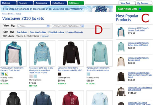
The control version had no sidebar content, variation A had a left sidebar with product categories, while Variation B had a right sidebar displaying “related products” from a recommendation engine.
The last variation performed the best and produced the highest number of sales (7% more than Variation A). These results demonstrate how users are more interested in products which they can directly see right on the page.
Consider this for your own eCommerce webshop. The addition of a recommendation engine can help visitors buy related products with ease; as can extended thumbnail previews for each garment of clothing in a different color which users found helpful.
For more details, check out this post on Get Elastic.
Goal: To improve conversion rates from visitors into customers.
Conclusion
Offering related products will bring more attention to items which users may not have found otherwise. Just a small update to your eCommerce website layout can bring about a large increase in the number of product sales.
Videos in Landing Pages
A great blog post on the website Unbounce follows the use of videos in landing pages. This is from a startup named VidYard back when it was only a landing page.
The tests had a signup form and a demo video which was embedded into the page, displayed in a lightbox, or not even displayed at all.
This method was a test into what video promotion can do for your product when users have no other alternative to learn about what you do.

The best results were with the video embedded into the page (up 69%) and even higher with the video in a lightbox (up 100%). The biggest point is to make sure that your video actually explains your product and how it can impact the user.
The best results found simplicity is the easiest way to get visitors interested. Make a simple video or animation that people can follow easily and present it in a clear manner on the page.
Goal: How does web video impact conversion rates on landing pages?
Conclusion
Both location and quality of video affects conversion rates. People are more willing to watch a video, if embedded into a lightbox. But they also want to be informed.
This study found that bright animations and cartoons tend to keep people interested for longer periods of time.
Stimulating Webcopy
The testing for conversion lifts in user signups follows a website Bettingexpert, with tips and tricks for betting. The original signup form had very basic web copy and the team wanted to bring in more users onto the website.

The in-test actions and subsequent results are fascinating. There were no changes made to the website design itself, only updates to the form text. The question of “why should I fill out this form?” was not orginally answered.
But updating the header text and the submit button value dramatically improved signup rates by 32% with a 99% confidence rating.
Just by looking at these two variations, it’s easy tell which one is better and more interesting, isn’t it? All webmasters should keep this in mind from the research done: “The copy you use in your signup form has direct and measurable effects on your conversion rate.”
Goal: Increasing the number of members/new signups.
Conclusion
With a clearer message in your webcopy, you can make a difference. By getting into your visitor’s head(s) and practicing different ideas for webpage copy, you’ll find a solution which is more direct and influential to the average person.
A Valentine’s Day Newsletter
Our next study investigates catching e-mail subscribers with an interest to purchase a certain product based on holidays. The Marine Mammal Center has an online gift shop, which handles a surge of purchases on various holidays like Mother’s Day and Valentine’s Day
During Valentine’s Day in 2013, the team sent out two variations of the same e-mail with different images for the product.

The test was to determine which photo would result in more purchases – the related baby seal, or a photo of the product itself. Naturally, the product photo got 6 more purchases and garnered 2 genuine donations from visitors. The product that they’re purchasing is more captivating and it’s no surprise as the results speak for themselves.
Goal: Increase the number of purchases through various holiday e-mail newsletters.
Conclusion
People are more willing to spend cash on items if they can see exactly what it is. Imagery placed inside the e-mail is key. Holidays are also a period where sales tend to spike therefore it’s perhaps worth redesigning a custom layout for the more important holidays.
Primary and Secondary Form Inputs
Although this was recorded and published in August 2007, the results are still relevant today. The article discussing primary & secondary actions in web forms delves into a case study following user’s interactions with submit and cancel buttons.
The theory is that by keeping the buttons closer together users are less likely to get confused. Also that by having the cancel button appear smaller and less in the way, users would not accidentally click and erase all of their input data.

The team ran several tests over 20+ different people to get their opinion. There were seven form variations and options A, B, and C received the highest praises from users. Option B had the best results with nobody making any mistakes in the form.
Yet many users also confirmed that option A works well using a single text link for the cancel button. Additionally, options D & E only caused confusion. Unless your form is particularly aligned to the right, it’s best to keep these two buttons aligned on the left.
Goal: What is the best location for submit/cancel buttons in web forms?
Read Also: Login / Registration Form: Ideas And Beautiful Examples
Conclusion
Visitors will perform best using form interfaces which they are familiar with. Keep the submit button on the left side, and always the same size as Cancel (if you even need it). Don’t use alternate colors for each button.
Overall common sense web design works the best when creating long forms with 10+ input fields.
Wireframe Usability Testing
This case study comes from, online testing company Loop11. It’s a wireframing case study that took place at a University in Sweden.
They made two distinct website wireframes for a tourist information webpage. Participants in the project were given either one of these layouts. Each person was asked to complete a number of 6 different tasks.
These tasks included finding a city map, tourist attractions, language courses, and other typical website information.

They found that having two columns full of navigation links helped more people find what they needed. But this led to users generally taking longer to find what they needed. Potentially an issue with clutter or link text. But using these results and some other ideas provided a great starting point for the new website launch. Read more about it here.
Goal: How to structure a webpage layout for easy access to a lot of information?
Read Also: 30 Quick Ideas To Make Your Website Look Nicer
Conclusion
It’s best to provide 2 or 3 separate navigation menus if needed. Try to keep pages no further than 2-sub levels deep as this will lead them to have to dig around more. Other wireframe structures may perform better for other websites.
Further reading
- 27 A/B Testing & Optimization Posts You Shouldn’t Miss
- Techniques to Develop a Real Test Hypothesis
- Call to Action Buttons: The Ultimate Guide on Which Ones Convert and Why
- Ecommerce A/B testing: Larger Product Images increase sales by 9%
- A simple change on homepage sends 9.6% more visitors to the pricing page
Final Thoughts
Web designers who’ve never gone through the process of A/B split testing may find all of this information to be foreign and strange. But as you research more, it starts making sense. I hope that these case studies open doors for even further marketing research.
My examples are only some of the best that I could find. If you know any interesting A/B testing ideas or similar links to case studies, why not share them in the comments below?