How to Add Animation on React Aria Components
React Aria Components gives you a library of accessible, headless UI components that work across mouse, touch, and keyboard. But being headless means they ship with zero styles and zero animations by default. Your popovers just appear. Your modals snap open. No transitions, no easing, no polish.
That’s fine if you’re building an internal tool. But probably less fine if you’re shipping a customer-facing product where smooth motion signals quality.
The good news is that React Aria provides clear paths for adding animation, and they cover everything from a simple CSS fade to physics-based animations.
Let’s take a look.
CSS transitions with data states
The simplest path requires zero JavaScript animation libraries. React Aria overlay components like Popover, Modal, ModalOverlay, Tray, and Menu expose [data-entering] and [data-exiting] states.
These data attributes are applied automatically when the component mounts or unmounts, and the component waits for your exit animations to finish before removing itself from the DOM.
.react-aria-Popover {
  transition: opacity 200ms, translate 200ms;
}

.react-aria-Popover[data-entering],
.react-aria-Popover[data-exiting] {
  opacity: 0;
  translate: 0 -8px;
}
With that CSS, your Popover fades in and slides down 8 pixels on open, then reverses on close. The browser handles the timing. No JavaScript animation overhead, no extra dependencies.
This works for any component that mounts conditionally. The data-exiting attribute is especially important: without it, the component would be removed from the DOM instantly and you’d never see the exit animation. React Aria handles the timing for you, keeping the element alive until the transition completes.
Try the code below.
Using CSS keyframes instead
If you prefer @keyframes over transitions, that works too.
.react-aria-Popover[data-entering] {
  animation: popover-enter 200ms ease-out;
}

.react-aria-Popover[data-exiting] {
  animation: popover-exit 150ms ease-in;
}

@keyframes popover-enter {
  from {
    opacity: 0;
    translate: 0 -8px;
  }
}

@keyframes popover-exit {
  to {
    opacity: 0;
    translate: 0 -4px;
  }
}
The key difference is that keyframes let you set different easings and durations for entering versus exiting. Enter at ease-out (slowing down at the end), exit at ease-in (quick start, gradual disappearance).
Which components support data-entering?
Not every React Aria component has these states. The ones that do are the overlay components that mount conditionally:
- Popover
- Modal and ModalOverlay
- Menu
- Select (the listbox portion)
- ComboBox (the popover portion)
- Tooltip
For non-overlay components like Button, Switch, or Slider, you’d use standard CSS transitions on :hover, :focus, or the React Aria data attributes like [data-pressed] and [data-selected]. Those components stay in the DOM, so entering and exiting don’t apply.
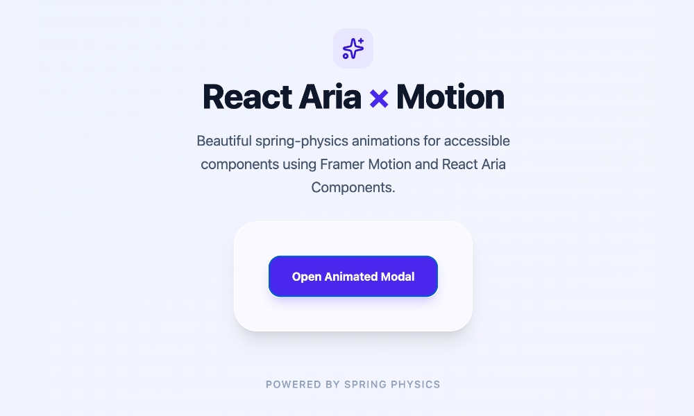
Using Motion
When you need more control over the animation, such as spring physics, gesture-driven interactions, or layout animations, CSS transitions won’t cut it. That’s where Motion comes in. This library is a collection of animation tools. It works with React Aria via motion.create(), which wraps any React Aria component into a motion component.
Start by installing Motion.
npm install motion
Then wrap your React Aria component using motion.create().
import { motion } from "motion/react";
import { Modal, ModalOverlay } from "react-aria-components";

const MotionModal = motion.create(Modal);
const MotionModalOverlay = motion.create(ModalOverlay);
Now you can animate the modal overlay and the modal itself using Motion’s initial, animate, and exit props.
import { AnimatePresence, motion } from "motion/react";
import { DialogTrigger, Button } from "react-aria-components";
import { Modal, ModalOverlay } from "react-aria-components";
import { useState } from "react";

const MotionModal = motion.create(Modal);
const MotionModalOverlay = motion.create(ModalOverlay);

function AnimatedModal() {
  let [isOpen, setOpen] = useState(false);

  return (
    <>
      <Button onPress={() => setOpen(true)}>
        Open modal
      </Button>

      <AnimatePresence>
        {isOpen && (
          <MotionModalOverlay
            isOpen
            onOpenChange={setOpen}
            className="fixed inset-0 z-10 bg-black/50"
            initial={{ opacity: 0 }}
            animate={{ opacity: 1 }}
            exit={{ opacity: 0 }}
            transition={{ duration: 0.2 }}
          >
            <MotionModal
              className="fixed bottom-0 left-0 right-0 top-24 z-20 m-auto
                         h-fit w-full max-w-lg rounded-xl bg-white p-6 shadow-lg"
              initial={{ scale: 0.9, y: 20 }}
              animate={{ scale: 1, y: 0 }}
              exit={{ scale: 0.9, y: 20 }}
              transition={{
                type: "spring",
                bounce: 0.3,
                duration: 0.4
              }}
            >
              <div slot="title">Modal with spring animation</div>
              <p>This modal enters with a spring bounce and exits smoothly.</p>
            </MotionModal>
          </MotionModalOverlay>
        )}
      </AnimatePresence>
    </>
  );
}
A few things worth pointing out. The isOpen prop is hard-coded to true on the MotionModalOverlay because AnimatePresence controls the mount state. The onOpenChange callback still updates your state, so closing the modal via Escape or backdrop click works normally. And the exit prop tells Motion what values to animate toward when the component unmounts, while AnimatePresence keeps it alive until that animation finishes.
Try the code below:
Choosing the right approach
| Approach | When to use |
|---|---|
| CSS transitions | Simple fades, slides, and scale effects. No JS library needed. |
Motion motion.create() |
Spring physics, drag gestures, layout shifts. |
Start with CSS transitions and upgrade to Motion only when you need gesture support or spring physics. Most overlays just need a 200ms fade and a small translate, and that’s CSS-only territory.