20 Rising Web Design Trends to Watch In 2017
Another year has passed and designers are looking ahead towards the future. Many promising design trends are bound to erupt in 2017. Last year I covered the top 2016 design trends and we’ve seen a lot of changes since then.
So, for this post I’ve picked the top 20 trends that I’ve noticed gaining traction in 2017. These design trends can apply to any website, so keep your eyes out for these techniques as we move through 2017 and beyond.
Web Design Trends for 2016
As time inches forward with each passing year, many new design trends loom on the horizon. The field... Read more
1. “Featured in” badges
Startups, blogs, SaaS projects and even small businesses are now using the “as featured in” badges on their websites. These badges often link to articles on mainstream blogs such as HuffPo, Forbes, CNN, Fox, and other news outlets.

The goal is to validate a website and build trust with new visitors. It’s easier for someone to trust a website when they can see that it’s been mentioned in authoritative publications.
In fact many top blogs appreciate the exposure, so it really helps everyone involved. These big sites often release their logos online but you can also find transparent PNGs or SVGs just by googling around.

Also it’s recommended that you link back to the original article mentioning your site. This proves that you were really mentioned on the site, and you’re not just making up claims.
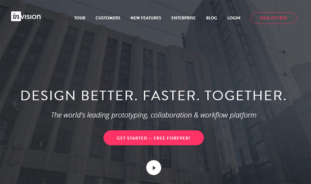
2. Bold all-caps nav links
I’ve seen dozens of sleek navigation menus all relying on this same design. These nav links vary in font and size but they usually have similar features, such as:
- All caps
- Bolded
- Evenly spaced
- Aligned to the right corner
The homepage of Zazzle is a great example. But you can find this on many startup websites because it’s a clean way to share links that are easy to read and easy to browse.

I mostly associate this trend with businesses and tech startups but it can be prevalent on blogs too.
Make note of the next time you see this trend because it’s everywhere. And I expect it to keep growing well into 2017.
3. Magazine-style blogs
Blogging was such a niche concept back in the early 2000s. If you ran a blog in 2003 it was considered a cute little hobby. In just over a decade that trend has radically changed. Now blogs can provide a full-time income, and they’re starting to look a lot more like digital magazines.
Look back at the original design of TechCrunch when it first launched in 2006. Looks like a generic WordPress blog right?

Now look at the current homepage of Techcrunch in 2017:

It not only looks like a magazine, it also functions like one. TechCrunch publishes dozens (if not hundreds) of new posts every single day. They’re the #1 go-to source for startup news.
The magazine-style design trends make a big difference. The homepage uses a big featured story section, each post has its own thumbnail, and the article pages center around the headline.
When you think about it, TechCrunch hasn’t changed much. It’s still “just a blog”. But it’s designed and managed like a magazine, and this makes all the difference.
4. Video backgrounds
Autoplaying sound is perhaps the most annoying trend on the web. But surprisingly, autoplaying video (without sound) is a rapidly growing trend. You can spot this on dozens of business sites where a video background takes over the entire screen.
I really like this technique when it’s applied properly. As long as the video relates to the site and doesn’t obstruct content, I think it’s a cool effect to use in your header.
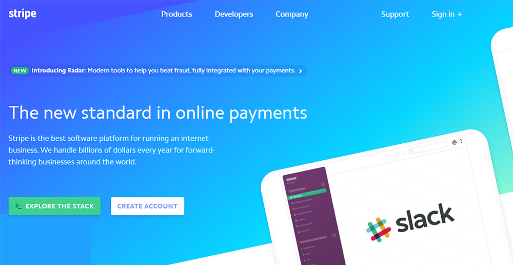
5. Ghost buttons
As minimalism feeds further into web design, many new trends are emerging. One such trend is the rise of ghost buttons which don’t have an inner fill but do have an outer border.

Most of the time these buttons contrast with others to draw attention. You can see this on the homepage of Instantmojo with the green signup button located right beside the ghost button linking to a live demo.
Other sites have adopted a purely-ghost design style to their buttons sitewide. A great example here is the new Bootstrap layout.
I think ghost buttons work on sites that lean towards minimalism. They may not be a great fit for every website, but I do see their use increasing with each passing year.
6. Modal window opt-ins
Modal windows are super annoying, and I can’t imagine any user would like them. However they are proven to increase signups, and marketers cannot ignore techniques that work.
This is why I think modal opt-in windows will continue to climb in 2017.
They’re not my favorite thing, and I never add them to my websites. But if the goal is to increase signups then modal windows are a surefire way to get things rolling.

New plugins can even target exit intent which triggers a modal whenever the user attempts to leave the site. Other modals appear after x seconds or are set to open when the user scrolls down far enough.
Regardless of how modals are triggered, how they’re designed, or how you feel about them, I think they’ll be around for the long haul.
7. Illustration & vector art
With new vector design programs such as Sketch and Affinity Designer, there’s a new wave of illustrators breaking onto the web. Graphic design and interface design are constantly merging with more multidisciplinary designers now than ever before.
This means we’ll be seeing a lot more custom icons and full-page illustrations in the near future.

Many illustrators are practiced artists so I think we’ll see more full page backgrounds made with digital painting software, rendered in detail like concept art.
8. Fixed scrolling sidebars
The first wave of fixed design focused on navigation bars. These are all too common especially in responsive designs where the fixed navbar replicates the feeling of a native mobile application.
But in 2017, I expect to see one more sticky element—the sticky sidebar.

Almost every major blog uses this kind of sticky sidebar. It keeps content in view at all times and increases the likelihood that users will interact with sidebar content.
Plus with dozens of free jQuery plugins that can replicate the sticky sidebar effect. It’s easier than ever to set this up on any website.
9. In-page table of contents
A recent case study found that longform content outperforms shortform in both rankings and quality of user retention. Granted this isn’t always true because some queries can be answered quickly.
But with far more longform content on the web, it’s natural to see more tables of contents added into articles. You’ll see this on lengthy review sites or in articles that break down into listed items.

Adding a table of contents can improve the user experience and help to break up the reading into smaller chunks. Table of contents can also help your site rank better! If Google finds your page valuable you might get jump links in the search results.
It may be true that ToCs are fairly scarce right now. But I expect this trend to blow up over 2017 and many years after.
10. Bright colorful designs
I’m not sure if this trend emerged out of minimalism or as a reaction to Google’s material design. But I’ve stumbled onto dozens of websites that use bright pastel colors mixed with other vibrant hues to create a very fanciful appearance.

The Rentberry homepage is a great example which also uses tons of gradients. And it even has the aforementioned “Featured in” badges located underneath! Two trends on one site.
You’ll notice that the colors don’t permeate the entire page, and they are muted with other shades of white & gray.
I’ve seen enough of these vibrant color schemes to believe they’re on the rise.
Best Color Tools for Web Designers
Setting a basic color theme for your web design project might be easy, but deciding the right color... Read more
11. Scroll animations
Web designers know about scroll-jacking and how terrible it is. However that’s not what I meant with the title “scroll animations”. I’ve seen many sites that now animate content into view when you scroll past a certain section of the page.

This trend is mostly confined to startup homepages & SaaS companies that want some pizzazz in their design.
I can’t say if it’s a particularly useful trend. It certainly does grab the eye but I don’t think it offers much beyond aesthetics. Still, it’s a trend that seems to be spreading fast, and when used sparingly it can be really neat.
12. Single-page apps (SPAs)
Single-page applications are websites built purely with Ajax calls. JavaScript pulls content from a server and loads it dynamically, so the page never refreshes.
Common examples are sites like Gmail and Facebook. But with more JS technology, I’m noticing more & more SPAs developed all the time. Heck, even CodePen could be considered an SPA.
With powerful frontend libraries such as React & Aurelia, it’s gonna be even easier to create an SPA from scratch in 2017.
Mastering Synchronous & Asynchronous JavaScript – Part 1
Synchronous and asynchronous are confusing concepts in JavaScript, especially for beginners. Two or more things are synchronous when... Read more
13. Toggleable search bars
It used to be that search fields were always in view somewhere on a webpage, either in the sidebar or the navigation. But lately I’ve noticed a lot more search fields that get hidden by default, and must be toggled into view.

Certainly a handy trend to save space on the page while still keeping the search feature accessible. If you’re unsure of where to place a search form in a new design you might consider using a toggle field linked to a magnifying glass icon in the navigation.
14. Adblock messages
There’s no denying the fact that ad blocking is on the rise. The only question is how publishers will handle this trend. Some sites politely add messages into the ad spaces like Time.com. On Hongkiat, you’ll notice internal ads to fill the void that link further into the site.
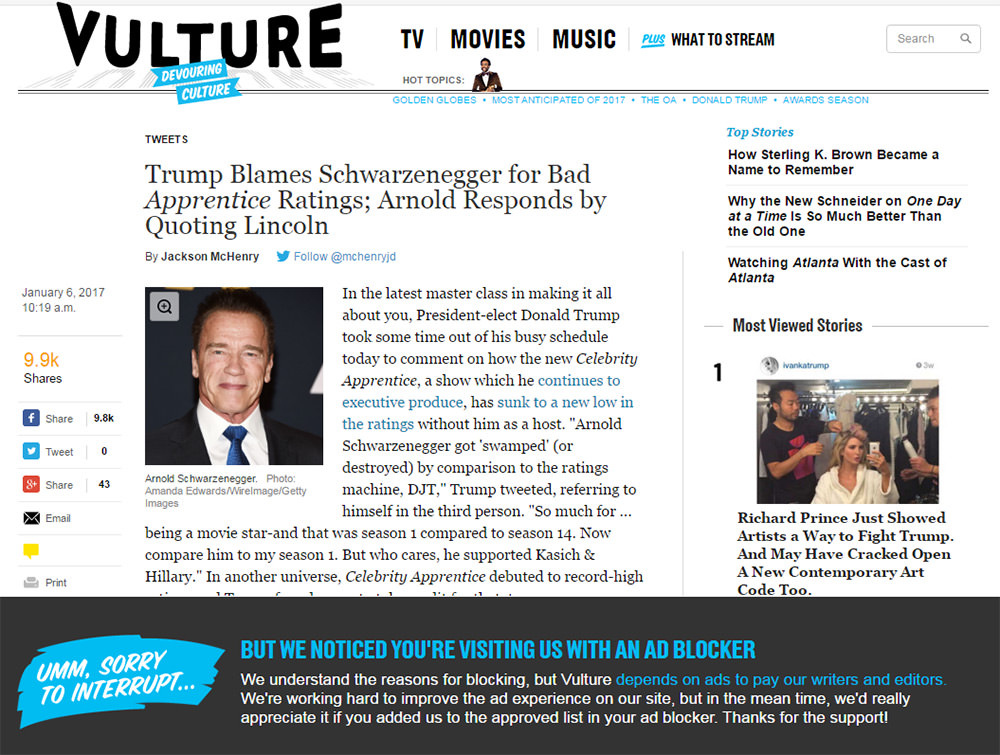
One serious trend that I see increasing is adblock content blocks. This is a technique to “block the ad blockers”. This feature is already in place on many large sites such as Business Insider and Forbes. Unfortunately, this hurts both the user and the publisher, and it all stems from poor-quality advertising techniques.
Ultimately, it doesn’t matter who you blame or where you stand in the ad blocking debate. More people are installing adblock plugins, and I’m expecting more publishers to push back.
Detecting Ads Blocker with jQuery
For many websites that publish content for free, advertisements (or ads) are one of their primary sources for... Read more
15. Pure SVG icons
SVG graphics have already seeped into the web but they’re growing larger by the day. And I have a feeling that 2017 will be a huge year for SVGs on the web.
You can find thousands of free SVG icon sets on sites like Flaticon if you know how to search. But you can also code SVGs into HTML, for example by making use of this example on CodePen.

So, designers have a way to use SVGs, and developers have a way to use SVGs as well. Modern browser support looks good across the board, so there no problem with compatibility. All that’s needed is enough designers to recognize the power of SVGs and start using them!
How to Style SVG Images with CSS: A Simple Guide
Today, we're diving deeper into Scalable Vector Graphics (SVG). As mentioned in our previous post, one of the... Read more
16. Adobe XD
Adobe put out a full beta of Adobe XD in 2016, and it has since grown rapidly. It currently supports both Mac & Windows, and it’s in the testing phase before being fully rolled out.
You may scoff at the idea of any program overtaking Sketch but Adobe is the main software company of creative work for a reason. Plus Sketch is still Mac-only while Adobe is looking to support everyone.
I firmly believe we’ll be reading a lot more about Adobe XD in the coming year. It may become the go-to software for designing UI mockups—so we can finally use Photoshop as a photo manipulation tool (as intended).
With the rise of new software, comes dozens of tutorials and freebie GUI kits as well. You can find lots of Adobe XD freebies in Dribbble along with new XD-focused freebie sites and XD Guru.
17. More hamburger menus
Love it or hate it, the hamburger is here to stay. There are plenty of usability studies that argue against menus hidden from view. But with a small screen and only so many alternatives, there isn’t any better alternative for now.
Hamburger icons are slowly becoming recognizable symbols for nav menus. Just like a magnifying glass icon implies “search”, the three-bar hamburger icon will soon be synonymous with “menu”.
This is already true for most tech-savvy individuals. But with each passing year, more people get smartphones and start browsing the mobile web. And they’re learning to associate that hamburger with a nav menu with no end in sight.
20 Yummy Hamburger Menu Animations
A hamburger menu primarily triggers a sliding drawer navigation which contains links to pages all over the website.... Read more
18. Product feature icons
I wrote about this trend on Treehouse but haven’t mentioned it recently. And going into 2017 this trend is gonna be huge. It’s probably the most common way to share product features on a homepage.
You start by making a list of features for your product. The product can be anything from a SaaS program to a WordPress theme or even a physical item.
Then you can either design custom icons or find an icon set to represent these features. It’s best to avoid generic features such as “reliable” or “fast” because most people expect this stuff.
Instead, list features that actually matter. If it’s a premium WP theme maybe list that it’s responsive, how many widgets it comes with, or how the menu works.
These feature icons work like visuals to help sell each feature. Text alone is difficult to consume but visuals are much easier to understand at a glance.
19. Above-the-fold CTAs
Call-to-actions have traditionally been placed all over a website. But with visitors spending less time on websites, it’s crucial to have a strong CTA right above the fold.
These call-to-actions might be buttons, opt-in forms, or other inputs to drive people to take some action such as signing up or reading a blog post.
I can’t tell you how to design a CTA or how to optimize it for conversions. But I can say the trend seems to be placing these CTAs above the fold and in clear view for all visitors to see.
20. Smaller content areas
Monitors have grown so large that most websites have to set a max width. It’s much harder to read sentences when they’re 2000px wide compared to only 700px wide.
Smaller content is easier to consume, and ultimately creates a better experience on content-heavy websites.
I think more designers are realizing this, and will slowly reduce the size of their content areas. I prefer a maximum width of 750px but you could go as small as 600px or less.

Shorter paragraphs with fewer sentences and smaller content areas will always increase readability. Major publications such as the NY Times may deviate with their own structural guidelines. But for a simple blog or business site, the trend is moving towards lengthier content with smaller paragraphs & content areas.
Wrapping up
There are many other trends I wasn’t able to cover in this post, but I think these 20 are the most interesting. As we move forward into 2017, it should be apparent which trends are exploding and which ones aren’t.
And if you have other ideas or suggestions for upcoming design trends feel free to drop a comment below.