15 Web Design Trends to Watch Out For in 2012
So far, the year 2011 has brought some amazing changes in design and Internet technology. Web development has become a much smoother subject to learn, not to mention the countless open-source libraries useful in streamlining the process. And yet, it seems the global design community is far from throwing in the towel.
I want to introduce 15 ideas that have grown very rapidly over the past year. These trends encompass web and graphic design techniques which will likely play a big role moving into 2012. You have probably seen a few of these represented throughout many of your favorite sites online.
Thankfully, the methods to implement these features are becoming easier to understand and much slimmer in code.
Web Design Trends for 2014
After spending hours online at different websites, you tend to pick up discernable trends in design. Over the... Read more
1. Responsive Interface Design
The average user’s experience is possibly the most important aspect to consider when designing a website.
You want page elements to respond quickly to keyboard/mouse input and behave as expected. Some examples may include side fly-out menus, drop-down boxes, and popup windows.
Including famous JavaScript libraries such as MooTools and jQuery, it has become much easier to animate these features and more. Most modern-day browsers support this code and even gracefully degrade when the scripts aren’t available.
Ultimately, you want to make the user feel comfortable when interacting with any part of the design.

Similarly, you should take form input and data checking into consideration. On many registration pages, you’ll receive small responses as you work through each input area.
You can automate checking for valid email addresses, duplicate usernames, and even double-check password inputs. This will save time on the user’s end and provides a handy guide throughout the signup process.
2. Touchscreen Mobile Devices
In the past couple of years, it has become evident that smartphones are gaining support among even non-tech enthusiasts. But only since 2011 have we seen an explosion of mobile sites and mobile-specific templates.

The popularity of iPhone and iPad devices along with Android-powered phones means you will have visitors fully interacting with your pages through touch commands. This has to become a realistic consideration with every design mockup.
Trends in mobile web design have shown that building an entirely separate mobile theme often provides the best results. In this way, you can keep all the dynamic content in place on your main layout while serving up a slimmed version of the site to mobile users.
Who can say they honestly don’t enjoy free downloads? Web designers have been sharing their content online for years, but only recently has this become a very popular trend among digital artists.
There have been a few communities built specifically around offering free downloads for web and graphic designers.
4. HTML5 & CSS3 Standards
Both of these new design archetypes have accumulated an ever-growing following throughout 2011. Semantic web designers have been waiting years to churn out CSS-only designs rendering rounded corners and drop shadows.
Additionally, the W3C has made a lot of headway in garnering support from the most popular browsers.
I can only see good things for the future of HTML5/CSS3 web development. Front-end designers are often overlooked in today’s field, yet they serve such a great importance to the entire composition process.
Try not to squeeze yourself into any set ‘label’ based on the techniques you know and practice daily. We offer a beginner’s how-to guide for HTML5/CSS3 coding if you feel the need to catch up.

Sticking with these new standards will also make developing in JavaScript and jQuery just that much easier.
Developers have already been publishing and sharing their HTML5/CSS3 project code online, and if things continue, we’ll surely notice a whole lot more of this going into next year.
5. Ribbons and Banners
Although this design technique isn’t exactly “new,” it never truly broke through mainstream until just recently. You have probably seen examples of corner ribbons, banner navigation bars, and small ribbon badges.
These trends have likely exploded because of the massive accumulation of detailed tutorials which can be found all through Google.
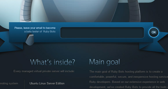
Web designers are more competent these days in launching their own blogs to share information. Now, simple techniques can easily be passed around between designers to duplicate the most popular effects.
There are even free PSDs you can download to save yourself the effort.
6. Premium WordPress Themes
The final release of WordPress 3.0 included a host of long-awaited features such as custom post types and unique article images. Yet, the most profound changes I have seen are coming from WordPress development shops which specialize in premium WP themes.
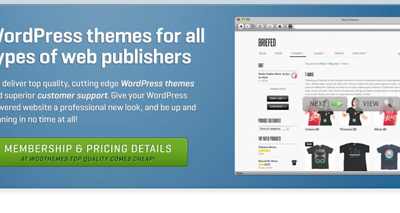
After you purchase such a theme, the installation process is similar to any other. Yet, it’s now possible to include custom plug-in functionality, child themes, new admin menus, and a whole bunch of other features right from within the theme!
WooThemes, ElegantThemes, and Rocket Themes are a few brands which stand out to me above all the rest. Their quality is impeccable, and I feel their developers go above and beyond to create the best templates and most intuitive admin menus.
Going into 2012, I can only imagine WordPress will become even easier to use. This means more high-quality themes to be released and more amazing blogs to be launched.
7. Online Magazines
Speaking about WordPress themes, we should also bring up the quickly-adopted success of online magazines. These websites are not so different from any generic WordPress blog aside from the general structure and page layout.
You can spot these larger mags by the sheer presentation of their home page and collection of authors writing for the site.

As magazines begin moving online, they will become a source of income for many writers. Granted, a topic such as ‘web design’ targets a smaller niche than, say, gaming or economics.
But the fact that we’re seeing more design magazines online than print goes to show where the world may be heading in the years to come.
8. Easy Drop Shadows
As a facet of CSS3, it’s now easier than ever for designers to implement a drop shadow anywhere on the page. Box text and box-style elements have been given respective properties to render clear-cut shadow effects.
The text-shadow syntax is very easy to memorize and follows along as box-shadow. With images now unnecessary in rendering these effects, web developers can focus on expanding these basic ideas further.
9. Dynamic Typography
Fonts are a big part of the sphere encompassing web design tradition. The most notable fonts including Arial, Helvetica, Georgia, and Trebuchet MS have been around for years now. Although they continue to serve a deep purpose in web standards, there are plenty of alternate options for advanced webpage typography.
Typekit, for example, only requires a couple of lines of code to be included in your document head. After this, you can specify which font names to include and append them into your CSS.
The best part about this technique is that it relies mostly on JavaScript, so the end user isn’t required to have the fonts installed.

Another alternative is Google Web Fonts, which behaves in a similar manner to Typekit. I recommend interested designers to check out CSS3’s @font-face media query, as you are given much more creativity. This code can be used to import a .ttf or .otf font file from your web server and include it as a usable stylesheet font! With so many alternate systems used for building dynamic fonts, I’m expecting 2012 to hold a surge of innovation and design talent in this area.
10. Image Gallery Slideshows
With the subsequent popularity of jQuery, I have spotted more and more image slideshows being dropped into web layouts. Galleries are perfect for demonstrating a quick glimpse of inner-page content. This could be a set of portfolio entries, photographs, blog posts with featured images, demo screenshots, etc.

When you consider the many unique sliding and fading animations, it has never been easier to construct a quick slideshow for your home page. I’m confident that 2012 will see an uptick in these trends, and not just between designers.
Online web applications and software companies have been using slideshows as guided tutorials to display screenshots and unique features.
11. Modal Popup Boxes
I feel that modal boxes are still fairly new to the Internet, considering they’ve been appearing in desktop software and mobile apps for years. The purpose of a modal window is to offer box content (such as user registration or login) on top of the current page without loading onto a new one.

Many of the open-source image gallery scripts use a type of lightbox effect where the background fades darker than the popup box. I really enjoy this feature whenever I see it, although it has yet to be adopted by many.
And although modal boxes are sexy and sleek, they can also be very difficult to code and get working properly.

To get ideas for your own websites, check out some of the more popular social news sharing communities. Reddit and Digg are the first two which come to mind as they both feature register/login modal boxes with a typical layout. Additionally, the UI effects for Google+ boast a considerable amount of modal functionality.
12. Inspirational Lists
Collections of list items have appeared since the very early days of web design. As we moved into the new century, designers began using HTML ordered and unordered lists to house navigation menus. But nowadays, lists can and are being used for much more.

In most of the blog themes I find, the entire sidebar is loaded with lists! Not to mention designers who have crafted awesome CSS styles for lists in their article entries.
We covered inspiring list styles in another post earlier this year which may give you some more insight into the matter. Looking forward into 2012, I’m expecting some really creative examples, possibly on par with Flowapp’s custom layout for tasks & to-dos.
13. Generated Image Thumbnails
In the web universe, we can agree that content is king. But most designers will also agree that a page of blank text becomes boring real quickly. Images can add that extra spice if you know how to sprinkle them in gently. One such method is using dynamic thumbnails to provide previews for each page or article.
Blogs today are continuing to adopt the featured image trend, so why not apply generated thumbnails into your theme as well? These often draw my attention towards the article headline and help to break up a page full of text links.
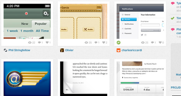
As another example, Dribbble provides a whole gallery listing of thumbnails for each design shot. In such a table row-style layout, it’s super easy to catch a glimpse of each thumbnail and scroll through to find what you’re looking for.
This tactic has proven to grab the attention of the whole design community! Er, at least the members of Dribbble at best. I can only expect that 2012 will see further exertion of these ideas building upon such examples from the past.
14. Oversized Icons
This unique trend semi-originates from the popularity of Mac OS X icon designs. As programmers began to launch websites for their Mac applications, we all too frequently have seen the enormous sizes represented in branding.
Accordingly, this trend has also been picked up through iOS developers and now comfortably rests within modern design culture.
It’s difficult to predict how these trends will fare as we move into 2012. On the one hand, these icons can be clunky and take up more space than necessary.
Yet, we’re not even close to hitting a shortage of iOS/OSX apps, and designers are still churning out pixel-perfect icon specs. Not to mention that web designers are now including oversized icons within just about any page branding! It’s a good way to nab your visitor’s direct attention and build a name for your company.
15. Exaggerated Hyperlinks
Anchor links are certainly within the top five most important elements of any website. These have obviously come a long way since the 1990s, and popular design trends have only been growing exponentially. It appears we are moving into an era where exaggerated design takes precedence.

There are so many incredible ideas for hyperlink design, both in standard and hover effects. CSS3 rounded corners, text shadows, and custom font families add even more great ideas into the mix! One of my favorite examples is from SimpleBits, which uses a short dynamic animation on each of their blog entry permalinks.
Conclusion
These ideas are only some of the more popular trends I have noticed gaining precedence throughout 2011.
Great web design is always about focus and keeping user intentions as top priority. It’s unlikely these philosophies will differ moving into 2012, but how we build layouts and present data is always in change. Let us know your thoughts or questions in the comments discussion area.