The Art of Using HTML Lists to Enhance Your Website
Have you ever noticed how lists are everywhere on the Internet? They’ve been a designer’s best friend for years, helping to organize information and shape page layouts. And today, the creativity in list usage is more apparent than ever. From navigation menus and profile links to archives and to-do lists, the versatility is astounding.
In this guide, we’ll dive into the various types of HTML lists and share some design tips to give your lists that extra flair. Plus, we’ll showcase some websites with incredibly designed lists to inspire you. Ready to transform your mundane lists into something spectacular? Let’s get started and unlock the full potential of HTML lists today!
Unpacking the Essentials of HTML Lists
While trends in web design shift like the sands of time, HTML lists have remained a constant, proving their value and versatility. These foundational elements are crucial for organizing content and structuring layouts efficiently.
Let’s explore the different types of HTML lists you can use. Most are familiar with Unordered Lists introduced by the <ul> tag. However, two other varieties might be flying under your radar: Ordered Lists and Data Definitions. We’ll illuminate these options, highlighting their unique features and how they can bring your web designs to life.
Unordered Lists <ul>
Among the most frequently used elements in HTML are unordered lists. Unlike their ordered counterparts, unordered lists don’t display numeric markers. Instead, items are typically marked with bullets, offering a clean and straightforward way to present information. The bullet style can easily be customized with CSS using the list-style-type property.
Here’s a quick example of an unordered list:
<ul>
  <li>Item 1</li>
  <li>Item 2</li>
  <li>Item 3</li>
</ul>
Unordered lists are incredibly versatile, ideal for crafting navigation menus. By nesting lists within each other, you can easily create sophisticated sub-navigation structures. With the list style removed, you’re left with clean slate elements. Styling anchor links to display as block elements can then form the backbone of a sleek navigation menu. Incorporating some jQuery magic can elevate your site’s header to new heights.
It’s also worth noting that unordered lists frequently appear within articles or guides. Rest assured, whether you opt for unordered or ordered lists, search engines don’t differentiate between the two, so your SEO efforts remain unaffected.
Ordered Lists <ol>
When your content demands a sequence, ordered lists are the go-to choice. They automatically number each item, saving you the hassle of manually inputting numbers. This feature is invaluable for content that requires a clear, step-by-step presentation.
Here’s how you set up an ordered list:
<ol>
  <li>Item 1</li>
  <li>Item 2</li>
  <li>Item 3</li>
</ol>
Moreover, it’s possible to customize the list marker from standard numbers to various styles, like alphabetical letters or Roman numerals, with CSS options. This flexibility makes ordered lists perfect for organizing content that benefits from a hierarchical structure, such as recipes, task lists, or even blog comments to maintain a numbered dialogue.
Check out the extensive list-style-type options to see how you can creatively implement ordered lists in your designs.
Data Definition Lists <dl>
Although not as commonly seen as their unordered and ordered cousins, definition lists <dl> hold a special place in the world of HTML for presenting paired data, like terms and their descriptions. In the past, these lists were the go-to structure for complex arrangements of links or boxed content, embodying the essence of key-value pairs.
Here’s a basic example of how a data definition list is structured:
<dl>
  <dt>Item 1</dt>
  <dd>Description</dd>
  <dt>Item 2</dt>
  <dd>Description</dd>
  <dt>Item 3</dt>
  <dd>Description</dd>
</dl>
The evolution to HTML5 has refreshed the purpose of <dl> elements, positioning them as perfect containers for grouping a term <dt> with its detailed explanation <dd>. This makes them ideal for constructing metadata information lists or any content that naturally fits into a descriptive format.
A compelling example can be found in the HTML5 Doctor’s discussion on description lists, illustrating their utility in neatly organizing metadata-like structures. Whether it’s personal information, product features, or any set of data with a clear term-definition relationship, <dl> elements can streamline your content in a uniquely efficient way.
Navigation with Simple Unordered Lists
Unordered lists are not just for content organization; they’re also a cornerstone for creating intuitive navigation menus. A prime example of elegant navigation built with unordered lists is found on the social media powerhouse, Mashable.

At the top of their site, Mashable showcases two main link sets. Above their logo lies a concise unordered list featuring community-centric links like Top Stories, Trending Topics, and People. The design incorporates sleek hover styles that integrate seamlessly with the site’s aesthetic.
Beneath this, another set of links directs users to various blog categories such as Social Media and Tech. Both sets of links are neatly wrapped within an HTML5 <nav> element, ensuring structural coherence and enhancing SEO. The hover effects here add a touch of sophistication, with rounded corners that invite user interaction. Each link is styled to occupy ample space, making the sub-navigation both attractive and user-friendly.
Highlighting Software Features with Lists
Lists serve as an excellent tool for detailing software features, a technique embraced by developers and companies to showcase their offerings. A standout example of this is found on the webpage for Culture Code’s Things, a to-do list app renowned for its design and functionality.

The features of Things are beautifully organized within a <div> that splits into left and right columns, showcasing the app’s capabilities in a clear and structured manner. The <ul> elements, styled with CSS to float either to the left or the right, hold the list items. This design choice not only enhances readability but also adds an aesthetic appeal.
Images within the list items are positioned relative to their containers, making each feature visually distinct. The use of strong tags emphasizes key points, drawing the user’s attention to important features. This meticulous arrangement highlights the app’s functionality and design prowess, setting a benchmark for presenting software features.
For those looking to create a similar effect, icon sets from resources like Icon Finder can be a great starting point. With the right icons and CSS styling, you can achieve a list presentation that is both informative and visually engaging.
Interestingly, the Things for iPhone page employs a description list to showcase features, proving there’s more than one way to utilize HTML lists to present information effectively.
Organizing Blog Categories and Tags
Blogs often leverage categories and tags to structure content, making it easily navigable for readers. This organization aids in connecting readers with related articles, enhancing the overall user experience. A shining example of effective category and tag use is seen on Smashing Magazine, known for its insightful design and development resources.
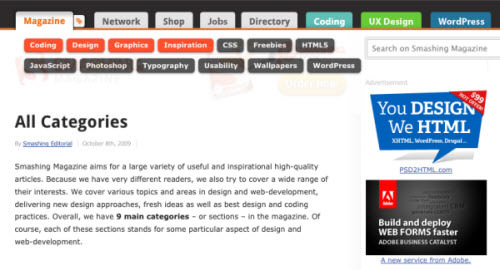
At the top of their redesigned homepage, Smashing Magazine features a tab labeled “Magazine,” adorned with a tag icon. Hovering over this reveals a dropdown menu of categories like coding, design, and graphics. Each category is presented with an engaging CSS3 hover effect that mimics glossy buttons, inviting user interaction.
The implementation details reveal that this category box is cleverly positioned in the left column, initially hidden with a display: none; style. It becomes visible upon user interaction, displaying the unordered list within. Each list item wraps an anchor link, showcasing the categories inline but broken into two lines for better spacing and readability.
Footer Columns with Definition Lists
I was always a huge fan of the classic Digg design. It featured everything you would expect from a news website with great social capabilities. One really interesting piece to their old design is the footer columns setup using definition lists.
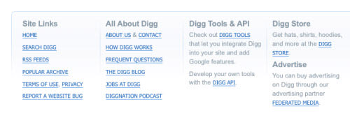
Unfortunately the Digg crew has already launched v4 design live, but the Internet is a nostalgic place and with the Wayback Internet Archives we can pull up an older design of Digg from August of 2007. This template features a lot of fantastic user interface elements, but more specifically let’s focus on the footer area. You’ll notice each column is actually broken into a data list element. These columns are set to display as blocks and float next to each other with predefined widths.
The data terms behave as headers within the list and only appear once per column. In my opinion this is a much nicer and cleaner way to build your description lists. It is possible to use more than one term per list, but this often mess up your HTML and you can lose track of code very quickly. The first two columns contain 6-7 links listed beneath each other as data terms for describing the header text, but after this you’ll notice columns break away from the default formatting.
For example, underneath Digg Tools & API there are only two data definitions. These are actually the 2 paragraphs which contain an internal link and a sentence. There’s certainly nothing wrong with this markup, and it’s actually a very creative and sustainable system for building footer columns. I’m certain if you surf the archives of Digg’s pages you’ll find a lot more fantastic examples of lists.
OrganizingTasks and To-dos with Lists
Lists are essential not just for web design aesthetics but also for creating functional task managers and to-do lists. While many task management tools exist, finding examples that utilize lists effectively in a web interface can be challenging.
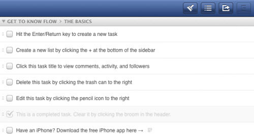
Flow App is a remarkable example of a task management tool that uses lists to enhance user experience. Signing up for a free account offers a firsthand look at the app’s functionality. Even if you don’t plan to become a paying user, the design elements of Flow can inspire your own project management interfaces.
Within the app, the bottom left menu organizes your tasks into manageable lists. These can be reordered, edited, tagged, and checked off as completed, all within a user-friendly interface. Selecting a default list like “The Basics” reveals a structured presentation of tasks in the right pane, all neatly organized within an unordered list.
Each task is represented by a bar that spans across the interface, containing detailed options like editing, flagging for importance, or deleting. This visual and functional clarity is a testament to the power of simple list structures in creating effective and intuitive task management systems.
Dribbble Players Showcase with Ordered Lists
The design community’s love affair with Dribbble is well-documented. This platform not only serves as a portfolio space but also as a source of inspiration, showcasing the talents of designers from around the globe.

A notable feature is the “players-list” found in the sidebar, highlighting rookies, the newest members with fresh perspectives. Dribbble employs an ordered list to rank these designers, adding a competitive edge to the discovery process. Each list item includes user details, integrating seamlessly with the site’s design ethos.
The content layout is particularly intriguing. A <div> floats to the right, containing follow/unfollow actions for logged-in users. Meanwhile, the user’s name and avatar take center stage, each linked to their Dribbble profile alongside a brief showcase of their work. This thoughtful arrangement not only facilitates networking within the design community but also elevates the overall user experience on the platform.
Enhancing Navigation with Horizontal Breadcrumbs
Horizontal breadcrumbs offer a streamlined way to showcase the hierarchy of links and improve navigation on websites. They represent the path users have taken to arrive at a current page, helping them understand their location within the site’s structure.

For an insightful look at building breadcrumb navigation with cutting-edge design, our tutorial on CSS3 breadcrumbs stands out. It employs unordered lists to create a visually appealing and functional navigation aid.

Google’s support pages, like this Gmail help example, illustrate another effective use of breadcrumbs. This feature is particularly useful for sites with multiple layers of content, allowing users to navigate backward without resorting to their browser’s history.
While you could opt for an ordered list to imply a sequence in the breadcrumb trail, it’s essential to remember that the choice between ordered and unordered lists doesn’t significantly impact SEO. The key is clarity and usability, ensuring visitors can easily trace their steps back through your site’s content.
Inspiring Examples of List-Based User Interfaces
The versatility of HTML lists extends far beyond basic organization; they are foundational to crafting beautiful and intuitive user interfaces. The web is brimming with creative examples that demonstrate the potential of well-designed lists to enhance user experience significantly.
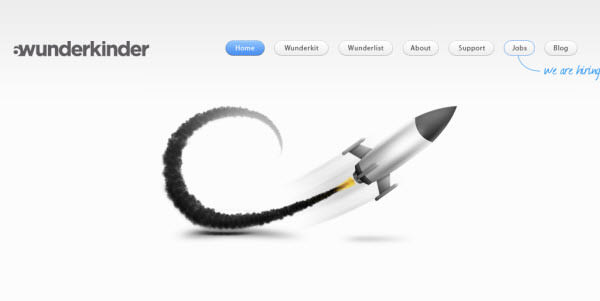
6wunderkinder
This site showcases an innovative navigation menu, transforming simple list items into visually appealing button elements.
Cake Sweet Cake
Here, a delightful array of bakery items is presented through a well-organized list of thumbnail images, inviting visitors to explore more.

Cheesemonger Invitational
The website utilizes two separate <ul> elements, floated to align with their centered logo, creating a clean and cohesive navigation menu.

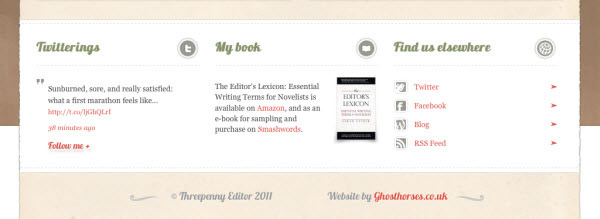
The Threepenny Editor
Social media links are elegantly organized under a list at the bottom of the site, fitting seamlessly within the theme of hands-and-paper layout.
Le Tipi
An exceptional example of a navigation menu styled with images and CSS, offering a visually engaging user experience.

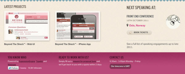
You Know Who
A site that features a retro design effect, incorporating an ordered list at the bottom to showcase thumbnails of their latest project work.
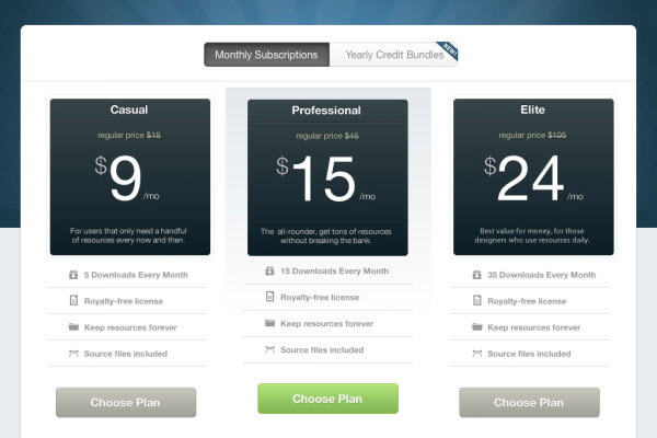
MediaLoot
MediaLoot creatively uses an unordered list for its signup plans, presenting options in a clear and engaging manner.
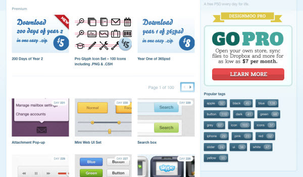
365psd
A daily resource for Photoshop templates, where a sidebar contains a tag list built into an unordered list, perfectly fitting for blogs and archive pages.
These examples serve as a testament to the adaptability and aesthetic potential of lists in web design. By embracing the simplicity and structure lists offer, designers can create interfaces that are not only beautiful but also enhance the overall user experience.
Wrapping Up
The journey through the diverse applications of HTML lists in web design demonstrates their unwavering significance. Far from being mere structural elements, lists are powerful tools capable of enhancing both the aesthetics and functionality of web interfaces. The examples showcased here illustrate the creative potential that lies in using lists, from organizing content to designing user-friendly navigation paths.
As the digital landscape continues to evolve, the role of HTML lists remains constant, offering designers a reliable means to structure content effectively. Whether you’re looking to create an intricate navigation menu, display content in a visually appealing manner, or simply organize information, HTML lists offer the flexibility and simplicity needed to achieve your design goals.
We encourage you to experiment with the different types of lists in your next web project. The adaptability and functionality of lists can significantly contribute to a more organized and engaging user experience. If you discover any other websites featuring outstanding list designs or have successfully integrated these ideas into your own projects, we’d love to hear about them in the comments below. Let’s continue to explore the possibilities and push the boundaries of web design together!
Note: This post was first published on the Nov 21, 2011.