Designing Empty State Pages for Websites & Mobile Apps
Empty state pages are lesser-known design elements with a significant role in user experience. In its simplest form, empty states are page layouts seen when a user first visits a page where no content is available.
This can include mobile applications, social networks, or even empty blog categories. The purpose is to deliver an empty page that looks like a non-empty page. Visitors should recognize the lack of content as a means of impending content.
I’d like to cover how empty state pages work and why they’re so important. Interface designers should consider these points and try to apply them to empty states whenever appropriate. But to get started let’s examine how an empty state functions and how it provides value to the interface.
The Value of Empty States
The beauty of a great empty state design is in the simplicity. Empty pages explain what should be on the page once there’s some content. It may be passive like an empty inbox, or it may be actively waiting for the user like an empty Twitter feed.
Blank pages are boring, dull, and even confusing. Empty states provide guidance to help users understand what they’re looking at. Even though it’s a blank page the extra context helps.
Empty states also give a sense of “freshness” with new accounts that have no existing data.
This test done by Redditor Bambo_Ocha checked 20 different apps for empty state designs. Various design styles occurred with CTA buttons, sample data, and even brief tutorial walkthroughs.
Apps that thrive on a userbase should design empty states that encourage user activity. This activity could be publishing content, adding friends, uploading photos, or whatever the app was made for. The screen below from Tookapic is a great example.

But empty state pages still have value even when no action is needed. These designs are primarily made to provide information.
Static information is just as valuable and it’s not inherently bad to have an empty state. For example this page design shows no current metrics from a tracking app dashboard. The user may want to add some metrics, but it’s not bad to leave the dash empty.

Similar static designs may work great for empty blog archives or empty messages folders. It’s perfectly acceptable to have no messages to display. But the page shouldn’t be completely empty with no context either.
Vital Page Elements
The most important element on an empty state page is context. This may come in the form of graphics, text, or both. You want to inform users why the page is empty and what sort of data could be there (emails, tweets, friend profiles, etc).
And while text is the primary communication medium on the web, you can’t overlook the value of graphics and icons.

DigitalOcean has a brilliant dashboard with empty state graphics that illustrate their point clearly. Their company uses creative branding and clean typography so it’s no surprise their empty state pages are so illustrative.
Another crucial aspect of empty state design is the call to action button. This is typically designed like a button although hyperlinks work fine too.
The goal is to help users take action and clear up their empty state. Whether this requires adding data or taking action on the site, CTAs guide users onto the next step necessary to clear up the empty state.

Dropbox has a great design with two CTA buttons. Whenever a Dropbox user has no folders they can either create a new folder or add a sample folder onto the page.
Encouraging User Activity
Call to action buttons are the active elements but remember that page copy explains what the user is doing. Nobody just clicks buttons without knowing why.
The best way to encourage activity is to write great copy on your empty state page. Guide users through a content flow that encourages user activity over the entire application.

This empty state by ModSpot is a brilliant example of quality design and encourageable content.
Icons are used to demonstrate what the user should add to the site. An arrow points to the button users should click along with some text encouraging behavior. This is a brilliant empty state design with all the elements you’d expect.
Similarly the Gumroad empty state offers two options targeting different potential actions. Users can add a digital product or a physical product to get started selling.

Other links on the page lead to help guides and contact details. Everything is incredibly streamlined and ties together nicely.
Web vs. Mobile Apps
Empty state pages for all mediums should follow similar design trends. But there are some minor differences with user experience on a desktop compared to a smartphone.
Websites on larger screens have more room for extra buttons. Web pages can also have larger navigation elements which can draw people elsewhere onto the site.

This can be solved in a similar style as Nusii does on their proposals page. Where there are no proposals the user is guided to the “add proposals” button in the top navigation bar.
Mobile apps may have similar problems but the screens are much smaller. This makes it a lot easier to draw users right into the action.
I find it’s best to keep mobile apps simpler with fewer options. Use visuals as eye candy to encourage action and point towards a very specific user flow.
Empty State Design Examples
Perhaps the best way to learn about empty state design is to study some examples. The brilliant web gallery emptystat.es curates empty state pages from various websites to mobile applications.
I’ve hand-picked some examples deserving of your attention that best illustrate empty state design. If you have any other suggestions feel free to let us know.
DigitalOcean Floating IPs

Webflow Beta
Invision

Bitbucket

No Pinned Groups

Facebook Messages

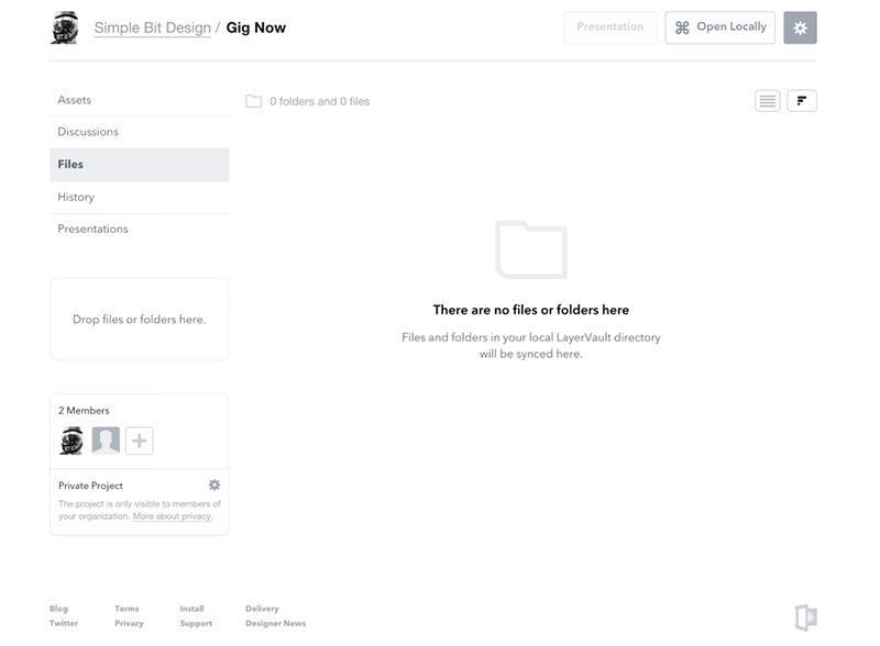
LayerVault
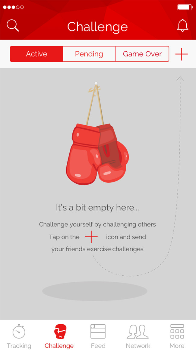
Workout Challenges
Buffer Empty

Word App Documents

Evernote Chats

Beamly For Android

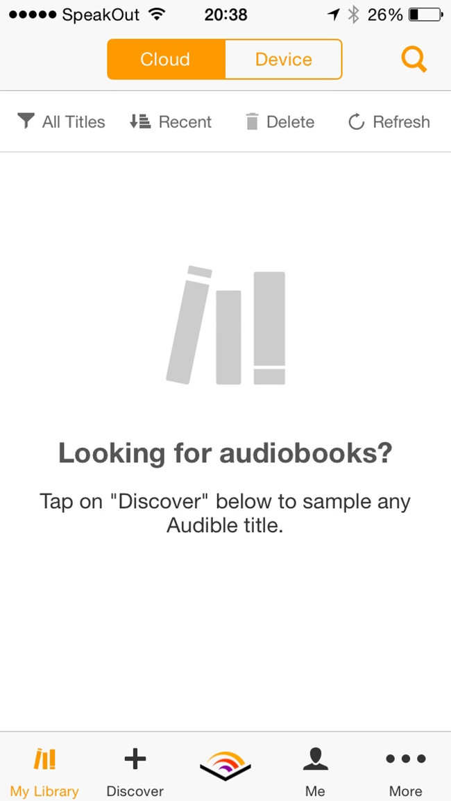
Audible Audio Books
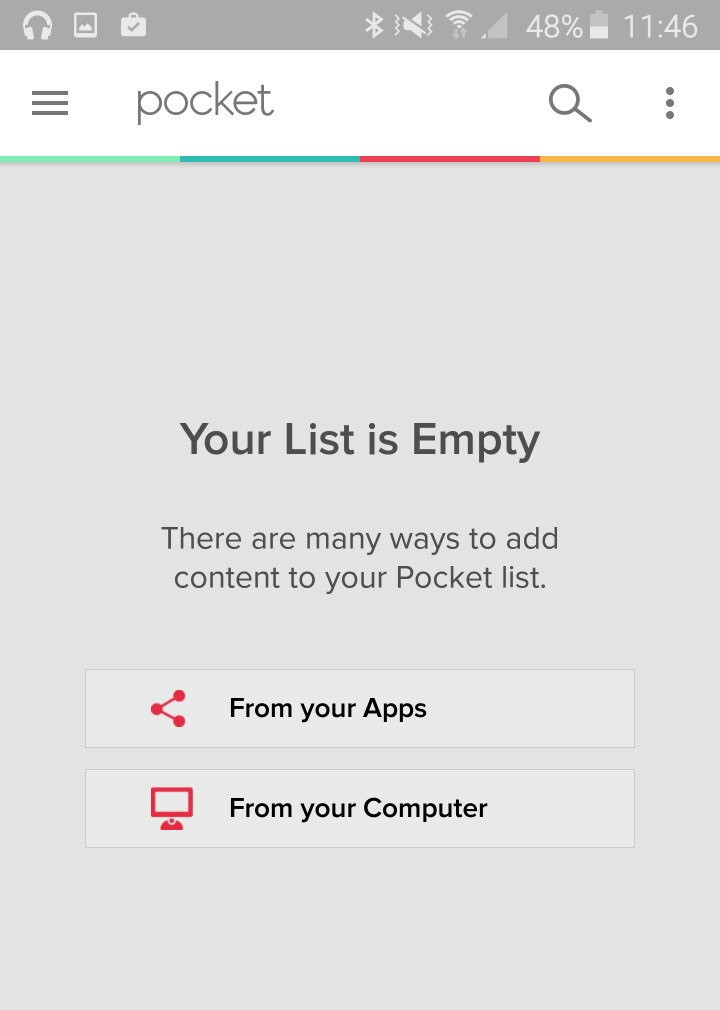
Pocket App
BBC My News

GitHub Wiki Pages


Chrome Bookmarks Manager

Mac Infinit App

Empty Facebook Feed
