Improve Your UX Design with These 9 Helpful Patterns
In our everyday lives, we engage in activities that we regularly perform almost automatically and in a nearly unchangeable manner. We call these habits or, more professionally, "patterns." Patterns help us structure our lives and simplify our decision-making processes.
The same concept applies to UX design – there are patterns here as well. These patterns assist UX designers in building high-quality user interfaces and managing users’ attention.

In this article, I want to shed light on some of the most popular patterns in UX design and explain how to use them to make your UI more user-friendly. Let’s begin!
What is a Pattern?
In psychology, the term "pattern" often refers to a recurring type of behavior exhibited in a particular setting over time. In interface design, patterns encompass rules and laws, including cognitive biases and behavioral patterns. Though applied in design, these patterns still have a psychological basis, as the biases and rules stem from subconscious thoughts and judgments.
Good products should elicit reactions and emotions while promoting specific actions. Thus, understanding how patterns work can help provoke the desired user responses. Comprehending patterns is essential for creating a user-friendly design that meets the following criteria:
- Users can solve their problems
- They can do so quickly
- The design minimizes human errors
- Users are satisfied
- The learning curve is short or non-existent
- The UI design aligns with business requirements (commercial success)
Are Patterns in UX Design Essential?
Not precisely. Patterns exist to assist you, not restrict you. Thus, I would suggest considering them. After all, it is more straightforward to follow existing patterns than to invest in new ones and teach them to users.
Top 9 Patterns to Follow in UX Design
These patterns are prevalent; therefore, remember to consider them every time you begin building an interface.
Fitts Law
"The farther and smaller an object is, the lower the chances of accurately reaching it."
Fitts’ Law states: the likelihood of achieving a goal depends on the size and placement of the interactive elements.
To provide some context, Paul Fitts was a psychologist who studied how people move toward their goals. In 1954, he concluded that the time it takes to achieve a goal depends not only on how far away it is, but also on its size. In other words, the farther and smaller an object is, the lower the chances of accurately reaching it.
For designers, Fitts’ Law is fundamental in terms of control placement. It can be translated as follows: interface elements should be large and accessible enough for the user.
For example, on the Patreon website, users can click on the text menu and the entire block.


Hick’ Law
"The fewer options there are, the faster the choice is made."
Congratulations! Now you know Hick’s Law.
Mr. Hick proposed this law in 1952, suggesting that when there are many choices, you end up "thinking too long." Now, this is the top principle for goods selection services. Indeed, we all know that the torture of choosing is one of the toughest. As UX designers who care about users, we do not want to subject our beloved users to it.
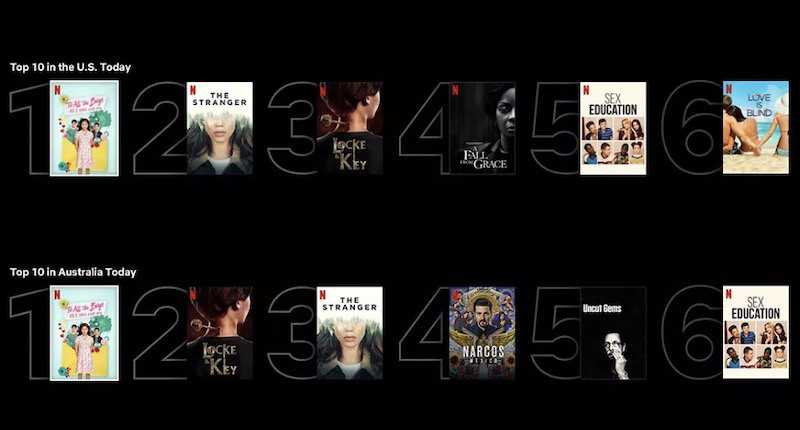
But what if it is impossible to reduce the number of options? Try to break them down into simpler steps. Hick’s Law is all about making it easier for the user to choose. Sometimes the options can be endless, and it’s difficult to make them fewer. Take Netflix, for example: the number of shows to choose from is seemingly infinite.
However, Netflix has managed to rescue users from the anguish of a difficult choice. They introduced the "Top 10 in your country" feature. And this is what I call Hick’s Law in action!
Jacob’ Law
"The more familiar the website looks to the users, the better they will like it."
Have you ever noticed, while surfing the internet, that many websites look similar to each other? In other instances, this might seem like a bad sign. However, when it comes to websites, it’s not about being "unique and exclusive," but rather about usability.
As a designer, you need to accept the harsh truth – users spend a lot of time on other websites. The last thing they want to do is learn new things when they visit a new website.
This is what UX specialist Jakob Nielsen postulates: don’t overwhelm users with new concepts and instead use familiar patterns.

Pragnanz Law
"The human brain tends to interpret complex things via simpler forms."
Pragnanz Law also originates from Gestalt psychology. In 1910 psychologist Max Wertheimer noticed that the human brain would see a row of blinking fires as a constantly moving line. The reason for this is, again, the human brain’s tendency to simplify difficult things and not to overwhelm itself.
So do not make the UX interface a mystery to the user, as they either do not understand it or simplify it to an understandable form. This rule is mainly applicable to the icons on websites.

Law of Closeness
"Elements standing close to each other are seen as one group."
This principle originates from Gestalt theory and suggests that if you want elements to be seen as related to each other, place them next to each other.

Law of the Inward and Outward
"To make one element distinct from others – make it more distant."
This is another aspect of the Law of Closeness. Every complex element consists of smaller objects: words are made of letters, lines are made of words, and passages are made of lines. To instill individuality into one object, you need to increase the distance between it and other objects.

Miller’ Law
"A person can averagely keep attention to 7 elements at a time."
In 1956, American psychologist George Miller discovered that the human brain can, on average, remember 7 (+- 2) objects. Therefore, the interface should primarily include 9 elements, or even 5, for better clarity. Long lists can bore users, even if they are helpful, so it is recommended to divide them into categories.
Edge Effect
"People better remember the first and the last elements in a row."
It’s as simple as that.

Restorff (Isolation) Effect
"Among the similar objects in a row, people will notice an isolated one."
In essence, the one who is not like the others will always stand out the most.
This fact was confirmed by psychiatrist Von Restorff, who suggested that in a group of similar elements, the isolated ones will be remembered. So here’s a tip for designers: if you want to emphasize something, give it a different form or keep it isolated from other elements.
General Recommendations Based on the Patterns
Here is a brief summary of how to create a user-friendly UI design, based on established patterns:
Navigation
- Avoid hiding menu sections that are essential for the user or business.
- Ensure the user always knows their current location on the website.
- Make transitions to other website sections simple and smooth.
- Carefully plan the user’s flow, considering the context.
Forms
- Apply the Cut and Postpone rule: remove all fields that are not required for the user to proceed. Collect optional information only after the goal has been achieved.
- Optimize your design for mobile versions.
- Create a clear path to completion, with a direct line from the heading to the call to action and minimal distractions.
General Recommendations:
- Maintain a strict hierarchy on the page.
- Help users understand what they should do on the page and include a clear Call to Action.
- Focus on the essentials, keeping the "decision tree" in mind.
- Use only meaningful and relevant images.
- Strive for a balanced and contrasting design.
Conclusion
For some designers, UX patterns may appear as rules designed to limit their creativity. However, I view these patterns as specific "hints" that aid in understanding how the human mind functions. Adhering to these patterns does not constrain your abilities.
On the contrary, they are present to help you comprehend the user and create a UX design that genuinely assists them.