Easy Steps to Make a JavaScript Surface Chart
Data visualization is a must-have skill today with ever-growing data and the need to analyze as well as present that data. You will definitely come across data charts whether you are in the technology industry or not and therefore, it is a good idea to learn how to build visualizations.
I will show you here that building charts is not very tough and with the right tools, you can start creating interactive, interesting visualizations in little time and effort!
In this step-by-step tutorial, I will demonstrate how to represent GDP values of various countries for the past 15 years on a beautiful interactive 3D surface chart using a JavaScript library for data visualization.
The surface plot looks quite complex, but I will show you how straightforward it is to make a compelling and fully functional one.
What’s a 3D Surface Chart?
A 3D surface chart plots three dimensions of data on the x, y, and z axes with two of the variables being independent (displayed along the horizontal axes) and one being dependent on the other two (shown on the vertical axis).
In this tutorial, I will be plotting countries and years as the independent variables and GDP values as the dependent variable.
JavaScript Charting Libraries
Currently, there are a lot of good JS charting libraries, all of them having some pros and cons. You can choose which one to use based on your specific requirements and the best part is that the process of building visualizations is very similar for all of the libraries. So, you can start learning with any of the libraries and extend your knowledge to another library as well.
For this tutorial, I am going to use the AnyChart JavaScript charting library which is likely a good choice for beginners. It has tons of examples along with extensive documentation that is really useful when starting out.
Also, AnyChart is quite easy to use and flexible with loads of customization options. And what’s especially important to many – it is free for personal, educational, and other non-commercial use.
Building Basic 3D Surface Plot Using a JS Library
It is an advantage, of course, if you have background knowledge of HTML, CSS, and JavaScript. But don’t get overwhelmed even if you are a complete beginner. I will walk you through each line of the code, and once you understand what is happening, it should get easier to grasp.
There are four general steps to create a 3D surface plot or basically any chart with a JS library, and as mentioned earlier, these steps remain alike irrespective of the library you use.
- Create an HTML page to display your chart.
- Include the required JavaScript files.
- Prepare and connect your data.
- Write the JS code for the chart.
Step 1 – Create a basic HTML page
The initial step is to have a blank HTML page that will hold the chart. I will add a block element with a unique id to the page. I will use the id to reference the <div> later.
I will now specify the height and width of the <div> as 100% for both in the <style> block of the page. This will render the chart on the full page. You can specify the height and width according to your preference.
<!DOCTYPE html>
<html lang="en">
	<head>
		<meta charset="utf-8">
		<title>JavaScript Surface Chart</title>
		<style type="text/css">
			html, body, #container {
			width: 100%;
			height: 100%;
			margin: 0;
			padding: 0;
			}
		</style>
	</head>

	<body>
		<div id="container"></div>
	</body>
</html>
Step 2 – Add the necessary scripts
When you are using a JavaScript library, you need to add the scripts specific to the chart that you are building and the library that you are using.
Here, I am using AnyChart so I need to add the corresponding scripts for the surface plot from its CDN (Content Delivery Network) which is basically where all the scripts can be found.
So, I will include AnyChart’s Core and Surface modules for this chart.
Just to remind you, include all these script files in the <head> section of your HTML page.
<!DOCTYPE html>
<html lang="en">
	<head>
	<meta charset="utf-8">
	<title>JavaScript Surface Chart</title>
	<script src="https://cdn.anychart.com/releases/8.10.0/js/anychart-core.min.js"></script>
	<script src="https://cdn.anychart.com/releases/8.10.0/js/anychart-surface.min.js"></script>
	<script src="https://cdn.anychart.com/releases/8.10.0/js/anychart-data-adapter.min.js"></script>

	<style type="text/css">
		html, body, #container {
		width: 100%; height: 100%; margin: 0; padding: 0;
	}
	</style>
	</head>

	<body>
		<div id="container"></div>
		<script>
			// All the code for the JS Surface Chart will come here
		</script>
	</body>
</html>
Step 3 – Include the data
The data I decided to visualize in a 3D surface plot comes from the World Bank Open Data website that gives me the GDP (PPP based) data for all the countries in a CSV file.
It is easier to create a chart if the data is in the format that the chart expects and how you want to show the data. So I pre-processed the data accordingly. You can go through my JSON data file here.
To load the data from the JSON file, I will add the Data Adapter module of AnyChart and use the loadJsonFile method inside the <script> tag in the body of the HTML page.
The three preparatory steps are done so get ready to write some code!
Step 4 – Write the code to draw the chart
The first thing I will do is ensure that all the code is executed only after the page is fully loaded. To do that, I will enclose the entire code within the anychart.onDocumentReady() function.
Then, I will work with the data that is loaded from the JSON file. Even though I have already pre-processed the data, I will need to further process it for plotting the 3D surface chart. Basically, I will create an array that holds the y and z axes data according to the sequence of the x axis data.
anychart.onDocumentReady(function () {
	anychart.data.loadJsonFile( 'https://gist.githubusercontent.com/shacheeswadia/b0d6b34a1910359e0e1a8fc0c84019a6/raw/4ab92ca6361f1bc9875d2854e2e1271bc991f86b/surfaceAreaData.json',
	function (data) {
		// processing of the data
		var result = [];
		for (var x = 0; x < data.x.length; x++) {
			for (var y = 0; y < data.y.length; y++) {
				result.push([x, data.y.sort()[y], data.z[x][y]]);
				}
			}
		}
	);
});
Now, I will create the surface chart and set the markers based on the data array just created.
Next, I will need to set the x axis labels from the loaded data because the array that I created contains only a sequence and not the country names. I will also specify the maximum for the x scale.
// create surface chart
var chart = anychart.surface();

// enable markers and set data for them
chart.markers().enabled(true).data(result);

// set x axis labels format
chart
.xAxis()
.labels()
.format(function () {
	return data.x[Math.round(this.value)];
});.

// set x axis scale maximum
chart.xScale().maximum(data.x.length - 1);
I will now give my chart a title and a bit of padding on all the sides. Lastly, I will reference the <div> created in step one and draw the chart.
// set chart paddings
chart.padding(25, 50, 75, 50);

// set chart title
chart.title('GDP per capita (PPP) in 2006-2020, in USD');

// set container id for the chart
chart.container('container');

// initiate chart drawing
chart.draw();
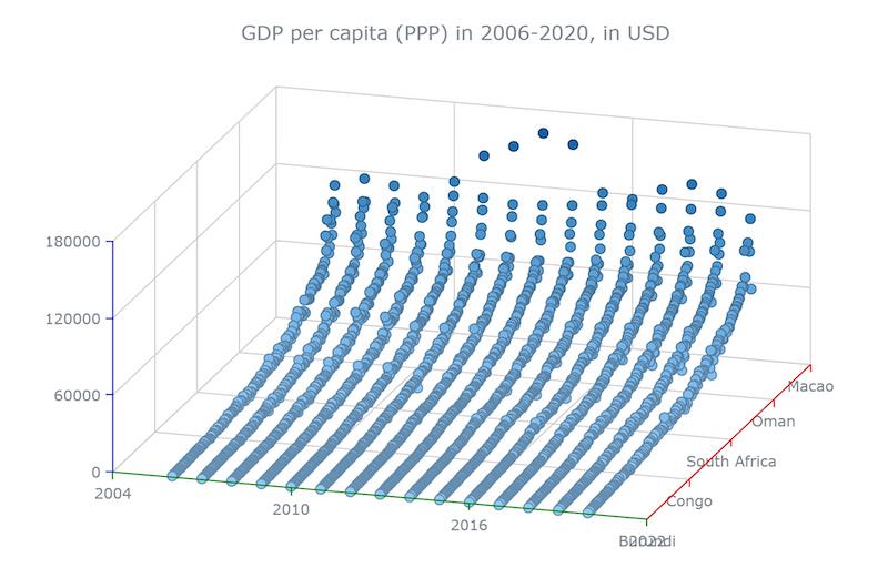
Voila! A basic functional 3D surface plot is ready!
You can have a look at this basic version of a JavaScript 3D surface plot on CodePen or check out the code right here.
Customizing the JS Surface Chart
One of the best parts of using any JS charting library is that you need to write a very minimal amount of code to get a working version of the chart implemented. Moreover, most of the libraries provide options to customize the chart to make it more personalized and informative.
Let me show you how to enhance the JS 3D surface chart to make it more intuitive and aesthetically better:
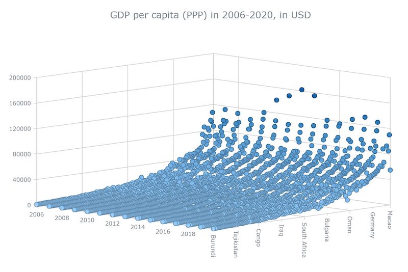
Step 1 – Improve the look and feel of all the axes
It might seem like small changes, but this is what I am going to do first. Modifying the look and feel of the axes makes the chart look distinctly better and easier to read.
Modify the basic settings of the axes
To emphasize the 3D effect of the surface plot, I will rotate the y and z axes 15 and 45 degrees respectively. This can be done very simply using the inbuilt rotation function.
I will now set the maximum and minimum of the y axis as the start and end year to make the plotting look sharper.
// set y and z axes rotation
chart.rotationY(15);
chart.rotationZ(45);

// set y scale minimum/maximum
chart.yScale().minimum(2006);
chart.yScale().maximum(2020);
I will now enable minor ticks for x and y axes to showcase more ticks and consequently more labels. For uniformity in the ticks, I will set the interval to a fixed value for y and z axes.
// enable x and y axes minor ticks
chart.xAxis().minorTicks().enabled(true);
chart.xAxis().minorLabels().enabled(true);
chart.yAxis().minorTicks().enabled(true);
chart.yAxis().minorLabels().enabled(true);

// set scales ticks intervals
chart.yScale().ticks().interval(8);
chart.zScale().ticks().interval(40000);
Modify the labels of the axes
To avoid overlap with the x axis label, I will hide the last label in the y axis.
Next, I will reduce the font size of the labels and minor labels (labels of the minor ticks) of all the axes.
// hide the last label in y axis
chart.yAxis().drawLastLabel(false);

// set x, y and z axes labels font size
chart.xAxis().labels().fontSize(10);
chart.xAxis().minorLabels().fontSize(10);
chart.yAxis().labels().fontSize(10);
chart.yAxis().minorLabels().fontSize(10);
chart.zAxis().labels().fontSize(10);
Finally, in the label modification, I will rotate the x axis labels and minor labels to 90 degrees for a cleaner look.
I will also need to set the x axis minor labels with the loaded data similar to what I did earlier for the x axis normal labels.
// set x axis labels rotation
chart.xAxis().labels().rotation(90);
chart.xAxis().minorLabels().rotation(90);
chart
.xAxis()
.minorLabels()
.format(function () {
	return data.x[Math.round(this.value)];
});
Modify the stroke of the axes
By default, the surface chart uses three different colors to denote the 3 different axes. But I don’t need that for my representation so I will change the stroke of all the axes along with the ticks to a light gray color.
// set x, y and z axes stroke settings
chart.xAxis().stroke(null);
chart.xAxis().ticks().stroke("1 lightgray");
chart.xAxis().minorTicks().stroke("1 lightgray");
chart.yAxis().stroke(null);
chart.yAxis().ticks().stroke("1 lightgray");
chart.yAxis().minorTicks().stroke("1 lightgray");
chart.zAxis().stroke(null);
chart.zAxis().ticks().stroke("1 lightgray");
chart.zAxis().minorTicks().stroke("1 lightgray");
Check out here how this version with all the beautification of the axes looks like, and you can play around with it on CodePen.
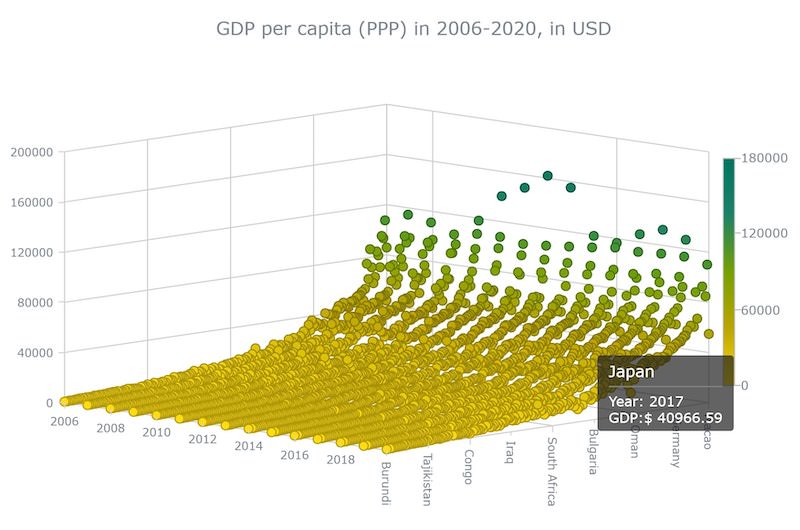
Step 2 – Add a color palette
A sure shot way of elevating your chart’s appeal is to add a color palette based on the data you are showcasing. It is quite a straightforward process where I will first create a linear color scale with the colors that I want and then set that color scale for the chart.
Along with adding the colors, I will also add a legend that will show what color indicates what value range, and this can be done in just one line of code.
// Create color scale
var customColorScale = anychart.scales.linearColor();
customColorScale.colors([
	'#ffdd0e',
	'#BCA600',
	'#76A100',
	'#1b8366',
	'#007561'
]);

// Set color scale
chart.colorScale(customColorScale);

// enable and configure color range
chart.colorRange().enabled(true).orientation('right');
Step 3 – Enhance the tooltip
When you are showcasing more data, it is always a good idea to have a useful tooltip. The default tooltip is not really informative so I will customize it to display the values of all the three parameters of each plotted point – country, year, and GDP figure.
// tooltip settings
chart
.tooltip()
.useHtml(true)
.titleFormat(function () {
	return data.x[this.x];
})
.format(function () {
	return "Year: " + this.y + "<br>" + "GDP:$ " + this.z.toFixed(2);
 });
Don’t you think that this simple tooltip adds so much more value to the chart? See how cool and customized the JavaScript-based 3D surface chart looks now and you can find the entire code on CodePen.
Conclusion
Isn’t it amazing how such an exciting and complicated-looking 3D surface plot can be built quite easily? With JavaScript libraries, you can quickly create a simple, operative chart and then add as many features as you want to tweak your visualization.
There are a lot of different types of data visualization available in the various JS charting libraries and you can look into the chart type options available in AnyChart, for example.
Please ask any questions, give suggestions, or simply say hello. The sky is the limit for improving every country’s GDP as well as creating great visualizations so start making some interesting and enlightening charts with this newly learned skillset!