20 Coming Soon Pages Explained & How to Do Them Right
For a coming soon page, all upcoming websites can ever do is to show an empty screen with the words “COMING SOON” plastered from end to end.
Or is it?
In several ways, designing a ‘Coming Soon’ landing page for websites, services, and products is a form of art. With limited space, a designer could only hope to infuse all of the necessary elements in a way that would harmonize with the audience — and make them take action to engage, return, subscribe.
In this post, we have gathered 20 unique, elegant, and high quality Coming Soon pages for you to take inspiration from.
20 "Coming Soon" Templates to Download
Your website's 'coming soon' page can tell a lot about your upcoming product or service. There are so... Read more
Quirky and Cartoony Coming Soon Pages
These Coming Soon landing pages’ common characteristic is that they are playful in nature, which is perfect for products or services that are family-oriented, or those who want to come off as welcoming to people. See for yourself!
Sorellina
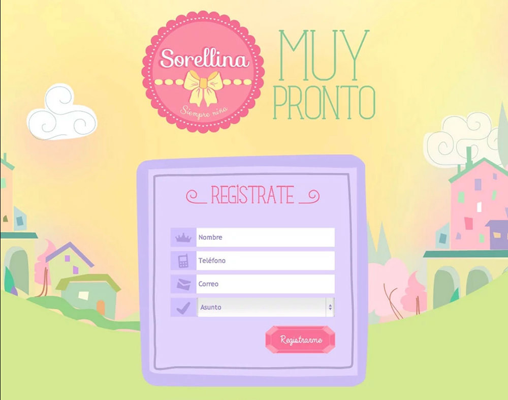
Sorellina takes the most important aspects of a Coming Soon page and combines it with a unique design. This original aesthetic is tailored to the website that it’s stitched on, giving it a custom look and feel. A refreshing sight to behold that is perfect for “quirky” kind of service or product.
You see all the essential elements of a coming soon page including a content box, email signup, social integration, background image, and logo image. The best thing about this, however, is that the overall design stays original despite the familiar elements on display.
Timeville

Animations that are driven by quirky or cute illustrations can put a smile on a visitor’s face. This is enough to catch the eyes of a visitor. The general goal of the page is to meet the needs of the viewer’s curiosity just enough for them to scroll down.
The first section of the page itself is the entirety of the animation with a timer and an email signup function lying in wait. Scroll down and you’ll find that there’s enough space for a paragraph or two about the website. Social media functions are then sprawled on the bottom.
Dualingo

Dualingo, like some of the pages listed, uses cute imagery and matching color combinations as their main design. The overall page design itself only revolves around the progress of the website alone. The only other content bar is an email signup.
The page itself mainly consists of a background illustration and a progress bar that uses three image markers for progression. These images show the progress of an owl hatching from its egg. Apart from that, an email signup function is located on the upper right corner.
Omakase Sushi

This website is for a sushi restaurant that pitches in a custom-made illustration on the left and content on the right. Of course, the overall color scheme will remind you of Japan and the content found on the right will sound like the deepest and most thought-provoking description you have ever read.
It’s quite easy to see that your eyes are first drawn to the image on the left which is then transferred to the content on the right. Reading past the description on top, you’ll find an email sign up box on the bottom. In addition, a banner trails off on the box which advertises other products of the website.
Shiva

Have you ever wanted to use a design or an image to purely convey what your coming soon page is all about? Well, this design by Shiva uses no text but the words “Coming Soon.” It’s simple and very minimalist in its structure.
You’ll notice right away that the page is bright. It’s painted with a white background save for a small image of workers prepping a billboard. Other than that, social media links are found at the bottom left.
Creative and Radical Landing Pages
On a different theme of Coming Soon pages, the items in this section give off a different vibe. You can feel the eagerness to be different from the rest of the boring, straightforward designs. These landing pages are perfect for those who wish to pique people’s interest through creative means, like the music industry, art, and the like.
Skate City

Skate City was originally a Coming Soon page used for a mobile game. It uses two clever techniques to keep a viewer’s eyes locked on the screen: animation and video. The latter being the first thing that viewers see as it occupies the entire screen.
As for its animation, Skate City uses two lights that switch on once a viewer scrolls down. The lights illuminate the email signup function and the viewer’s eye is immediately centered on it. It’s a clever way of putting a literal spotlight on a desired section of the page.
Self Made

Self Made is a music and talent competition website. It takes on unconventional imagery and color combinations that pull the eyes of a user even from afar. It also uses surreal or unfamiliar illustrations that make viewers take a second look thus capturing their full attention to the page and what it’s all about.
The main focus of the site consists of the image on the right which is then followed by a brief description of development on the left. Below this description lies the email signup and a few more links below it. Finally, the bottom page fits in information on the website itself.
Free Sketch

The pre-launch page for Free Sketch takes on a modern look for the website. If the background image of a city isn’t clear enough, then the text boxes in the middle should make it shine. It keeps everything simple and minimalist in nature.
The design itself is composed of a background image, a logo on top, a series of messages from the admin and an email signup box on the bottom for current updates.
Vincent Thouin

Vincent’s coming soon page utilizes one image and a dark background. That’s it. The image itself is animated and encapsulates what he’s trying to convey. It’s a simple technique that may be too vague for the ordinary user.
The overall design is a dark background and a sizeable lightbulb in the middle with working gears behind it. As the website’s structure progresses so too will the light that comes from the lightbulb.
Firman

Firman’s pre-launch page is something different. You’ll notice right off the bat that its color scheme is dark and grim. This is furthermore supplemented by a background image of a misty forest.
The design itself uses a unique form of a timer on the right, the words “coming soon” on the left, and social media integration on the bottom. It’s simple, yes, but it’s mainly carried by the overall vibe that it gives off.
Modern and Professional
Smart, sleek, minimalist — like all professional Coming Soon pages. These are some perfect examples of how coming soon pages should be designed, which can be used in a corporate setting.
Robert Smart

Sometimes, simplicity is the most efficient way of creating an impression that lasts. Well, Robert Smart created a coming soon page that embraces simplicity and straightforward design. What’s produced is a site that gives viewers what they want and offers them a chance to get in touch with you.
As you can see, the main focus of the page is to introduce the viewer to who you are. It then trails with more information as to what you can do or what you’re able to do for the reader. It’s closed off with an email signup option.
The Factory

If you’re e-commerce website deals with elegant products, then why not show off a coming soon page that reflects this very image? This is what The Factory brings to the table, a coming soon site that puts in just enough effort to merit the viewers’ attention.
The landing page begins with a loading screen shaped to the website’s name. The page itself consists of a static background image, the email signup function on the bottom left, and a few extra links on the bottom right.
Not Dark Yet

Sleek and professionalism are the two aspects that Not Dark Yet would like to introduce you to. It does away with the usual elements that are heavily filled with background colors. It leverages lines, outlines, and transparency in a way that produces a great effect, suitable to its background image.
As for the page itself, there are two progress bars in display one is the loading bar and the other is a timer. In between the main header and progress bars is a sentence or two about the progress. Below you’ll find the email signup function as well as social media links at the bottom. All this is wrapped around a background image or video that’s given a slight tint.
Blogin

Blogin toys with the concept of simplicity by adding subtle hints as to what the website is after and it seeks to accomplish. The overall look or aesthetic in the display is pretty simple and the color scheme also follows the same brand. It also gives off an impression of an energetic and exciting thing that is about to unfold.
As the page itself, it still contains an email signup function, a background image, and the logo placed on top. However, what’s most clever about the design is the description in the middle. It produces a call to action by using an action word as an intro to each sentence.
Cap/Sure

Cap/Sure is a website that deals with new investors and equity crowdfunding. With that said, it’s easy to say that the overall design of the page is sleek and professional. It uses easy-to-read fonts with a dark background that makes everything more readable and noticeable.
The page consists of a preview image of the beta on the right, a general heading on the left and a brief description below it. At the bottom of the description lies a signup bar for users to try the beta and a “learn more” function beside it.
048

You can never go wrong with a sleek and simple design that puts in a release date as its main show. 048 applies this very concept as it tries to be as minimal as it can without being too vague or devoid of information.
The general design of the page is a background image, a logo on top, a suspected release date in the middle and an email signup below it. At the bottom, you’ll find a link on the user’s YouTube account with its associated subscriber count.
Imam Maulana

The image above is for a booking website based in Indonesia. Since its focus is just for booking tickets or hotel rooms, the only content box you’ll find is for booking for said events. The color scheme, however, is what really pops into attention as well as the image that melts in the background.
The overall design consists of a background image, a largely plastered “coming soon” sign on top and then a signup box below it. The page then cuts on the bottom to make space for additional contact information.
The Apartment

Sometimes, a flashy or eye-catching design may not be for you. If it’s true, then The Apartment’s cool and laid back design should be your cup of tea. It keeps everything neat and organized in the middle with a lightly colored background image.
The design consists of the logo on top, a short description of the middle, and an email box on the bottom.
Jay Nagar

Jay’s coming soon page practices the more common form of a pre-launch page. It has a timer, a description, and a link to the admin’s blog. The overall aesthetic is simplistic as it’s color scheme is only composed of black and different shades of grey.
The structure is made out of a background image that melds together with the color scheme. The content on display is a timer, a description below it, and a link to a blog on the bottom.
PandaDoc

PandaDoc’s page is quite common at first glance. However, it actually uses simple imagery and design to lure in a user’s eyes as to what it has to offer. It’s not minimal but it does use it space efficiently to prevent the viewer’s eyes from too overburdened.
The design consists of a preview page on the right, and the content on the left. The latter is made out of a header, a short description under it, and then a link to its email box on the bottom. The black background cuts off after the social media link as it turns into a cool green color. This second section details what the website can do for the reader.
Conclusion
If you are going to design a coming soon page for your product or service launch, it is crucial to catch people’s attention in an instant. Not only do they have short attention span, they will also most likely never visit your landing page a second time! So if you don’t capture their details within the first couple of seconds, then I’m afraid you won’t have a second chance because there are literally millions of new websites popping into existence weekly.
With the coming soon page examples shown above, I hope you have been inspired to design new, fresh, and captivating landing pages that will entrance your audience!