20 Web Design Industry Terms for the Clueless Client
In the web design industry, we use many insider terms. This doesn’t only make it hard to get started for newcomers, particularly clients who are not involved in the design industry, but communicating their meaning properly can sometimes be quite a challenge.
In this glossary, we have collected 20 frequently used web design terms and added a short explanation to each, so that anyone can quickly have a look at them in case of any uncertainty. If you have a client who really needs a crash course in web design jargon, share this article with them.
Read Also: 30 Acronyms All Web Developers Should Know
“Animation”
A web design technique that adds motion to on-screen elements in order to visualize change or to attract users’ attention.
Animations are more powerful than transitions, as they can go through many different states between their start and end points, therefore they can be used for more complicated effects.
Read Also: How to use CSS3 Transitions & Animations to highlight UI changes
“Breadcrumb”
A navigation type that informs users about their current location on a site.
Breadcrumbs contain the path on which the current page can be reached from the home page, usually in the format of Home / Category / Page. Each element of the path is also clickable so that users can quickly navigate the site hierarchy. Breadcrumbs are usually displayed on top of each page.
“Clutter”
A web design blunder, an indicator of a poorly designed page.
We speak about a cluttered page when the designer squeezed too much information on the same page without adding enough white space & properly structuring content. Cluttered pages have low readability, and harm user experience.
“Color Scheme”
A collection of harmonizing colors used for creating a recognizable brand identity.
Usually the same color scheme is used consistently across the brand’s website, mobile app, logo, and marketing materials. A color scheme can be designed according to different principles, there are monochromatic, analogous, complementary, triadic, and other color schemes.
Read Also: Basics behind Color Theory for web designers
“Contrast”
A design technique to emphasize differences between elements that have different role or meaning.
Using complementary colors (opposites on the color wheel) are the most well-known way to express contrast, however visual differences in the shape, style, typography, or layout of page elements we want to distinct can also achieve a contrasting effect.
Read Also: Using high colour contrast for more Accessible Design
“Empty State”
A specific state of a website or application when there’s not yet any content on a particular page, however the design elements are already on their place.
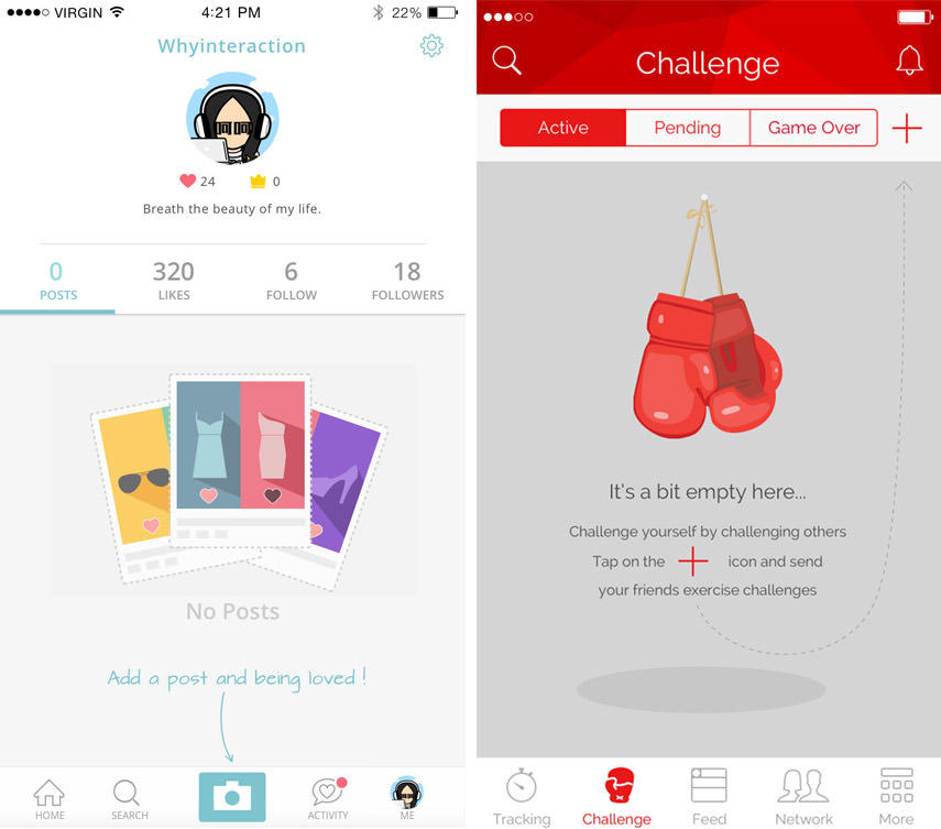
First-use states, such as empty profiles are typical examples for empty state pages. They require specific design techniques (such as onboarding design) that inform users about what should be on the page, and encourage them to perform certain activities.
Read Also: How to design Empty State Pages for websites & mobile apps
“Fixed Layout”
A layout type in which a site and its elements use the same width across all resolutions, defined in static values (usually pixels).
The traditional way of building websites. Rarely chosen for newer websites, as sites with fixed layouts are hardly usable (readable) on mobile screens. To stay accessible for mobile users, many fixed layout sites use a secondary mobile site.
“Flat Design”
A UI design language that focuses on clean and minimalist styles, and removes complicated textures, patterns, gradients, and other fancy effects in order to help users better focus on the content.
Flat design has been criticized for usability problems stemming from the lack of three-dimensionality. More mature Flat 2.0 design languages, such as Google’s Material design, have appeared as a response, and added a little depth back to flat design.
Read Also: Flat 2.0 & how it solves Flat Design’s usability problems
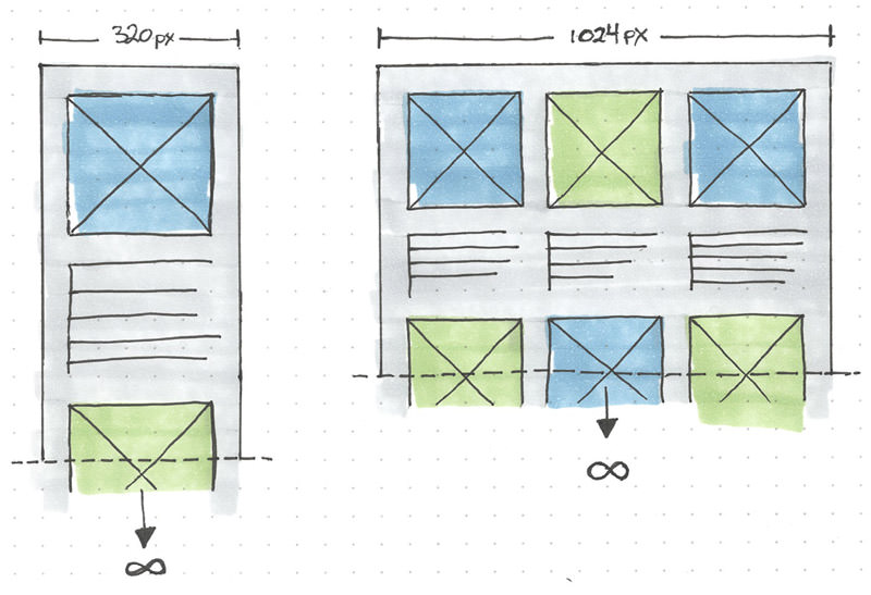
“Fluid Layout”
A layout type that uses relative units to define the width of a site and its elements.
The most frequently used relative units for fluid layouts are percentages, but ems and rems can also be used. A fluid layout resizes (stretches and shrinks) as the width of the viewport changes. Unlike responsive layouts, a fluid layout doesn’t use media queries. Also referred to as liquid layout.
Read Also: A look into CSS units: Pixels, EM, and Percentage
“Fold”
The bottom side of the visible part of the screen.
The term “above the fold” refers to the portion of a web page that visitors can see without taking any action, while “below the fold” refers to the rest of the page that users can only reach by interacting with the site — usually by scrolling or swiping (on mobile).
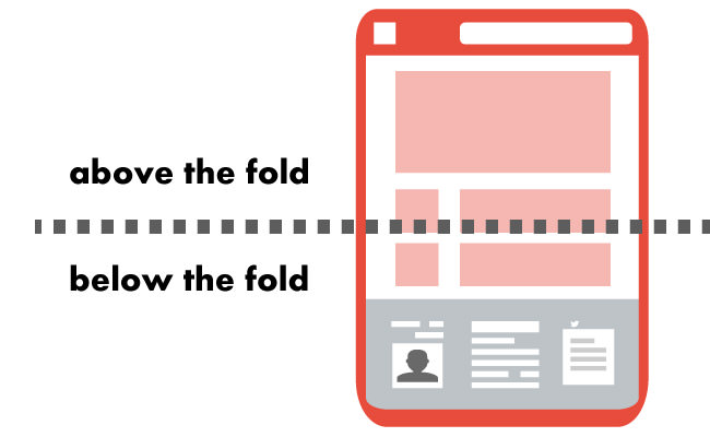
It’s recommended to place branding elements (e.g. the logo), in-site navigation, and enticing content above the fold in order to make users quickly understand the purpose of the site and be interested in the rest of the content.
“Graceful Degradation”
A web design strategy that includes all advanced features by default on a site, then later removes or simplifies things that don’t work in older browsers, on less capable devices, or at lower bandwidths.
Focuses more on appearance than on the content. In the mobile era, progressive enhancement has become the predominant web design strategy for new sites, graceful degradation is mainly used on older or legacy sites.
Read Also: 10 useful fallback methods for CSS & Javascript
“Hero Image”
An oversized image banner placed above the fold.
Hero images are high-quality, usually full-width images relevant to the content of the site. On top of them, there’s typically a short (one or two lines) text that conveys a message to users, and a call-to-action button that calls them upon to take a certain action, such as shopping or signing up to the site.
“Landing Page”
Originally any page where an online visitor enters a site. Recently the term is rather used for a standalone page designed for a specific business purpose.
For instance, if web users follow a banner ad they frequently find themselves on a landing page that calls them to buy a relevant product. Landing pages with a single focus and a clear call-to-action tend to reach higher conversion rates.
Read Also: 10 WordPress Plugins to create landing pages easily
“Lazy Loading”
A technique for loading images and other static content, such as videos, only shortly before they get visible for the user.
If a website uses lazy loading, only images above the fold are loaded first, the rest is only loaded when (if) the user scrolls the page. Frequently used in responsive and mobile design as it saves resources. For instance, Google AMP speeds up mobile sites by lazy loading static resources by default.
“Media Query”
A CSS feature that makes responsive web design possible by enabling designers to create different designs for different device dimensions (width and/or height), orientations (landscape or portrait), and media types (print, screen, etc.).
Typically, responsive sites have separate layouts for desktop, tablet and mobile screens, the breakpoints between them are defined by media queries added to the CSS.
“Progressive Enhancement”
A web design strategy that first adds only the basic elements to a site, that work on any browser, bandwidth, and device. More advanced front-end features (styles and interactivity) are loaded in layers afterwards.
Progressive enhancement primarily focuses on the content, results in sites that are accessible to every user, therefore it’s the predominant way of building websites in the mobile era (as opposed to graceful degradation).
Read Also: Best Practices for Progressive Enhancement in Web Design
“Responsive Design”
A web design approach to create websites that adjust to the dimensions of different device types (most frequently mobile, tablet & desktop) by designing different layouts and other styles (e.g. typography, image size) for them.
Responsive design makes use of various techniques, such as relative units, flexible grids, and media queries in order to serve every user with usable, readable and accessible content. Most modern websites use responsive design.
Read Also: Responsive Headers & Logos – Tips and Pitfalls
“Skeuomorphism”
A UI design language that leverages the principle of familiarity, and focuses on creating design elements that resemble their real-world equivalent.
For example buttons that look like real-life buttons by using effects such as bevel and emboss, drop shadows, gradients, and others. Before flat design has become predominant, skeuomorphism was the leading web design trend for many years.
Read Also: Skeuomorphic PSD to Flat Design with Skeuomorphism.it
“Transition”
A web design technique for visualizing simple changes when an on-screen element smoothly alters between a beginning and end state.
Transitions — unlike animations — don’t have in-between states, only a start and end point, therefore they are to be used for subtle changes, such as for visualizing hover states.
Read Also: How to Create Animations and Transitions with Motion UI
“White Space”
The blank space between adjacent design elements. Also referred to as negative space.
White space helps users skim the content, and visually indicates content hierarchy. White space is not necessarily white but uses the background color of the site. The lack of sufficient white space leads to a cluttered page.