How to Use Motion UI to Enhance Animations and Transitions in Web Design
Animations and transitions enable designers to showcase changes and distinguish between different types of content. These moving effects are crucial as they assist users in recognizing changes on a website; for instance, when a button is clicked and new information is displayed. Incorporating movement into apps and websites not only enhances the visual appeal but also makes the content more intuitive to understand.
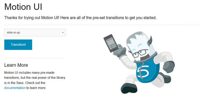
Creating animations and transitions can be done from scratch or through the use of libraries or frameworks. For those of us in frontend development, the good news is that Zurb, the creators of Foundation, in October released Motion UI, their animation and transition library based on Sass.
Originally part of Foundation for Apps, the standalone release of Motion UI has been revamped, featuring an animation queueing system and flexible CSS patterns. It also enhances certain components within the Foundation framework, like the Orbit slider, the Toggler switch, and the Reveal modal, making it a robust tool.
By the end, you will have a fully dynamic and customizable contact form.
Start building your advanced contact form today!
Introduction to Motion UI
While Motion UI is a Sass library, it isn’t necessary to use it with Sass. Zurb offers developers a convenient starter kit that includes just the compiled CSS. This can be downloaded from Motion UI’s home page, allowing you to immediately begin prototyping using predefined CSS animation and transition classes.
This starter kit includes not only Motion UI but also the entire Foundation framework. This means you can utilize the Foundation grid and all other features of Foundation for Sites as needed.
Additionally, the starter kit comes with an index.html file that facilitates quick testing of the framework.
If you require more complex customization and wish to utilize Motion UI’s extensive Sass mixins, you can opt for the full version, which includes the source .scss files. Installation can be done using npm or Bower.
The documentation for Motion UI is still in development. You can access the existing guides here on Github, or even contribute to its improvement.
Rapid Prototyping Techniques
To begin prototyping, you can either modify the index.html file included in the starter kit or create a new HTML file. While you can develop the layout using the Foundation grid, Motion UI can also function independently without the Foundation framework.
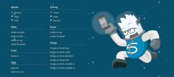
Motion UI includes three primary types of predefined CSS classes:
- Transition Classes – These allow for the addition of transitions such as sliding, fading, and hinging effects to HTML elements.
- Animation Classes – These enable the implementation of various movements like shaking, wiggling, and spinning.
- Modifier Classes – These are used in conjunction with transition and animation classes to modify aspects such as speed, timing, and delay of animations.
Constructing the HTML Structure
One of the unique aspects of predefined CSS classes is their versatility beyond just class attributes. For instance, you can incorporate them into the value attribute of the <option> tag, or utilize them in your own custom data-* attributes.
In the example below, I’ve opted to differentiate behavior and modifier classes. I’ve applied the slow and ease modifiers as classes, and established a custom data-animation attribute for the scale-in-up transition. The effect is triggered by the Click me button.
<div class="transitions">
    <button type="button">Click Me</button>
    <img id="boom" data-animation="scale-in-up" class="slow ease" src="#" alt="#">
</div>
Activating Animations and Transitions with jQuery
Motion UI also includes a compact JavaScript library that can trigger transitions and animations based on specific events.
This library is included in the starter kit under the motion-ui-starter > js > vendor > motion-ui.js directory.
It provides a MotionUI object with two methods: animateIn() and animateOut(). These methods can be used to initiate transitions or animations on specific HTML elements, like the <img id="boom"> in our example, using jQuery as follows:
$(function() {
    $(".button").click(function() {
        var $animation = $("#boom").data("animation");
        MotionUI.animateIn($("#boom"), $animation);
    });
});
The code snippet above retrieves the data-animation attribute using jQuery’s data() method, and then invokes the animateIn() method of the MotionUI object.
The following iframe showcases the complete code and its output, employing Foundation framework’s built-in button classes for the Click me button along with some basic CSS.
As Motion UI is highly versatile, there are numerous ways to apply and trigger transitions and animations. For example, in the above scenario, instead of using the custom data-animation attribute, you could also directly apply the behavior class using jQuery’s addClass() method to the <img id="boom"> element:
$('#boom').addClass('scale-in-up');
Customizing with Sass
Motion UI’s ready-to-use CSS classes come with default settings, but you can easily customize these using Sass. Each transition and animation in Motion UI is controlled by a Sass mixin, allowing for easy adjustments to suit your specific needs, enabling the creation of fully custom animations or transitions.
However, customization is not possible with the starter kit alone; you need to install the Sass version to tailor the effects as desired.
To begin customizing a transition or animation, first locate the relevant mixin. The _classes.scss file lists the compiled CSS classes along with their corresponding mixins. For example, the .scale-in-up class uses the mui-zoom mixin:
// Transitions
@mixin motion-ui-transitions {

...

// Scale
.scale-in-up { @include mui-zoom(in, 0.5, 1); }

... }
Motion UI employs the mui- prefix for its mixins, each contained in its own file. The mixins are named intuitively, making it easy to locate them, such as the mui-zoom mixin found in the _zoom.scss file:
@mixin mui-zoom(
$state: in,
$from: 1.5,
$to: 1,
$fade: map-get($motion-ui-settings, scale-and-fade),
$duration: null,
$timing: null,
$delay: null
) { ... }
This approach allows you to precisely control every aspect of an animation or transition by modifying the Sass variables.
Tailoring Modifier Classes
Modifier classes that affect the behavior (speed, timing, and delay) of animations and transitions can be customized in Sass by altering the values in the _settings.scss file.
Once you adjust these values, Motion UI applies them as the new defaults across all animations and transitions, eliminating the need to adjust each mixin individually.