A Look Into CSS Units: Pixels, EM, and Percentage
Unit takes an important role for measuring and building things like a house, a bridge or a tower, and building a website is not an exception. There are a number of methods of measurements used on the Web, specifically in CSS, namely Pixel, EM and Percentage.
In this post, we are going to run through these units to get further insight into these units of measurements.
Guide to CSS Viewport Units: vw, vh, vmin, vmax
Viewport-percentage lengths, or viewport units as they are more frequently referred to, are responsive CSS units that allow... Read more
PX
Pixel is a fixed unit measurement and the smallest unit on screen measurement but don’t confuse this with the Pixel that defines screen resolution. The Pixel in CSS has nothing to do with the screen resolution.
When we try viewing a web page fixed at 1024px width say on a tablet with 1024px by 480px screen resolution, the web page will not fit in the screen.
I’ve been experiencing this issue in the past and found out that the Pixel in CSS is actually not a linear unit – it is in fact a radial measurement.
Basically, the Pixel in CSS measures the length of the display area instead of the screen resolution, so the 1024px screen resolution does not mean that the screen is also 1024px of the length.
More On PX
I’m not an expert on the technicalities in this matter but if you know Trigonometry, and want to find out more, check out the following explanation from Sean B. Plamer: CSS px is an Angular Measurement.

Finding The Display Area
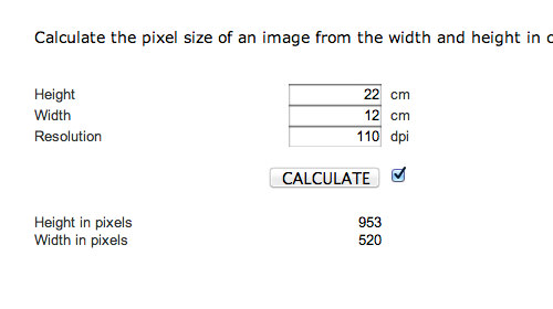
So, how do we find the actual display area of a device? Luckily, there is a handy special calculator to roughly estimate the display area in format of Pixel, CM to PX.
We simply need the length of the device in cm and the PPI (Point Per Inch) / DPI (Dot Per Inch) which you can get these from the device box. With this, it turns out that the tablet I used is merely 953pxin length.
Recommended Reading: Pixel Identity Crisis
Pixels Font Size in Photoshop
When working on Photoshop, we will find that the font size is by default set to Pt (Points). The Pt unit is ideal for print styles.
To not confuse this with px when we are translating it to Web documents, we can change the units from the following menu: Edit > Preferences > Units and Rulers.
There, you get a window option as shown in this screenshot below. Choose ‘pixels’ for the Type unit.

And, we have px for the font size.

EM
EM is a relative measurement. In CSS, EM refers to the multiplication of the default font size from the device or the document itself, that is why I personally word EM as EMphasize, but of course don’t take my word for it.
Here is an example; let’s say in a document, the font size is assigned for is 16px. 1em is equal to 16px, 2em is equal to 32px and so on.
Although EM is traditionally used for font sizing and in fact it is the standard unit used in browser styles for measuring font size, we can also used EM to define an element’s length.
The only constraint when working with EM unit is it is not quite intuitive, but there are two practical ways we can handle this. First, we can use this calculator, PX to EM; it’s a handy calculator that I use often.

Another way is to set the document pixel base to 10px, so we can calculate it more easily; for instance setting 15px at 1.5em. Well, I hope you get the basic idea with this example.
Percentage
It is more straightforward with percentage, which measures relatively to the parent length. When the parent width is 800px then 50% would become 400px. In recent years, as Responsive Design starts becoming the web design standard, percentage unit is adapted more frequently in the wild.
Alright, let’s take a look at the following example; this code below defines .container and .main class selector with 60% for the width, but these classes refer to different parents thus they generate different lengths.
The .container will take 60% of the browser viewport width, whilst the .main will take .container width as its direct parent.
 .container {
 width: 60%;
 margin: 100px auto;
 background-color: #eaeaea;
 padding: 1%;
 height: 250px;
 font-family: Arial;
 text-align: center;
 }
 .main, .aside {
 line-height: 253px;
 }
 .main {
 width: 60%;
 height: 100%;
 float: left;
 background-color: #ccc;
 }
 .aside {
 width: 40%;
 height: 100%;
 background-color: #aaa;
 float: left;
 }
Thus, it will give us the following nice result:

As percentage is also a relative unit, so it has a similar constraint like the EM unit as well. It is not obvious how much a percentage 15px is of 500px? This generally happens when we translate px unit from the design stage to web document in many cases.
There are two ways we can take to this matter, either we do it traditionally with a calculator or if you are comfortable with using CSS Pre-processor, you can utilize the percentage() function from Sass.
Final Thoughts
There are many discussions on the best practices of using units in web design. But ideally the PX unit should be used when the properties generally need to be precise e.g. the border-radius and box-shadow horizontal or vertical offset, whilst for the EM unit as suggested by W3C is better used for font sizing. Percentage is the ideal unit to use on responsive layouts.