Web Design: 20 Hottest Trends to Watch Out For In 2014
After spending hours online at different websites, you tend to pick up discernable trends in design. Over the years I have written about changing trends, particularly in the field of website layouts and web apps. Advancing W3C specifications coupled with modern web browsers have opened the door to a new era of digital design.
In this article I want to share 20 growing trends I hope to see blossom over the course of 2014. Many have already been set in motion while others are just beginning to dawn. New trends are fun to check out and see how long they stick around. When browsing websites in 2014 keep your eyes peeled for any of these UI/UX trends in action.
Web Design Trends for 2016
As time inches forward with each passing year, many new design trends loom on the horizon. The field... Read more
1. Grid-Style Layouts
My first mainstream recognition of the grid design was on Pinterest. Social news feeds have always been in a streamlined fashion such as Twitter or Tumblr. Nowadays even many Facebook pages scatter timeline updates to appear like a grid.
This isn’t something you can force into any old website. There needs to be a purpose, the user experience always comes first. In situations using thumbnail images or text updates the grid layout condenses everything into an easy-to-read format. Everything is skimmable yet still coherent and it doesn’t require much space on the page.

Open source JS libraries such as Masonry can do a lot of the hard work for you. Not many websites utilize this feature but the ones that do are often quite pleasant on the eyes.
2. Crafty Image Captions
In the past we covered some unique CSS3 image caption effects. Many websites use image galleries to showcase portfolio items, photographs, article thumbnails, etc. Using a text caption helps the visitor connect more information to the image. And with CSS3 you can rely on natural browser resources without any JavaScript effects.
Each website should have its own design to provide benefit to the reader. Another tutorial I enjoy from Codrops is figure numbering with CSS3. You can build caption-style labels which automatically append to the images (or figures) on each page.
3. Extended Form Elements
Most frontend developers are familiar with the purpose of jQuery. It helps you write smoother JavaScript code with fewer lines and much less clutter. Free open source jQuery plugins have taken on their own market — and they’re currently in high demand.

There is a particular enthusiasm surrounding jQuery form plugins which enhance the user experience. These effects could include floating labels, input validation, guided tooltips, almost anything you might imagine. Take a peek at the Unheap form gallery which catalogs open source jQuery plugins that you can download and test in new projects.
4. Deeply-Focused Landing Pages
I remember when the iOS App Store was launched and developers were clamoring to release their next great idea. Fast-forward some years and we have millions of apps for Android + iOS devices. Many of these applications even have their own companion website.
Software developers often purchase a domain name and launch a website as a marketing tool. This idea has since expanded to encapsulate mobile games, open source scripts, smartphone apps, really any digital product you can imagine. These landing pages are basically essential to encourage prospective customers into learning more about a product before buying.
Check Out: 20 Gorgeous Mobile App Landing Pages
5. HTML5 Video Players
I remember back in 2004 teaching myself basic ActionScript to create a custom video player for my website. It took months of work and the best playback solution was an FLV video. Thankfully times are quickly changing with HTML5 media and emerging JavaScript libraries.
Flash still has a purpose when necessary, but most web developers would agree that the future of Internet video is HTML5. Two scripts I would highly recommend are Video.js and MediaElement.js. The first is much simpler but also limited with basic functionality.

Media Element provides some default skins and greater documentation for building your own player designs. You can also try building a music/audio player out of the same codes. Both scripts provide documentation along with an API and they’re both fantastic libraries. Keep these in mind when you need self-hosted videos on any future projects.
Read Also: 10 Things Designers Need To Know About HTML5 Videos
6. 3D Transition Effects
I’ve been finding a number of creative 3D animations in more websites over this past year. These are often built into the page for animated image galleries, navigation menus, and elements. The 3D effects can be created using jQuery although CSS3 has been catching up.
Naturally the animations aren’t fully supported in all browsers, and designers should be wary of using too many animations on one page. But if you like to try new things I’d highly recommend scouring the web for 3D animated code examples to play around with.
7. Flat Design Elements
How could I discuss web design trends without mentioning the widespread use of flat UI elements. CSS3 allowed designers to create much flatter buttons using natural box shadows, text shadows, or rounded corners. This flat UI pattern transcended into form inputs and even navigation menus.
But I feel there is more we can expect in the near future. Flat icon sets and GUI kits have been released for free on dozens of websites. In my guide to flat web design you can find heaps of free downloadable PSD/AI graphics. Metro-style layouts have also grown in popularity from Microsoft’s Windows OS and the Windows Mobile Phone.
Read Also: Showcase Of Beautiful Flat UI Design
8. Personal Portraits
Simple portfolio websites are often my favorite. You want to convey a bit about yourself, where you’ve been, and showcase your work samples. But to keep people truly interested you need to form a human connection. One of the best ways to accomplish this would be including a sample photograph of yourself somewhere on the page.

Andrea Mann uses a photo which encapsulates much of the homepage. This is also blended into the darker background and recolored to shades of B&W. It looks fantastic, although you don’t need to use large background portraits on your website. Even a small photograph in your homepage or about page offers visitors a glimpse into who you are.
9. SVG Images & Icons
Vector-based graphics aren’t built around pixels, but lines and coordinates. Individual shapes are organized by mathematical equations and this allows you to stretch vectors to any size. SVG images are like vectors in the sense they can be manipulated easily without much quality loss.
The biggest problem is support for these images within all web browsers. Many people are still using older versions of Internet Explorer and other legacy titles. It’s a huge trend that will be sweeping the Internet in years to come (if it hasn’t already).
Read Also: More On Scalable Vector Graphics
If you really want to get started might I recommend Codepen, an open community-driven IDE for developers to share their work online. You’d be surprised at the quality. Snap.svg is a JavaScript library devoted to support in multiple browsers with natural SVG images. This is a somewhat detailed topic but if you’re curious, it is worth delving into.
10. Unique Web Copy
One of the coolest new features in web development is the @font-face declaration. You can import font files hosted locally or externally on another server. These fonts are defined within CSS and you can write them into font-family properties to style your webpage text.
This has grown to include font-based icons where flexible icons are rendered on the page as text. These icons aren’t as well-designed in comparison to real graphics, which can incorporate a multitude of different colors. Yet simply having the ability to customize any font on the page is a powerful technique to help your website stand apart from the crowd.
11. Lazy-Loading Animations
When browsing ThemeForest one day I came across many WordPress themes which had transition effects applied onto elements, but they only animate when you scroll them into view. These elements behave similar to lazy-loading images except they’re already loaded in the page and hidden from sight.
Using JavaScript it’s easy to detect when the element(s) are in view, and then use CSS3 transitions or JavaScript to animate.

If you scroll down the page on Chart.js you will see blocks of content + images begin to slowly fade into view. This trend probably doesn’t save on bandwidth unless you purposefully wait to load the content. It’s more about page aesthetics and providing a sleek interface for your visitors.
12. Customized Image Galleries
The growing integration of JavaScript and CSS has allowed developers to produce exceptional new projects. Image galleries are one trend that have been around for decades. Going into 2014 we might expect to see even greater solutions to dynamic carousels and image lightboxes.

To provide a small example, take a look at this recent gallery tutorial on Codrops which uses an elastic dragging effect to switch between photos. This is somewhat experimental but you can see how developers are willing to push the boundaries and see what’s possible.
13. Mega-Navigation Menus
All kinds of new fancy navigations have been tested and adopted in recent years. The mobile responsive web is a big piece to this, along with the HTML5/CSS3 specifications. I have noticed a small yet growing trend of mega navigation menus which expand to hold large blocks of content and links.

These are most common on websites that publish lots of unique content in high volumes. Online magazines or web forums immediately come to mind. It does take up a bit of space on the page, but it also gives readers a broader choice to navigate your site.
I stumbled onto a related article on Smashing Magazine talking all about navigation menus for mega-sites. The concepts are similar and the examples provided may be a good starting point for anyone interested in this trend.
14. Expanding Search Bars
Looking back I’m not completely sure when this concept picked up steam. But there is a growing popularity for building semi-hidden or expanding search bars into your layout. The user clicks a magnifying glass icon or clicks into the form itself, and then it expands wider to allow for more text input.

Codrops wrote an outstanding tutorial about this topic and it’s a great read for any developer. Primarily the hidden search field is used to save room on the page. You might even hide the form at the very top and toggle it up/down like a navigation menu. This technique is prominent with responsive layouts, but even larger & more completed designs are incorporating these adaptable search fields.
15. Featured Detail Lists
Recently I put together a design showcase of featured detail lists to be found on website homepages. These are list-oriented details explaining information about a company or product. Oftentimes the details are coupled with some icons to help illustrate the points in a more concise manner.
I’ve noticed these detail lists have become a staple for many homepages. A collection of information about any product or service provides visitors a reason to stick around. It gives some insight towards what you provide to customers and how it all works. Icons are like the frosting to catch people’s attention when scrolling by quickly.
16. Mobile-First Design
A book called Mobile First by Luke Wroblewski gave me this idea some time ago. When browsing a website it’s not easily possible to differentiate how the design process worked out. But the idea is to first mock-up how your website should look as a responsive layout on mobile screens. Eliminate all the excess fluff and keep only the bare essentials.
From this standpoint it’s much easier to scale up your design to wider screens. Navigation menus become wider, content is lengthened along with a possible sidebar. Mobile-first design places a higher priority on the mobile experience which then becomes a baseline for the entire layout. I love the concept, and I hope designers will try implementing this to see how it can affect workflow and the final outcome.
17. HTML5 Canvas
There is a lot to be said about the canvas element and it’s quite a topic of study. Using JavaScript, it’s possible to create games or drawing applications right inside HTML5. I’ve even seen the canvas element used to collect signatures with the mouse.
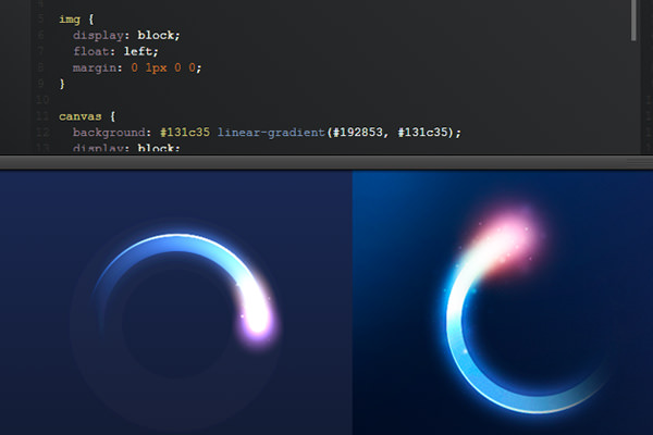
The example above is from a simple Codepen entry. Someone posted a glossy loading circle onto Dribbble and this pen is a replication using the canvas element. Another example is this small horizontal loading bar built on HTML5 canvas and JavaScript. The possibilities are growing rapidly and personally I’m excited to see what canvas will be like 2-3 years down the road.
18. Pixel Sprites & Browser Games
Much like classic video players, browser games used to be exclusively produced in Adobe Flash. But JavaScript has gotten a foothold into the community and many developers are happy to release open source codes for these types of projects.
A little while back I wrote an article detailing pixel-centric websites that could also use animation. These designs aren’t common but they do catch your attention. It takes a lot of design talent to create such exquisite pixel artwork. So building your own in-browser sprite game would be an even larger challenge.
One of the best resources for getting started can be found on HTML5 Game Engine. The site lists many free JavaScript libraries for creating your own browser games. There is a lot to learn about the process, but thankfully you can find hundreds of tutorials online within Google.
19. Quick User Registration
There are an increasing number of brand new startups and web applications that allow for user registration. In fact, many services require you to signup before you can start using the website. Long detailed registration forms are tremendously off-putting in this fast-paced world.
Try to keep all registration forms quick and to the point. Many newer webapps include the signup form right on their homepage to capture as many visitors as possible. This happens when a new visitor is curious about your product, sees the form only has 2-4 fields and decides to go for it. You may be shocked at how well this strategy works for capturing new users.
Read Also: Boosting Your Site Traffic By Harnessing Your Subscriber’s List
20. CSS3 Animated Keyframes
Since the early millenium JavaScript has been the primary choice for browser animation. Only recently has CSS3 become adopted into the mainstream where developers can build their own animation effects using @keyframe.

There is another way to animate using the transition property, although this only has one state for animation whereas keyframes behave much like Adobe Flash. You setup a frame percentage value from 0% – 100% and define properties which change over time. The latest CSS3 spec provides enough tools for you to animate elements in practically any style you like.
Closing
Smaller interface concepts aren’t something we think about everyday. But it is these smaller accents that bring life into a clever website layout. I hope this article can shed light onto a handful of design trends we’ll prominently notice in future projects. Also if you have ideas for 2014 design trends I may have forgotten, feel free to share with us in the comments area below.