Showcase of Stunning Web Designs Featuring Beautiful Typography
Typography, the art of arranging type in design, is undeniably one of the fundamental elements of excellent web design. This visual art form allows us to create designs that are both aesthetically pleasing and functionally effective. However, despite its importance, typography often remains an underappreciated aspect of web design.
Good typography enhances the appeal of a design, guiding the reader’s eye across the page according to the hierarchy of the content. It’s not just about choosing the right font style, size, or family; it’s about achieving a high level of visual hierarchy through thoughtful typographic choices.
In this post, we provide tips on improving typography in your web design. Additionally, we showcase 16 websites with outstanding typography, along with resources to elevate your typographic skills.
Pure Typography: Beauty in Simplicity
While many visually stunning websites combine typography with graphics, there is still beauty in designs that rely solely on typography. The simplicity of such designs is powerful, but crafting a visually appealing website using only typography can be challenging, as it requires creating more impact with fewer elements.

To master typography in web design, start by learning the fundamental structure of typography. Understanding the relationship between typography and other design elements will help you choose the right colors, images, and type sizes to create a cohesive design. Experimenting with different typographic styles will reveal their impact on your overall design.
Some websites use black backgrounds with large white fonts to enhance readability, while others use bold or bright colors to emphasize headlines. Minimalist web design often leverages typography to draw attention to content, making the design both striking and easy to navigate.
Typography is a powerful tool in creating visually appealing web designs. For further learning, check out I Love Typography. For a fun way to learn, try the Font Game. For more resources, explore our comprehensive guide to better typography for modern websites and our quick guide to typography.
The Art of Typography in Web Design
Studying websites with exceptional typography can boost your creativity and improve your designs by teaching you how to use colors, fonts, and other design elements more effectively. Let’s explore 16 websites that showcase beautiful typography with unique visual appeal.
Helveticons
This website features premium icons with beautiful typography, offering goodies like desktop folder icons, social media icons, and Helveticons wallpapers.

Type Daily
Type Daily curates typography-related content from across the web, updating its content via RSS feeds as soon as new material becomes available.

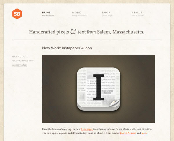
SimpleBits
This user-friendly site showcases typography in an organized and aesthetically pleasing way. The bold uppercase type used in the navigation menu pairs well with the descriptive text.
Information Highwayman
Typography art is cleverly integrated into the background of this site, enhancing its artistic appeal.

Jason Santa Maria
This minimalist design relies heavily on typography, with large titles that immediately draw the reader’s attention.

Elysium Burns
Despite the abundance of elements in this design, they are arranged in a way that keeps the layout clean and organized.

The New Yorker
This magazine website uses typography to maintain its brand’s established yet stylish image, enhancing reader engagement.

Black Estate
The white text on a dark background in this minimalist design significantly improves readability and makes a strong visual impact.

A List Apart
The centered design elements and minimalist approach in A List Apart highlight the typography, making it easy for readers to navigate the site.

Good
The use of clean, well-spaced typography in this design results in a beautiful and easily readable layout.

The Darling Tree
The Darling Tree showcases the effective use of various typography styles, contributing significantly to the overall design aesthetic.

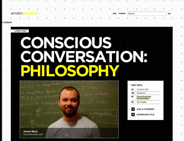
Erratic Wisdom
The combination of a black background with bold typography, when used correctly, creates a powerful and striking design.
Switch Mediaworks
This site effectively combines typography with visual elements in a minimalist way, exemplifying the concept of ‘less is more.’

Hungry Man
This distinctive design with a touch of retro style stands out, giving the website a unique identity.

Elmwood
Effective typography can be a powerful tool for promotional purposes, and Elmwood uses it to impress and engage its audience.

Explore More Typographic Inspirations
If you’re looking for more inspiration and wisdom in typography, these resources will spark your creativity: