A Look Into: Fonts Used In Logos of Popular Brands
Are you staring at other designers’ logos and immediately trying to decipher what typeface they are using? If you are a designer, it is probably an inevitable habit. There are no hard and fast rules to help you determine which typeface you should land on for your logo. And because we are showered with thousands of free fronts on the Internet, deciding on the ideal font to use can be a challenging task.
If you have experimented with hundreds of fonts, but they just don’t work out right for you, are suffering from a design block where you don’t know what font to use, or you are just curious about what fonts others are using for their logo, this article is for you. Today we have analyzed some top brands of their respective industry and revealed the font they used in their logo. They may give you some raw ideas for your next logo design; try not to replicate :)
Zopa.com
Many top websites are trending towards gray color schemes with bright color splashes. The Zopa logo and overall image are a perfect example of this trend.
Font used: Frankfurter medium

Shutterfly
Shutterfly’s modern logo is simple, refined, and playful. This image shows that life is too fast to take it too seriously. Their use of bright colors is consistent with the latest website trends and effectively enhances their overall image.
Font used: Frutiger

NewsGator
Multi-colored logo fonts are all the rage these days, as shown in NewsGator’s logo.
Font used: ITC Bauhaus

Shoutwire
Many cautions against excessive capitalization in logo fonts. However, Shoutwire’s use of a font in all caps shows that those who caution against this trend can be wrong.
Font used: Agency Bold

Shozu
This is an ultra-modern design consistent with the styles of current top websites. When your font is paired with playful colors, you will grab the viewer’s attention.
Font used: FF Cocon Bold

Elegant and straight-sided characters on the dark-blue background are easy to recognize: Facebook is the perfect example of a minimal yet most recognizable logo!
Font used: Klavika

Light-blue letters with rounded corners: here you go! Now you can spoof the famous Twitter logo!
Font used: Pico Alphabet

Digg
Unlike the above font, this one has no rounded corners at all: everything is sharp and diagonal here, giving the perfect feel of the original logo.
Font used: Pico y

Cork’d
A very cheerful font with attention to detail in every letter – it makes a perfect fit for the Cork’d logo.
Font used: Triplex

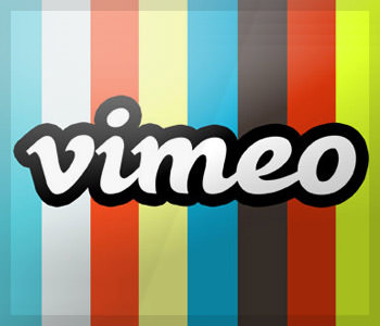
Vimeo
A bold italic font somehow resembles handwriting. It is almost a universal font that can match any interface easily.
Font used: Black Rose
Last.FM
A very elegant narrow character with rounded borders makes a great fit for the music-related website.
Font used: National

Flickr
Named after its designer, Adrian Frutiger, the font is used in frequently used in various logos and advertising campaigns. What makes it stand out in Flickr logo is the famous blue/ pink color combination.
Font used: Frutiger

Youtube
A straight diagonal font on a red background is one of the easiest to spoof.
Font used: Alternate Gothic No. 2

The font has a somewhat calligraphic feel with contrasting stroke weights and distinctive serifs. Play a bit with colors, and you have an exact copy of the Google logo!
Font used: Catull BQ

Yahoo
This one is the easiest to spoof: they have their own original font you can download and use!
Font used: Yahoo Font

Hulu
No extra details: smooth lines with rounded corners make up a very elegant font.
Font used: Futura MDd BT

TMZ
TMZ logo features very effective use of the Amelia font, which makes it one of the most recognizable fonts out there.
Font used: Amelia

Linked-in
Myriad Pro Bold is used in many contexts but has become very popular from the LinkedIn brand.
Font used: Myriad Pro Bold

Skype
The smooth lines of this font with characters a bit smashed to each other make a unique combination.
Font used: Helvetica Rounded Bold

Revision 3
What makes this font recognizable is the effective use of the logo right inside the brand name.
Font used: VAG Rounded Black

Ferrari
Ferrari has a very stylish font: letters seem to match one another so well that you can’t imagine they can exist separately.
Font used: Ferro Rosso

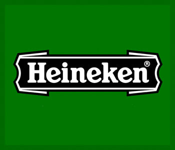
Heineken
Like Yahoo! logo, this one requires no effort to spoof. Just use its original font designed by Jeroen Klaver.
Font used: Heineken
Swatch
Swatch sports a very interesting use of the most famous font: its narrow rounded lines imply Swiss accuracy.
Font used: Swatch it

Time
A narrow diagonal, very clear and readable font reminds of the print industry.

Absolut
Dark blue bold font has smooth, rich lines and implies luxury.
Font used: Futura Condensed ExtraBold or Absolut Vodka
