Feature Post Widgets: Brilliant Ideas & Trends
Running a successful online magazine requires a solid audience and lots of high-quality writing. But the magazine’s layout also plays a crucial factor in visitor engagement. One technique is to create a featured posts widget at the top of the homepage. This showcases the most recently popular articles to ideally drive readers further into the site.
In this post I’d like to cover design techniques that can be used to create a successful featured post widget. Although this widget often works best on a magazine-style layout, you can also apply this to smaller blogs or dynamic content websites.
Typographic Contrast
Most featured posts rely on thumbnail images to draw attention. This often takes the form of a background image tied to each article headline.
This technique looks fantastic but it’s hard to build noticeable contrast between typography and dynamic background pictures. By studying other magazines you can pick up subtle techniques to help improve readability.

The Next Web is a large online magazine with a prominent posts widget on the homepage. Each thumbnail varies in size but they all use dark gradients for improved contrast.
Article headlines are placed at the bottom of thumbnail blocks on top of dark gradients. The light text is easy to consume on a dark background, yet it doesn’t cover the whole image either.
Modern advancements in CSS3 allow developers to recreate these effects with ease. Fixed gradients are perfect if you can get them to flow naturally on top of each thumbnail and still show off enough of the image to capture attention.

A slightly different technique is used on the homepage of Digital Trends. This post widget uses high-contrast solid backgrounds behind text to make each headline crisp and vibrant.
The difference here is that each background color is 100% solid. You can’t see the entire thumbnail photo so small portions are lost from view. But the text is clearly legible which can be just as appealing to visitors first landing on the Digital Trends homepage.
Finding the right amount of contrast is tricky. Some websites like TechCrunch try to place text beside the thumbnail to remove this problem entirely.
But if you like the design style of headline text on top of a thumbnail you’ll want to consider how contrast factors into the equation.
Sporadic Image Sizes
The value of a featured post widget is to feature content at the top of the page. Asymmetry is a great way to bring attention towards something, and in this case asymmetrical thumbnail sizes work great.
Take for example the homepage of ZDNet. In their featured widget the largest article on the left-hand side uses the widest thumbnail image to take up more space and hopefully draw more attention. Other featured thumbnails fall into smaller sizes with smaller headlines.
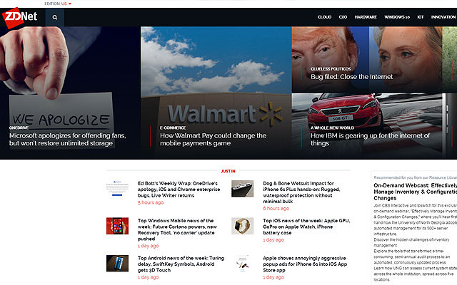
Notice how this grid structure naturally leads your eye around the page. Each visitor’s gaze tends to fall in one particular area, then move between each thumbnail until something jumps out.
Also ZDNet places a dark gradient atop each thumbnail image to build typographic contrast for more readable text. Fundamentally it’s one of the best featured post widget designs I’ve ever seen.
A very similar design style can be found on CNET’s homepage. The largest thumbnail takes its place on the left-hand side since most visitors read from left-to-right.

When designing your own featured post widget don’t feel obligated to follow this same technique. You can go with any thumbnail size so long as they fit together cohesively and form a unified grid layout.
Custom Thumbnail Styles
Design choices vary widely from layout to layout so there is no one perfect solution. Featured post widgets are definitely more complex to design, so they require study and patience to fit into a custom layout.
The style of each thumbnail affects how the entire widget looks to your audience. Take for example the featured widget style found on The Verge.

Each thumbnail has a colorful gradient on top of the photo. This boosts contrast and improves readability, but it also adds a certain flair to the website as well.
Some people don’t like this style because they find it gaudy or unappealing. But it’s also rather popular among Verge readers and other designers are mimicking this style.
But colors and fancy techniques aren’t the only factor to consider. Grids and thumbnail sizes also have to be chosen carefully as they help to define the overall featured posts widget style.
Perhaps one of the best example is Mashable’s design which has gone through many phases over the years. Now considered a mainstream source for news, Mashable works to cram a large number of posts onto the homepage for easy browsing.

Some posts use small square thumbnails while their main leaderboard fixes a large fullsize thumbnail banner to the article. This must require extra work from the editor to ensure that all posts have their appropriate photos at the correct sizes.
But right after landing on the site you’ll notice that it gives off a sense of credibility. This style feels very mainstream and can be used by almost any type of online magazine to build trust with the readerbase. The only problem is writing enough content to fill up the page!
Multi-Post Widgets
Some featured post widgets display articles in a static grid. This is often the most popular choice because it can be made responsive and blends nicely into any layout.
Other widgets rely on dynamic interactions like a slideshow. Take for example the homepage of Vanity Fair with their featured post block at the top of the page. Only one post is shown at a time but new articles display when hovering over a particular headline.
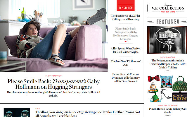
Both the thumbnail and title auto-update with a simple hover interaction. One thing to note is this can be very confusing for Internet users who aren’t familiar with this dynamic hover technique.
But on the positive side this technique will save space on the page by hiding excess content.
Try not to think of featured post widgets as black-and-white. They are just page sections used to feature the most interesting or popular articles. The technique(s) by which you accomplish this task can always be open for debate.

Complex magazine uses a full slideshow display for their featured widget. Each post has a featured thumbnail along with the bottom gradient for typographic contrast.
But instead of placing each thumbnail side-by-side, the articles stream dynamically through a slideshow box. Navigation can be set automatically or controlled by arrow links. This design saves a lot of space and keeps the user more willing to interact with the page.
Wrap Up
There is no right or wrong design when it comes to featured post displays. They all share many similar traits but each magazine uses their own style for organizing featured content.
I hope this post offers practical tips to use when designing your own featured posts widget. If you ever feel stuck just look to other magazines for inspiration. Find traits that you like and figure out how to replicate them to blend into your own magazine design.