5 Tips to Designing The Winning “Buy Button”
If you are a web designer, online marketer, or a website owner aiming to boost sales, crafting an effective “buy button” is pivotal. Simply using the “buy now” phrase on a standard blue button might not yield the desired outcomes.
However, with a dash of basic knowledge, designing a compelling “buy button” becomes manageable. The crux lies in its text. A visually stunning button is futile if its text conveys a negative message. The right copy is the game-changer.
In this guide, we will explore 5 key characteristics of a successful “buy button”. Dive in!
1. Distinctive Design
The primary consideration for a “buy button” is its overall style. This cannot be stressed enough. It is paramount to make your button unforgettable.
The idea is to fashion your button as a purple cow, a concept introduced by Seth Godin. This means crafting a button so distinctive that it’s impossible to ignore, akin to spotting a purple cow amidst a herd.
Many designers fall into the trap of designing a button that seamlessly blends with the website’s theme and colors. While this might seem like an apt approach, it isn’t always effective. The challenge is that such buttons tend to become inconspicuous.
The goal is to create a button that asserts its presence, rather than merely complementing the website’s design. Think of it as an independent element that has its own significance, rather than a mere accessory.
For instance, consider the button design of Mozilla Firefox:

Observe the download button on the left. Its design starkly contrasts with the rest of the page. It is the sole green element, prominently features the Firefox logo, is larger than most elements, and is strategically placed above the fold. All these characteristics make this button incredibly noticeable – a true purple cow. If you claim not to notice it, you’re likely just posturing.
In essence: Strive for a standout button.
2. Appearance
First, let’s discuss color. To truly make a statement, opt for a color not already dominant on your webpage. For instance, Firefox brilliantly utilizes a distinctive color for its button. Tools like Paletton can assist in selecting a color that contrasts with your website’s palette while still being aesthetically pleasing.
Difference is essential. If your website predominantly features blue, steer clear of blue buttons or even blue tinges. Go bold with hues like pink or orange. To illustrate, orange, second only to red in terms of visibility, is a popular choice – notably seen on amazon.com.

Another vital aspect is size. A cardinal rule? Bigger is generally better. During the design process, continuously ask, “Can this be magnified?”
When it comes to design – simple or elaborate? While some flair is acceptable (like the Firefox button with its striking fox), the design shouldn’t compromise the button’s primary function. If it no longer resembles a clickable button, users will overlook it.
Determining whether a simplistic or elaborate design works best requires experimentation. Split testing is a practical approach. Develop two variations, one straightforward and another more intricate, and gauge their performance. Tools like Google Website Optimizer can aid in this evaluation.
For reference, consider the minimalist button design from ThemeFuse:

This button, devoid of any flashy design elements, still commands attention. Notably, ThemeFuse provides user-friendly shortcodes, simplifying the creation of appealing buttons. With just a single line of code:
[button link="domain.com" class="btn_orange"]Click here to buy my fantastic product![/button]This results in:

3. Typography Choices
The choice of font can significantly impact the effectiveness of a button. For digital platforms, sans-serif fonts reign supreme owing to their readability. Conversely, serif fonts are more suited for print materials.
The button’s text should stand out, being arguably the most crucial content element on the page. Avoid all-caps; instead, opt for mixed-case, where the first letter of significant words is capitalized, leaving out conjunctions and prepositions.
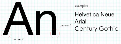
For safe and universally recognized options, consider fonts such as Arial, Helvetica, Franklin Gothic, Myriad, among other classic sans-serif choices.
Read Also: 45 Free Fonts for Web Designers (Updated)
Moving on to text color, it’s imperative to ensure a high contrast with the button’s background. Avoid similar hues like gray-on-gray. Instead, aim for combinations like black-on-white or blue-on-orange, enhancing legibility.
In summary, prioritize readability in every design choice.
4. Strategic Positioning
While the ideal button placement largely depends on your website’s design, some universal principles can guide you to the right choice.
Always opt for the most intuitive location. Avoid overthinking or trying too hard to be innovative. The button’s placement should immediately resonate with the user.
Users often have expectations based on common website designs – for instance, anticipating the logo in the top-left corner, shopping cart summary in the top-right, or copyright details in the footer. Your objective is to discern the most intuitive spot for a buy button and place it there.
Moreover, the button’s position should ensure its maximum visibility. This involves:
- Ensuring the button is above the fold to capture immediate attention.
- Embracing whitespace. A clutter-free design enhances user experience. Prioritize the essential elements and eliminate the unnecessary.
For an even more effective strategy, consider duplicating the button, placing it both at the top and bottom of the page. This ensures users can easily take action even after scrolling through the entire content.
5. Enhancing with Extra Elements
Adding additional elements to your button can enhance its visibility and appeal. Common supplementary elements include arrows, shopping carts, magnifying glasses, plus signs, and brand-specific icons.
An illustrative example is Firefox’s use of its vibrant orange fox logo. The key is to incorporate elements that underscore the button’s primary function. For instance, downward-facing arrows are fitting for download buttons, while a shopping cart icon pairs well with add-to-cart buttons, as seen with Amazon.
Here are some examples of buttons enhanced with supplementary elements:
Wakeinteractive

Commercialiq


Sofasurfer.eu


The Influence of “Free”
The word “Free” carries immense power in the English language. When an offer is marked as free, it tends to elicit an often-irrational response from individuals. For more insights on this behavior, refer to Dan Ariely‘s book, “The Upside of Irrationality.”
Here are some examples that leverage the allure of “Free”:


Note: This post was first published on the Mar 6, 2012.