10 Distasteful Things to Avoid Adding to Your Website
When making a website, deciding what to include and what to leave out is tough. Even today, many of us (still) don’t know what users really don’t like on a site.
Think about it: Do you like annoying pop-ups or content that’s locked away? Chances are, your visitors don’t like them either.
Here’s a list of design features you might want to skip to make a great website. Use this list next time you’re updating your site or starting a new one.
Read Also: 10 Common Web Design Mistakes (Blunders)
1. Pop-ups and Pop-unders
Many people enjoy surprises, but not the kind where an unwanted window suddenly appears on their screen. Modern web browsers often block these annoying ads because users don’t like them.
Most people who’ve dealt with pop-ups have become experts at closing them quickly. Here’s an example:

Also, be cautious with flashy ads that take up a big part of the screen. Or when a website asks visitors for their email to sign up for a newsletter. While it might get you many sign-ups, it might not be the best for the long-term.
Don’t put anything in front of your content. It annoys users and they might leave. Think of YouTube ads. When an ad pops up 10 seconds into a video, what do you usually do? Look for the close button.
2. Marquee Text (Or Anything That Moves)
Not many websites use moving text nowadays because it’s distracting. It’s similar to the scrolling text on TV news. Moving items grab attention, and it’s hard for users to ignore them.
Read Also: Marquee in CSS – Beginner’s Guide

3. Intro Pages
Intro pages or splash pages can be good if they quickly show what the site is about. However, some sites use them for ads, which isn’t a great idea.
I’ve seen many where visitors have to watch a 10-second ad before reaching the main content.
4. Hidden Features
Some websites hide features to boost their earnings and sign-ups. It’s strange when a site lets you see a tool but stops you from using it. Messages like ‘Sorry, you need a premium account for that’ can be frustrating. It doesn’t matter how good a site looks; if it misleads users, it’s not right.

For instance, once when I was searching for web development info, I found a high-ranking site called Experts Exchange. They showed the question but locked the answers. It was disappointing, especially when I was a student trying to learn.
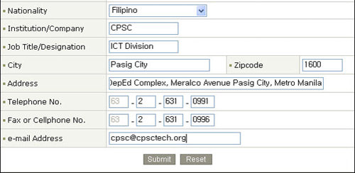
5. Complicated Sign-Ups without Clear Instructions
Take a cue from popular websites like X. Signing up for X takes less than 20 seconds. Many sites require registration to access features, which is fine. But it’s frustrating when sites demand too much information just to use basic features, like leaving a comment.
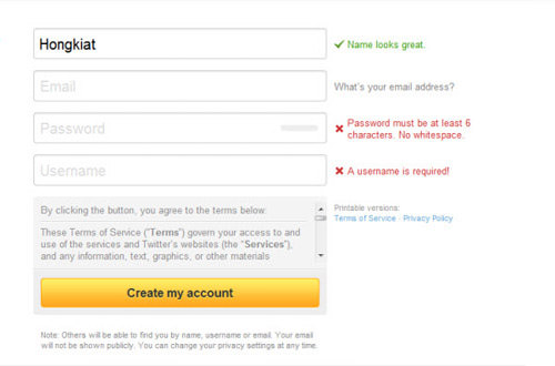
Moreover, some websites don’t give clear instructions about required fields or if a username is taken. What’s the result? If you miss a detail and press ‘submit’, you might lose all your entered data and start again. This isn’t user-friendly, unlike X’s registration page.
Read Also: 50 Mobile Login and Signup Forms For Your Inspiration
6. Overusing CAPTCHA
Initially, CAPTCHAs were great for blocking spam in comments and sign-ups. But as online activities sped up, users began disliking them. They often require entering a mix of letters and numbers, which can be tedious. I’d argue that CAPTCHAs reduced commenting on many sites.
There’s a better solution: spam filters like Akismet. Many sites have switched to it, saying goodbye to the CAPTCHA puzzle.

Akismet is like a shared filter; it identifies spam based on the feedback from millions of users. Spammy comments or trackbacks won’t appear on your site unless you approve them. If Akismet isn’t your top choice, there are other user-friendly spam blockers available.
7. Overwhelming Social Media Toolbars
Many sites now have toolbars to link to social media platforms like Facebook, Twitter, and YouTube. While staying connected is good, having too many icons can clutter a site and use up valuable space. It’s better to select a few key platforms rather than cramming in every possible option.

8. Excessive Pagination
While content is essential, splitting it across multiple pages can be counterproductive. Even established websites sometimes opt for this instead of consolidating everything, especially when dealing with text-heavy content. For instance, dividing a two thousand word article into three parts forces users to click “next” repeatedly. This tactic, while potentially beneficial for ad revenue, can diminish the user experience.
9. Non-Standard Window Sizes
Some websites experiment with horizontal scrolling, but it’s crucial to remember that vertical scrolling is the widely accepted norm. Design choices should prioritize universal accessibility. For instance, as of a few months ago, I used a CRT monitor, and many sites weren’t compatible with my screen resolution, requiring horizontal scrolling.

Another point to consider is refraining from forcibly resizing a user’s web browser. Adapt your design to the user’s preferences rather than imposing your own.
10. The “Reset” Button
Placing a reset button, especially adjacent to the submit button on forms, can be problematic. Modern users often prefer refreshing with F5 over using a dedicated button. With the rise of touchscreen devices like tablets and smartphones, where precision can be an issue, accidentally hitting “reset” after completing a long form can be extremely frustrating.
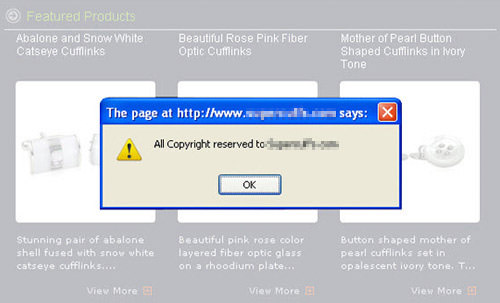
Another Misstep: Disabling Right-Click
It’s not just about disabling the right-click function; some sites even use JavaScript to display a pop-up notifying users about the restriction. However, determined individuals will find ways to copy content regardless of such limitations.
Conclusion
There are numerous strategies to both monetize and popularize a website without resorting to these irksome features. Prioritizing quality content and services, combined with persistence, is more effective and user-friendly.