10+ Best Data Visualization Tools
As technology continues to advance, the ability to visually represent data has become crucial for both businesses and individuals. It’s more important now than ever to turn complex data into clear, actionable information. That’s why we’ve put together more than ten great data visualization tools you should know. This list is designed to help you explore the wide range of data visualization tools available and choose the one that suits your needs best.
Best Customer Relationship Management Tools (2025)
Explore the top CRM tools of 2023 to boost sales, streamline operations, and enhance customer relationships. Read more
No matter if you’re an experienced data analyst, a marketing expert, or a small business owner, our guide offers a deep dive into the leading data visualization tools on the market. We’ve selected these tools based on their ease of use, customization features, ability to integrate with other systems, and the types of users they’re designed for.
First, here is the list of data visualization tools that made it to our selection.
| Data Visualization Tool | Target Users |
|---|---|
| Tableau | Suitable for a wide range of users, from individuals to large organizations, with varying levels of access and roles. |
| Qlik Sense | Ideal for groups of users needing access to specific data streams, without admin access or the ability to create sheets. |
| Klipfolio | Most often used by companies in the marketing and advertising industry, particularly those with 10-50 employees and 1M-10M dollars in revenue. |
| Looker | Suitable for users who need to log in directly or through groups, with varying levels of access. |
| Zoho Analytics | Ideal for collaboration within an organization, with the account administrator controlling permissions and managing subscriptions. |
| Domo | Often used by companies in the Information Technology and Services industry, particularly those with 50-200 employees and 1M-10M dollars in revenue. |
| Microsoft Power BI | Suitable for sharing reports and dashboards within or outside an organization, with users able to view and interact but not edit. |
| Infogram | Target users not clearly defined from the search result. |
| Sisense | Suitable for users with varying roles, including Admins who can manage ElastiCube s, users, user groups and more. |
| Grow.com | Ideal for targeting and acquiring users who engage and retain on your app, with support for setting up campaigns, user acquisition, and growth. |
| Preset.io | Target users not clearly defined from the search result. |
| Datapine | Ideal for advanced market research analytics, analyzing user data in real-time and identifying important patterns and trends. |
| Whatagraph | Suitable for targeting business owners on Facebook via various methods. |
| Databox | Ideal for targeting a group of people who are most likely to want to buy your products or services. |
| ChartBlocks | Suitable for users who need to import, create, and share data visualizations with various design options. |
| Datawrapper | Designed to be used in server-side scripts or from a script on your computer, ideal for fetching data and creating charts. |
1. Tableau

Pros
- Superior quality data visualization capabilities
- Easy drag-and-drop interface for all users
- Handles large datasets efficiently
- Connects to many data sources
- Active community and learning resources
Cons
- Expensive pricing
- Complex advanced features
- Rigid pricing structure
Created by Salesforce, Tableau is a user-friendly data visualization tool that turns complex data into easy-to-understand, visual formats. It’s a comprehensive suite of tools that supports the entire analytical process, from preparing your data to sharing your insights.
With Tableau Desktop, part of the Tableau Creator package, you can easily connect to data stored locally or in the cloud. Its intuitive interface lets you clean and combine your data, and create visualizations with dynamic previews. This makes it simple to discover trends, identify opportunities, and make informed decisions.
A standout feature of Tableau is its real-time data exploration. This allows you to gain insights as your data updates, facilitating continuous exploration. Tableau also integrates AI and machine learning to provide enhanced insights, assisting users of all skill levels to make better data-driven decisions.
It includes AI capabilities within the platform to make scenario planning, guided model building, AI-powered predictions, and other data science techniques accessible to all users.
How much Tableau cost?
Tableau offers various plans to cater to different data needs.
- Creator: 0/user/month – Includes Desktop, Prep Builder, and Server/Cloud license
- Explorer: 2/user/month – For larger teams and organizations
- Viewer: 5/user/month – Basic access to Tableau Cloud
- Free Trial available to test features
2. Qlik Sense

Pros
- Reveals hidden data insights through unique associative technology
- Automated insights and data preparation with AI capabilities
- Supports cloud, on-premises and hybrid deployments
- Fast real-time calculations and updates
- Easy to use interface for all skill levels
Cons
- Steep learning curve for associative model
- Limited chart type options
- High system resource usage
Qlik Sense is an innovative data analytics platform that uses artificial intelligence (AI) to help users of all abilities extract insights and make informed decisions based on data. It’s designed to create an interactive relationship with data, offering a real-time reflection of the current situation and going beyond the usual static business intelligence (BI) tools.
Qlik Sense’s unique associative technology allows users to freely explore data, providing ultra-fast calculations that are always relevant. This technology forms the heart of Qlik Sense’s superior analytics experience, taking users beyond the constraints of traditional analytics and dashboards.
The platform boasts a variety of features, including self-guided visualization, interactive dashboards, search and conversational analytics, alerts and actions, reporting, mobility, custom and embedded analytics, and advanced analytics.
Qlik Sense’s augmented analytics capabilities use AI to assist users in understanding and utilizing data more effectively, reducing cognitive bias, enhancing discovery, and improving data literacy. It offers AI-generated analyses and insights, automated creation and data preparation, search and natural language interaction, and machine learning predictive analytics.
How much Qlik Sense cost?
Qlik Sense offers a 0/user/month plan (billed annually) including:
- Smart visualizations and dashboards
- Associative data insights
- AI-powered analytics
- Multiple data source connections
- API access
They also provide a free trial for users to evaluate the platform before committing to a subscription.
3. Klipfolio
Pros
- Continuous real-time data syncing
- Connects with many data sources
- Flexible dashboard customization
- Strong team collaboration tools
- Built-in data cleaning tools
Cons
- Complex initial setup process
- Limited features in free version
- Steep learning curve
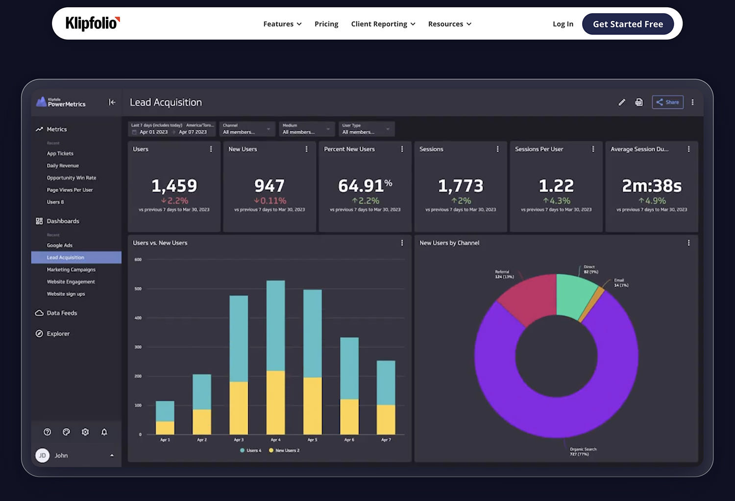
Klipfolio is an online tool that helps you visualize and understand your data in real time. It’s like a playground for data analysis, where you can mix and match data from different sources and explore a wide variety of visualization options.
One of its key features, PowerMetrics, is perfect for analyzing data over time and getting a quick grasp of your historical data. Klipfolio also has a data preparation feature that lets you fetch and refine your data using data feeds. It’s like a Swiss army knife for data, with a visual query builder and data transformation tool that helps you mold any data to fit your needs.
What sets Klipfolio apart is its knack for creating sleek, professional-looking data visualizations and dashboards. PowerMetrics lets you customize your data visualizations, making them look so good that people might think you hired a designer.
Klipfolio also promotes teamwork by letting you share your dashboards with your colleagues, ensuring everyone is on the same page when making decisions. Plus, you can empower your team to create their own dashboards, complete with their own business logic, dimensions, granularity, and visualizations.
How much Klipfolio cost?
Klipfolio offers a range of plans to help you make the most of your data.
- The Free plan lets you create unlimited metrics, includes 2 editor users, 2 dashboards, 3 data services, and updates your data every 4 hours.
- The Go plan, which costs 0 per month (or 25 if paid annually), bumps up the number of editor users to 4, dashboards to 4, data services to 5, and updates your data every hour.
- The Pro plan, their most popular, costs 25 per month (or 00 if paid annually) and includes 10 editor users, 10 dashboards, 8 data services, and updates your data every 15 minutes.
- For larger teams or more complex needs, they offer Business and Enterprise plans with more flexibility and features.
4. Looker

Pros
- Flexible data modeling with LookML language
- Seamless Google Cloud Platform integration
- Git-based version control for models
- Strong application embedding capabilities
- Robust security and access controls
- Live database connections
Cons
- Requires SQL knowledge
- Higher pricing than competitors
- Difficult to learn LookML
- Limited visualization options
- Complex initial setup
- Slow performance with big datasets
Looker is a data platform that offers a unified, real-time view of your data. It’s designed to make it easy to create workflows and applications powered by insights from your data. The platform is built to provide reliable data experiences on a large scale from your preferred cloud, enhancing productivity, decision-making, and innovation by delivering more insights to more users.
Looker’s data model is designed to deliver insights when and where they’re needed, thanks to timely alerts and deep integrations.
A standout feature of Looker is LookML, a potent modeling language based on SQL. This feature allows analysts to centrally manage business rules and definitions in a single data model that’s controlled by git versioning. LookML generates efficient SQL queries for users based on the information in the model, eliminating the need for technical skills and freeing up the data team to focus on innovation.
Looker also works seamlessly with Looker Studio, enabling users to connect to Looker’s semantic model and analyze, explore, and visualize data within Looker Studio. This integration combines the benefits of a governed data layer with a self-service solution for analyzing both governed and ungoverned data.
How much Looker cost?
- Pricing available by request only
- Free trial available to test platform
5. Zoho Analytics

Created by Zoho.com, this tool is a cutting-edge platform designed to simplify business intelligence and analytics. It’s a tool that allows users to swiftly connect, process, and analyze their data, resulting in striking data visualizations and the uncovering of hidden insights.
The platform is designed to transform raw data into meaningful reports and dashboards, enabling you to monitor your crucial business metrics, observe long-term trends, spot anomalies, and even forecast future trends. Trusted globally by a multitude of customers and users, Zoho Analytics has been acknowledged by Gartner in their 2023 Magic Quadrant for BI and Analytics.
The platform is packed with features that streamline data visualization and analysis. It allows users to connect to a wide range of sources such as files, feeds, popular business applications, both cloud and on-premise databases, custom apps, and more. Zoho Analytics also includes a smart AI assistant, Zia, which can automatically generate insights, predict future trends, and interact with users.
Pros
- AI assistant Zia for automated insights
- Budget-friendly with free tier
- Easy to learn and use
- Many built-in data connections
- Good team collaboration tools
- iOS and Android apps available
Cons
- Limited data rows in basic plans
- Key features locked behind upgrades
- Basic visualization options only
- Shallow integration capabilities
- Slow for complex data analysis
- Few export format choices
How much Zoho Analytics cost?
Zoho Analytics offers several pricing plans:
- Free Plan: 2 users, 10,000 rows, unlimited reports
- Basic Plan: 2/month yearly, 2 users, 0.5M rows
- Standard Plan: 5/month yearly, 5 users, 1M rows, hourly sync
- Premium Plan: 12/month yearly, 15 users, 5M rows, advanced features
- Enterprise Plan: 45/month yearly, 50 users, 50M rows, premium support
Additional users and viewers can be added for an extra cost. Zoho Analytics also offers a 15-day free trial for you to explore their services.
6. Domo
Pros
- Access platform from anywhere with internet
- Connect to over 1000 data sources
- Great mobile app functionality
- Built-in team collaboration tools
- Powerful data transformation tools
Cons
- More expensive than competitors
- Hard to learn for beginners
- Limited visualization options
- Inconsistent customer support
- Slow performance with big datasets
- Time-consuming initial setup
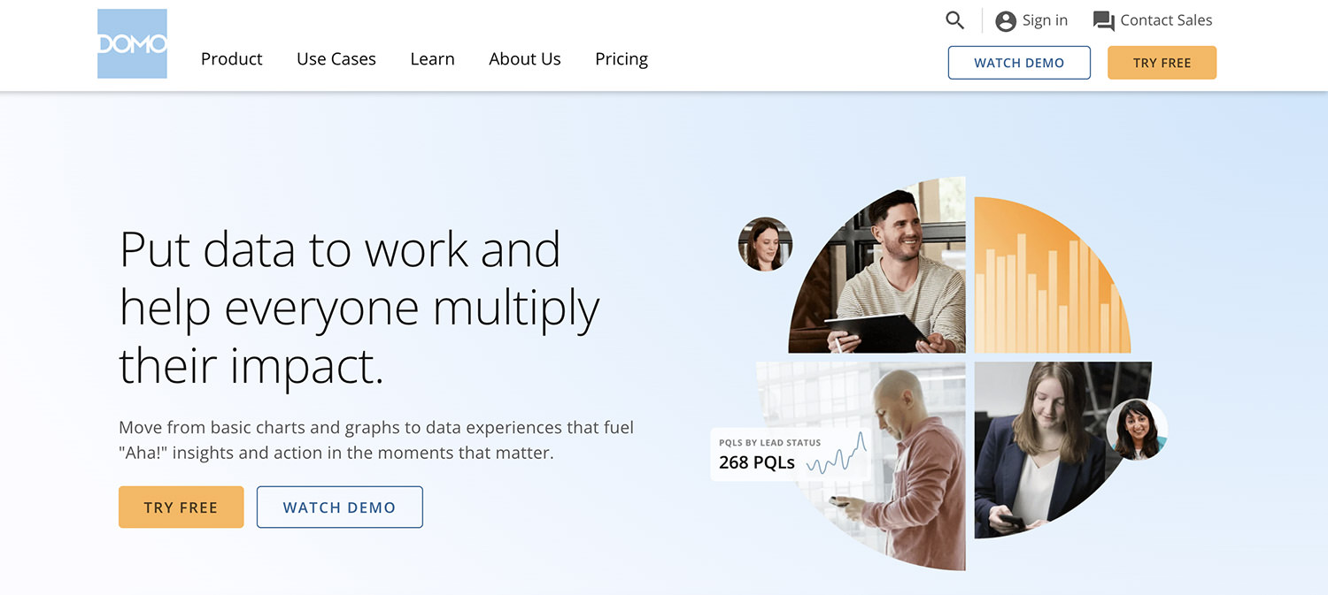
Domo is a cloud-based tool that offers immediate and direct access to business data for decision-makers throughout an organization. It’s designed to amplify the impact of everyone in a company by transitioning from basic visualizations like charts and graphs to more immersive data experiences that inspire insights and prompt action.
Domo is user-friendly, making it accessible to all, while also providing advanced features that allow tech-savvy teams to swiftly meet business requirements.
When it comes to visualizing data, Domo provides custom data views and reporting tools that facilitate quicker and more effective decision-making for users at all levels. The platform includes advanced visualizations, alerts based on data science, collaboration tools, data storytelling, and interactive mobile dashboards.
Domo’s secure data foundation provides the necessary infrastructure, data integration, and governance that support your data experiences. It enables data integration from any source, data governance, integration with cloud data warehouses, data writeback, and easy-to-use ETL (Extract, Transform, Load) tools.
How much Domo cost?
Domo offers a range of pricing plans to suit different business needs. The pricing details can be found on their pricing page.
7. Microsoft Power BI

Pros
- Affordable pricing starting at 0/user/month
- Connects with wide range of data sources and business apps
- Seamless integration with Microsoft products
- Regular feature updates from Microsoft
- Robust data modeling with DAX capabilities
Cons
- Complex interface requiring significant training
- Slow performance with large datasets
- Limited visualization customization options
Power BI is Microsoft’s powerful business intelligence and data visualization platform that enables organizations to connect to, model, and visualize data to gain insights. The platform offers both desktop and cloud-based solutions for creating interactive reports and dashboards.
Pricing
Microsoft Power BI offers several plans:
- Power BI Pro: 0/user/month – For report sharing and team collaboration
- Power BI Premium: 0/user/month for per-user plan with advanced features, or ,995/month for enterprise capacity plan
- Power BI Free: Basic version with core visualization features
8. Infogram

Pros
- Clean and easy-to-use interface
- Large selection of chart and map types
- Real-time team collaboration
- Version control and change tracking
- Interactive elements and tooltips
- Multiple export format options
Cons
- Limited features in free version
- Expensive advanced and team plans
- Few direct data connections
- Basic analysis capabilities only
- Design restrictions in lower tiers
- Minimal learning resources
Infogram is a user-friendly tool designed to help you create visually stunning data presentations. It offers a broad spectrum of features that breathe life into your data. With Infogram, you can choose from over 37 interactive chart types and 13 map types, tailoring your data presentation to your specific needs.
The tool also provides object animations, adding a lively touch to your visualizations. Interactive features like tooltips, tabs, clickable legends, and linking add depth and context to your data, enhancing the overall user experience.
A key feature of Infogram is its emphasis on teamwork. It enables teams to work together in real-time to create, edit, and publish projects, making it a perfect tool for organizations that need to collaborate on data visualization.
Infogram also keeps a record of your project’s version history, allowing you to view and revert to earlier versions. This feature promotes creativity and experimentation without the worry of losing prior work.
How much Infogram cost?
Infogram offers a variety of pricing plans:
- Basic: Free plan with 10 projects, 5 pages per project, and basic chart types
- Pro: 9/month (annual billing) includes 100 projects, premium templates, and privacy controls
- Business: 7/month (annual billing) adds unlimited pages, branding options, and SQL connectors
- Team: 49/month (annual billing) includes collaboration features and analytics for 3+ users
- Enterprise: Custom pricing with advanced features, dedicated support, and 10+ user licenses
9. Sisense

Pros
- Fast processing of large datasets
- Seamless integration with existing apps
- Supports both code and no-code development
- Handles data from multiple sources
- Highly customizable dashboards
Cons
- Expensive compared to alternatives
- Requires technical knowledge
- Complex initial setup
Sisense is an all-in-one business intelligence tool that simplifies the process of turning complex data into insights you can act on. It’s designed with flexibility and user-friendliness in mind, making it a go-to choice for businesses across various sizes and sectors.
A key highlight of Sisense is its ability to create interactive dashboards. These dashboards visually represent data in a way that’s easy to digest, helping you understand your business better. You can tailor these dashboards to your business’s specific needs, emphasizing the most crucial information and trends. Plus, Sisense lets you merge data from various sources, giving you a holistic view of your business operations.
Another unique feature of Sisense is its “Infusion Apps“. These apps deliver actionable insights right where you work the most, eliminating the need to juggle between different apps or platforms.
Sisense also introduces “Fusion Analytics“, a feature that lets you craft personalized experiences using a combination of code-first, low code, and no code approaches. This enables you to create transformative workflows tailored to your needs.
How much Sisense cost?
Sisense offers a range of pricing plans to suit different business needs. The pricing details can be found on their pricing page.
10. Grow

Pros
- No coding required for basic operations
- Connects with multiple data sources
- Live data monitoring capabilities
- Flexible dashboard customization options
- Strong sharing and permissions features
Cons
- Limited advanced analytics capabilities
- Some integrations require custom work
- Limited mobile functionality
Grow.com is a comprehensive business intelligence (BI) tool designed to enable everyone in your team to make informed decisions based on data. It offers a user-friendly, no-coding-required platform that lets you connect, store, and combine data from a multitude of sources. This makes it an ideal choice for businesses aiming to centralize their data for real-time viewing.
A key feature of Grow.com is its capacity to create visually appealing, interactive data visualizations. Users can construct impactful data visualizations and KPI metrics without the need for any coding expertise.
This is especially useful for businesses that want to encourage their team members to delve into data and create their own visualizations. The platform is designed with user-friendliness in mind, making it accessible to everyone in your team, regardless of their technical proficiency.
How much Grow cost?
Pricing for Grow.com begins at .99/month. This package includes features such as customizable dashboards, in-depth analysis, collaborative report sharing, and formatting capabilities.
11. preset.io

Pros
- Built on Apache Superset’s proven technology
- Wide range of visualization options
- Cloud-hosted and fully managed service
- Supports SQL queries for deep data analysis
- Infrastructure as code capabilities
Cons
- Higher pricing for professional features
- Limited data source connections in free tier
- Requires SQL knowledge for advanced features
Preset is a tool designed for data visualization, built on the foundation of Apache Superset, an open-source platform for business intelligence. It provides a service that’s managed and hosted in the cloud, enabling users to design, share, and work together on data visualizations and dashboards.
With Preset, you have the ability to connect to a vast array of data sources, craft interactive dashboards, and disseminate your findings within your team or organization.
The data visualization capabilities of Preset are driven by Apache Superset, offering a broad spectrum of visualization choices. You can generate various visualizations such as bar charts, line charts, pie charts, maps, and more.
Preset also accommodates SQL queries, giving you the opportunity to delve deep into your data. Moreover, Preset provides features that allow you to manage your workspaces as code, which can be extremely beneficial for teams tackling intricate data projects.
How much preset.io cost?
Preset offers three pricing tiers:
- Starter: Free with basic features and limited connections
- Professional: 00/month with advanced features
- Managed Private Cloud: Custom pricing for enterprises
12. Datapine

Pros
- Self-service Analytics: Easy-to-use interface for non-technical users
- Interactive Dashboards: Highly customizable and dynamic visualizations
- Predictive Analytics: Advanced forecasting capabilities
- Data Connectors: Wide range of data source integrations
- Cross-platform: Works on desktop and mobile devices
- White Labeling: Customizable branding options
Cons
- Price: Higher cost for advanced features
- Advanced Features: Some features limited to enterprise plans
- Mobile Experience: Limited functionality on mobile devices
Datapine is a powerful business intelligence software that provides a wide range of features to help businesses make data-driven decisions. It offers self-service analytics tools that allow users to explore and analyze data without needing advanced technical skills. This makes it accessible to a wide range of users, from data analysts to business executives.
One of the standout features of Datapine is its interactive BI dashboards. These dashboards allow users to visualize their data in a way that is easy to understand and interpret. Users can create custom dashboards that display the most relevant data for their needs.
This can include everything from sales figures to customer behavior data. The dashboards are fully interactive, meaning users can drill down into the data for more detailed insights.
In addition to its visualization capabilities, Datapine also offers effective KPI reporting and predictive analytics tools.
13. Whatagraph

Pros
- Specialized marketing analytics tools
- Simple marketing platform connections
- Automated PDF report scheduling
- Clean and professional templates
- Flexible data export with BigQuery support
Cons
- Expensive starting price
- Marketing metrics focus only
- Premium plans needed for many integrations
Whatagraph is a versatile platform designed to simplify data management tasks for marketing teams. It’s a one-stop-shop for connecting, visualizing, and sharing your marketing data.
Whether you’re looking to create stunning data visualizations, share insights, set up reports, or even move your marketing data to a BigQuery warehouse, Whatagraph has all the tools you need. It integrates seamlessly with a variety of marketing sources, enabling you to directly import your data for visualization and sharing.
What sets Whatagraph apart is its focus on creating data presentations that are not only informative but also visually engaging and easy to understand. It provides a range of features that allow you to create impressive reports that are straightforward to build and share.
With live dashboards and scheduled PDFs, sharing insights with others is a breeze. Plus, its export to CSV/Excel and easy transfers to BigQuery make it simple to share data with other platforms and tools. If you need to move your data to a BigQuery warehouse, Whatagraph makes this process easy with a few simple steps.
How much Whatagraph cost?
Whatagraph offers three plans:
- Professional: 23/month (annual) – 25 data sources, 5 users, basic features
- Premium: 35/month (annual) – 50 data sources, 10 users, all Professional features
- Custom: Custom pricing – 100+ data sources, unlimited users, all Premium features
14. Databox

Pros
- Simple and intuitive interface
- Private visualizations by default
- Fully responsive across devices
- Multiple data import options
- Strong geographic mapping tools
Cons
- Free plan shows Datawrapper branding
- Premium features are expensive
- Custom plans needed for advanced features
Databox is a tool designed to simplify business analytics and data visualization. It’s a one-stop platform where you can gather data from various sources and transform them into easy-to-understand, actionable visuals. It’s a versatile tool that caters to businesses of all sizes, offering a range of features.
One of Databox’s standout features is the Dashboard Designer. This feature allows you to create personalized dashboards to keep an eye on key performance indicators (KPIs) and other crucial metrics. Plus, with automated reporting, you can effortlessly keep track of your business’s performance and make decisions based on solid data.
Databox integrates with over 100 popular platforms like HubSpot, Google Sheets, Excel, and various social media ad platforms, allowing you to gather and visualize data from these sources in one central location.
Beyond just visualizing data, Databox offers additional features like scorecards for a quick performance snapshot, and alerts and insights that notify you of significant data changes. You can even display your data visualizations on a TV dashboard for a larger, more visible display.
How much Databox cost?
Databox pricing plans:
- Free: 3 data sources, 3 users
- Basic: 9/month – 10 data sources, 5 users
- Growth: 9/month – 50 data sources, 20 users
- Custom: Enterprise plan with custom pricing
15. ChartBlocks

Pros
- No coding needed to create charts
- Extensive styling and design customization
- Multiple export formats with vector graphics
- Simple embedding and social media sharing
- Supports many data source formats
Cons
- Advanced features are restricted
- Limited data volume capacity
- Fewer chart types than competitors
ChartBlocks is an online tool designed to make data visualization a breeze. It’s a platform where you can transform your data into stunning custom charts without needing any coding skills. Whether your data comes from spreadsheets, databases, or even manual input, ChartBlocks has the capability to turn it into a visual masterpiece.
The standout feature of ChartBlocks is its wide array of customization options. It gives you the reins to every detail of your charts, enabling you to present your data in the most effective and visually appealing way. With a multitude of graph types and a plethora of customization choices at your fingertips, creating the perfect chart is just a few clicks away.
It also offers various ways to share your visual insights. You can easily embed your charts on any website, bring them into the Ceros studio, or share them directly on social media using ChartBlocks’ in-built sharing tools. And if you need your charts for presentations or print documents, you can export them as editable vector graphics or optimize them for high-quality printing.
16. Datawrapper

Pros
- Simple and intuitive interface
- Private visualizations by default
- Fully responsive across devices
- Multiple data import methods
- Strong geographic visualization tools
Cons
- Free plan requires Datawrapper branding
- Premium features are expensive
- Limited design options in basic plans
Datawrapper is a tool that makes it easy for anyone to create engaging data visualizations. It’s designed with simplicity in mind, so you don’t need any technical skills to use it.
With Datawrapper, you can create a range of visualizations, from basic bar and line charts to more intricate scatter plots and thematic maps. It also allows you to create responsive data tables that offer a variety of styling options.
What sets Datawrapper apart is its user-friendly design. You can easily import your data from the web, Excel, or Google Sheets, or upload CSV/XLS files. Once your data is uploaded, you can select from a variety of chart and map styles with a single click, and then customize and annotate your visualization to make it more impactful.
The end result is a visually appealing, responsive visualization that looks great on any device. Plus, your visualizations and data remain private until you decide to publish them.
How much Datawrapper cost?
- Free Plan: Basic visualizations with PNG export and Datawrapper branding
- Custom Plan: 99/month
- Full customization
- PNG, SVG, PDF exports
- 10 user licenses (extra users 1/month)
- Enterprise Plan: Contact for pricing
Frequently Asked Questions
What is the best data visualization tool for beginners?
For beginners, Tableau and Microsoft Power BI are excellent choices. Tableau offers an intuitive interface and extensive learning resources, while Power BI provides a user-friendly environment and seamless integration with Microsoft products. Both tools offer free versions or trials to help you get started.
How much do data visualization tools typically cost?
Data visualization tools vary widely in pricing. Free options like Power BI Free and basic plans of tools like Zoho Analytics (2/month) and Infogram are available for individuals and small teams. Enterprise solutions can range from 00 to several thousand dollars per month, with Tableau starting at 0 per user per month and Power BI Premium at ,995 per month for organization-wide deployment.
Can I create interactive dashboards with these visualization tools?
Yes, all the tools mentioned in this list support interactive dashboard creation. Tools like Looker, Sisense, and Domo excel in creating dynamic, interactive dashboards that allow users to drill down into data, apply filters, and get real-time updates. These dashboards can be shared with team members and stakeholders for collaborative decision-making.
Do I need coding skills to use these data visualization tools?
Most modern data visualization tools are designed to be user-friendly and don’t require coding skills for basic to intermediate use. Tools like Infogram, ChartBlocks, and Whatagraph offer drag-and-drop interfaces and pre-built templates. However, knowledge of SQL or programming can be beneficial for advanced features in tools like Looker (LookML) or Preset.io (based on Apache Superset).
Which data visualization tool is best for real-time data analysis?
For real-time data analysis, Tableau, Power BI, and Domo are top choices. They offer robust real-time data processing capabilities, live database connections, and automatic dashboard updates. Klipfolio also stands out with its real-time data monitoring features, offering update frequencies as quick as every 15 minutes in its Pro plan.