Four UX Design Strategies to Boost User Engagement
Keeping users engaged on a website isn’t solely about faster code or more attractive visuals. Even simple designs, like those seen on Reddit, can captivate users and encourage them to interact more deeply with the site.
The magic often lies in the user experience-specifically, how a website operates. Effective user engagement stems from how page elements and action flows guide users from one section to another.
In this discussion, we’ll explore various UX design strategies aimed at enhancing user experience and boosting engagement. Remember, these strategies may not be universally applicable, but understanding their effectiveness can help you tailor them to fit specific needs.

The topic of user experience is broad and demands patience to grasp fully. However, the more you engage with it, the clearer it becomes.
One of the best approaches is to experiment with your favorite websites and determine what appeals to you about them. By analyzing your own interactions, you can identify patterns and elements that maintain engagement, both for yourself and potentially for others.
1. Use Contrast to Highlight Key Elements
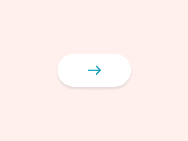
Every website incorporates various interactive elements such as hyperlinks, buttons, input fields, and sidebar widgets. However, not every element demands equal attention. Certain features are crucial for engaging visitors and should be emphasized with stronger contrast to distinguish them from less significant elements.
This principle is based on the concept of high color contrast and how humans process visual information by recognizing patterns. An element can seem more important when it contrasts sharply with its surroundings, whether through color, size, shape, or spacing.
Apply contrast effectively to guide visitors’ attention to specific elements that encourage them to perform certain actions. For example, if increasing newsletter subscriptions is a goal, the subscription box could feature a brightly colored, animated signup button or a distinctive vector icon.

The objective is to create an interface that not only captures attention but also encourages visitors to take desired actions.
Investing time in conducting A/B testing might prove invaluable. Although it’s hard to predict outcomes precisely, you might be amazed by the insights gained from these comparisons.
2. Tasteful UI/UX Animation
I recently discovered a post titled What Does Disney Know About Interface Animation, which delves into the essential aspects of animation and its psychological impact on users interacting with a flat 2D screen.
Animations can signify specific behaviors. For instance, a button might bounce when hovered over to indicate its clickability. Similarly, error messages might shake to catch the user’s attention.
It’s crucial that UX animation remains noticeable yet subtle; overly dramatic animations are better suited for TV and movies, not user interfaces.
However, a completely static interface can feel lifeless. Most users prefer some animation, as it enhances the perception of a smoother experience. Effectively, digital design often involves crafting an engaging illusion-the more believable it is, the more users will want to interact with it.
3. Responsive Design as a Requirement
With many Internet users accessing the web via mobile devices, it’s clear that websites need to be mobile-friendly, ideally through responsive design.
Adapting to various screen sizes forces a reevaluation of essential features. Designers must prioritize elements based on their importance and visibility on smaller screens. Learning this responsive design approach involves studying other websites and adopting techniques that resonate.

Responsive design is not just a trend-it’s a user expectation that’s gaining acceptance each year within the design community.
Users now expect websites to be fully responsive, adjusting seamlessly to any device screen. A non-responsive site can detract significantly from the user experience.
4. Simplify the Interaction Process
Smashing Magazine recently featured an excellent article advocating for simplification in interface design. It emphasizes that users do not want to navigate through complicated processes; they are primarily interested in the end result and the fastest way to achieve it.
I often create UX flowcharts for each interactive element while designing wireframes. These flowcharts are crucial for visualizing both the appearance and functionality of a site.
The method of planning isn’t as important as ensuring the plan aims for the simplest and quickest user experience possible. It’s vital that your design intuitively guides users to important actions.
If a user struggles to figure out how to sign up upon arriving at your webapp, that’s a significant issue. The functionality of your site should be immediately apparent to new visitors.
Starting with some foundational research on UX design can immensely benefit your understanding of how users interact with interfaces, leading you to streamline your designs effectively.
For further exploration into user engagement, consider these readings:
- Breaking Web Design Conventions = Breaking the User Experience
- Usability & User Experience Archives on Smashing Magazine
- Web Design Concepts to Entice User Interaction
Wrap-Up
There is no one-size-fits-all answer in designing or improving websites for better usability. While certain strategies might be effective, each website presents unique challenges, and the field of UX design is complex.
I hope this article sparks your interest in common strategies for developing highly usable interfaces. The most effective approach is to empathize with typical users, identify major interface flaws, and start addressing them. Recognizing a problem is the first step towards solving it.