Mastering Web Design with Insights from Human Visual Processing
Designing websites and user interfaces has become much easier in recent years. Numerous tools are available, making it unnecessary to start from scratch when developing UIs (check out our fresh UI compilation). But this isn’t about the end of web design.
Instead, this article aims to explain the basic psychology-based concepts behind the wide array of visual design tools (from the simplest CSS kits to the most advanced premium themes). Not only will you use them, but you’ll also understand them. This understanding will make it easier to successfully modify existing ones.
Let’s explore how the human mind and body process visual information and how this knowledge informs web design.
Principles of Perceptual Organization
According to Gestalt psychology, the whole is different from the sum of its parts. Proponents of this theory argue that the human mind groups objects based on several principles. These aren’t just theories but practical facts about organizing visual groups.
Below are some laws and popular uses of these principles. You might even find new ideas for your next design.
Law of Similarity
The first principle states that similar small objects are perceived as a group rather than as multiple instances of the same object. Similarity might be based on shape, color, shading, or other qualities. This principle underlies pattern design and many geometric and minimalistic logo designs.
For instance, this picture shows a circular logo instead of separate triangles. The triangular shape at the bottom of the eagle makes us think that the shape is part of the image.

You’ve probably used this law unknowingly when creating same-sized featured content boxes for your website. To show that certain content elements are of the same importance or share similar information, create a specific shape for that purpose. This way, users will immediately associate that particular shape with a specific area of information.
Law of Proximity
According to this law, objects that are closer to each other are considered to be of the same group. When squares are rendered next to each other in close, regular proximity, they create a sense of grouping.
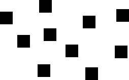

This principle has been widely used on the web, especially in content loops on blogs and webshops.
Titles, featured images, metadata, and excerpts can be grouped together even without borders or backgrounds. You might be able to remove unnecessary lines and colors from your design, making it more minimalistic yet fully comprehensible.
As Wikipedia states:
“The laws of similarity and proximity can, for example, be used as guides for placing radio buttons. They may also be used in designing computers and software for more intuitive human use. Examples include the design and layout of a desktop’s shortcuts in rows and columns.”
Law of Good Form
Also known as the Law of Pragnanz or Good Gestalt, this law states that we tend to group objects together if they form a simple, regular, and orderly pattern. Our mind tries to separate complex forms into simple, understandable shapes, emphasizing the importance of conciseness.
This is one reason behind the success of grid-based design and why table- and frame-based web structures were so popular in the past.
By keeping this principle in mind, you can avoid creating websites filled with complex shapes of content blocks connected via other laws. Instead, you can group your objects in interesting ways, such as in diamond- or kite-shapes, which are still perceived as orderly and concise.
Color Theory, Perception, and Usage
Color vision and perception are largely subjective, based on how viewers’ brains react to light waves reflected by colorful objects or shapes. Different people, even without visual impairments, may see the same object in different colors (remember the dress).
Color Properties
There are three objective properties of color: hue, value, and intensity.
Hue is the name of the color as labeled on a color wheel or in a rainbow. There are six (or twelve, depending on whom you ask) basic hues: red, orange, yellow, green, blue, and violet.
Yellow, blue, and red are primary; orange, green, and violet are secondary hues. Tertiary hues are direct mixtures of two primary and secondary hues (e.g., yellow-green or red-violet).
Value refers to the lightness or darkness of the color, described as high-value for light colors or low-value for dark colors.
Intensity describes the brightness or dimness of a color. A color with the same hue and value can still be altered by changing its intensity, creating different color outputs.
The highest intensity of every color is its hue on the color wheel, while the lowest is grey.
Color Contrasts
Based on the laws of similarity, viewers’ minds group objects by similar and different properties, often colors.
When choosing a color palette for your website, especially for minimalistic designs or text-heavy content areas like blogs or ads, understand different color contrasts to find the right values for the best results.
According to Johannes Itten, there are seven color contrasts. Here are three of them:
1. Contrast of Hue
Yellow, red, and blue at full intensity create direct and vivid contrasts. Secondary hues provide less sharp distinctions but still work well. Tertiary hues are less effective but still useful, though primary hues produce the most striking results.
2. Complementary Contrast
Two colors are in complementary contrast if they create a neutral grey when mixed. These strange pairs enhance vividness and intensity when adjacent and cancel each other out when mixed. Each color has one complementary color, located diagonally opposite on the color wheel.
3. Light-Dark Contrast
For single-color websites, using different values of the same hue can yield impressive results. This approach is often used in minimalistic web design. Light-dark contrast is also effective for grayscale designs and providing theme color options.
To explore the remaining four color contrasts, visit this resource.
Creating Palettes and Checking for Contrasts
Knowing the theory is great, but applying your ideas is another challenge. Fortunately, the web offers many tools for creating custom color patterns based on contrast rules, such as Paletton and Adobe Kuler.
For web purposes, you can check the contrasts you choose using tools like webAIM, Jonathan Snook’s site, or download the Color Contrast Analyser by The Paciello Group here.
Conclusion
When working with a new theme or modifying existing ones, consider principles of perception to organize your content and follow color rules to give your design its final form and tint.