Utility Navigation: How it Influences User Experience Design
To design an effective and user-friendly navigation, we don’t only need to think about how to group our content into well-structured menus to enable users to easily find what they want, but also about how to design the tools they will need to interact with the site
Navigation that is not strictly related to the content, and helps users perform different actions is called utility navigation, and it’s a less widely discussed but hugely important aspect of user experience design. Search bars, login and signup forms, subscribe, sharing and print buttons, shopping carts, contextual menus, and tools that allow users to switch languages or font size are typical examples of utility navigation.
Designing them is not as easy as it seems at first sight, it requires consideration to find out what elements we need, where to place and how to display them to make sure that our visitors can quickly find them and understand how they work.
How Utility Navigation Impacts UX
When we design utility navigation we need to decide how we want our users to interact with our site. We need to provide them with an interaction structure that fits our business goals, leads users through the customer journey, gives them easy-to-understand options, and provides them with a pleasant user experience.
First of all, they need to be able to quickly perform the actions they want. If we enable them to do so, customer satisfaction will grow, and pleased users tend to spend more time and more money on websites.
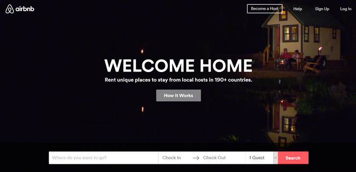
The home page of AirBnB follows this UX principle, and its top menu only contains utility tools. It’s not a usual solution, but if we take a look at AirBnB’s incredible growth rate, it’s the perfect choice for them.
The 4 top menu items target the 4 main personas who usually visit AirBnB’s site: people who are interested in becoming a host (“Become a Host”), people who want to solve a problem that took place while they used the service (“Help”), new and returning users (“Sign Up” and “Log In”). AirBnB’s utility-focused home page also contains a quick search bar that is a crucial tool on an accommodation renting website.
Secondly, users don’t need superfluous utilities, as too much clutter distracts attention and reduces focus. What tools are necessary in our utility navigation and what are not depend on the nature of our site. For example it can be useful to include a Print view on a blog or a news site, but the same feature can be an unnecessary distraction on a forum board or a social media website.
Washington Post for example displays utility navigation on its single post pages differently from on the homepage. This way users only meet utility tools that are relevant, and are not pestered with options that they wouldn’t want to use anyway.
There are 3 utility navigation items that visitors may want to use site-wide. These are smartly included in the fixed top bar (search tool, “Sign In”, and “Subscribe”), but users don’t have to think about options related to single posts such as “Reading List” when they are browsing the home page or one of the category pages.
Read more: Anticipatory Design – When Choice is Removed From Decision Making

Thirdly, users need to quickly understand what they can do on our site. Visitors don’t necessarily know what they want, so we always need to provide them with information about the options they have.
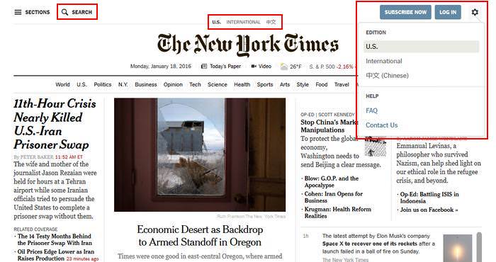
If you take a look at the screenshot below, you can see that The New York Times informs users about the availability of 3 different editions: American, International, and Chinese, and also enables them to quickly switch between the three. This great example of smart utility navigation shows users less-obvious options they probably wouldn’t find on their own, in a non-obstrusive and elegant way.
Find The Best Place
There are typical placements for utility navigation where users intuitively look for these tools, as that’s what they’ve got used to on the majority of websites. Breaking web design conventions is considered bad user experience practice, and it’s especially true for utility navigation that, in most cases, is more about usability than creativity.
As utility navigation is secondary to content-based navigation in most websites, it’s frequently placed in less prominent but still visible areas. This usually means the (1) top-right corner of websites, and the (2) lower part of the footer. It’s a good idea to follow these conventions, as these are the places where most users look for utility tools first.
As you can see below, Reuters has positioned most of its utility tools into these two typical areas, the top right corner of the site, and the lower part of the footer below the content-based navigation. The unique solution here is the fixed extra footer with 2 utility items that designers thought to be the most important: “Login or register” and “Latest from My Wire”.
It’s interesting to note that the extra utility navigation area is still placed into a kind of footer where users would normally look for similar tools, so Reuters’ designers were creative in a way but still followed web design conventions to maintain usability.


Build A Logical Structure
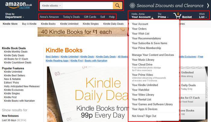
Grouping utility tools into a logical structure is crucial if we want to build a site with a high conversion rate. This can be a challenge even if we don’t want to provide users with many options, but Amazon takes the complexity of utility navigation to the next level. Amazon has an incredibly complicated utility navigation with many options, but if we use Amazon regularly enough, it doesn’t appear so. This is the magic of smart design.
They didn’t only place utility navigation on the top-right corner where users expect to find it, but they also divided it into 3 main groups: (1) a search bar, (2) user-related information (below the search bar), and (3) actions that users can perform on the site.
It’s smart because, thanks to the visual cues such as the shopping cart or the search icon, customers can decide in the twinkling of an eye which group they want to use, and from then on they can ignore the other two. There’s only one group (“Your Account”, “Try Prime”, “Basket”, and “Wish List”) that has submenus that are also logically structured, and the different submenu groups are divided by discreet but visible separators to help users quickly find what they want.
Create An Effective Visual Design
The visual design of effective utility navigation needs to follow the famous KISS principle (Keep It Simple, Stupid). It’s recommended to provide icons with text labels, make controls look like controls, and visually emphasize the most important actions. It can also be a good idea to distinguish utility and content-based navigation by using a slightly different design.
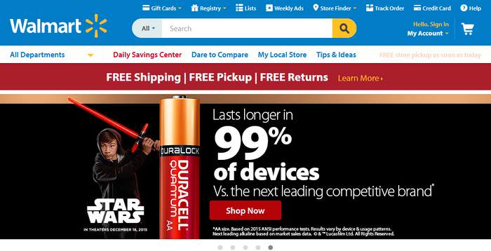
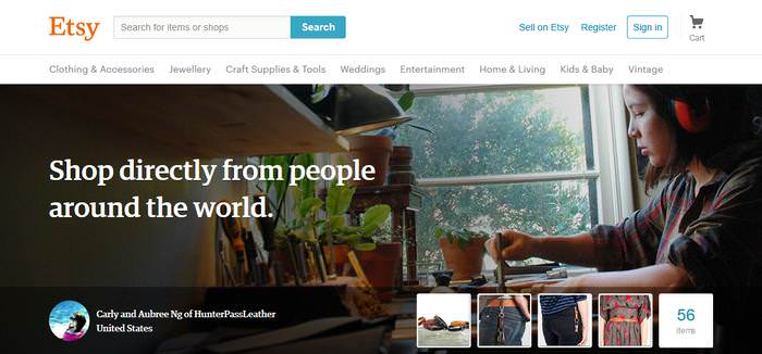
Two great examples of effective visual design can be found on Walmart‘s and Etsy‘s website. Designers placed utility navigation on the topmost of both sites, and highlighted it with colours that vary from the rest of the navigation, Walmart with a blue background, and Etsy with blue fonts.
Both sites emphasize the most important user actions with different visual design elements, Walmart uses yellow for the Search and the Sign In buttons, while Etsy gives a discreet blue border to the Sign In button, and includes a gray shopping cart icon above the Cart menu.
This is the only place where Etsy uses an icon in its utility menu, while Walmart displays an icon next to each item, but still doesn’t forget to include the necessary text labels right next to the icons.