10 Lightweight Alternatives To Bootstrap & Foundation
Choosing the right framework that is the perfect fit for your projects could be a little bit overwhelming – there are a lot to choose from. Perhaps, you want to go with popular choices like Bootstrap or Foundation, but if your website is going to be a fairly simple one, you won’t be needing most of the building blocks and materials included in the default package.
The good news is that there are a handful of alternatives that are much leaner than Bootstrap or Foundation. Most of these frameworks ship with just the right amount of styles and components to help you get started, while allowing you to be able to extend them in the direction you want for your project.
Here are 10 lightweight alternatives to Bootstrap and Foundation that you should use for building smaller-scale websites.
More on Hongkiat.com:
- Getting started with Twitter Bootstrap
- Using Bootstrap 3 With Sass
- Bootstrap Tool: Build HTML Bootstrap Layouts
- Working With Bootstrap Plugin: Modal Window
- Bootstrap Tool: Build Megamenu with YAMM3
1. Skeleton
Skeleton has finally gotten a facelift. It’s a total revamp from the ground up, and yet it is still as light as it used to be. The new Skeleton grid system now adopts mobile-first philosphy, which ensures that the layout takes center stage regardless of how small the device screen is.
All components that were included in the earlier version – buttons, forms and input elements – are still present but basic typography styles are now set in rem unit.

2. CardinalCSS
CardinalCSS is a CSS framework built with a focus on performance, readability and most importantly maintainability. CardinalCSS adopts some modern approaches such as mobile-first for shaping up the grid; and CSS Box Model that allows you to easily determine element width and height.
CardinalCSS also comes with a handful of helper classes that allow you to quickly apply styles upon an element, for example, the drop-cap which applies the drop-cap effect for the first character in the paragraph.

3. ConciseCSS
ConciseCSS is a CSS framework – without the bloat. It is a lean framework built on top of Sass, LESS, and Stylus which paves its golden path to CSS maintainability. But, if you prefer plain simple vanilla CSS, you can have that as well.
Similarly, ConciseCSS also comes with base styles for essential elements such as the headings, paragraphs, tables, forms, and a set of helpers class to create button UI.

4. PowertoCSS
PowertoCSS is lightweight and a solid frontend framework. Class names that are used to build the grid and apply styles are simple and easy to remember e.g. .button. You can also add your own theme. Head over to their StarterKit to get started.

5. Furtive
Furtive is a mobile-first CSS framework built around the cutting-edge web standards like the use of Flexbox for the grid and rem unit for sizing elements (including font size). Furtive retains a small CSS footprint by not supporting older browsers (*cough* Internet Explorer) since they require some CSS hacking. Hence Furtive is a perfect framework if you are designing a website for the future.

6. BassCSS
BassCSS offers a lightweight set of base element styles, utilities, layout and color styles, in modular form for buildilng a responsive web application. The SCSS files are included to customize the style easily. You can play with typography, white space, breakpoints, and UI elements.

7. Mueller
Mueller is a modular responsive grid system built on top of Sass and Compass. With Mueller, you can build the grid either by adding classes straight to the HTML elements, or if you prefer your HTML elements to be neat and clean, using the grid() function. Mueller grid can be used in tandem with the Masonry Javascript library to create a Pinterest-like layout.

8. Tuktuk
Tuktuk is a very unique name for a framework. Compared to Bootstrap or Foundation, Tuktuk is much lighter as it only comes with just the proper amount of components to build a presentable website including for the grid system, basic styling for typography, tables, and a couple of UI like navbar and modals.

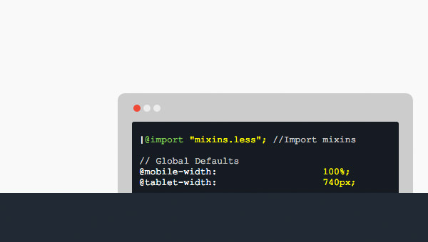
9. Base
Base is built on top of LESS and Sass, and it includes only the most essential of components to build websites: the grid and the basic styling of HTML elements. Base does not come with Javascript components, yet it provides great browser compatibility so much so that it works even with IE7.
10. Toast
The last of our list is Toast. Through the SCSS stylesheet is included in the package, Toast allows you to easily configure the grid class names, the gutter, and even the column-base. For example, if you want the grid to be a 9-base column instead of 12, you can do that. Toast is a minimal CSS framework with very flexible configurations catered to meet your requirements.
