Designing a Clean and Elegant Blog Layout with Photoshop
In this guide, I’ll walk you through the steps to create a minimalist and refined blog design utilizing the power of the latest version of Photoshop. You’ll learn how to efficiently use Character Styles and Paragraph Styles to simplify your design process.
Before starting, ensure you have these resources at your disposal:
- Free Font Sansation courtesy of Bernd Montag.
- Free Social Media Icons by Daniele Selvitella.
Setting Up Your Workspace
Step 1
For our project, we’re utilizing the 960 gs framework. Start by downloading the framework from the official site. Within the zip file you download, look for the Photoshop document named ’12 Column Grid’ and open it with Photoshop.
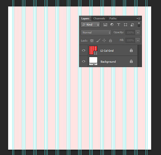
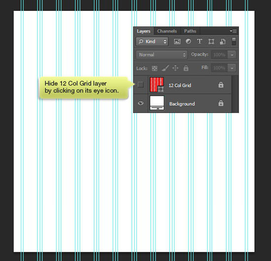
Toggle the visibility of the 12 Col Grid layer off by clicking the eye icon; we won’t be needing it just yet.
Step 2
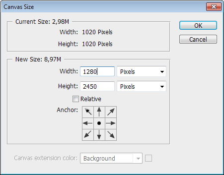
Our current canvas size is a bit on the smaller side. To adjust, go to Image > Canvas Size (or press Ctrl + Alt + C) and input a larger dimension, ensuring the anchor point is set to the center.
Step 3
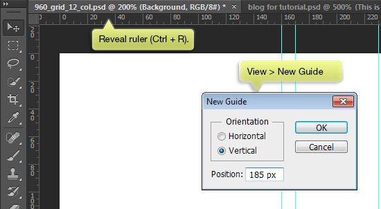
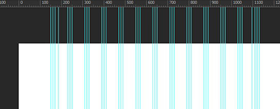
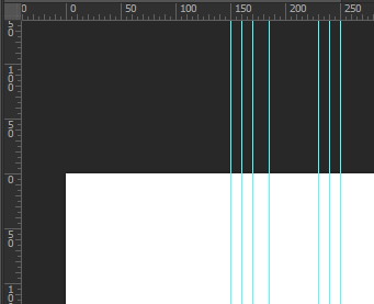
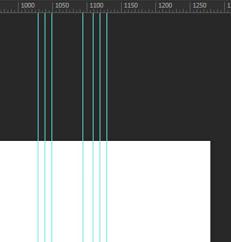
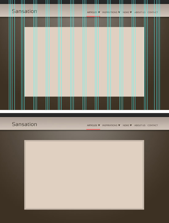
Activate the ruler by hitting Ctrl + R. Navigate to View > New Guide to introduce a new guide, aiding in precise design. Choose Vertical and set the Position to 185 px for a vertical guide 185 px from the top left corner of the canvas.
Step 4
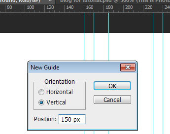
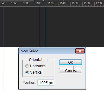
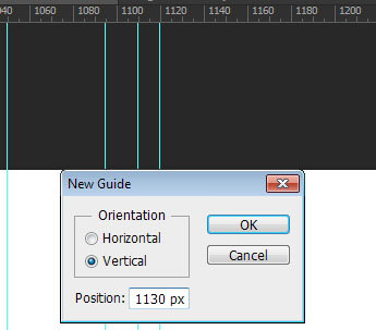
Add more vertical guides at positions 150 px, 1095 px, and 1130 px.
Below, you can see our canvas with the final guide layout.
Choosing Your Color Palette
Step 5
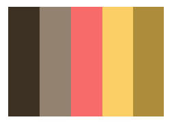
We’ll select a beautiful color scheme from Colorlouver for our design. Start by clicking on the Preview link to view the color combination as a jpeg file.
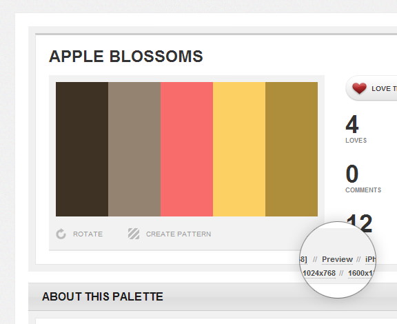
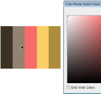
After saving the color combination, add it to your Photoshop project. By integrating the image into our canvas, we can quickly and effortlessly sample the colors from it.
Creating the Background
Step 6
Begin by selecting the Background layer and click the lock icon at the top of the Layers panel to unlock it. Then, double-click the layer thumbnail to change its color.
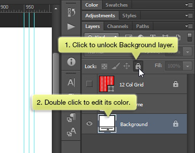
Choose the color #948371 by clicking on it.
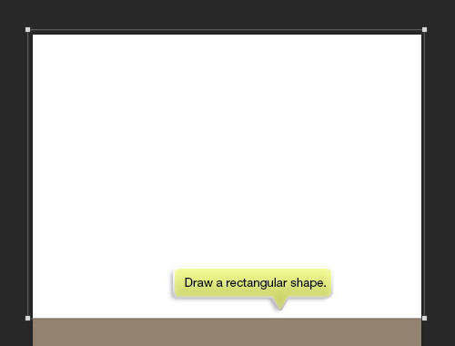
Step 7
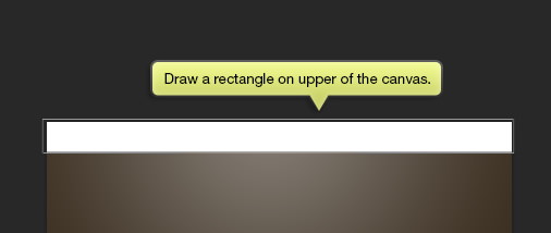
On the canvas, draw a rectangular shape. This will serve as the secondary background layer.
Step 8
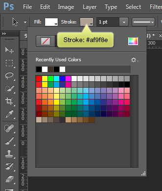
With the shape still selected, head to the Option Bar, click on the Fill Color box, and then select the color wheel icon. In the Color Picker dialog that appears, choose the first color. Set the Stroke color to None.
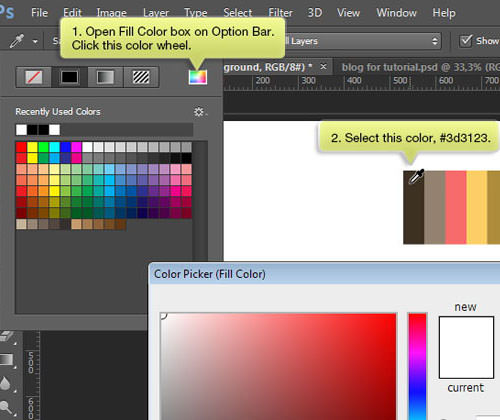
Step 9
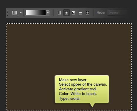
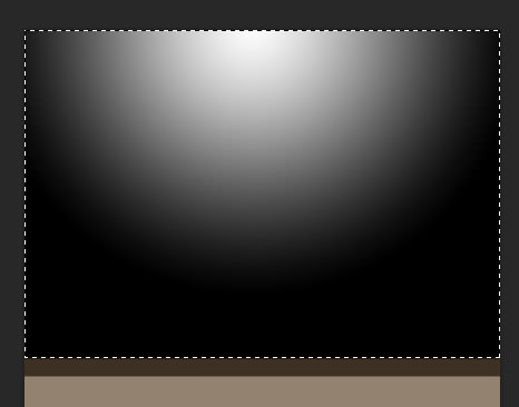
Create a new layer and select the top portion of the canvas with the rectangular marquee tool. Apply a radial gradient that transitions from white to black using the gradient tool, ensuring it’s centered over the canvas.
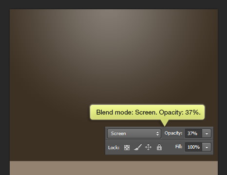
Adjust its Blend mode to Screen and lower the Opacity to 37%.
Step 10
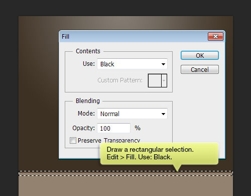
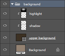
Create a new layer and label it ‘shadow’.
At the base of the secondary background, form a rectangular selection as displayed. Go to Edit: Fill and choose Black for Use. Hit OK to fill the area with black.
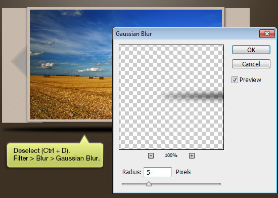
Step 11
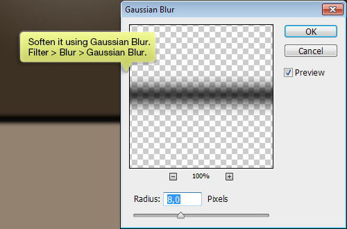
Apply a Gaussian Blur to soften the shadow. Navigate to Filter > Blur > Gaussian Blur.
Step 12
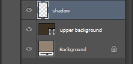
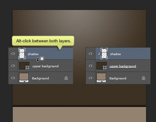
Press and hold Alt, then hover the cursor between the ‘shadow’ and the ‘upper background’ layer. Without releasing the Alt key, click to convert the layer to a Clipping Mask. This action makes the shadow integrate seamlessly into the upper background.
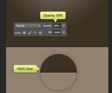
Step 13
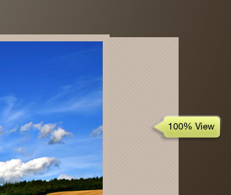
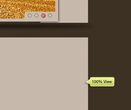
Adjust the shadow’s Opacity to 50% for a more subtle effect. The image below showcases the effect at 100% zoom.
Step 14
For better organization, it’s advisable to group these layers together. To do this, select all relevant layers and then press Ctrl + G.
Designing the Header
Step 15
On the upper part of the canvas, draw a rectangle as illustrated below.
Step 16
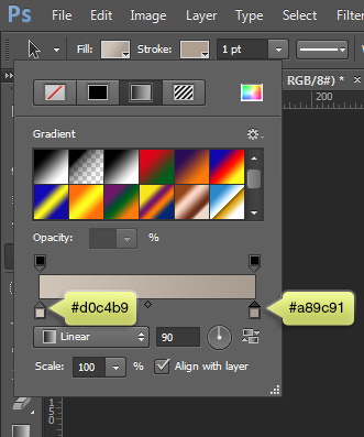
Go to the Option Bar and set the Stroke color to #af9f8e.
Step 17
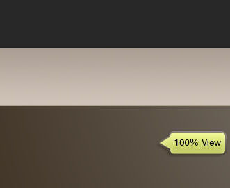
Choose a linear gradient for the Fill color, transitioning from #d0c4b9 to #a89c91.
Here is how it looks at 100% zoom.
Adding the Site’s Name
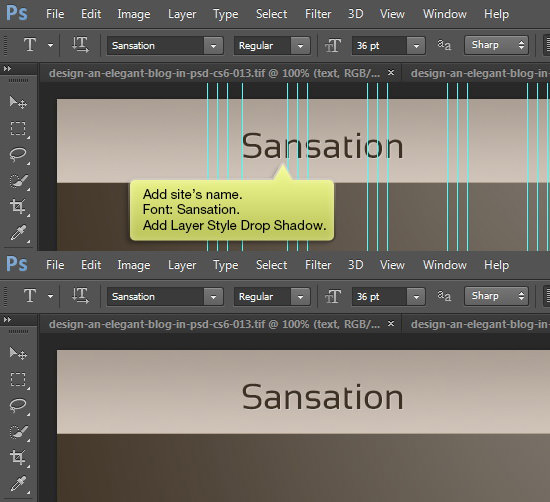
Step 18
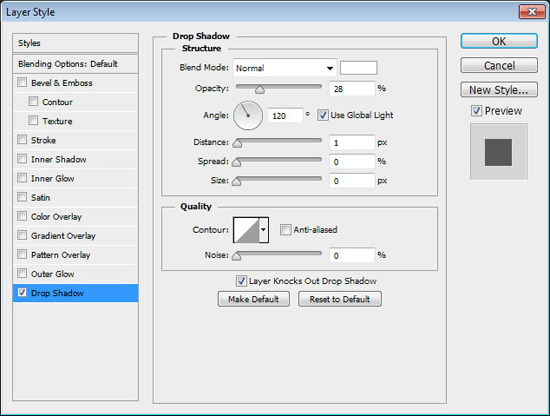
Place the site’s name on the left side of your design, as indicated in the image below. To enhance the text, double-click on it to add a Drop Shadow. For the text font, opt for Sansation.
Designing the Menu
Step 19
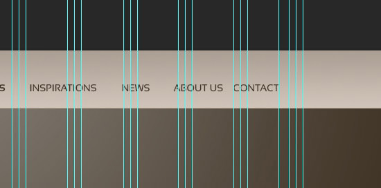
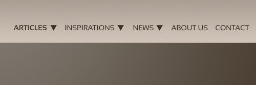
Create the menu items on the opposite side of the menu bar, using the Sansation font at 14 pt. Pay close attention to their placement as shown below.
Step 20
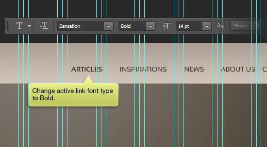
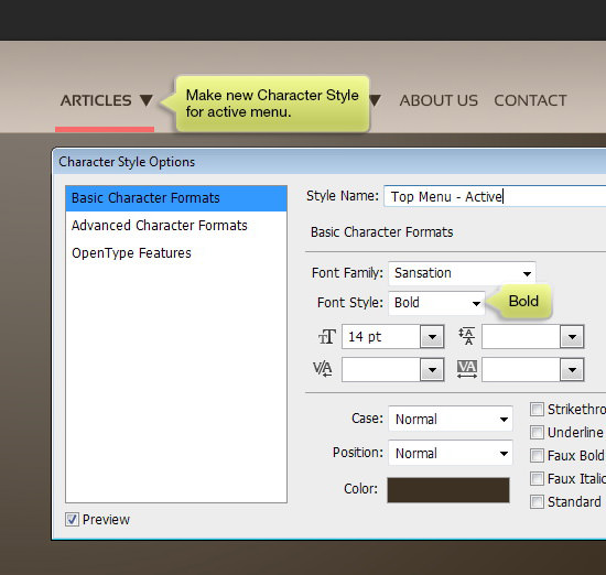
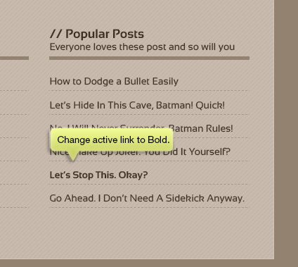
Highlight the active menu item by changing its font to bold.
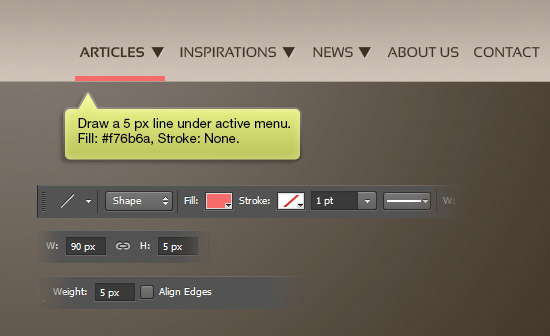
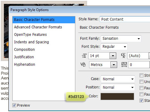
Step 21
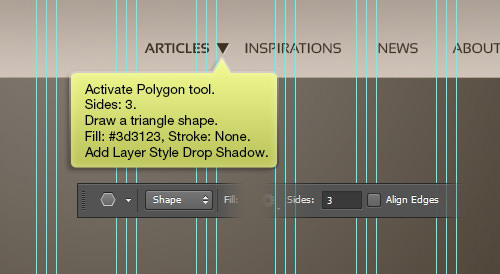
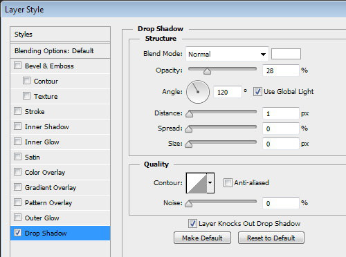
Use the Polygon tool with the Sides set to 3 to draw a triangle. Apply a Fill color of #3d3123 and set Stroke to None. Enhance it with a Drop Shadow from the Layer Styles menu.
Step 22
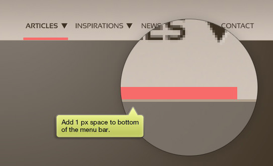
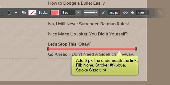
Accentuate the active menu item further by adding a line beneath it. Use the Line tool with a 5 px weight, choosing #f76b6a for the Fill and no Stroke. Position this line just below the active menu, ensuring a 1 px gap from the menu bar’s bottom.
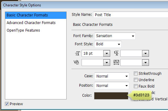
Implementing Character Styles
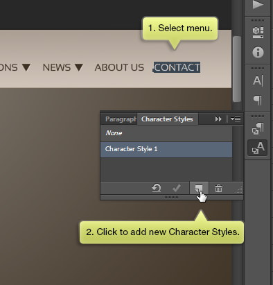
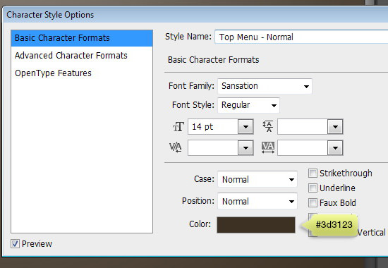
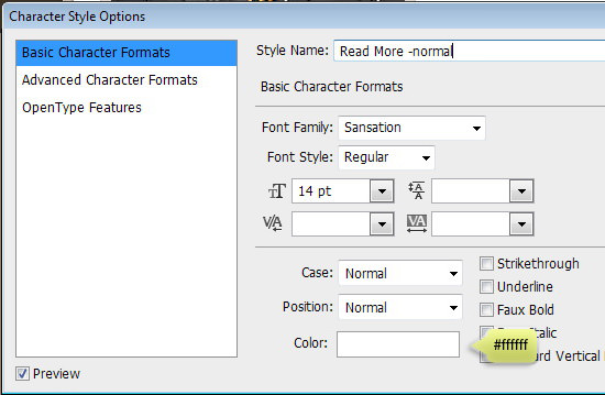
Step 23
Now, let’s save our text settings as a Character Style, a feature inspired by InDesign’s Character Styles, but simpler. First, highlight the text then click on the ‘New Character Style’ icon to save it.
Double-click on the newly created Character Style to adjust its settings as shown below.
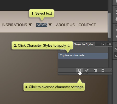
Step 24
Apply the Character Style to the other menu items by selecting them and clicking on the Character Style. If there’s a plus sign next to the Character Style, it indicates a deviation from the set settings. To standardize the settings, click on the circular arrow icon.
Step 25
Follow the previous steps to create a distinct Character Style for the active menu item.
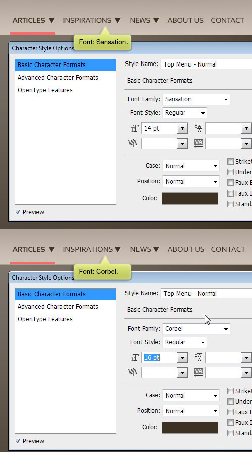
Step 26
What makes Character Styles so useful? They allow for centralized control over text settings. By editing a single Character Style, we can simultaneously update all text elements linked to that style. For instance, changing the font of the Top Menu – Normal style to Corbel automatically updates all corresponding menu items to Corbel.
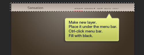
Step 27
Create a new layer beneath the menu bar. Use Ctrl-click on the menu bar to generate a new selection shaped like it. Fill this new layer with black.
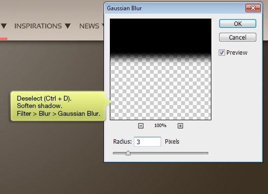
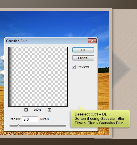
Step 28
Deselect using Ctrl + D. To soften the shadow, apply a Gaussian Blur from Filter > Blur > Gaussian Blur.
Creating the Slider
Step 29
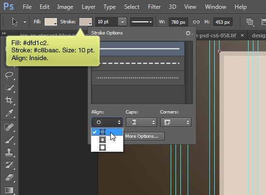
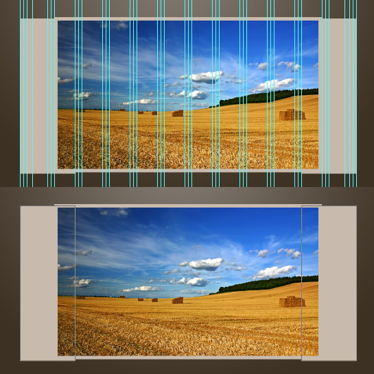
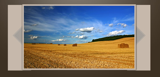
Create a rectangular shape that spans the width of 10 columns as shown in the image below.
Choose #dfd1c2 for the Fill color and #c8baac for the Stroke, setting the stroke size to 10 pt. Ensure Align Inside is selected by clicking the dropdown arrow next to the stroke preview.
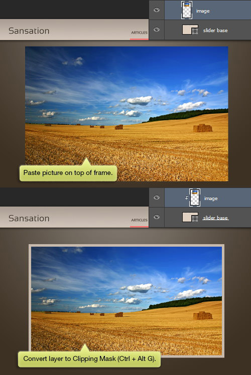
Step 30
Insert an image on top of the frame and apply a Clipping Mask by pressing Ctrl + Alt + G. This will confine the picture within the slider frame, allowing for adjustments in positioning and size without altering the frame itself.
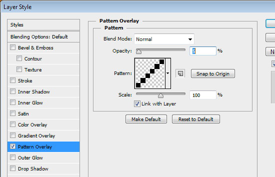
Step 31
Behind the slider, draw another rectangular shape with the same color, aligning it to the outermost guide. Apply a Layer Style > Pattern Overlay with a pixel pattern and adjust its Opacity to achieve a subtle effect.

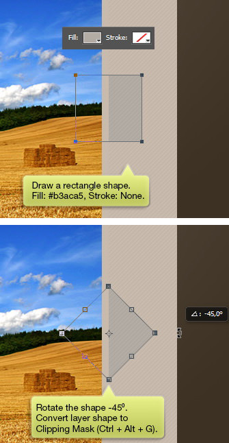
Step 32
Above this shape, create a new rectangular shape with Fill: #b3aca5 and no Stroke. Transform it by pressing Ctrl + T and then rotate it by 45°. Apply a Clipping Mask to the layer shape.
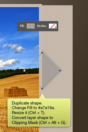
Step 33
Duplicate this shape and resize it. Alter its Fill to a darker shade for contrast. Again, use a Clipping Mask on this layer shape.
Step 34
Follow the same process to create another arrow on the opposite side of the slider.
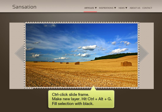
Step 35
Ctrl-click the slide frame to generate a new selection. Add a new layer and turn it into a Clipping Mask. Fill this new layer with black.
Step 36
Remove the selection (Ctrl + D) and then apply a Gaussian Blur to soften the layer.
Adjust the shadow’s Opacity as needed to achieve the desired effect.
Step 37
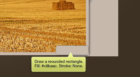
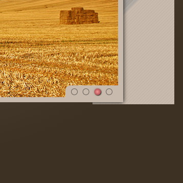
Create a rounded rectangle at the corner of the slider with a Fill color of #c8baac.
Step 38
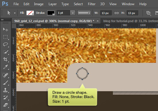
Inside this shape, draw a circle. Set its Stroke to black, with a size of 1 pt, and remove the Fill.
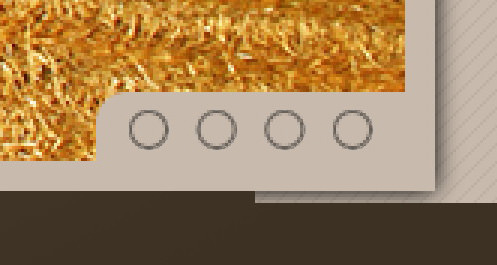
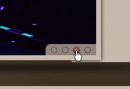
Step 39
With the Path Selection tool, select the circle’s path. Use Shift + Alt-drag to duplicate the path.
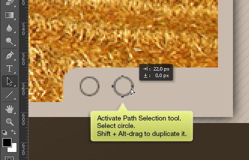
Repeat the process to add more circles as desired.
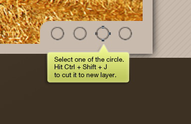
Step 40
Select a circle path and use Ctrl + Shift + J to move it to its own layer.
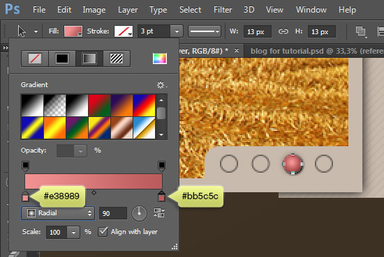
Step 41
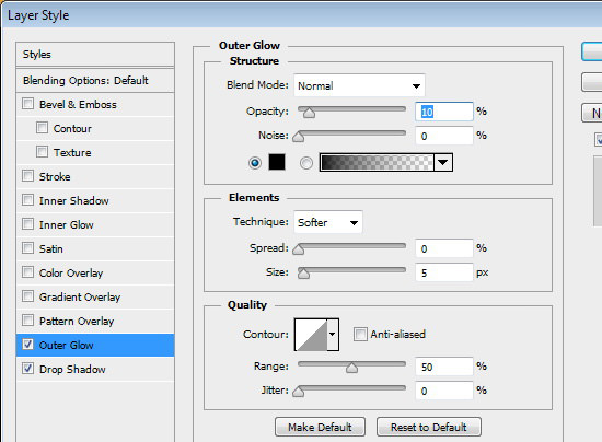
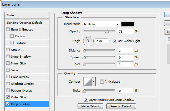
In the Option Bar, eliminate the Stroke and set the Fill to a radial gradient transitioning from #e38989 to #bb5c5c. Enhance the circle with an Outer Glow and Drop Shadow from the Layer Styles menu.
Step 42
Create an elliptical shape below the slider. Add a new layer and fill this shape with black.
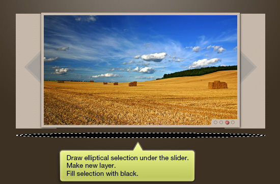
Step 43
Clear the selection (Ctrl + D) and then blur it using Gaussian Blur to create a soft shadow effect.
Creating the Lower Background
Step 44
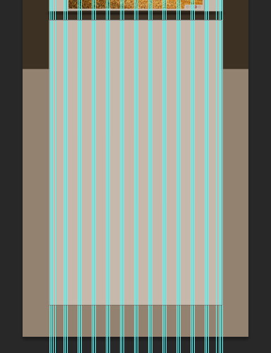
Construct another rectangular shape for the lower background, employing the same Fill and Stroke colors as used for the slider. This ensures consistency across your design.
Position it meticulously to ensure it spans across all guides on the canvas, providing a seamless look.
Enhance this shape with a Pattern Overlay for added texture.
The detailed look of the patterned background can be seen below at full magnification.
Step 45
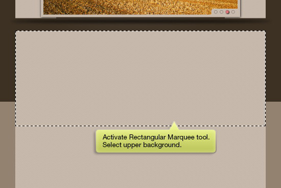
Using the Rectangular Marquee tool, highlight the upper section of this new background area.
Step 46
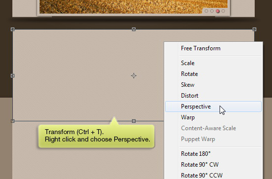
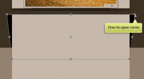
Create a new layer and position it behind the previously made shape. Fill this new layer with black. Press Ctrl + T, then right-click and select Perspective to modify the layer’s perspective.
Adjust the perspective by dragging the upper corners outward to widen the top of the shape.
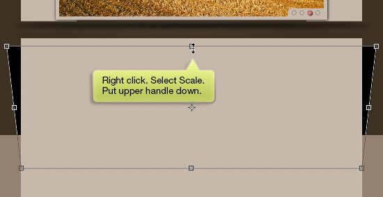
After setting the perspective, right-click again and choose Scale, then pull the upper edge downwards to resize the shape vertically.
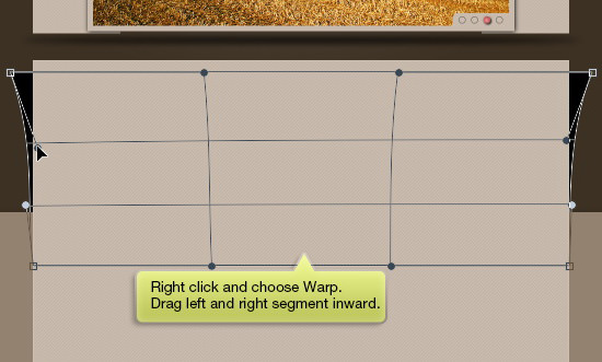
Next, select Warp from the context menu and manipulate the left and right segments inward to fine-tune the shape’s curvature.
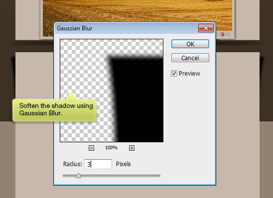
Apply a Gaussian Blur to soften the shadow created by the shape.
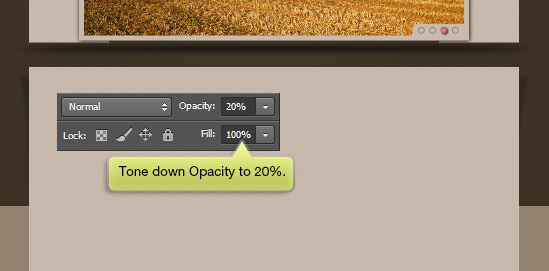
Finally, adjust the layer’s Opacity to 20% for a more subtle shadow effect.
Step 47
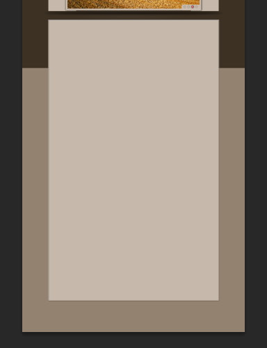
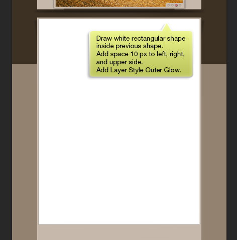
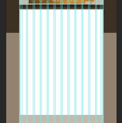
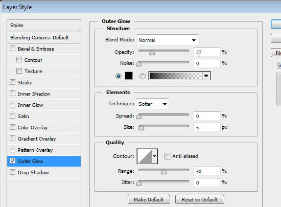
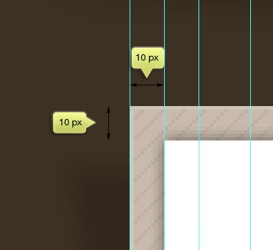
Create a white rectangle within the background area to serve as the main content’s backdrop. Ensure there’s a 10 px margin on the left, right, and top sides relative to the background, utilizing the guides set in earlier steps for precise spacing. Enhance this rectangle with an Outer Glow from the Layer Styles menu for added depth.
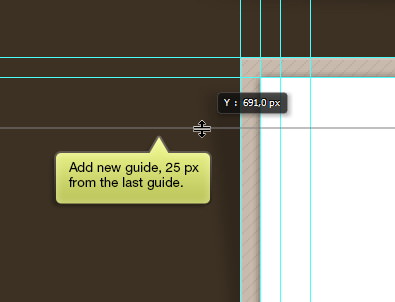
Step 48
Introduce a new guide 25 px above the upper edge of the main content’s background to help delineate space for upcoming design elements.
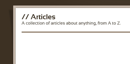
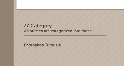
Adding Section Titles
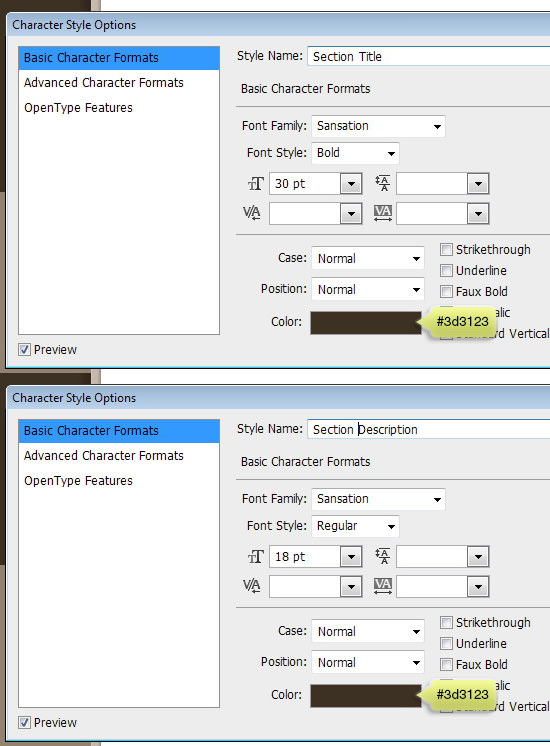
Step 49
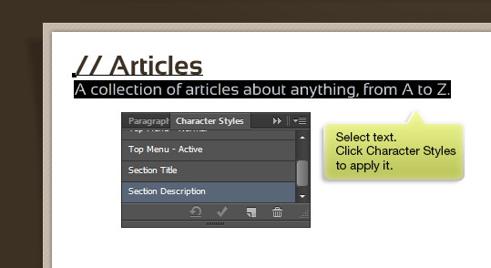
Create a new Character Style specifically for the section titles and their descriptions on the page. This ensures consistency in typography across different sections.
Using the Type tool, input the section title and its description. Apply the previously created styles for a cohesive look. Position these elements 25 px from the top of their background, aligning them with the guide set in the previous step.
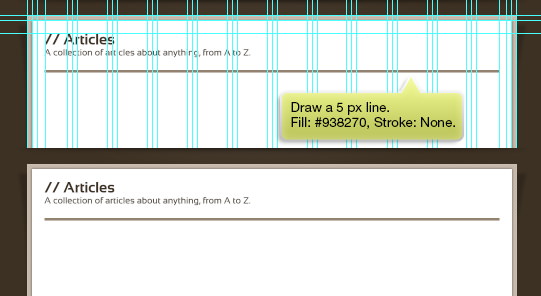
Step 50
Below the site’s description, draw a 5 px horizontal line with a Fill color of #938270 and no Stroke. This subtle line acts as a visual separator, enhancing the design’s readability and aesthetic appeal.
Designing the Blog Post Section
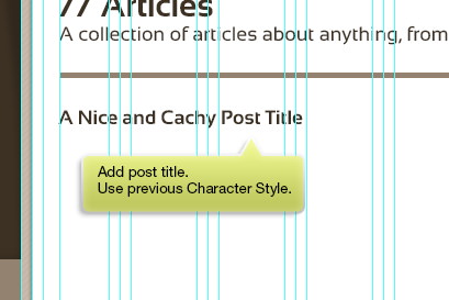
Step 51
Create a distinct Character Style for blog post titles to ensure they stand out and maintain consistency across your blog design.
Step 52
Insert a blog post title and apply the newly created Character Style for a polished and uniform look.
Step 53
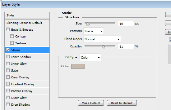
Beneath the title, draw a rectangle to act as the post’s feature image background, making it four columns wide. Use white for the Fill and #bebebe for the Stroke. Enhance it with a Layer Style > Stroke for added definition.
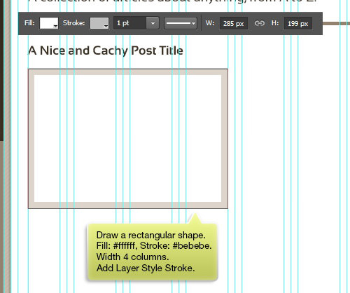
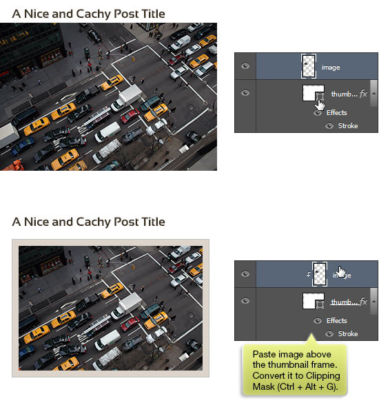
Step 54
Place an image within this rectangle and apply a Clipping Mask (Ctrl + Alt + G) to ensure it fills the designated area perfectly, enhancing the post’s visual appeal.
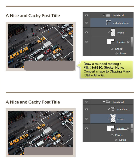
Step 55
For additional detail, draw a rounded rectangle at the bottom of the image area with a Fill color of #8e8380 and no Stroke, and then convert it to a Clipping Mask for a cohesive look.
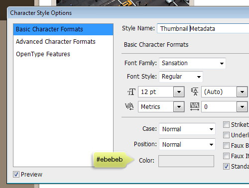
Step 56
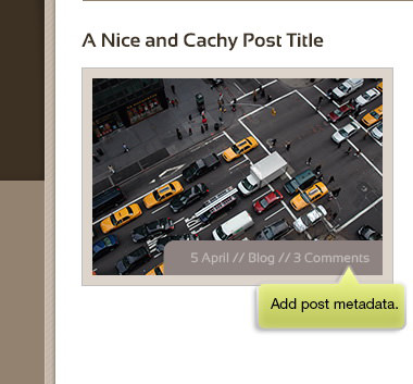
Create new Character Styles tailored for the blog post metadata to ensure readability and visual consistency.
Step 57
Position the metadata text atop the previously designed shape and implement the freshly established Character Styles for a coherent look across the blog post.
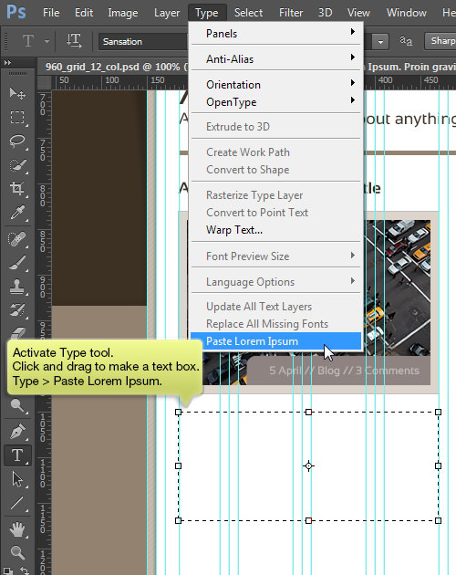
Step 58
Use the Type tool to create a text box aligned with the width of 4 columns. Fill the box with placeholder text by selecting Type > Paste Lorem Ipsum, which uses Photoshop’s built-in function to generate dummy text.
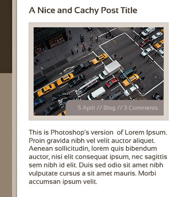
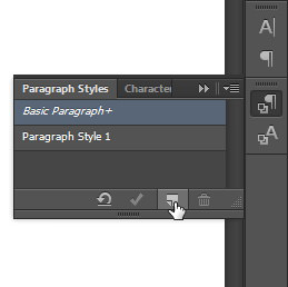
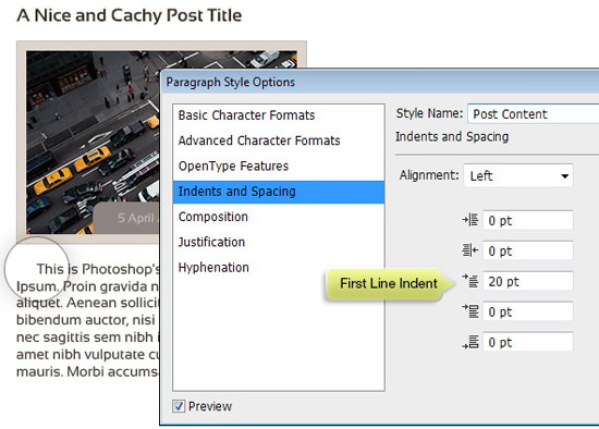
Step 59
Create a new Paragraph Style for the blog post content to enhance the readability and aesthetic of the text. Initiate this by selecting the new icon in the Paragraph Styles panel.
Configure the Paragraph Style with the specific settings provided to align with the blog’s design standards.
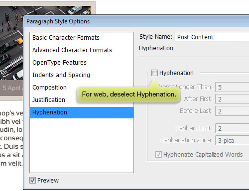
Step 60
Apply the newly created Paragraph Style to the main body of the post content, tweaking Indent and Spacing settings as necessary for optimal layout and readability. For web design purposes, it’s advisable to turn off Hyphenation to maintain clean text flow.
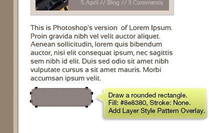
Step 61
Draw a rounded rectangle to serve as an additional decorative element, filling it with #8e8380 and opting for no Stroke. Accentuate this shape with a Pattern Overlay Layer Style, employing the same pattern used in the slider section for visual harmony.

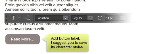
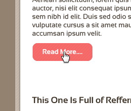
Step 62
Create a label for a button and save this text styling as a new Character Style for consistency and ease of use across other buttons in the design.
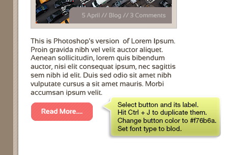
Step 63
Duplicate the previously designed button and modify its color to #f76b6a for a hover or active state representation. Additionally, adjust the label’s font to bold to distinguish the button’s state.
Step 64
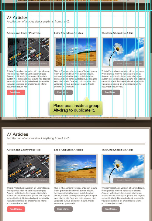
Group the blog post elements and duplicate them using Ctrl + J. Then, use Alt-drag to replicate the group for multiple posts, ensuring to update the image and title for each to maintain variety.
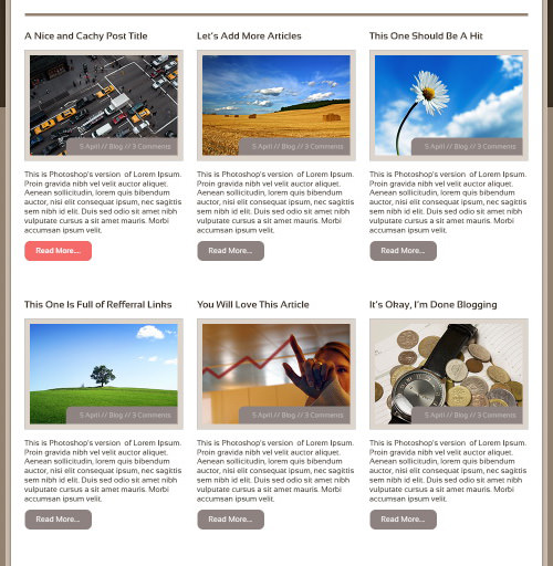
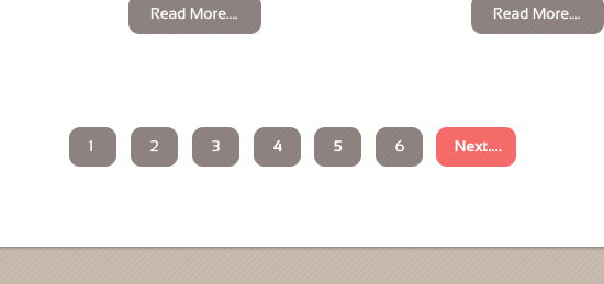
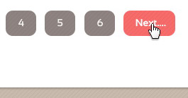
Step 65
Replicate the Read More button and adjust its label to a number, intending to use these for page navigation. Ensure to designate one button to represent the hover state for visual feedback.
Step 66: Footer
Begin crafting the footer by adding widget titles and their descriptions, laying the foundation for this important site section.
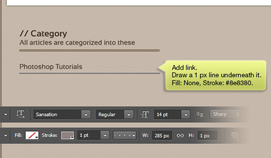
Step 67
Add links within the footer and underline each with a 1 px line for clarity and emphasis. Use no Fill and a Stroke color of #8e8380 to match the site’s design aesthetic.
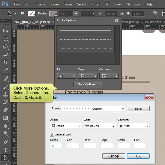
Step 68
Access the More Options button and choose a dashed line style to create a visually distinctive separator for the footer content.
Step 69
Enhance the widget by adding additional links, further expanding the footer’s functionality and navigation options.
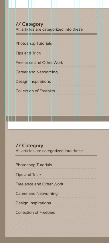
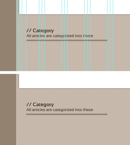
Step 70
Replicate the widget to utilize the design across different sections of the footer, creating a unified and structured appearance.
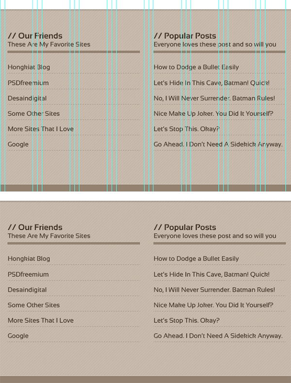
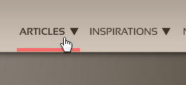
Step 71
Indicate a hover state for the links by setting one of the link’s text to bold, mirroring the active menu item’s style from the main navigation bar. Directly below this active link, draw a 5 px line colored #f76b6a, ensuring consistency with the design’s active state indicators.
Step 72
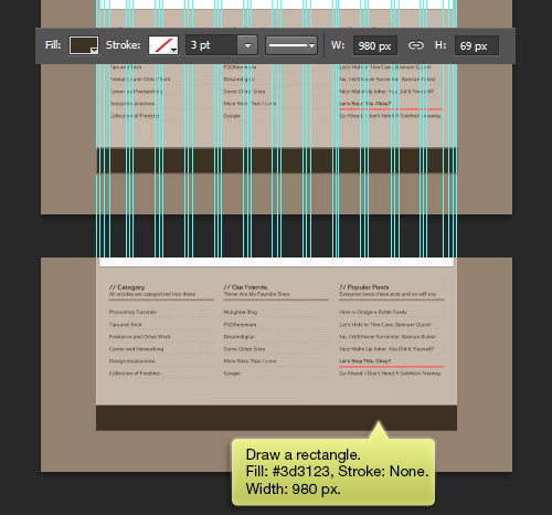
At the footer’s lower section, introduce another rectangle with a Fill of #3d3123, adding depth and visual interest to the page’s bottom edge.
Finalizing Footer Information
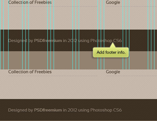
Step 73
Utilize the Type tool to insert the footer information. Enhance its visibility against the background by applying a dark Drop Shadow, creating necessary contrast for readability.

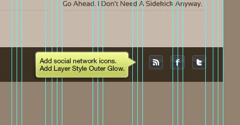
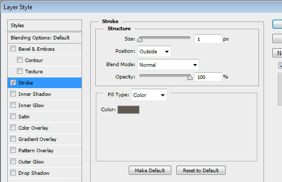
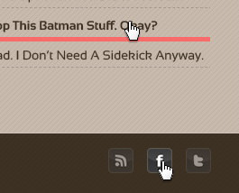
Integrating Social Media
Step 74
Incorporate social media icons provided by Daniele Selvitella to connect your site more closely with your social platforms. Enhance these icons with an Outer Glow from the Layer Styles for added visual appeal.
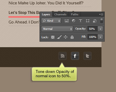
Step 75
Adjust the opacity of the normal state icons to 50% to distinguish them from their active or hover state, which should remain at 100% opacity for clarity and user interaction feedback.
Step 76
Enhance interactive elements by adding a freehand cursor icon over active or hover links, indicating to users where interaction can occur. This subtle cue contributes to a more intuitive navigation experience.
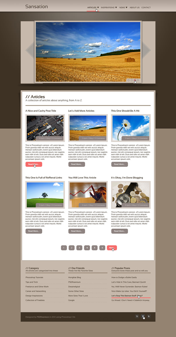
Final Result
Here is the culmination of our work. The latest version of Photoshop introduces some powerful tools specifically useful for web layout design. The inclusion of Character Styles and Paragraph Styles marks a significant advancement for web designers, streamlining the design process and ensuring consistency across the project.