A Guide to CSS3 Linear Gradients
Gradient is a great color feature addition in CSS3. Rather than only add a single color, we can now add multiple color combinations in one declaration block without relying on images, which could decrease the HTTP request in our website allowing the website load faster.
If you have played around with gradients in CSS3 you are probably familiar with the two methods: radial and linear gradient. Today’s post will be about the latter.
Creating Gradients
As the spec says gradients in CSS3 is an image, it has no special property like other new feature addition, so it is declared using the background-image property instead.
If we take a look at the complete syntax for gradient, it looks a little overstuffed, which could lead to confusion for some people.
div {
	background-image: -webkit-linear-gradient(top, #FF5A00 0%, #FFAE00 100%);
	background-image: -moz-linear-gradient(top, #FF5A00 0%, #FFAE00 100%);
	background-image: -ms-linear-gradient(top, #FF5A00 0%, #FFAE00 100%);
	background-image: -o-linear-gradient(top, #FF5A00 0%, #FFAE00 100%);
	background-image: linear-gradient(top, #FF5A00 0%, #FFAE00 100%);
}
So let’s dig into each part of the syntax one by one to make things clearer.
First of all, linear gradient is declared with the linear-gradient() function. The function has three primary values. The first value defines the gradient starting position. You can use a descriptive keyword, like top to start the gradient flowing from the top;
div {
	background-image: linear-gradient(top, #FF5A00, #FFAE00);
}
The snippet above is the official version from W3C to create gradients. It’s actually simpler and quite self-explanatory and it will also create the following gradient.

You can also use bottom to do the opposite, or else right and left.
We can also create a diagonal gradient using angle degree as the gradient starting position. Here is an example:
div {
	background-image: linear-gradient(45deg, #FF5A00, #FFAE00);
}
The snippet above will create the following color gradient:

The second value of the function will tell the first color information and its stop position which is stated in percentage. The stop position actually is optional; the browser is clever enough to determine the proper position, so when we don’t specify the first color’s stop the browser will take 0% as the default.
And, the next value is the second color combination. It works like the previous value, only that if it is the last color applied, and we do not specified the stop position, a value of 100% will be taken as the default. Now, let’s look at the example below:
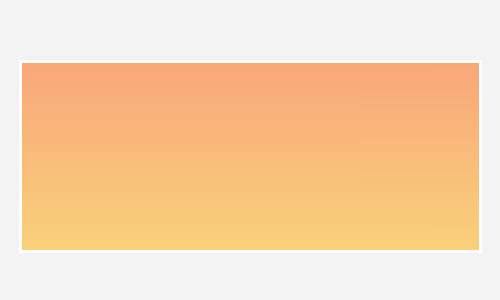
div {
	background-image: linear-gradient(top, #FF5A00 0%, #FFAE00 100%);
}
The snippet above will create a gradient like what we saw earlier (no difference) but now we specify the color stop position;
Now let’s change the color stop, and this time we will specify 50% for the first color and 51% for the second color, and let’s see how it turns out;
div {
	background-image: linear-gradient(top, #FF5A00 50%, #FFAE00 51%);
}

Transparency
Creating transparency in gradient is also possible. To create the effect we need to translate the color hex into rgba mode and lower the alpha channel.
div {
	background-image: linear-gradient(top, rgba(255,90,0,0.2), rgb(255,174,0,0.2));
}
The snippet above will lower the color intensity by 20%, and the gradient will turn out like this:
Multiple Colors
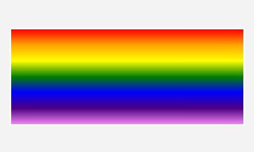
Should you want more colors to be added, just add the colors next to another with a comma delimiter and let the browser determine each color stop position.
div {
	background-image: linear-gradient(top, red, orange, yellow, green, blue, indigo, violet);
}
The snippet above will create the following rainbow.
Browser Compatibility
Unfortunately, at the time of this writing, all current browsers have yet to support the standard syntax. They still need the vendor prefix (-webkit-, -moz-, -ms- and -o-). So, that is why the complete syntax appears like this:
div {
	background-image: -webkit-linear-gradient(top, #FF5A00 0%, #FFAE00 100%);
	background-image: -moz-linear-gradient(top, #FF5A00 0%, #FFAE00 100%);
	background-image: -ms-linear-gradient(top, #FF5A00 0%, #FFAE00 100%);
	background-image: -o-linear-gradient(top, #FF5A00 0%, #FFAE00 100%);
	background-image: linear-gradient(top, #FF5A00 0%, #FFAE00 100%);
}
On the other hand, the Internet Explorer, specifically version 9 and lower, is far from the standard. The gradient in IE9 and below is declared with filter, so if we want to add gradient on those browsers, we have to write something like this;
div {
	filter: progid:DXImageTransform.Microsoft.gradient(startColorstr=#FF5A00, endColorstr=#FFAE00);
}
The filter has its limitations: first, it does not allow more than three colors added, and creating the transparency effect is also a bit tricky – it does not allow rgba, but the IE filter uses #ARGB;
div {
	filter: progid:DXImageTransform.Microsoft.gradient(startColorstr=#33FF5A00, endColorstr=#33FFAE00);
}
Here is a tool to help you convert rgba to #ARGB.
Writing the Syntax Faster
As you can see above, in order to maintain the gradient compatibility across browsers, we need to add five more lines of codes which is inefficient.
There are many ways we can do to simplify the task; such as using the Prefix-free, Prefixr, LESS or Sass to help compile the codes, but above all, we recommend using this tool, ColorZilla Gradient. This tool will simply generate all the necessary codes for the gradients to work in all browsers.
Final Words
Today we have discussed quite a lot on creating gradients, we have looked into each part of the syntax, creating transparent effects and maintaining browser compatibility. So, at this point, we hope that you already have a better understanding on the subject.
There are still many things we plan to explore on CSS3 Gradients in our future posts, so stay tune to Hongkiat.com. Lastly, thank you for reading this post, we hope you enjoyed it.
Further Reading
- Bullet Proof Cross Browser RGBA Backgrounds – Lea Verou
- CSS3 Image – W3.org
- When can I use CSS3 Gradients – CanIUse.com