Keeping Your CSS3 Code Markup Slim
Web developers can save a lot of time using more sophisticated CSS3 syntax. Users who visit your page are expecting the fastest possible load time – which makes it your responsibility to keep file sizes down. There are plenty of shorthand tricks with CSS and especially under the new CSS3 model.
I have put together a few of these ideas in the guide below. We should also touch upon other areas such as minifying your CSS code. There are in-browser tools available to aid developers in the styling process but you would want to combine shortcodes with this file-size reduction to ultimately streamline the rendering process of your website.
Basic Tips on Formatting
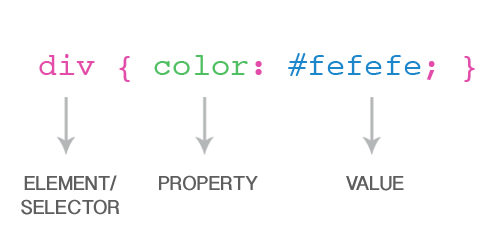
Before we jump into the actual CSS syntax I want to go over the topic of how to write your CSS. If you’re any bit familiar with web design, you’ve likely seen a stylesheet before, probably more than once. The first part of each command is called the selector. This targets the type of element which will receive the styles added inside the curly braces, also known as properties.
Inline Level
With inline styles each property is written one after the other with only spaces to separate them. This method is best applied onto selectors where you only need a couple of properties. It will save you space on the page and scrolling through your stylesheet will be much quicker. In case you’ve never encountered inline CSS before, I’ve added a small example below targeting HTML anchor links.
a {
  color: #648cc8;
  font-weight: bold;
}

a:hover {
  color: #739cda;
  text-decoration: none;
}

a.alt {
  color: #bd4949 !important;
}
Block Level
On the other hand block-style properties are entered in one line per key/value pair and are often indented for quicker edits when scanning the code. About 99% of the cleaner stylesheets I run into use this formatting, and it has become an industry standard to many designers. If your selector is using more than 6 or 7 properties this is the best formatting to apply.
When you take into consideration the many new CSS3 properties, you also realize just how quickly your stylesheets fill up. And many of these properties support browser-specific copies which require almost duplicate code entries(such as border radius). You can check out my example of a block property set below targeting a sample wrapper div.
.wrap {
  display: block;
  padding: 6px 10px;
  background: #FFF;
  border-radius: 4px;
  -moz-border-radius: 4px;
  -webkit-border-radius: 4px;
  -o-border-radius: 4px;
}
Neither way of writing CSS is specifically better than the other. Ultimately it is your choice as a developer which style you prefer, and even this will according to the project you work on. It’s even common to find CSS where designers have mixed both together! I personally feel that “works in progress” tend to be easier with block-styles since I’m constantly examining the stylesheet to make edits or additions. But for traffic-heavy domains minifying your CSS file is the absolute best way to go.
Keeping Them Slim
By utilizing the many short codes available in CSS3 you can save a lot of development time. Editing HTML elements will become a lot easier as you understand this time-saving lingo. Additionally your code will appear more clean-cut and easier to look at.
The only downside is that not all browsers fully support these properties. There are workarounds for many of the existing issues such as in Internet Explorer and Netscape. Thankfully the Web is always progressing forward and as CSS3 grows in popularity, we will undoubtedly experience a growth in browser compatibility too.
RGBa Color Transparency/Opacity
The new RGBavalue isn’t exactly a CSS3 property, but alpha transparency is specific to CSS3 only. Instead of the common “Red Green Blue” values you pass in for color you may now include a fourth option of color transparency. Because of this, web developers are done with transparent PNGs almost entirely.
The basic syntax requires a value from 0-255 in the first three(3) slots and 0–1.0 in the alpha position. The color range is specific for how much of each hue (RGB) is visible with 0 being nothing and 255 full.
div { background: rgba(255, 255, 255, 0.3); }
Cross-browser compatibility
Another property opacity can be used in some circumstances. However this will affect the whole HTML element and inner content, not just the background as you saw in my example.
Unfortunately Internet Explorer does not support the RGBa color value as of yet. You should generally include a fallback property with full opacity for these less-standard browsers. You set this up with the same values but excluding the 4th(opacity). It would look something like rgba(255, 255, 255)
Additionally Internet Explorer can be handled a bit more gracefully through conditionals. You can actually check if the browser is running IE and display a proprietary Microsoft CSS filter on command. I’ve demonstrated this in my example below (note this would appear somewhere in your HTML file):
<!--[if IE]>
<style type="text/css">
.bg {
  background: transparent;
  filter: progid:DXImageTransform.Microsoft.gradient(startColorstr=#ffffff, endColorstr=#ffffff);
}
</style>
<![endif]-->
CSS3 Border Radius
I have read a few confusing forum threads about creating rounded borders with CSS3 – not so much on the side of how it’s done, but with finicky browser support, web developers are scrambling for the easiest code to drop in and function as expected.
border-radius: top-left top-right bottom-right bottom-left;
The border-radius property shares similar syntax to creating a standard border, except in this case we’re targeting the box corners. This property will actually accept 1 – 4 values and they each target a different setup of corners.
- 1 value: All four corners are rounded to the same value
- 2 values: The first value applies to
top-leftandbottom-rightwhile the second value hitstop-rightandbottom-left - 3 values: First applies to the
top-leftcorner, the second is bothbottom-left&top-rightwhile the 3rd and final value is applied tobottom-right - 4 values: All 4 values target corners in the following order: top-left, top-right, bottom-right, bottom-left
 div { border-radius: 4px 4px 8px 4px; }
 div { border-radius: 4px 4px 8px; }
So in the code above we’re using border-radius to apply a 4px rounded effect on everything except the bottom-right border which gets an 8px smoothed curve. If you noticed it, both of these codes will actually apply the same style effect.
Cross-browser compatibility
Now the main problem is that border-radius is only supported within a few browsers. Internet Explorer 9 recently added great support and Opera will render this as well. However even Opera has created its own property with -o-border-radius targeting their specific browser engine. Additionally -moz-border-radius is supported by Firefox/Gecko software and -webkit-border-radius for Google Chrome/Safari.
The code below is an example of my bare-bone template for creating rounded corners with the largest global browser support.
div {
  border-radius: 4px 4px 8px 4px;
  -webkit-border-radius: 4px 4px 8px 4px;
  -moz-border-radius: 4px 4px 8px 4px;
  -o-border-radius: 4px 4px 8px 4px;
}
Fancy a Drop Shadow?
The other really awesome facet of CSS3 is the support for box and text shadows. This has been such a problem for developers in the past since background images were the only realistic option. This syntax actually follows a shorthand role that is much easier than the other properties we’ve covered. It is difficult to remember the proper order of key values at first – but the more practice you put in, the easier it’ll become.

Unfortunately Internet Explorer is once again the odd one out. Every other major browser including Firefox, Google Chrome, Safari and Opera fully support the text-shadow property. Developers have tried to build their own IE support in but is still very limiting. The basic syntax is written as follows:
/* Text Shadow Syntax */
text-shadow: x-offset y-offset blur-radius color;

/* Example */
div {
  text-shadow: 2px 2px 1px #111;
}
The X and Y offset tell the browser how far over right and low the shadow should appear. You can use negative values to position the shadow above and over left, respectively. But this comes off looking very awkward so I recommend positive integers. Also the blur-radius value can be used to smooth out the rigid edges, if the text shadow appears unnatural.
This syntax is just looking into the basic notation when creating a single drop shadow effect. Highly advanced designers have studied to even create multiple shadows simultaneously! I reference this awesome blog post from back in April 2011 which goes into great detail on imposing text shadows. If you’ve got time, skim through the content just to get an idea of the more advanced features, and be sure to bookmark it as a future reference!
Cross-browser compatibility
The biggest detractor we run into is Internet Explorer. Time and time again Microsoft has pushed out their own browser rendering engine which has performed sub-par at best. Now even with CSS3 taking the reigns at text shadows, IE is still behind. There is a great demo website where you can find code examples and traditional CSS conditional comments.
<!--[if lte IE 9]>
<style type="text/css">
p {
  font-size: 1.2em;
  filter: shadow(color=#222222,direction=135,strength=3);
  -ms-filter: "progid:DXImageTransform.Microsoft.Shadow(color=#222222,direction=135,strength=3)";
}
</style>
<![endif]-->
Basically you’re looking to check if the browser your user is running matches any version of Internet Explorer 9 or below. Then using MS filters we can apply a shadow into any text element (above, we’re using a paragraph).
Easing Transitions
CSS3 transition is the hottest property on the design market since granny’s flapjacks! Web designers have been making such a fuss about pure CSS transitions, even though support is mainly limited to Webkit browsers. You can of course utilize secondary properties for Mozilla and Opera and such. But the shorthand notation is really captivating, especially if you are against JavaScript animations for whatever reason.
Firstly let’s take a look at the original transition property. This will require 4 values which you could also break down into properties themselves. They correspond with the transition property(what is the effect), duration(how long to draw it out), timing-function(changes in speed over the animation), and delay(number of seconds to wait before animating).
/** syntax **/
 transition: property duration timing-function delay;


 img {
 transition-property: opacity;
 transition-duration: 2s;
 transition-timing-function: ease-in;
 transition-delay: 0.5s;
 }
You should intuitively understand the purpose for most of these properties except possibly the timing function. Although confusing at first, this property simply animates your transition differently so the effect will start slower, end slower, or something similar.
W3 Schools has a timing function doc online which lists all the possible values you can try out. I constantly find myself Googling for these guides, yet they make such handy bookmarks.
Cross-browser compatibility
Now let’s bring full browser support into play. By default the transition property is only supported by newer versions of Safari. Yet many users still require the -webkit prefix which also applies to Google Chrome and similar rendering engines. Below is a “finalized” code block template I recommend saving and using if you need transition support from the majority of web browsers.
img {
  transition: opacity 2s ease-in 1s; /* standard syntax */
  -webkit-transition: opacity 2s ease-in 1s; /* chrome, safari, flock */
  -moz-transition: opacity 2s ease-in 1s; /* mozilla+gecko */
  -o-transition: opacity 2s ease-in 1s; /* opera */
}
Text-stroke Effects
This property isn’t huge and you won’t find many web designers using it today. But you can use text-stroke to build some really neat effects with your fonts. Webkit browsers such as Safari and Chrome are the only true supporters of this property so far. Opera and Firefox have difficulty rendering text objects with these same outlines.
p {
  -webkit-text-stroke: width color;
}

/* Example */
p {
  -webkit-text-stroke: 1px #222;
}
Cross-browser compatibility
If you feel the need for text stroke effects, you should always include a backup color. Mozilla and Opera can get by, however Internet Explorer users have no other options. Sadly this is one of the newer CSS3 properties which just hasn’t garnered enough support from the web browser developers’ community. You should spend some time playing around with this great web tool specifically created for building these CSS3 text outlines.
Box-sizing
The box-sizing property gives you more control over the total width/height of any block element. By default the width/height+border+margin+padding make up the total size of a box. However using border-box on your content pushes all your padding and margins inward to keep the width exactly the same. There are only two values for this property, with content-box being the default.
div { width: 550px; padding: 9px; box-sizing: border-box; width will stay at 550px _old/ }
As you can imagine this will come in handy at some point during your CSS career. Padding and margins can be a real pain and when you add in borders you tend to lose track of pixels.
Cross-browser compatibility
Opera and IE 8 support this new property by default. IE7 and below are stuck with the content box setup unless your visitors are using quirks mode. The only additions you should know about specifically target webkit and Mozilla-powered browser engines.
div {
  -webkit-box-sizing: border-box; /* Safari/Chrome */
  -moz-box-sizing: border-box;    /* Firefox */
  box-sizing: border-box;         /* Opera/IE8+ */
}
Pure CSS3 Columns
Columns are a bit tricky with CSS3 but can be accomplished with minimal code. The 2 properties you want to focus on are column-count and column-gap. The count references the total number of columns you wish to apply while the gap creates a margin between each one.
div#cols {
  column-count: 3;
  column-gap: 10px;
}
In my example we can see the ID #cols being used as a container. Inside we split the div into 3 columns with a 10px gap between each one. Further you could set column-width which is used to set the total width of each column instead of listing a solid number.
Cross-browser compatibility
Anything before IE8 will simply not be able to make use of this property. But as we’ve seen in every example, Mozilla and Webkit offer their own solutions for multiple browsers. If you need a template check out my small example code below:
div#sidebar {
  width: 210px;
  -moz-column-count: 3;
  -moz-column-gap: 7px;
  -webkit-column-count: 3;
  -webkit-column-gap: 7px;
  column-count: 3;
  column-gap: 7px;
}
Custom @font-face
You must have heard about the excitement regarding CSS3 custom fonts. Well using the @font-face property we can import external font styles and use these just like any other family. The syntax is somewhat convoluted and you’ll have to spend some time getting it right. The block for @font-face is used to define a family name, afterwards you can use this in your font-family properties wherever!
@font-face {
  font-family: 'MyNewFont';
  src: url('New_Font.ttf'),
       url('New_Font.eot'); /* Internet Explorer only */
}
So you see above I’m not targeting any specific font type, but the syntax is what should stand out. Notice that Internet Explorer only supports .eot font types, while .ttf and .otf are popular options for the other browsers. Also of importance, you should understand that you can pass in font URLs from direct links, ie. url(‘https://www.hongkiat.com/css3/fonts/myfont.ttf’);
There is no real cross-browser issue with this setup since all rendering engines can parse these font file types. Just remember that for IE support you must include an eot version as well as your original. I feel that W3 Schools article has a catalog of the most important information you should check out.
Converting to Miniature CSS
This topic is debated frequently as it serves a different purpose for each project. On the one hand, web developers spend a lot of time writing their stylesheets. There is no way to encrypt this type of plaintext data and hide it from snooping eyes. If you are trying to keep others from blatantly stealing your code the best you can do is clutter up the styles and remove all line breaks/spaces.
This process can be labeled as miniaturizing your code. Generally developers will write the CSS in standard format and then remove all whitespace before uploading to the web server. Then you have a local copy to edit quickly while also providing a smaller version on the live project. This method can obviously be useful to reduce page loads along with keeping code hijackers at bay.
The link I posted above leading to Minify CSS has some terrific reading material on the subject. The site also provides a browser-based tool for removing such whitespace and key returns from your code. CSS Compressor is another option sporting a simple interface which runs directly within your web browser. I have also heard good things about Clean CSS, though I have never used the app myself.
Related Links
To keep you pushing forward I’ve provided six handy links from around the Web. These include not only shorthand notation but helpful guides and tutorials to access when practicing this new shorthand CSS code.
- Beginner’s Guide to CSS3
- CSS Shorthand Guide
- Are You Using CSS3 Appropriately?
- CSS contents and browser compatibility chart
- CSS3 + Progressive Enhancement = Smart Design
- Complete CSS/CSS3 Properties Index
Conclusion
It takes a lot of dedication and practice writing CSS code to build a concrete schedule which you can follow for each project. Most web designers are happy to pick up new projects and ideas, so you will surely find the time to practice these helpful coding tips. Try copying down a small reference sheet for your own convenience in case you can’t find any cheat-sheets, or even worse you lose Internet connection!
Do you know of any other handy CSS3 properties or shortcuts? We would love to hear your thoughts and ideas in the discussion comments. Web developers are pushing for more standardization within the W3C and clearly the transition has been getting easier. CSS3 provides fantastic benefits and if you can master shorthand coding this will keep your file sizes low and deter copycats from stealing your code.