Color Safe is The WCAG-Compliant Color Picking Tool Designers Need
Web designers are constantly pushing towards more accessibility. This means increased support on the web for hearing & vision impairments, which can include problems reading high-contrast websites.
The Color Safe web app is perfect for finding just the right colors that fit exactly what you need. It’s a free web app that gauges the quality of the contrast ratio of your text, based on the background color, the font size, and the font family.
Read Also: Using High Colour Contrast For More Accessible Design
It’s a very interactive web app, so it’s not just another color scheme generator.
First, you enter a background color and pick the font you are using. This doesn’t have to be an exact match but you should try to get the size and placement right. Try to match your page’s body content rather than headers.
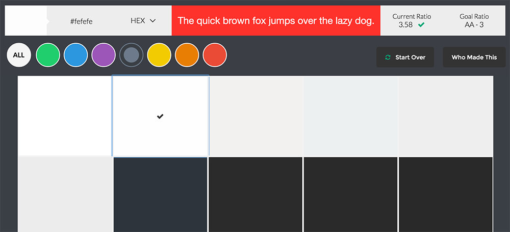
Once you click “OK”, you’ll get a brand new screen full of color recommendations. You can browse through color choices that best match your chosen background to find text colors with high readability ratios.
The WCAG has very strict color contrast ratio requirements to get a passing grade (either AA or AAA). This rating is based on a specific ratio, calculated by the hex codes and the dissonance to each other.
For example, a bright green font on a bright red background is a great way to fail the WCAG rating. That’s why this tool is so valuable.
Instead of randomly picking colors in Photoshop, you can select from predefined color choices tailored to suit your background. This ensures a high readability ratio and a smooth experience for all users.
We did a huge post on color contrast for accessibility, so definitely check that out if you’d like to learn more. And, if you’re stuck finding a great color combo for your website visit Color Safe and give it a shot. It will definitely help you find a color scheme that works.
Read Also: How to Design For People With Accessibility Needs