Convert PSD to CSS Codes Easily With CSS3Ps
Photoshop isn’t only the popular choice for photo editing, it’s also a good choice for designing a website. We have previously shown you how to design a blog layout with Photoshop. With a range of effects and features, Photoshop allowed us to compose a visually rich presentation using drop shadows, rounded corners, inner glow, outer glow, and texture, among other effects that make a website look fascinating.
But, the problem comes when we are about to convert those heavy effects into CSS3. It would be a very tedious task indeed to convert every piece of effect into CSS3. If you are facing this problem, we hope this tip can help you out.
Best PSD To HTML Services to Code Your Design
In this Internet world full of business opportunities, having a semantic and user-friendly website is important to the... Read more
Using CSS3Ps
CSS3Ps is a free Photoshop plugin and a cloud-based service to convert your Photoshop layers to CSS3, SCSS and Sass syntax in seconds – and yes, this plugin supports SCSS and Sass for Compass as well.
This plugin is available for Photoshop CS3 up to the latest CS6, and at the time of this writing, it supports the following conversion (more features will be added in the future).
| Photoshop Effect or Object | CSS3 Property |
| Object Size | height and width |
| Shape with Border Radius | border-radius |
| Stroke | border |
| Inner Glow, Outer Glow, Drop Shadow, and Inner Shadow | box-shadow |
| Text | font, text-transform, text-decoration, and color. |
In addition, CSS3Ps also added the vendor prefixes for cross-browser compatibility.
For this demonstration, we will convert the following transparent objects, as pointed in the following screenshot, from this PSD at Premium Pixels.
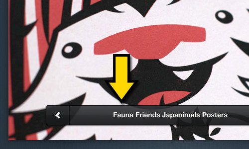
This plugin is simple to work. Just select the corresponding layer for the object, and click the CSS3Ps bar, as shown below.
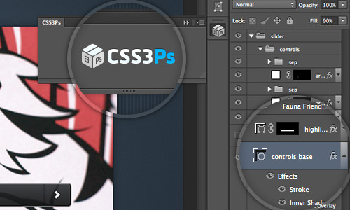
Then, we will be redirected to the CSS3Ps webpage, where the output is generated. In our case, the output is as shown in the following snippets.
The result is clever, it turned the Opacity effect into Alpha channel from RGBA format.
 controls base
{
    width: 500px;
    height: 40px;
    -webkit-border-radius: 4px;
    -moz-border-radius: 4px;
    border-radius: 4px;
    background-color: rgba(34, 36, 38, .9);
    -webkit-box-shadow: 0 1px 3px rgba(0, 0, 0, .7),
                       inset 0 2px rgba(255, 255, 255, .15);
    -moz-box-shadow: 0 1px 3px rgba(0, 0, 0, .7),
                     inset 0 2px rgba(255, 255, 255, .15);
    box-shadow: 0 1px 3px rgba(0, 0, 0, .7),
                inset 0 2px rgba(255, 255, 255, .15);
    border: solid 1px #000;
    background-image: -webkit-linear-gradient(bottom, rgba(0, 0, 0, .35), rgba(255, 255, 255, .35));
    background-image: -moz-linear-gradient(bottom, rgba(0, 0, 0, .35), rgba(255, 255, 255, .35));
    background-image: -o-linear-gradient(bottom, rgba(0, 0, 0, .35), rgba(255, 255, 255, .35));
    background-image: -ms-linear-gradient(bottom, rgba(0, 0, 0, .35), rgba(255, 255, 255, .35));
    background-image: linear-gradient(to top, rgba(0, 0, 0, .35), rgba(255, 255, 255, .35));
}
Final Thoughts
This plugin is really a time saver and reduces the workload involved. It is worth noting that in order for this plugin to convert appropriately, make sure to use the right Photoshop fx for displaying the effect.
The only downside that I saw from this service is the waiting time, as the process is done in the Cloud. Depending on your Internet connection, the speed may vary. Still, it is practically faster than doing the conversion manually.
Have you tried this plugin? Feel free to share your thoughts in the comment box below.