Create, Control, & Customize Your Website’s Modal Window with Vex
A modal window can greatly enhance user interaction on your website. Often referred to as a modal box, this feature is essentially a dialog box displayed within your webpage. We previously offered a tutorial on creating modal windows with the Bootstrap Plugin in a previous article.
This article will introduce you to Vex, another fantastic tool for crafting modal windows, which utilizes the jQuery library for seamless integration.
Vex stands out as a fully customizable Javascript library, facilitating the easy creation of modal windows. This lightweight jQuery plugin offers an alternative to the native dialog box provided by browsers.
Getting Started
First off, let’s get the Vex script ready. It’s available for download here. After downloading, ensure to include the latest version of jQuery in the header of your webpage using the script below.
<script src="http://code.jquery.com/jquery-latest.min.js"></script>
To integrate Vex into your project, you must include both the vex.js and vex.css files in your site’s header. For simplicity, instead of separately adding vex.js and vex.dialog.js, you can use vex.combined.js or its minified version, vex.combined.min.js.
Let’s proceed by including the necessary Vex library files in the header as shown below.
<script src="vex.combined.min.js"></script>
<link rel="stylesheet" href="vex.css" />
<link rel="stylesheet" href="vex-theme-os.css" />
In the script above, vex-theme-os.css is a pre-designed Vex theme that’s ready to use. If you’re interested in exploring other themes, the documentation and demo here can guide you through the available options.
Applying Vex
The foundational methods within Vex include vex.dialog.alert, vex.dialog.confirm, and vex.dialog.prompt. Additionally, there’s vex.dialog.open, a versatile method that combines these functions for advanced applications, such as creating forms, login interfaces, or multiple modal windows.
Next, let’s construct a straightforward login modal window using the vex.dialog.open method. Before diving into the method, it’s crucial to set our theme via the defaultOptions.className option. Applying the theme is straightforward – simply assign the theme name to the option like this:
vex.defaultOptions.className = 'vex-theme-os';
For additional options and API documentation, visit the Vex advanced documentation page.
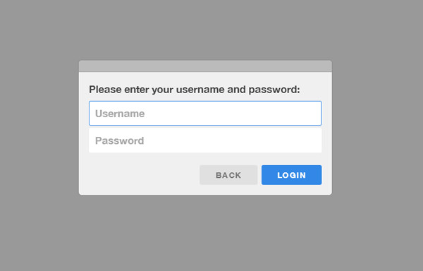
As previously mentioned, vex.dialog.open essentially integrates three other methods for a more complex use-case. Below is a sophisticated example where we internally utilize alert, confirm, and prompt to create a login dialog.
<script>
  vex.defaultOptions.className = 'vex-theme-os';
  vex.dialog.open({
    message: 'Please enter your username and password:',
    input: "<input name=\"username\" type=\"text\" placeholder=\"Username\" required />\n<input name=\"password\" type=\"password\" placeholder=\"Password\" required />",
    buttons: [
      $.extend({}, vex.dialog.buttons.YES, { text: 'Login' }),
      $.extend({}, vex.dialog.buttons.NO, { text: 'Back' })
    ]
  });
</script>
Thus, our login modal appears as follows.
<script> vex.defaultOptions.className = ‘vex-theme-os’; vex.dialog.open({ message: ‘Please enter your username and password:’, input: “<input name=\”username\” type=\”text\” placeholder=\”Username\” required />\n<input name=\”password\” type=\”password\” placeholder=\”Password\” required />”, buttons: [ $.extend({}, vex.dialog.buttons.YES, { text: ‘Login’ }), $.extend({}, vex.dialog.buttons.NO, { text: ‘Back’ }) ] }); </script>