5 <IMG> CSS Properties You Should Know
There are CSS properties, such as background images, border images, masking, and clipping properties, with which you can directly add images to web pages and control their behavior. However, there are also less frequently mentioned image-related CSS properties that work on images added with the <img> HTML tag, which the preferred way of adding images to web pages.
The job description of these latter properties varies from controlling the image shadow to setting the sharpness, helping us better control the appearance and the position of images added with the <img> tag. Let’s see them one by one.
Read Also: 3 Ways to Turn Web Images to Grayscale
1. Sharpen images with image-rendering
When an image is upscaled, the browser smoothens the image, so it doesn’t look pixelated. But, depending on the resolution of the image and screen, this might not be the best at all times. You can control this browser behavior with the image-rendering property.
This well-supported property controls the algorithm used to scale an image. Its two main values are crisp-edges and pixelated.
The crisp-edges value maintains the color contrast between pixels. In other words, no smoothening is done to images, which great for pixel artwork.
When pixelated is used, the nearby pixels of a pixel might take up its appearance, making it seem like together they form one big pixel, great for high-resolution screens.
If you keep looking closely at the flower edges in the GIF below, you can see the difference between a regular and a pixelated image.
img {
  image-rendering: pixelated;
}

2. Stretch images with object-fit
The contain, cover, fill values are all familiar, we use them for the background-size property that controls how a background image fills up the element it belongs to. The object-fit property is quite similar to it, as it also determines how an image sizes inside its container.
The contain value contains the image within its container. cover does the same, but if the aspect ratio of the image and the container doesn’t match, the image is clipped. fill causes the image to stretch and fill its container. scale-down chooses the smallest version of the image to display.
<div id='container'>
  <img src="rose.png' alt="rose flower'>
</div>
#container {
  width: 300px;
  height: 300px;
}
img {
  width: 100%;
  height: 100%;
  object-fit: contain;
}

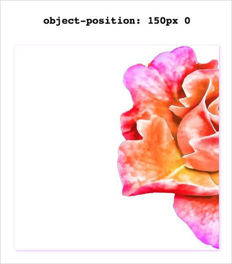
3. Shift images with object-position
Similarly to the complementing background-position property of background-size, there’s an object-position property for object-fit, too.
The object-fit property moves an image inside an image container to the given coordinates. The coordinates can be defined as absolute length units, relative length units, keywords (top, left, center, bottom, and right), or a valid combination of them
(top 20px right 5px, center right 80px).
<div id='container'>
  <img src="rose.png' alt="rose flower'>
</div>
#container {
  width: 300px;
  height: 300px;
}
img {
  width: 100%;
  height: 100%;
  object-position: 150px 0;
}
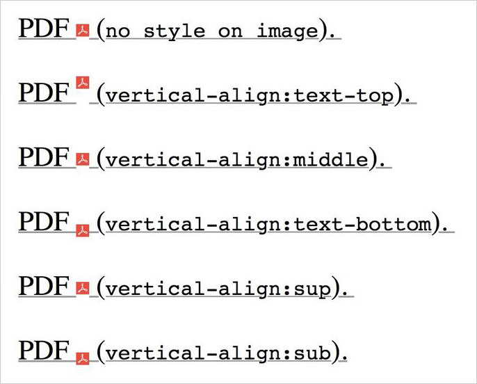
4. Situate images with vertical-align
We sometimes add <img> (which are inline by nature) next to text strings for added information or decoration. In that case, aligning the text and the image into the desired position can be a tad bit tricky—if you don’t know which property to use.
The vertical-align property is not exclusive to table cells alone. It can also align an inline element inside an inline box, and thus can be used to align an image in a line of text. It takes a fair number of values that can be applied to an inline element, so you have many options to choose from.
<p>
PDF <img width="15" src="pdf.png"
style="vertical-align:text-top" alt="Image">
</p>
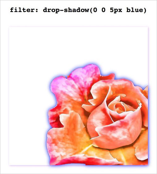
5. Shadow images with filter: drop-shadow()
When used inconspicuously in texts and boxes, shadows can add life to a web page. The same is true for in images. Images with core shapes and transparent backgrounds can benefit from the drop-shadow CSS filter.
Its arguments are similar to the values of the shadow-related CSS properties (text-shadow, box-shadow). The first two represent the vertical and horizontal distance between the shadows and the image, the third and fourth are the blur and the spread radius of the shadow, and the last one is the shadow color.
Just like text-shadow, drop-shadow also creates a shadow that is molded to the belonging object. So, when it’s applied to an image, the shadow takes the shape of the visible portion of the image.
img {
  filter: drop-shadow(0 0 5px blue);
}