Mastering Clipping and Masking Techniques with CSS
Masking in image editing is a method of “hiding” a portion of an object based on another object. This method has long been available in image editors like Photoshop. A similar method can also be achieved in CSS using specific properties.
Before we proceed, let’s first take a look at how this effect is done in Photoshop, and then we’ll explore how to replicate a similar effect with CSS.
In Photoshop
In Photoshop, at least two objects are required for masking. After that, simply hold the Alt (Win) or Option (Mac) key and position the mouse pointer between the layers of these two objects (see screenshot).
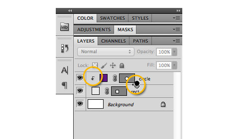
In this example, a circle is clipped into a rectangle.

Masking can also be applied to other types of layers. In this example, an image is masked to text.

So, can we apply similar techniques on the web? The answer is yes. Let’s see how it’s done.
In CSS
There are several CSS properties we can use to recreate similar effects on the web, such as overflow, clip, and the new CSS3 property background-clip.
Overflow
The overflow property defines the area that exceeds the CSS box model. In the following example, we recreate the first Photoshop example.
In the HTML markup, we will have two div elements to form the circle and the rectangle. The circle’s div is nested inside the rectangle’s div like so:
<div class="rect">
    <div class="circle"></div>
</div>
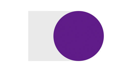
Next, we style the elements and position the circle slightly out of the rectangle to the right.
.rect {
    width: 200px;
    height: 200px;
    background-color: #eaeaea;
}
.circle {
    width: 200px;
    height: 200px;
    border-radius: 100px;
    background-color: #601785;
    position: relative;
    left: 100px;
}
At this point, we achieve the following result:
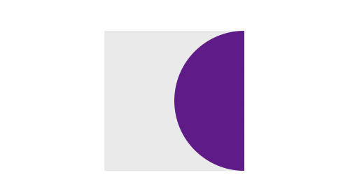
Now, to hide the part that exceeds the rectangle area, simply declare the overflow property as hidden on the rectangle like so:
.rect {
    width: 200px;
    height: 200px;
    background-color: #eaeaea;
    overflow: hidden;
}
And there we have it; the result is the same as the Photoshop method.
Clip
Another method is using the clip property. This property has been around since CSS2, so it is supported by older browsers. By using clip, we won’t need the rectangle div. Instead, our markup will just be the circle, as shown below:
<div class="circle"></div>
With the same style, we form this div into a circle. Then, we use the clip property to hide half of this circle. The clip property supports the rect() function, which contains four values defining the rectangle’s coordinates as rect(top, right, bottom, left).
Lastly, for the clip property to work in hiding the element, we need to set the element’s position to absolute.
.circle {
    width: 200px;
    height: 200px;
    border-radius: 100px;
    background-color: #601785;
    position: absolute;
    left: 100px;
    clip: rect(0px,100px,200px,0px);
}
This code will result in the following. Unfortunately, since we define the rectangle through the rect() function, we cannot add a background color to it, but the concept of masking elements is still there.

Background Clip
CSS3 introduced a new property called background-clip, which determines the background painting area. This property allows us to limit where the background will be applied.
The full syntax of this property is: background-clip: border-box|padding-box|content-box;.
WebKit browsers have extended this property by adding the text value, making it possible to use text for masking. In the following example, we will recreate the second masking effect from our Photoshop example. First, we add the text like so:
<h1>Galaxy</h1>
Next, in the stylesheet, we add a background-image to the text and declare the background-clip property. To make the background visible, we also decrease the text color’s opacity using RGBA color mode.
h1 {
    font-family: Arial;
    font-size: 5em;
    text-align: center;

    background-image: url(Galaxy.jpg);

    -webkit-background-clip: text;
    background-clip: text;

    color: rgba(0,0,0,0);
}
This code will produce the following effect for the text.

Final Thoughts
In this post, we have covered three different approaches to masking objects on the web. There is no one best way; it depends on the purpose. Have you tried these properties on your website? Do you have other tips for achieving similar effects? Share your thoughts in the comment box below.