How to Create a Switch UI Using CSS Mask
In image processing, masking is a technique that allows you to hide an image with another. A mask is used to make a portion of an image see-through. You can perform masking using CSS with the help of masking properties.
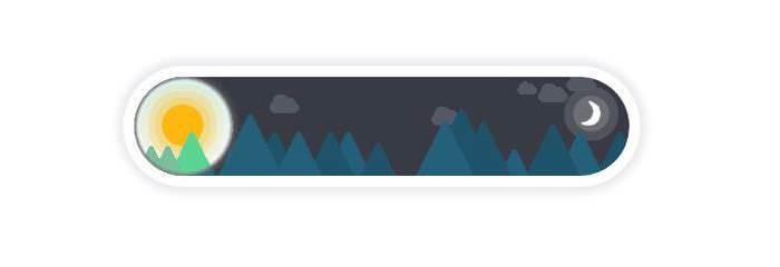
In today’s post, we’ll create a masked image using two PNG images and CSS masking techniques, and allow users to handle the two states of the image (day and night) with the help of a switch UI.
Because of some browser-compatibility issues — not all masking properties are supported in every browser (as of June 2016) — I will show two techniques for adding masks, one for Webkit-based browsers and one for Firefox. The first two steps in this three-step tutorial are the same for every browser, but there will be a difference in the third step.
Read more: Clipping and masking with CSS
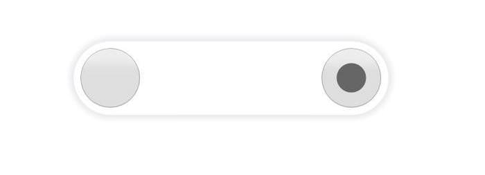
Step 1. Create A Basic Switch
Since a typical switch has two states with only one enabled at a time, you can use a radio button group of two to create the working components of the switch. Place each radio button at the left and right ends of their parent element.
Radio button groups are created by giving each radio button the same name attribute. In a radio button group, only one radio button can be checked at a time.
We start with the following HTML and CSS:
HTML
<div id="outerWrapper">
    <div id="innerWrapper">
        <input type="radio" id="leftRadio" class="radio" name="radio" />
        <input type="radio" id="rightRadio" class="radio" name="radio" checked />
    </div>
</div>
CSS
In the CSS below, I used absolute positioning to place the radio buttons on the screen exactly where I want.
#outerWrapper {
    width: 450px;
    height: 90px;
    padding: 10px;
    margin: 100px auto 0 auto;
    border-radius: 55px;
    box-shadow: 0 0 10px 6px #EAEBED;
    background: #fff;
}

#innerWrapper {
    height: 100%;
    border-radius: 45px;
    overflow: hidden;
    position: relative;
}

.radio {
    width: 90px;
    height: 100%;
    position: absolute;
    margin: 0;
    opacity: 0;
}

#rightRadio {
    right: 0;
}

.radio:not(:checked) {
    cursor: pointer;
}
I added the opacity:0 rule to the .radio class to hide the radio buttons. The last rule in the code block below, cursor: pointer; shows the pointer cursor for the unchecked radio button, so users know which button to click to toggle the switch state.
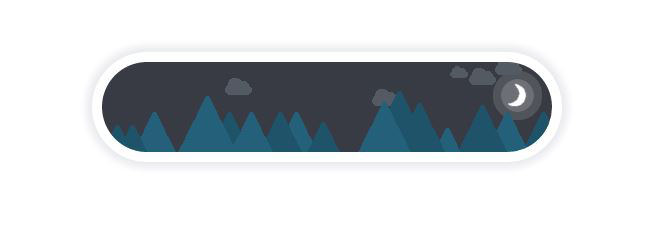
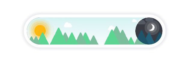
Step 2. Add Skins to the Switch
In this step, we’ll add two <div> tags for the two skins below the radio buttons in our HTML file, and a background image to each skin in our CSS.
I’m using “Day” and “Night” as the two states of the switch, inspired by a Dribbble shot by Minh Killy Le.


HTML
    <div id="daySkin" class="skin"></div>
    <div id="nightSkin" class="skin"></div>
CSS
#daySkin {
    background-image: url('day.png');
}

#nightSkin {
    background-image: url('night.png');
}

.skin {
    width: 100%;
    height: 100%;
    pointer-events: none;
    position: absolute;
    margin: 0;
}
The pointer-events: none; rule is added to the skins so that click events on the switch can pass through them and reach the radio buttons.
With the pointer-events CSS property, you can set the circumstances under which a graphic element can be targeted by mouse events.
As an alternative for the code above, two <img> tags (with source images) inside the <div> tags can also work. They will be the skins for the two switch states.
Step 3a. Add Mask (Webkit version)
For Chrome and other Webkit-based browsers, I will use the mask-image CSS property, which — as of the writing of this post — only works with the -webkit prefix in Webkit browsers. The mask-image property lets you specify the image to be used as the mask.
In general, there are two kinds of masking: luminance and alpha.
- In luminance masking, the dark portion of the mask image hides the image it is masking: the darker a portion is in the mask image, the more hidden that portion is in the image being masked.
- In alpha masking, the transparent portion of the mask image hides the image it is masking: the more transparent a portion is in the mask image, the more hidden that portion is in the image being masked.
In Chrome (as of version 51.0.2704.103, Win10), only alpha seems to currently work.
In CSS, alpha and luminance are the values of the mask-type property.
Here is the CSS that adds a mask to background images in Webkit browsers:
CSS
#nightSkin {
    background-image: url('night.png');
    mask-type: alpha;
    /* transparent circle with remaining portion opaque */
    -webkit-mask-image: radial-gradient(circle at 45px 45px,
        rgba(0, 0, 0, 0) 45px,
        rgba(0, 0, 0, 1) 45px);
}

/* When day skin selected */
#leftRadio:checked ~ #nightSkin {
    mask-type: alpha;
    /* opaque circle with remaining portion transparent */
    -webkit-mask-image: radial-gradient(circle at 405px 45px,
        rgba(0, 0, 0, 1) 45px,
        rgba(0, 0, 0, 0) 45px);
}
I used the -webkit-mask-image property to create the initial mask image. Its value uses the radial-gradient() CSS function that’s used to create an image from a pre-defined shape, a radial gradient, and the center of the gradient.
For the night skin, I created a transparent circle, and I made the remaining part of the container opaque. For the day skin, I did the opposite: created an opaque circle with the radial-gradient() function and made the remaining portion transparent.
Although it’s not yet supported in Webkit browsers, I added the mask-type property to the CSS for future reference.
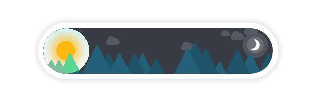
As you can see above, the border of the circle isn’t very smooth. To hide the rough edges, add a <div> after the skins in the shape of a circle (same size as the mask circle) with a box shadow. The shadow will hide the rough edges of the circle mask.
HTML
<div id="switchBtnOutline"></div>
CSS
#switchBtnOutline {
    width: 90px;
    height: 100%;
    border-radius: 45px;
    box-shadow: 0 0 2px 2px grey inset, 0 0 10px grey;
    pointer-events: none;
    position: absolute;
    margin: 0;
}

/* Place #switchBtnOutline at the right end when day skin is selected */
#leftRadio:checked ~ #switchBtnOutline {
    right: 0;
}
Step 3b. Add Mask (Firefox version)
The mask-image CSS property is actually a longhand property, and it’s part of the shorthand property mask that lets you specify the image to be used as a mask as well. While mask-image isn’t supported in Firefox yet, mask is.
Although the mask property should accept an image created with the radial-gradient() CSS function as a value, just like the mask-image property did, there’s no support for that in Firefox yet.
So, instead of a radial-gradient() image, let’s use an SVG image as the mask image with the mask type luminance.
<svg>
    <rect x="0" y="0" width="450" height="90" fill="rgb(255,255,255)" />
    <circle cx="45" cy="45" r="45" />
</svg>
The SVG image above looks like a combination of a white rectangle and a black circle. Add this, and another one with a black rectangle and a white circle as masks to the HTML we used in the Webkit version.
HTML
<svg>
    <defs>
        <mask id="leftSwitchMask">
            <rect x="0" y="0" width="450" height="90" fill="rgb(255,255,255)" />
            <circle cx="45" cy="45" r="45" />
        </mask>

        <mask id="rightSwitchMask">
            <rect x="0" y="0" width="450" height="90" />
            <circle cx="405" cy="45" r="45" fill="rgb(255,255,255)"/>
        </mask>
    </defs>
</svg>
Replace (or combine with) the CSS code for #nightSkin we used in the Webkit version with the following code. And you’re done.
We now have two different mask images (CSS gradient & SVG), two different mask types (Alpha & Luminance), and support for both Webkit and Firefox.
CSS
#nightSkin {
    background-image: url('night.png');
    mask-type: luminance;
    mask: url(#leftSwitchMask);
}

#leftRadio:checked ~ #nightSkin {
    mask-type: luminance;
    mask: url(#rightSwitchMask);
}