Mastering Mobile Layouts: Tips and Examples
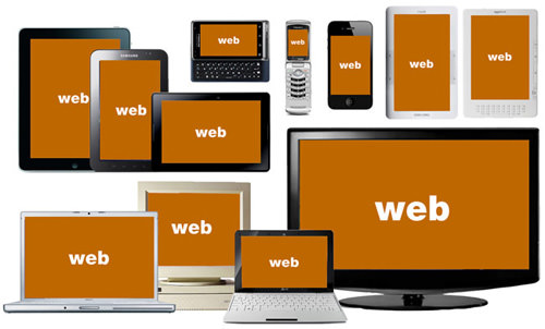
Designers have it tougher now than before. We not only have to design for stationary devices, but also mobile devices like tablets and smartphones, and since we are talking about a lot of different screen sizes and resolutions here, it’s a huge task to shoulder.
In light of this, responsive web design could be the best solution. It offers more than just a simple mobile template; instead, your entire site layout is designed to be flexible enough to fit into any possible screen resolution.
With such a fluid design scheme, there are obvious benefits and drawbacks. Consider my examples below for how responsive web design can make the transition into mobile devices a smoother one.
How Responsive Design Works
When I use the word “responsive” in terms of web design, I mean that the entire layout responds based on the user’s screen resolution. Imagine this scenario: you’re reading a website on one tablet, then you switch to another device for one reason or another. The browser window is now re-sized. A responsive web design layout will feature schemes and a layout that gracefully breaks down and reinvents itself. From a usability perspective, this is a brilliant technique.
Responsive design is all about creating a homogeneous experience regardless of the browser or device screen size. I’ve found the perfect example from ‘A List Apart’ to illustrate my point, which also includes dynamic images.
The width is set in CSS using percentages for mostly all of the internal container elements. Larger websites also respond well to removing dynamic content, such as JavaScript, when it’s not supported.
Why Design for Mobile?
It has become evident that more users are going mobile, and not just for on-the-go web browsing either. Tablet PCs have begun to change in context when users are online in the classroom. Designing for mobile is certainly a requirement in modern-day web standards. The only problem is choosing your method of development and targeting your audience appropriately.
When you start coding for specific screen resolutions, you end up with too many stylesheets to deal with. Media queries in CSS3 can be used to build iPhone-specific layouts for both portrait and landscape views. Since you can predetermine the pixel density, it’s easy to revamp any HTML template for mobile.
But when you code a layout for responsive design, the mobile aspects are taken care of by default. Both desktop and mobile users will be offered a similar experience and you won’t need to worry about external CSS properties. The only research you’d need to perform is planning for the smallest possible display screen. Google Analytics traffic data can be very helpful for this.
You won’t likely get your website working 100% on every single device running every browser. But you can target a majority based on the average width of the screen. Older iPhone models use a 320×480 display resolution which isn’t so unbelievable. I would shoot for a minimum width of 240px, or even smaller if you can fit it.
Removing the Default Zoom
If you have spent any time browsing the Web on a smartphone, you’ll notice how websites are scaled out to fully display within the screen. This is for the user’s convenience since most websites do not have a mobile counterpart thus the full layout is the safest bet.
But when you get into building a responsive mobile design, the auto-zoom can really mess up your layout elements. Specifically, images and navigation content may appear small or too large in your layout. There is a special meta tag you can append into the document header, which resets this in most Android and iPhone devices.
<meta name="viewport" content="width=device-width; initial-scale=1.0; maximum-scale=1.0; user-scalable=0;" />
This is known as the viewport meta tag which sets up some custom variables within the content. Apple has a documentation page regarding a few other meta tags you should look into, although these are geared specifically toward websites on iOS. The initial-scale value is important as this defaults your website to a full 100% zoom.
The last value for user-scalable will remove this zoom functionality altogether so the user cannot resize the layout. This will lock the design into one size based on the full device width. Note that even if you disable the zoom functionality, a good, responsive design will still adapt when transitioning from portrait to landscape on any device! But it makes sense to lock a responsive design and remove the generic scaling options.
Dynamic Image Scaling
Images are another important facet of practically every website. Mobile users may not be looking to stream videos, but photos are a whole different story. These are also the biggest culprits when it comes to layouts breaking out of the box model.
img { max-width: 100%; }
The standard rule for CSS is to apply a max-width property to all images. Since they’ll always be set at 100% you will never notice distortions. When the user resizes their browser window smaller than your imagination can handle, it’ll automatically re-adjust to 100% width scaled down. The problem is that Internet Explorer cannot understand this property, so you’ll need to put together an IE-specific stylesheet using width: 100%;.
Flexible images are also possible if you use JavaScript or jQuery plugins. There are some really smart developers out there who have put in the time to build incredibly responsive image content. This thread is just one of many in Stack Overflow which features an outlandish yet convenient approach to solving the IE6/7 bugs.
I would personally recommend sticking to natural CSS image resizing. If your website is running in a mobile browser with JavaScript enabled it can most likely support CSS as well. If you really want to dig deeper, check out this 24 ways article Images for Adaptive Designs.
Touching Designs
Web developers may forget that mobile users aren’t on keypad phones like BlackBerrys anymore. A majority of smartphones today use touchscreen interfaces, which render a scenario different from mouse-and-keyboard setups.
As such, you’ll need to consider alternate solutions in mobile elements. Dropdown menus may work better when displayed as a single menu on the right-hand side. Most users are able to tap links on the right side easier than on the left, but either column works to alleviate space. Using margin indents, it’s simple to identify the link hierarchy without requiring any jQuery code.
It’s also good practice to increase the size of these navigation links. Mobile users do not have the luxury of a large screen afforded on desktops or even laptop computers.
You need to keep text large, up-front, tapable, and readable at all costs. You may even want to resize if the user switches between portrait and landscape view – a fairly common recurrence when browsing the mobile web.
Custom CSS Layouts
In general, it’s best to adapt your layout and allow for the natural degradation of your content. If you have a sidebar and content area, you should set them in widths of percentages or ems, anything that will re-size with the browser window. If you apply a min-width, this will eventually break off part of the layout; so now your sidebar content displays above the page content.

When you consider how this affects the overall design, it’s a lot easier to develop external stylesheets. However, you are likely to run into screen resolutions that are just too small for your layout to render. This is the perfect scenario for adding custom CSS properties to remove portions of the page or reformat the content altogether.
Toggle Extra Content On/Off
Examples of large content blocks include web forms, dynamic menus, image sliders, and other similar ideas. Instead of completely removing these elements as the layout gets smaller, why not simply hide them in a “minimized” content div? You could use either CSS or JavaScript to perform the edits, but ultimately you’ll likely need some JS code to create a toggle button.
This alternative is perfect for keeping your home page dynamic and full of rich web media. Instead of completely removing your drop-down navigation or rearranging the page structure, you can hide it within a content div. If the user wants to display your links, they tap a toggle button to open/close the menu.
This formatting is simple, intuitive, and easy to work with on touchscreen devices. Inside the div, you can place each of the dropdown menus side-by-side in a column format. As the window resizes even smaller, they will naturally drop below each other and increase the page height. Yet the option to collapse the entire menu is easily attainable and just a single tap away. This toggle div is also perfect for image sliders in cooperation with dynamic photo re-sizing.
Using Media Queries
If a mobile screen breaks your two or 3-column layout, you’ll end up with each of the content areas stacked above each other. The whole site would appear to bleed over and may come off very confusing without distinguished block areas. A better idea is to add a bottom border on each column, only for mobile devices, using an external stylesheet like mobile.css.
<link rel="stylesheet" type="text/css" media="screen and (max-device-width: 480px)" href="css/mobile.css" />
With these new styles your content is broken up into divisible sections. The media attribute above is specially designed to target older iPhone devices in landscape view. But it will also apply to devices with screens smaller than 480 pixels. Use this to your advantage so you can determine at what point the layout “breaks up”.
There are a few more options you can use for detecting device orientation. This fantastic guide on CSS media can give you a few ideas. Additionally the new mobile project 320 and up offers a boilerplate for mobile CSS @media styles. These can be included directly into the same mobile.css file and apply rules for many different devices.
/* Smartphones (portrait and landscape) ----------- */
@media only screen
and (min-device-width : 320px)
and (max-device-width : 480px) {
/* Styles */
}

/* Smartphones (landscape) ----------- */
@media only screen
and (min-width : 321px) {
/* Styles */
}

/* Smartphones (portrait) ----------- */
@media only screen
and (max-width : 320px) {
/* Styles */
}

/* iPads (portrait and landscape) ----------- */
@media only screen
and (min-device-width : 768px)
and (max-device-width : 1024px) {
/* Styles */
}
(Source: Hardboiled CSS3 Media Queries)
Helpful Tools
- Skeleton – Beautiful Boilerplate for Responsive Mobile Design
- Going from adaptive to fully responsive
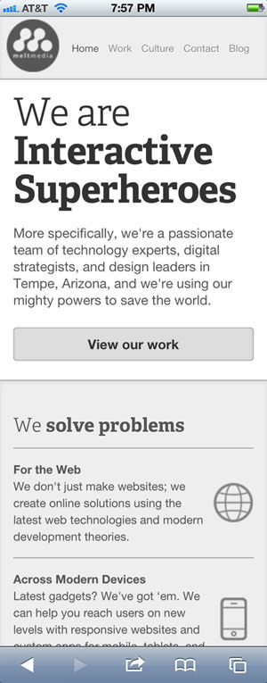
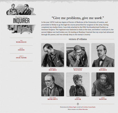
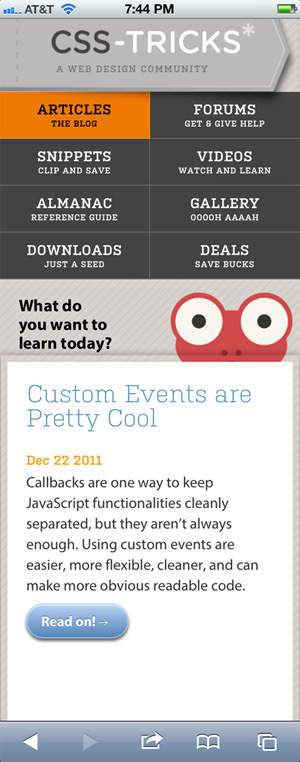
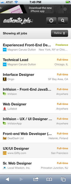
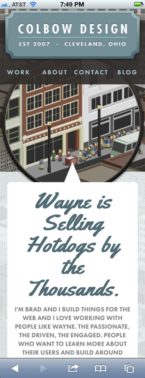
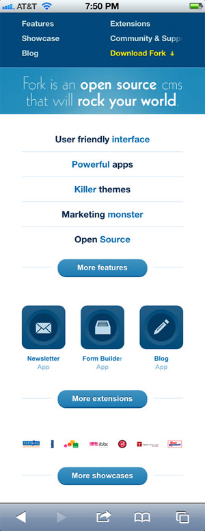
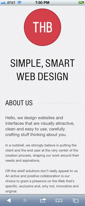
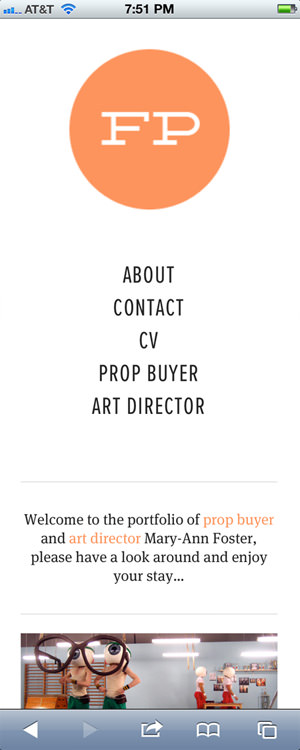
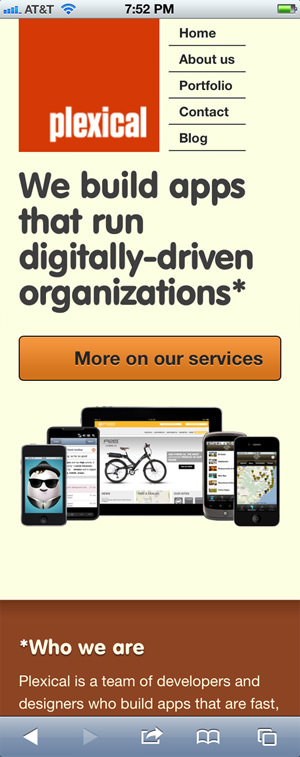
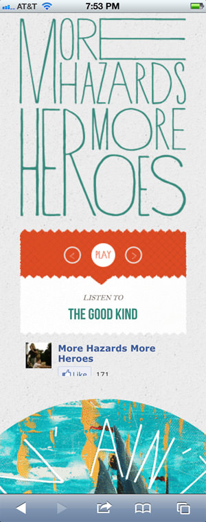
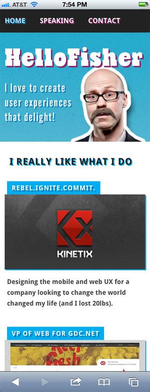
Showcase: Beautiful Responsive Designs
I hope these tips and design techniques will encourage you to move towards building exciting responsive layouts not just for mobile screens, but for any common device with web browsing. To keep the creative juices flowing I have put together a small showcase of responsive mobile web designs. Be sure to check out some of the more unique features and share your thoughts on the design or the topic in the discussion area.


Hardboiled Web Design

Future Friendly
We Can’t Stop Thinking

Colbow Design
320 and up

The Happy Bit

Plexical
Preeti Cakes

More Hazards
Dentistry’s Information Centre


Hello Fisher
Social Marketer’s Summit

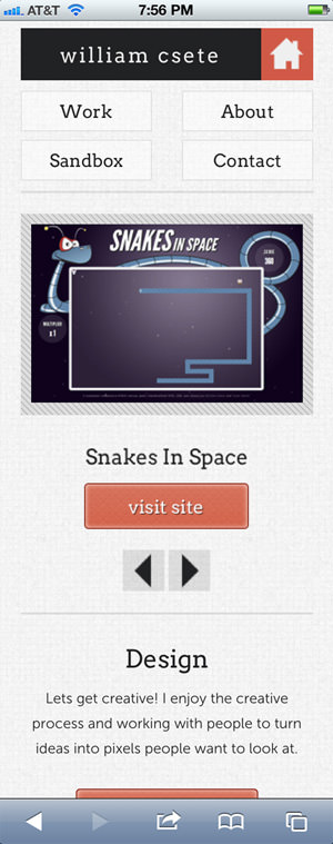
William Csete
Woolly Robot