Designing a Winning Navigation Menu (Ideas and Inspirations)
Note: This post was first published on the 20th December, 2012.
The navigation menu on a website is like a road sign on a street or a level directory in a shopping mall. You cannot reach your destination without first knowing where you are. Like in real life, navigation in web design is very important and plays a major role in a website’s usability as well as in user experience.
Nowadays, you can see plenty of different types of navigation menus with interesting, creative, and unusual designs. But how about effective navigation in a website, what would it look like; how should it look like?
Today, I would like to share my observations and knowledge about the importance of navigation in web design. I will reveal a few simple tips that you can use to improve your website navigation and usability. There will also be some examples of effective navigation menus to give you some idea of how to plan your next design.
Breadcrumb Navigation: Best Practices and Examples
Breadcrumb navigation is often overlooked in the design and development process. Some people may see it as unnecessary, while... Read more
Information Architecture
Navigation planning should start with information architecture. It is vital to sit down and brainstorm about a website’s information architecture. You have to figure out what kind of features the website offers, what is most important, and what could be placed at lower levels in the information hierarchy.
Information architecture includes features, user needs, sitemap, testing and wireframes. You can read more about information architecture in article by Cameron Chapman in Information Architecture 101: Techniques and Best Practices.

Using user-enabled technologies
Avoid using Flash, JavaScript, jQuery, or anything else that risk inhibiting access to your website navigation in building your navigation bar, or at least make sure they can degrade gracefully.
For more references on graceful degradation of javascript, check out this post on 10 Useful Fallback Methods for CSS and Javascript.
Use simple, User-friendly terms
It is better to use simple, obvious terms that are easy to figure out than to keep to industry-only terms for your navigation menu. Any link that takes users more than a second or two to figure out is probably unsuitable for use.
If a user needs to click on a link to figure out what the link leads to, then this will contribute to a bad user experience for your visitors.
Examples
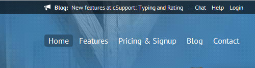
Terms in the navigation menu of Larissa Ness’ website are easy to understand and common enough. Users won’t find it confusing because they already have experience with menus like this.

Creative agency Eighty8Four uses the term “showroom” which can be confusing for visitors. This term might mean portfolio or work, but it is not clear, and visitors have no choice but to click in to check it out.

Standardize the Navigation design
Use the same navigation model in all your pages. It is very important because, without a consistent design, a user may actually think he is on another website. Make sure that you use the same navigation model so that users can easily go about your website without being lost.
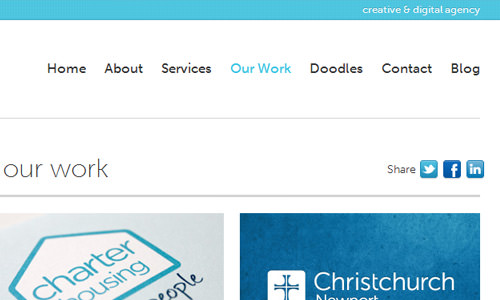
Bluegg, shown below, uses a simple and clean navigation design which remains the same in all subpages. The only difference is the color indicator, which shows the page the visitor is currently at.
Indicate where you are
It is crucial to let the user know where he is at all times. You can do this by changing the link’s background, color of the page name or turn the text bold in the navigation menu to make it different from others.
Austin Eastciders uses a different color and background to indicate the page the user is on. This indicator can also work as a subtle design change, for example, by using a different navigation background which creates the feeling that other menu items are in-depth.

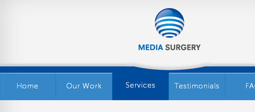
Media Surgery uses a darker color as an indicator for an opened subpage. Simple but effective.
Use web conventions
It is all about easy-to-use and intuitive website navigation. Web conventions make it a lot easier for designers to work around their designs. Most users would click on the website logo to return to the homepage, so design your logo to do that.
If you don’t, you are making them spend time to learn something new or, in some cases, inconvenience them by not providing what they expect to be commonly accepted navigational norms.
You can learn more about web conventions here:
Inject Design places the logo at the top left corner which fits one of the most used web conventions today.

Adams Creation uses one of the most common web conventions – logo is placed on the left top corner of the website and links to the homepage.

Test it: Involve a 3rd party
Always test your navigation design with anyone who has used the Internet before. You might want to bring in people unrelated to the design process to test it. Observe their preferences when they navigate through your site and analyze the time it took for them to find the pages that they were looking for.
For better accuracy, involve more people, collect the data, analyze and summarize it for a better fit. Do an after-test survey if it is necessary. You may get some unexpected ideas and input that would otherwise go undetected without this test run.
Read more on how to get better user feedback for your website
Provide context
To be consistent with your content and navigation, provide some context for website users to find things they need quickly. You can place small icons related to the content you link to or short descriptions to give an overview of what the page is about.
My Own Bike uses simple icons to give users more information about what they can find in certain subpage.

Sarah Parmenter uses short and nice captions under main navigation to provide some information about the subpages the main navigation is linking to.

SEO purposes
Google likes consistent navigation. It is good to have consistent navigation not only for users to understand and get an idea of how to navigate through your website but also for search engines to index your website.
Search engine robots will crawl through your website to index your website and put the links in the search engine results page. If you want to be visible, pay attention to good navigation design and get more traffic.
Free navigation scripts (CSS, and jQuery)
Here is a short list of the latest navigation menus you might find useful for your projects. These scripts will make your product’s user experience even better by adding some nice features and making it a pleasure to use.
XML-driven Vertical News Scroller Script using HTML and jQuery: vScroller


Page Scroller


CSS3 Minimalistic Navigation Menu

Circle Navigation Effect with CSS3

Grid Navigation Effects with jQuery


Create An Elegant CSS3 Navigation Menu
Showcase of beautiful horizontal navigation
And last but not least, some inspiring horizontal navigation menus. Check these amazing websites and their navigation menu solutions to find new ideas for your projects.


Libor Zezulka


Neil Carpenter


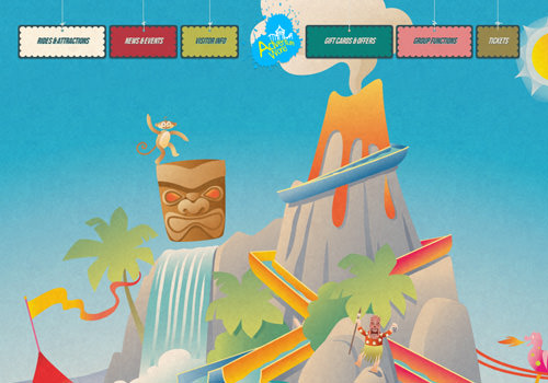
Adventure World
Arbutus Photography

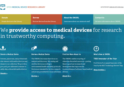
OMDRL


Hopefully, you will find this article useful and informative. If you have any thoughts or if you disagree, please share your opinion in the comments section.