40 Mobile Apps Onboarding Designs for Your Inspiration
The very first thing users see when downloading an app these days is an onboarding screen. An onboarding screen is like a walkthrough, aimed to introduce what an app does to a user and of course how to use it. Thta’s the simplest way of describing it. Designing it however is a totally different thing.
An onboarding screen needs to be designed in the most simple, welcoming and user-friendly way possible. Onboarding screens like empty state pages created to inform and educate users. Not every app needs an onboarding screen although I think onboarding screens save users from the frustration of having to figure out on their own that new app they are trying out.
But let’s take a look at these 40 examples of onboarding screen designs from creatives from all over the world then you can tell me in the comments whether or not you are on board with the onboarding screen idea.
Designing Empty State Pages for Websites & Mobile Apps
Empty state pages are lesser-known design elements with a significant role in user experience. In its simplest form,... Read more
Check out these smooth illustrations and animated onboarding screens by Virgil Pana for inspiration. It’s designed with an education institution in mind.

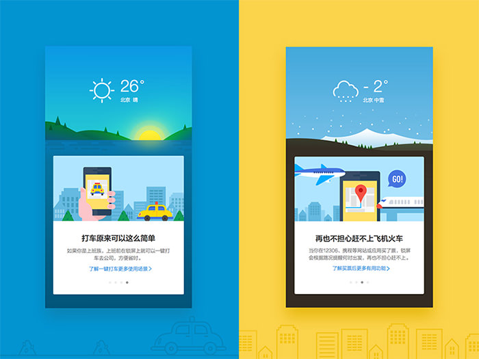
The onboarding illustrations for what seems to be a travel app features sceneries on the same rounded mountainous background. Designer Anggit Yuniar Pradito has a few more onboarding design ideas in his portfolio.

This onboarding design is part of of a presentation for an app called Bemyspot which appears to be shopping app that rewards you for selfies, discovering new spots and social sharings. It is designed by Rosario Sarracino and Ivan Paudice.

Each image on these screens is placed into postage stamps which alludes to the service it provides: delivery. Anastasiia Andriichuk understands that humor goes a long way as shown by astronauts and hot air balloons doing the deliveries.

Sasha Gorosh produced an engaging and fun onboarding screen inspired by Space travel. The illustrations are simple and can get you "on board" in no time.

"May the force be with you!" An onboarding screens where the planets get a makeover; inspired by Star Wars, created by Anton Chandra.

In a few line illustrations Aika explains what you can do with this travel app. You can slide the screens or close them with the X.

The layout, gradient, illustrations and use of color in this design is amazing. The CTA button is highlighted in orange which looks strangely awesome upon a deep blue background. A nice design by Murat Gursoy.
These cute little people were drawn to show you the app’s possibilities and features. They look pretty cute, in serious working mode, bu still cute.

Here is a smart use of icons on walkthrough screens. Green highlights on illustrations with greyed out portions look great. Designed by Nitesh Chandora.

This is one more onboarding screen with awesomely minimalistic illustrations with a green-eco theme going on. Navigation buttons are placed at the bottom of the screen for convenience. Designed by Martin Strba.
These illustrations show different places to visit around the world. It looks like a concept of onboarding for a travel guide app. Brief descriptions of the locations add to the allure. Another great piece by Anton Chandra.

The chat bubbles and the globe on the illustrations are drawn quite detailed. I can imagine how great it would look as an animation inside any discovery app. Nice work by Ghani Pradita.

These illustrations are similar to the orbital stylings of Ghani Pradita but are adopted throughout all the onboarding designs. These designs are by Faiz Al-Qurni.

These illustrations by Ivy Mukherjee are funny and creative, however, the wordings are a bit small and difficult to read. This however is the perfect example to show why well-done illustrations play a major role in the onboarding experience.

These onboarding screens are my favourite. I love the use of illustrations and the color scheme here. They look minimalistic, detached, yet still meaningful. Designed by Mariusz Onichowski.

Here is one more onboarding screen design created by Anton Chandra. Anton has a space inspiration thing going on in his designs, including this one.

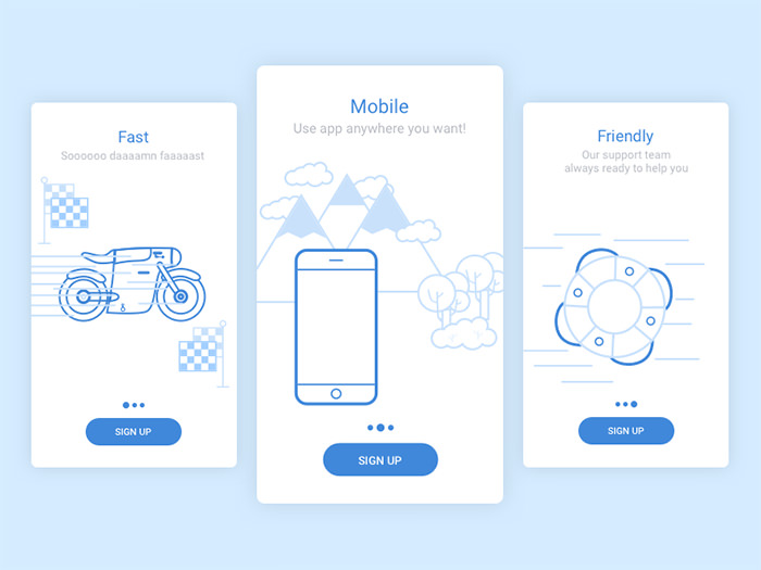
The onboarding screens describes an app that is fast, mobile, and friendly with appropriate illustrations that get the message across. Designed by Wayne Baryshev.
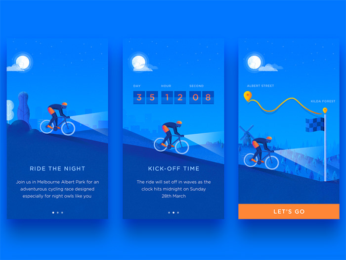
These onboarding screen were made for sea transport app. I think that day and night in the designs shows that this transportation company works 24/7. The influence of Material Design is strong int his one, by Ivan Bjelajac.

We finally see an onboarding screen design for e-Commerce, an industry that probably needs this type of design most. These are created by Katya Dihich to aid in the shopping process.

A greeting screen designed by Anggit Yuniar Pradito, this one shows a successful booking and isn’t afraid of using more than just one or two colors. Simple and minimalistic.

Speaking about colors, these onboarding screen by Dux Nguyen are amazingly bright and colorful. They clearly show that you can play games with your friends and chat with this app.

These are onboarding screens for budget hotel apps. Blue and white seem like a safe but still relevant color combination for a hotel booking app. This is designed by Muhammad Watsik Dzawinnuha.

Such playful illustrations will definitely make the onboarding experience more enjoyable. As you may have already guessed, these screens are made for a florist app. A nice color scheme and design by Jocelyn Crankshaw.

This is an onboarding design for a lock screen but which fits for a weather or travel app as well. Brilliant use of colors. The designer Xiu Yuan has more oriental designs in her portfolio.
These onboarding screens seem to have their own personality. Each screen is highlighted with different colors and a person-centric illustration. The designer, Min had fun with this project.

George Gao chose grey as the running color theme for these onboarding designs. The mascot is a nice touch, and it makes an appearance on every design for continuity.

A clean and funny onboarding screen designs by Anwar Hossain Rubel for a travel app. I like the watercolored clouds on the background and colorful dots which add something magical to the design.

Ray Martin created these for a social app. The use of gradient onboarding screens for the app called Vue gives off a stunning effect. Sometimes we just have to be brave with color choices.

These are onboarding designs for an international calling app by Ivy Mukherjee. The bright green color scheme reminds me of WhatsApp.

Drawn and designed by Anandu Sivan, here are some funny and creative illustrations on the tutorial screen of an app. It doesn’t say however what sort of app it is but the illustrations deserve a highlight.

These funny screens encourages you to find some food. I love the way illustrations are connected on both screens in a step-by-step way. This is designed by Syafrizal Wardhana.

Jinyi Fu shows you how to pair colors and bold illustrations. It probably is still a work in progress because it lacks the text to give meaning to the drawings.

I love the use of outline buttons here by Wenhui Yu. The designs looks light and minimalistic, in spite of the general use of bright colors and clever illustrations.

Another Wenhui Yu’s creation, this one uses photographs insead of illustrations. It’s for a fun fashion app for teenagers and the designer nailed it.

A recipe app with fun possibilities, the onboarding designs here created by Eva Hoefer really drive home the idea of how to use this app.

I like the human illustrations and different background colors used in this onboarding app by Melvin Johnson. This will probably stay a concept since it became too fun for its original purpose, as mentioned by the designer.

Sometimes illustrations can take a secondary role in delivering instructions, like how Carlos Ramos does it. These drawings are smaller but still detailed.

A walkthrough screen for an app which finds identical photos on your computer and phone and removes them. This creation by Tetiana Zahorska plays with the white on bold background color approach.

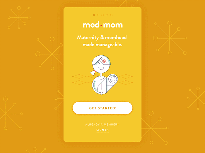
These colorful screens for the ModMom app is pretty much the most welcoming of all the designs featured on this post. The funny background illustrations also help. Stunning work by Staci Carpenter.