How to Add Animation with TailwindCSS
Adding animations can be a great way to make your website feel more alive and enjoyable. They can be used to provide helpful feedback, guide users’ attention to important elements, and make your interface feel more intuitive and responsive.
If you use Tailwind CSS to build your websites, you don’t need to start from scratch as it already comes with built-in utilities and tools that make creating and customizing animations as easy as adding a few classes to your HTML.
In this article, we’ll walk through several ways how you can add animations to your project with TailwindCSS.
Without further ado, let’s get started!
Built-in Utilities
Tailwind CSS includes a variety of pre-configured utilities out of the box that you can use right away on elements of your website.
| Utility | Description |
|---|---|
animate-bounce |
Bounces an element up and down |
animate-pulse |
Makes an element fade in and out subtly |
animate-spin |
Spins an element continuously |
animate-ping |
Scaling an element up and down |
For example, to make an element bounce up and down, you can simply add the animate-bounce class to it:
In this case, the class will move our element up and down infinitely, with the specified duration and easing function.
As mentioned, these animations are pre-configured. If you want more control over the animations, you should consider creating your own custom utilities.
Let’s see how to do it!
Creating Custom Animations
There are several ways to add your own custom animations.
First, we can specify keyframes, durations, and easing functions to create unique effects using the animate- property, as follows.
animate-[<animation>_<duration>_<easing>_<delay>_<iteration>]
To do this, we need to add the animation keyframes to our stylesheet. For example, below, I have a keyframe named tada, which will scale an element up and down while also rotating it slightly to the right and left, as if making a surprise gesture.
@keyframes tada {
  from {
    transform: scale3d(1, 1, 1);
  }

  10%,
  20% {
    transform: scale3d(0.9, 0.9, 0.9) rotate3d(0, 0, 1, -3deg);
  }

  30%,
  50%,
  70%,
  90% {
    transform: scale3d(1.1, 1.1, 1.1) rotate3d(0, 0, 1, 3deg);
  }

  40%,
  60%,
  80% {
    transform: scale3d(1.1, 1.1, 1.1) rotate3d(0, 0, 1, -3deg);
  }

  to {
    transform: scale3d(1, 1, 1);
  }
}
To apply this keyframe, you could add the following class to your element:
<div class="animate-[tada_1s_ease-in-out_1s] ...">
    ...
</div>
Although this works well, adding a custom animation like this can be a bit cumbersome, especially if you will add it across multiple elements. Fortunately, TailwindCSS provides a more convenient way to handle this.
So, alternatively, we can define the animation as a custom property. For example, let’s call it --animate-tada, and set its value to include the animation name, duration, easing function, and delay.
:root {
  --animate-tada: tada 1s ease-in-out 1s;
}
@keyframes tada {
  ...
}
Now we can apply it with the shorthand animate-[--animate-tada] instead of writing all the values directly:
<div class="animate-[--animate-tada] ...">
    ...
</div>
I think this is now much more manageable than adding the animation values directly to the element. It allows you to easily reuse the same animation across multiple elements without repeating the same values.
Here’s how it looks in action:
But, let’s make it simpler with a custom utility class for our animation. Instead of adding the custom property, what if we could simply add a class animate-tada?
To create one, we can wrap the keyframes and the custom property definition within @theme in our main stylesheet.
@theme {
  --animate-tada: tada 1s ease-in-out 1s;
  @keyframes tada {
    ...
  }
}
Use the Tailwind CLI to build the main CSS.
npx @tailwindcss/cli -i ./main.css -o ./build.css
It will generate the necessary classes for you that you can simply add the animate-tada class to your element:
<div class="animate-tada ...">
    ...
</div>
More Animations
One of the great things about TailwindCSS is its ecosystem of extensions or addons. So instead of creating every animation from scratch, you can install plugins that provide additional animations out of the box. This will save you time and effort in implementing complex animations.
Here are a few popular ones that you might find useful:
tailwindcss-motion
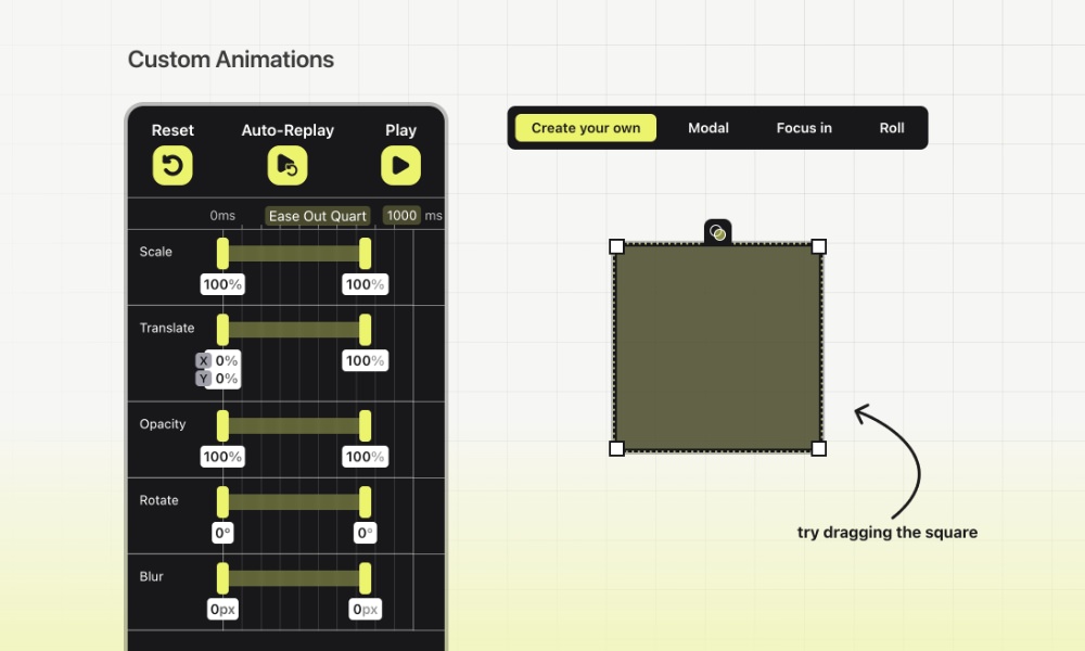
tailwindcss-motion is a Tailwind CSS plugin that makes adding complex animations simpler. It gives you an easy syntax for defining the motion effects and comes with built-in presets you can use right away.
It also provides an easy-to-use GUI where you can tweak how animations look and feel, so you get smooth, polished effects, and then simply copy and paste the classes.
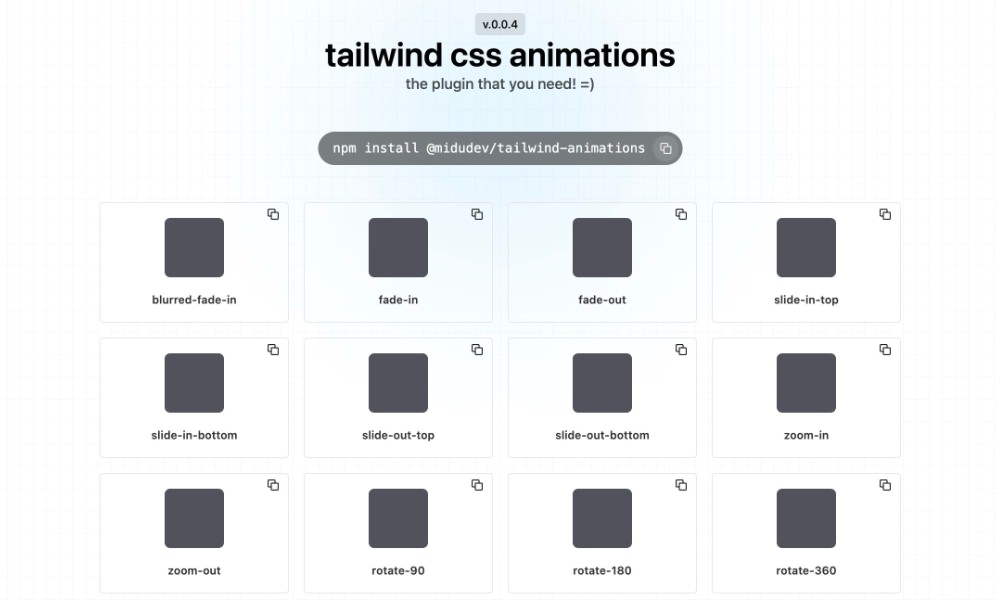
@midudev/tailwind-animations
This library is a Tailwind CSS plugin that provides a set of pre-configured common animations including fade-in, fade-out, slide-in, zoom, rotate, bounce, shake, swing, and many more. Check out the demo here.
tw-animate-css
tw-animate-css is for Tailwind CSS 4, and one of the most popular and downloaded.
It makes adding animations to your Tailwind CSS projects easy. It gives you ready-to-use utilities for smooth effects like fade-ins, zooms, and slides. You can also fine-tune the details, like animation duration, delay, and other properties.
tailwind-animated
Another Tailwind CSS plugin that you could consider is tailwindcss-animated. It provides various utility classes and several ready-to-use CSS animations that extend the basic animation capabilities of Tailwind CSS. It’s compatible with Tailwind CSS 3 and 4.
Wrapping up
Animations are a great way to make your site feel more lively and engaging. With Tailwind CSS and the plugins, adding smooth motion can be as easy as dropping in a few classes.
Whether you prefer creating your own utilities or taking advantage of ready-made plugins, Tailwind gives you the flexibility to add polished, professional-looking animations that bring your site to life, and hopefully, this article can help you get started.