Create Cool Flip Effect With CSS3 3D Rotation For UI Design
The CSS3 specification includes two types of transforms: 2D and 3D. In a previous post, we discussed CSS3 2D Transforms. This time, we will look into transforming elements in 3D space and specifically demonstrate how to create the OSX Flip Effect.
Click ‘View demo’ below to see the final result.
3D Rotation Syntax
Rotation in 3D space is fundamentally similar to 2D rotation, which we discussed previously. To rotate an element vertically, use the following syntax:
    -webkit-transform: rotateX(Ndeg);
    -moz-transform: rotateX(Ndeg);
    transform: rotateX(Ndeg);
Similarly, you can flip horizontally using this syntax:
    -webkit-transform: rotateY(Ndeg);
    -moz-transform: rotateY(Ndeg);
    transform: rotateY(Ndeg);
Many great resources delve deeper into CSS3 3D Transforms. Here are our recommendations:
- An Introduction to CSS 3-D Transforms – 24 Ways
- CSS3 Transform Browser Support – CanIUse.com
- Adventures In The Third Dimension: CSS 3D Transforms – SmashingMagazine
OSX Flip Effect
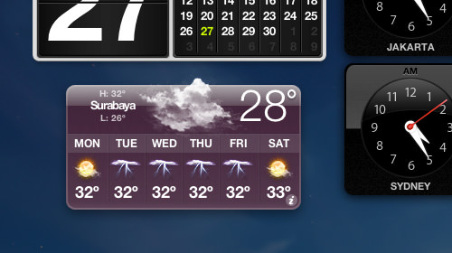
As mentioned, we will apply CSS3 Transforms to create the OSX/iOS flip effect. If you use these operating systems, you are likely familiar with this effect. In macOS, you can often find it in Dashboard Widgets.
Previously, creating such an effect required JavaScript libraries. Today, however, we can achieve it more simply by combining JavaScript with CSS3 Transforms.
Assets
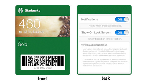
For this demonstration, we only need jQuery and this PSD of iOS Passbook from Dribbble for our graphical UI. We can make adjustments using Photoshop.
Next, pick one of the passbook graphics and save it as two separate files: one for the front face and one for the back. In this example, we picked the Starbucks Passbook:
HTML
Now, create a basic HTML document and place the following markup inside the <body>:
<section class="passbook">
    <div class="card front">
        <img src="img/starbuck-front.png" alt="Starbucks Passbook Front">
        <a href="#" class="info flip">i</a>
    </div>
    <div class="card back">
        <ul class="nav">
            <li class="title">Starbuck Coffee</li>
            <li class="button done">
                <a class="flip" href="#">Done</a>
            </li>
        </ul>
        <img src="img/starbuck-back.png" alt="Starbucks Passbook Back">
    </div>
</section>
As shown above, we contain the front and back faces in two separate <div> elements. The front face has a link that flips the Passbook when clicked. The back face also has a link to flip it back.
CSS
Assuming you have created a new CSS file: In this stylesheet, we first specify the Passbook dimensions and set the `transform-style` to `preserve-3d`. This ensures child elements are also transformed in 3D space. We also add a transition effect for a smooth flip animation.
Recommended Reading: CSS3 Transform: preserve-3D Documentation
.passbook {
    position: relative;
    width: 300px;
    height: 380px;
    margin-bottom: 100px;
    margin-left: 85px;

    -webkit-transform-style: preserve-3d;
    -moz-transform-style: preserve-3d;
    transform-style: preserve-3d;

    -webkit-transition: 0.5s;
    -moz-transition: 0.5s;
    transition: 0.5s;
}
Next, we set the card `position` to `absolute`, so the cards stack on top of each other. We also need to hide the back face using the `backface-visibility` property.
Recommended Reading: CSS3 Transform: backface-visibility Documentation
.card {
    position: absolute;
    -webkit-backface-visibility: hidden;
    -moz-backface-visibility: hidden;
    backface-visibility: hidden;
}
Front Face
Now, let’s add decorative styles to the link on the front face:
.front .info {
    /* Positioning */
    position: absolute;
    right: 10px;
    bottom: 15px;
    display: block;

    /* Box Model */
    width: 18px;
    height: 18px;
    border-radius: 21px;

    /* Typography */
    font-family: "Georgia", serif;
    font-style: italic;
    font-size: 11px;
    line-height: 18px;
    text-align: center;
    text-decoration: none;
    color: #fff;

    /* Background */
    background-color: #075621;
}
We also need to position the front face above the back face by specifying a higher `z-index`.
.front {
    z-index: 1;
}
Back Face
For the back face, we need to flip it initially:
.back {
    -webkit-transform: rotateY(180deg);
    -moz-transform: rotateY(180deg);
    transform: rotateY(180deg);
}
Then, we add decorative styles to the navigation. This includes changing the text color, adding a gradient to the link button, and positioning it correctly.
.back .nav {
    padding: 0;
    margin: 0;
    color: #fff;
    font-size: 12px;
    width: 100%;
    font-weight: bold;
}

.back .nav li {
    display: inline;
    position: absolute;
    top: 18px;
}

.back .nav a {
    font-weight: bold;
    text-decoration: none;
    padding: 7px 10px;
    border: 1px solid #095d25;
    border-radius: 5px;
    color: #fff;
    background: -moz-linear-gradient(top, rgba(255,255,255,0.3) 0%, rgba(0,0,0,0.5) 100%);
    background: -webkit-gradient(linear, left top, left bottom, color-stop(0%,rgba(255,255,255,0.3)), color-stop(100%,rgba(0,0,0,0.5)));
    background: -webkit-linear-gradient(top, rgba(255,255,255,0.3) 0%,rgba(0,0,0,0.5) 100%);
    background: -o-linear-gradient(top, rgba(255,255,255,0.3) 0%,rgba(0,0,0,0.5) 100%);
    background: -ms-linear-gradient(top, rgba(255,255,255,0.3) 0%,rgba(0,0,0,0.5) 100%);
    background: linear-gradient(to bottom, rgba(255,255,255,0.3) 0%,rgba(0,0,0,0.5) 100%);
}

.back .nav a:hover {
    background: -moz-linear-gradient(top, rgba(255,255,255,0.4) 0%, rgba(0,0,0,0.55) 100%);
    background: -webkit-gradient(linear, left top, left bottom, color-stop(0%,rgba(255,255,255,0.4)), color-stop(100%,rgba(0,0,0,0.55)));
    background: -webkit-linear-gradient(top, rgba(255,255,255,0.4) 0%,rgba(0,0,0,0.55) 100%);
    background: -o-linear-gradient(top, rgba(255,255,255,0.4) 0%,rgba(0,0,0,0.55) 100%);
    background: -ms-linear-gradient(top, rgba(255,255,255,0.4) 0%,rgba(0,0,0,0.55) 100%);
    background: linear-gradient(to bottom, rgba(255,255,255,0.4) 0%,rgba(0,0,0,0.55) 100%);
}

.back .nav .title {
    left: 105px;
}

.button.done {
    right: 10px;
}
Finally, we add a class to flip the Passbook horizontally:
.rotate-3d {
  -webkit-transform: rotateY(180deg);
  -moz-transform: rotateY(180deg);
  transform: rotateY(180deg);
}
jQuery
The jQuery part is relatively simple. First, remember to link the jQuery library in the `<head>`:
<script src="https://ajax.googleapis.com/ajax/libs/jquery/1.8.3/jquery.min.js" type="text/javascript"></script>
Then, we use the `toggleClass` function from jQuery to apply the `.rotate-3d` class defined in our stylesheet:
<script type="text/javascript">
    $(document).ready(function() {
        $('a.flip').click(function(event) {
            $('.passbook').toggleClass('rotate-3d');
            event.preventDefault();
        });
    });
</script>
That’s all the code required. It’s significantly simpler than using only JavaScript to achieve a similar effect. As usual, you can view the demo and download the source code using the links below.