Designing an Onboarding Process That Actually Helps Users Learn
Jumping into a new app usually comes with a struggle of learning how it works. You might get the hang of it quickly, but there’s always a learning process. The goal of onboarding is to introduce new users to a website, program, or application. With onboarding, you should teach about individual features, how they work, and how the app offers value to the user.
In a recent post we covered mobile onboarding screens that focus on designs and content styles. In this post, I want to share tips for the user experience and the marketing process of guiding a user through the onboarding process.
Read Also: 40 Mobile Apps Onboarding Designs for Your Inspiration
Use images & diagrams
Graphics and visual elements can explain a user experience much better than words. Rely on visuals to help guide users through the process as needed. This is a valuable strategy because it draws the eye onto the onboarding process and clarifies intent. With visuals your goal is to show rather than tell.
You can do this many different ways with full screenshots, small icons, or illustrations/vector graphics that fit into the design workflow. Take for example this onboarding screen from designer Salman Shah.
He uses vector icons to visually cue each slide. The icons work as metaphors for each point, and help sell the features to the user.
If you don’t have skills to design icons from scratch you can always use free icon packs to your advantage. Many designers release their work for free, and you can easily incorporate these icons into your onboarding screens.
You can move beyond static icons to include animation as well. Take for example the finance-based onboarding process created by Iaroslav Zhmak.
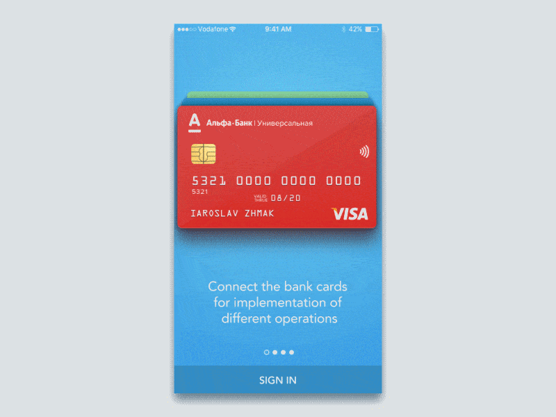
He uses plenty of icons but also places animations into each section. You learn what the app does through visual cues that animate to draw your attention.
Notice that each onboarding slide does have a text description as well. This is the real meat of the message because it tells users what they can actually do with the application. Sometimes a text-only page can feel like a stuffy college textbook though. Use visuals and animations to spice up each part of the onboarding process.
Display features in action
Try to avoid stating the obvious features or forcing users to memorize all the individual parts of the app. Also try to avoid basic statements that guide users around the app like “this is the main menu, this is the friends screen”, etc. Instead try to focus on what these things can do, and how the user can interact with these areas.
This strategy is reminiscent of the old marketing adage “don’t sell the steak, sell the sizzle”. You want to sell the app through its benefits to the user, not through arbitrary features and menu items.
For example, this design created by Prakhar Sharma guides you through a full process of working in your bank account.
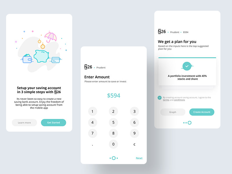
The design offers a natural flow to help you get started, and guide you every step of the way. This onboarding process forces users to take action which is ultimately the main goal.
You can either show the features in action through a demo, or you can help users take action through the onboarding process. Either method encourages action over consumption which usually leads to more engaged users.
I found another nice example of a YouTube-style app onboarding screen created by Riko Sapto Dimo. It uses visuals and icons to convey a message, but also helps the user take action before diving into the app.
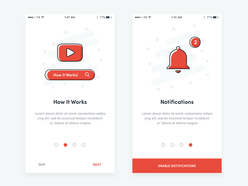
After the “How It Works” screen you can choose to set up notifications with the click of a button. This is a great strategy because many users will completely forget about the app, but with notifications popping up they’ll eventually use it again (or disable notifications).
You can also add buttons to enable or disable features at any point in the onboarding process. These features could relate to newsletter signups, following other accounts, or even subscribing to updates. Just get users engaged, and help them start taking action. From there, it gets easier to keep them hooked.
Show one feature at a time
Most onboarding screens display certain features, and move you through a process from start to finish. Don’t rush users, and definitely don’t shove a bunch of information onto the screen at once.
The key to keeping new users interested and excited is to maintain focus and showcase one feature at a time. If you shove too much onto the screen then users can feel overwhelmed. If the onboarding process is too boring then people will get bored and quit.
Each screen should have at least one new piece of information that’s valuable to the user. You can also do this on the web with a modal window/dialog box approach. However you should still keep focus on one topic at a time to draw attention where it belongs.
The Dropbox team is planning a new desktop app with onboarding, and Wes O’Haire shared this example on his Dribbble account.
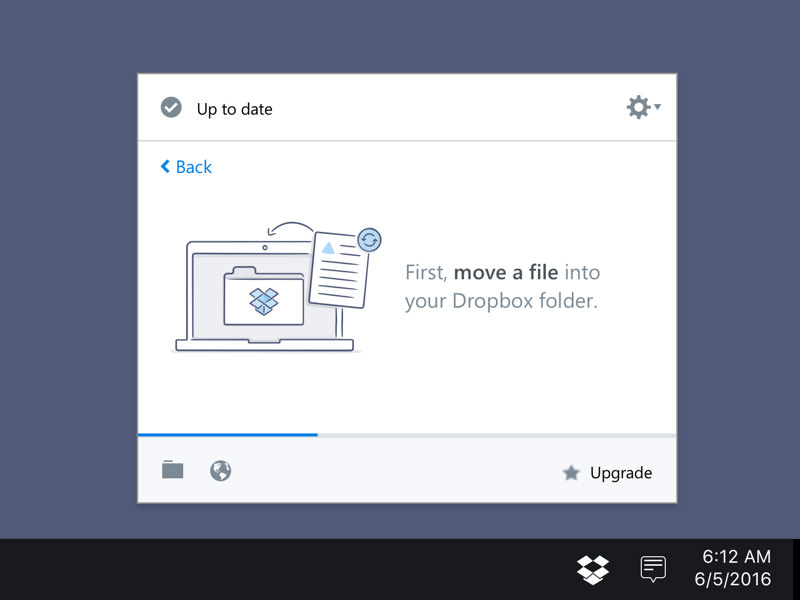
Everything about this onboarding screen feels very natural. You have a blue bar indicating how far along into the onboarding process you’ve gone. Then you also have clear directions to move in a step-by-step manner through the process. There’s also a back button in case the user forgets any previous steps, or just wants a recap.
Focus is the name of the game, and this design keeps users focused on the actions. By the end of this onboarding process, new users should be able to comfortably use the Dropbox app on desktop to upload, download, and perform any other actions they need.
And remember that benefits sell better than features. Explain what the user gets from the app rather than how quick it runs or how many profiles you can have.

The above example features a couple screens from a health/doctor appointment app called Qikwell. Each slide demonstrates one major feature targeted towards the user’s benefit (appointment availability and total # in line).
The last slide also has a small “Get Started” link to guide users about the next step. It would increase the visibility of that link to encourage engagement, but just having it there is a great idea.
Remember to keep everything simple and straightforward. Each step of the process should have a goal to either teach the user or help them move further into the application.
Wrap up with an action
By the end of the onboarding process, you should have users that know what the app offers, what they can do, and why they should use it. Yet they might need a push to actually take action and do something.
Always end your onboarding with some type of link or button that drives the user to get started somewhere. This could be a settings page, a profile page, a user flow screen, or anything similar.
The best recommended actions will vary based on the goals of your app. A nutrition app might encourage new users to start logging their foods for the day, but a social networking app might send users to a profile screen, or to a recommended list of users to follow.
In this app design by Oktafian Nugraha you’ll notice a big orange “Let’s Start!” button at bottom of the last slide. This is super bright and pretty hard to miss.
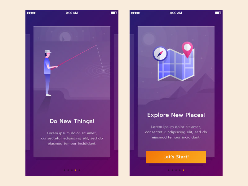
This final action button can lead anywhere as long as the end goal is user retention. Stick this button into your onboarding process, and make sure it’s visible. If users complete the onboarding, and don’t see a button to wrap up they might feel trapped and just leave.
It’s pretty hard to mess this up, so just plan out a typical user flow, and make sure you link to an appropriate page at the end of the onboarding process. If the onboarding did its job then new users should already know what to do from there.
A Final Look
Every new project should have some type of help guide or onboarding process for new users. It’s the fastest way to guide new users, and to keep more people engaged with your mobile app, website, or desktop program.
Design aesthetics are important but the user experience trumps everything. When done correctly, the onboarding process should be educational and hopefully a little fun!