Image Carousels in Web Design — Benefits & Best Practices
There’s no shortage of carousel feature slideshows on the web. In fact, this trend has done nothing but grow in the past 5-10 years with more browser support now than ever before. But are image carousels really worth the effort? What sorts of benefits do they produce, and how should they be used productively in a layout?
I’d like to share some common trends, live examples, and ideas for web designers interested in image carousels. These dynamic sliders are heavily debated, but I do think they add value when crafted in the right context.
10 Best Photo Gallery & Slideshow WordPress Plugins
For any portfolio or image-oriented website running on WordPress, it is imperative to have a photo gallery and... Read more
Product carousels for e-commerce
The world of e-commerce is full of rotating carousels on home pages and product pages. The goal is to maintain a clear information density with photos and text that tell a unique yet valuable story to help sell products.
There are two primary placements for an e-commerce product slider:
- On a shop’s home page
- On a product page
They both work differently but serve the same goal — to sell products in a visual manner.
Example 1: Au Lit Fine Linens – home page
Take a look at the home page for Au Lit Fine Linens, that uses a fullscreen auto-rotating carousel to show off different products, such as duvets, pillows, and bed covers.

The images take up the full width of the home page, and they appear well above the fold. In fact, this slider should be the very first thing to catch your attention when first landing on the page. Each slide leads to a different page on the site to guide customers through the shopping experience.
This slider can be a tad intimidating when first landing on the page, but with the button link and overlay text it can also be very encouraging to visitors who just want to dive in and shop.
Example 2: Eden phone case – product page
It uses an auto-rotating slider to show off images of the product.
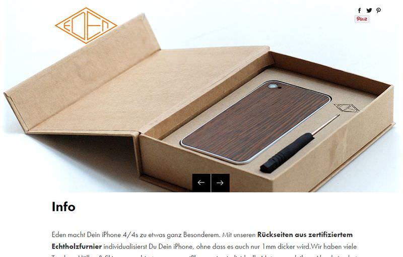
I find these to be a little “too much” in the world of e-commerce. When looking at a product I want to be in control of switching between images.
The better choice is to do a gallery of images with control given to the visitor. For instance, the Design by Humans page uses thumbnails for each photo which is much more encouraging, and grants more control to the user.
Web portfolio carousels
Online website portfolios are a bit different because these slides don’t always click through to another page. It’s true that some will lead to a case study or write up about a project, but many carousels on portfolio websites are just meant to show off visual work.
Example 1: Biboun – home page
The French artist working under the name Biboun has a carousel slider on the home page featuring snippets of artwork. The individual slides lead to internal pages in the portfolio which cover an entire project with multiple photos.

This is probably the best way to do a slider on a portfolio website. Just showcasing a random list of work is pointless unless those specific works have a reason to be showcased.
All of the pieces are exquisite in Biboun’s slider, and it doesn’t take up much room either. Although I know some people hate the auto-rotating slideshows for good reason, on such a minimalist layout I have a difficult time complaining about this design feature.
Example 2: Aaron Blaise’s website – home page
I really like the example found on Aaron Blaise’s website because he showcases his work as a portfolio, but mostly uses this website to sell his art videos. Aaron Blaise worked at Disney for a couple decades, and he has the skillset to prove it.

While the home page slider on his site does auto-rotate, I don’t find it incredibly annoying or out of place. Each slide has a bit of content relevant to the image, and it helps Aaron draw attention to his latest video lessons that teach young artists how to master specific skills.
A great portfolio carousel focuses on visuals, and leads visitors further into the website. If you can get these two things then I wouldn’t be against a feature like this in a personal portfolio website.
Common design trends
If you look at some of my above examples you’ll notice there’s generally two different types of sliders: fullscreen and fixed width.
These stylistic choices often relate to the layout and to how much content it can hold. If a layout spans the full width of the page then it makes sense to widen out the slider too. But this also forces you to find high-quality images that still look good at full screen on large resolution monitors.
I personally prefer the fixed width style like you’ll see in the two art portfolio examples. These are much easier to control, and they’re often not as tall — making it easier for visitors to simply ignore them if they wish.
Also consider the value of auto-advancing slides, and how difficult it can be for users to catch this content. There’s a great case study by the Nielsen Norman Group showing that it’s better not to have auto-advancing sliders.
I’m on board with this approach in the sense that it’s less intensive on memory with less animations and motion in the browser, and most people don’t like auto-rotating carousels either — and you should always cater to your audience.
However I can’t say that it’s never worth adding an auto-advancing slider, especially since with static sliders you don’t get as many views, and you also need to make your first slide the most important as many users won’t proceed to the next slide. Deciding whether to make a slider auto-rotating or not is unfortunately an area of trial-and-error.
What to avoid at all costs
Here’s an important thing that I personally think falls under “avoid at all costs”. Have a look at or click on the screenshot below, and try to guess what it may be.

The Yozenn cafe website uses a fullscreen header slider. It does not auto-rotate which is great, however the slides also serve no purpose other than decoration.
The images don’t link anywhere, and they show off a small handful of products. They could all just be added to the home page background without the slider to save confusion and extra kilobytes of JavaScript.
I’d argue this background sliding feature doesn’t add much value to an already-cramped website. If the images had links or accompanying text they’d at least be more relevant.
Feel free to use images in your header section that take up the full page, however if they don’t link anywhere or offer any genuine information then don’t turn them into a carousel.
Interactive features
The way users navigate a carousel affects the design itself. There are a variety of navigation styles, but these are the most popular:
- Dot-based navigation
- Arrow navigation
- Thumbnail navigation
- List links or headline items
The most common is the dot navigation which you’ll find on hundreds of modern websites.
Example 1: Chic at Home – home page
Chic at Home is a great example using three tiny dots beneath the slider to denote navigation. Each image rotates through automatically, and the related dot in the series gets filled with black. The other two empty dots denote potential slides for users to browse.

This is a popular design pattern that many users already recognize. It falls into the same category as the hamburger menu that many designers do not like, but users already recognize it, and instinctively know how to use it.
Example 2: Pure Cycles – home page
The home page of Pure Cycles uses a combination of dot and arrow navigation. This way users have the forward&back navigation, but also see the “overall” navigation through dot links in the bottom.

I actually find the dot links in this example tough to see. The difficulty with visual slides is that many elements aren’t easy to distinguish, so arrows and dots can easily blend into the background.
Example 3: IGN – home page
On the homepage of IGN you’ll find another auto-rotating carousel that uses title links for the navigation. This is very common for publishers who want to sell headlines rather than products. Each link goes to the individual slide that eventually leads to the article page.

These links could be replaced with thumbnails, or even include thumbnails from each story — however the visual aspect is shown in the carousel, so omitting the thumbnail actually saves space.
Different websites use different navigation styles for different reasons. Consider the goal(s) of your visitors, and design for the best user experience.
Key takeaways
You should aim to produce genuine value, or extra information with a carousel. This may be information the visitor did not have before, or it may lead to pages that the visitor may not have found otherwise.
Try to avoid auto-rotating carousels, and only use them on major landing pages (the home page being one example). As long as the carousel has a purpose, and doesn’t look like an ad, your design should do well.
If you’re looking for more info on web carousels, check out some of the following posts: