4 Form Design UX Tips You Should Know (With Examples)
We tend to think about forms as simply a means to collect user data, but they are also one way, sometimes the only way, for our users to connect with us. It’s probably delusional to think we can make users love filling in forms, however it’s certainly possible to find solutions that don’t annoy them too much, and help them along the process.
While browsing the net we can find sometimes surprising solutions that are programmatically correct, but are designed in a way that most likely makes many users abandon the site because of the poor user experience.
If our forms are designed well, we will be able to not only please our users but also the backend team who can deal with much less user input errors. Thus, in this article, we’re going to have a look at how we can minimize user input errors and still keep our users happy.
Read Also: Login / Registration Form: Ideas and Beautiful Examples
Anticipate User Needs
Websites and applications have different user bases & goals, and even the same location can host many forms that collect different kinds of data, just to name the most frequent ones:
- Login forms
- Registration forms
- User profile forms
- Newsletter signup forms
- Checkout forms
- User surveys
- Contact forms
- Comment forms
- Search forms
All these form types require different things. When designing a checkout form it’s crucial to credibly assure users about security, while in the case of comment forms it’s a good idea to add emojis or other methods that enable users to express their actual mood.
However even similar form types may need to be designed differently, as all sites have their unique user base. Before embarking on the design process, it’s always a good idea to anticipate what our users need, and design accordingly.
Read Also: Anticipatory Design: When Choice is Removed From Decision Making
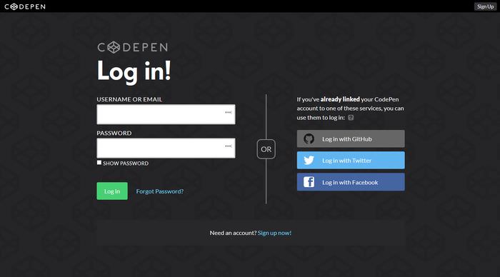
Example: Social Logins Targeting User Needs
Codepen‘s login form contains three social logins with Github at the top. This choice would be unreasonable for most sites.
But it’s perfect for Codepen, as their user base consists of developers, many of whom will want to login with their Github accounts, or connect their development accounts with each other at once.
Think Mobile-First
Mobile and desktop users have different needs, but as completing forms is a much bigger challenge on a mobile screen, using hand gestures than on a physical keyboard, a mobile-first approach can take us further when we want to design usable forms.
Moreover, many form UI patterns that work well on mobile will work well on desktop as well.
Example: Tappable Controls
High quality mobile forms cannot be imagined without visible controls on which mobile users can easily tap with their fingers.
The newsletter signup form of the web design conference An Event Apart adapts to the way mobile users access the screen – it contains two easy-to-tap input fields and a fingertip-sized button.
The text input fields are higher as usual so that mobile users can easily tap on them, and the big, orange button with a tick icon further encourages users to submit the form.
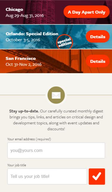
The desktop version of the site uses the same form design, as it also looks good and works well on larger screens.

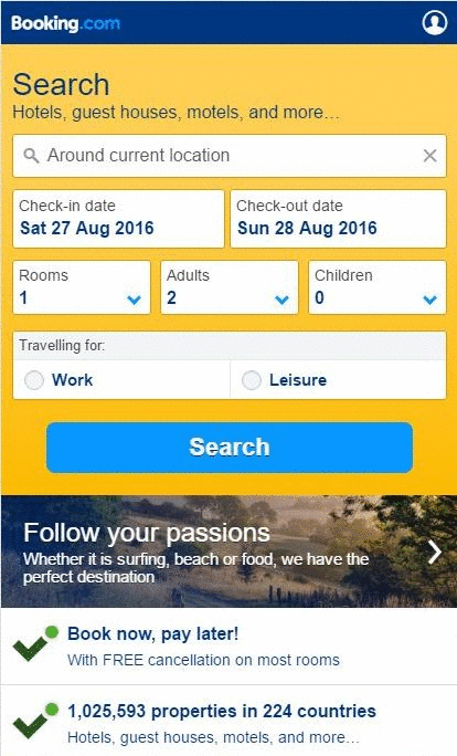
Example: Expendable Input
When designing forms for mobile, it’s always important to consider how we can minimize the space we use. The expendable input UI design pattern has become quite popular lately, and it works especially well on mobile.
Booking.com leverages this pattern in the search form on its mobile site. When the user taps into the search field it expands in order to leave more space for gestures, and a select list with recommendations also appears below it.
When the user taps out of the field, it shrinks, and the extra information disappears.
Example: Morphing Button
Morphing buttons take the expendable input pattern one step even further, as users first see a button, which then morphs into a form when they tap on it.
The screenshot below is from The Startup’s brilliant article on innovative form design, which presents many other creative solutions as well.

Facilitate Input Take-In
Lengthy forms tend to deter users. The best we can do is to only ask for the input we really need. This is not only important from a user experience perspective, but users can also hesitate to give out too much personal information because of privacy concerns.
Sometimes, however, we still have to go along with longer forms. In this case it’s a good idea to slice them up into smaller chunks, and serve the chunks as successive screens.
Many e-Commerce sites (e.g. Amazon) use this solution in order to reduce cart abandonment rates.
Recommended Reading: How to Reduce Cart Abandonment Rates on your e-Commerce Site
If we want to ease completing form fields, the rule of thumb is to reduce both distractions and user actions as much as possible.
Example: Personalized Input Picker
Different content pickers, such as date pickers or color pickers, don’t only make it easier to take in the right input, but they also make the form more attractive, and significantly reduce user errors.
The Todoist list-taking app gives personalized hints inside its date picker when the user hovers over the days.
For instance on the screenshot below, the user can see that for Aug 31 she already has 2 due tasks, and can take this information into account when deciding the right date for tasks. It’s an excellent idea for an app where productivity is the user’s main concern.

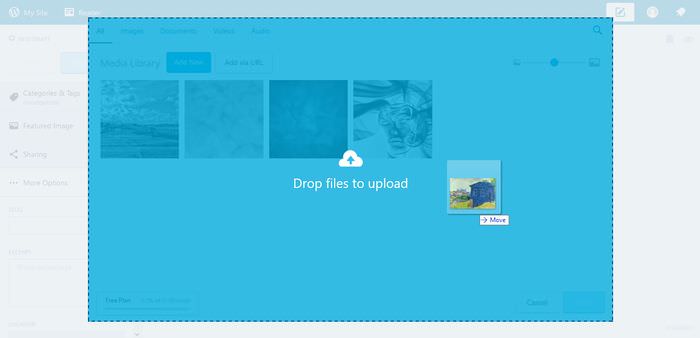
Example: Drag-and-Drop Input
Drag-and-drop designs usually work well with file upload fields, especially where users are supposed to upload images.
They probably don’t reduce user actions that much compared to the ordinary Upload a file button, but they make it much easier to choose which file the user wants to upload, therefore reducing the chance of submitting a wrong file.
WordPress.com provides an elegant and intuitive drag-and-drop user input interface in its post editor form. The little thumbnails and the visual representation of the already uploaded files further help users quickly execute the upload.
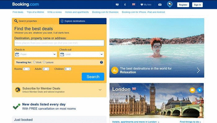
Example: Overlay to Remove Distractions
If users are distracted while completing our form, they are more prone to errors, and also get annoyed more easily
Content overlays are a great alternative to minimalist form design. They are used by more complex sites that want to display different kinds of information on the same screen.
On the screenshot below, you can see the desktop version of Booking.com. When users hover on the search form the rest of the content gets covered by a greyish overlay to help them keep focused on the form filling process.
Give Feedback to Users
Giving the right feedback at the right time can significantly improve user experience.
In form design, there are two kinds of user feedbacks:
- Feedback given before form submission – in order to reduce errors and form abandonment rates, such as progress trackers, instant input validation that immediately rewards users for the correct input, or helper tooltips
- Feedback given after form submission – in order to let users know they committed an error, such as error messages
The kind of user feedback our users need highly depends on the characteristics of our target audience, and the goal of our site.
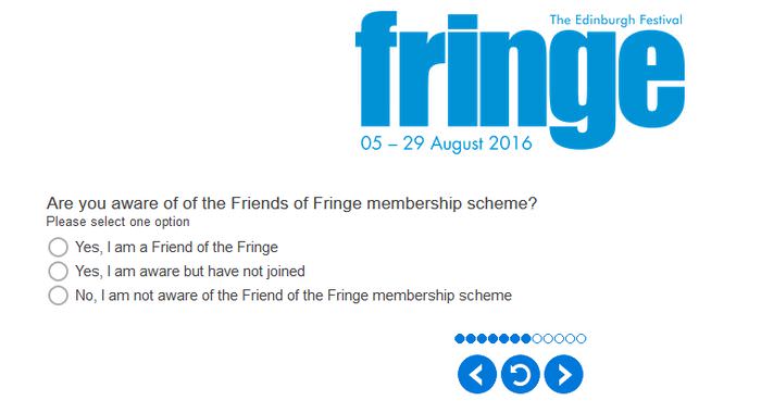
Example: Progress Tracker
Forms longer than one page, such as surveys and most e-Commerce checkout forms can take leverage of the progress tracker design pattern. Progress trackers give an instant visual feedback to users about their status, and encourage them to move on with the process.
The SnapSurveys survey creator web app shows a little progress tracker right above the submit buttons so that users can naturally catch sight of it.
he progress tracker doesn’t use any labels, but the way it’s designed makes its goal clear – the number of circles indicates the number of steps, the already executed steps becomes blue, and users can easily see how many steps are still ahead of them.
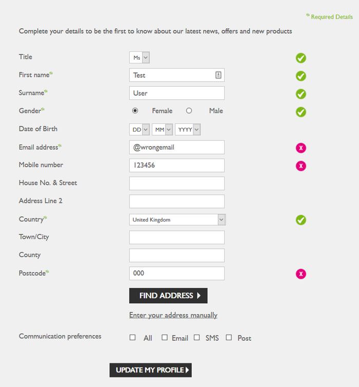
Example: Real-Time Validation
The Body Shop cosmetics retailer uses real-time validation on its User Profile form to eliminate errors and improve the UX of the form completion process.
Inputs are checked while users complete the form, and the right and wrong answers are immediately indicated by easily distinguishable icons a little bit further on the right but still in the visible area.
Example: Expressive Tooltips
Understandable microcopy is also an essential part of successful user feedback in form design. By definition, the microcopy of a website consists of small chunks of text used in different elements – labels, buttons, error messages, tooltips, etc.
Recommended Reading: Tips to Master Microcopy for Web Designers
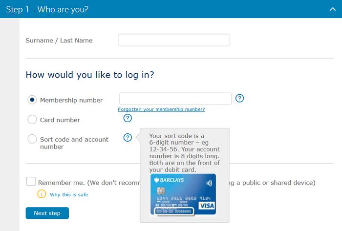
In its login form, the Barclay’s banking group replies to the questions users potentially may ask with the help of well-designed tooltips that include easy-to-understand microcopy.
The tooltips are hidden behind little ? icons not to distract users who know how to complete the login form, but to be always present for users who are unsure.
Some of the tooltips even contain a little visual of an annotated debit card so that users can easily find the data they have to enter into the login form.