How to Use minmax() CSS Grid
The CSS Grid Layout Module takes responsive design to the next level by introducing a new kind of flexibility that was never seen before. Now, we can’t only define custom grids blazingly fast solely with pure CSS, but the CSS Grid also has many hidden gems that allow us to further tweak the grid and achieve complicated layouts.
The minmax() function is one of these less widely known features. It makes it possible to define the size of a grid track as a minimum to maximum range so that the grid can adapt to the viewport of each user the best possible way.
Read Also: Introduction to the CSS Grid Layout Module
Syntax
The syntax of the minmax() function is relatively simple, it takes two arguments: a minimum and a maximum value:
minmax(min, max)
The min value has to be smaller than the max, otherwise max gets ignored by the browser.
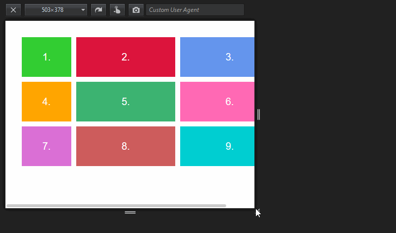
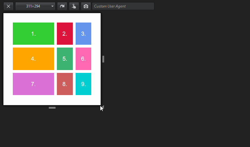
We can use the minmax() function as the value of the grid-template-columns or grid-template-rows property (or both). In our example, we’ll use the former, as it’s a much more frequent use case.
.container {
  display: grid;
  grid-template-columns: minmax(100px, 200px) 1fr 1fr;
  grid-template-rows: 100px 100px 100px;
  grid-gap: 10px;
}
In the Codepen demo below, you can find the HTML and CSS code we’ll use throughout the article.
We can use different kind of values inside the minmax() function, all depends on what kind of custom grid we want to create.
Static length values
There are two basic ways how we can use the minmax() function with static length values.
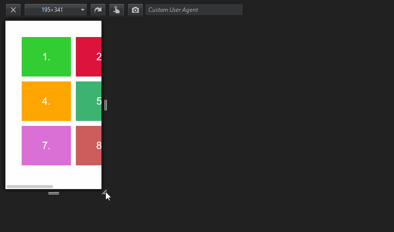
Firstly, we can use minmax() only for one grid column and define the width of the other columns as simple static values (pixels here).
grid-template-columns: minmax(100px, 200px) 200px 200px;
On the gif demo below, you can see that this layout is not responsive, however the first column has some flexibility. The second and the third columns retain their fixed width (200px) while the first column ranges from 100px to 200px, based on the available space.
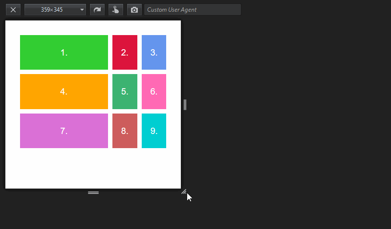
Secondly, we can define the width of more than one grid column using minmax(). The min and max values are both static, so by default, the grid is not responsive. However, the columns themselves are flexible, but only between 100px and 200px. They grow and shrink simultaneously as we change the viewport size.
grid-template-columns: minmax(100px, 200px) minmax(100px, 200px)
                       minmax(100px, 200px);
Note that we can also use the repeat() function togehter with minmax(). So, the previous code snippet can also be written like this:
grid-template-columns: repeat(3, minmax(100px, 200px));
Dynamic length values
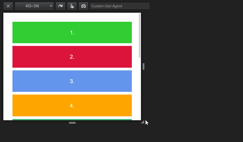
Apart from static values, the minmax() function also accepts percentage units and the new fraction (fr) unit as arguments. By using them, we can achieve custom grids that are both responsive and change their dimensions according to the available space.
The code below results in a grid in which the width of the first column ranges between 50% and 80% while the second and the third one evenly share the remaining space.
grid-template-columns: minmax(50%, 80%) 1fr 1fr;
When we use dynamic values with the minmax() function, it’s crucial to set up a rule that makes sense. Let me show you an example where the grid falls apart:
grid-template-columns: minmax(1fr, 2fr) 1fr 1fr;
This rule doesn’t make any sense, as the browser is unable to decide which value to assign to the minmax() function. The minimum value would lead to a 1fr 1fr 1fr column width, while the maximum to 2fr 1fr 1fr. But, both are possible even on a very small screen. There’s nothing the browser can relate to.
Here is the result:
Combine static and dynamic values
It’s also possible to combine static and dynamic values. For instance, in the Codepen demo above, I used the minmax(100px, 200px) 1fr 1fr; rule that results in a grid where the first column ranges between 100px and 200px and the remaining space is evenly shared between the other two.
grid-template-columns: minmax(100px, 200px) 1fr 1fr;
It’s interesing to observe that as the viewport grows, first, the first column grows from 100px to 200px. The other two, ruled by the fr unit, begin to grow only after the first one reached its maximum width. This is logical, as the goal of the fraction unit is to divide up the available (remaining) space.
The min-content, max-content, and auto keywords
There’s a third kind of value we can assign to the minmax() function. The min-content, max-content, and auto keywords relate the dimensions of a grid track to the content it contains.
max-content
The max-content keyword directs the browser that the grid column needs to be as wide as the widest element it contains.
On the demo below, I placed a 400px-wide image inside the first grid track, and used the following CSS rule (you can find a Codepen demo with the full modified code at the end of the article):
.container {
  grid-template-columns: max-content 1fr 1fr;
  /**
  * The same with the minmax() notation:
  * grid-template-columns: minmax(max-content, max-content) 1fr 1fr;
  */
}
I haven’t used minmax() notation yet, but in the code comment above you can see how the same code would look like with it (although it’s superfluous here).
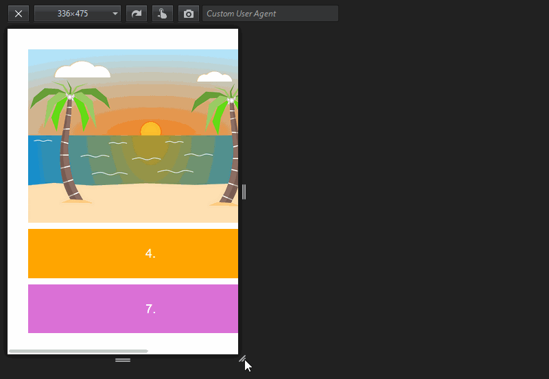
As you can see, the first grid column is as wide as its widest element (here the image). This way, users can always see the image in full size. However, under a certain viewport size, this layout is not responsive.
min-content
The min-content keyword directs the browser that the grid column needs to be as wide as the narrowest element it contains, in a way that doesn’t lead to an overflow.
Let’s see how the previous demo with the image looks like if we change the value of the first column to min-content:
.container {
  grid-template-columns: min-content 1fr 1fr;
  /**
  * The same with the minmax() notation:
  * grid-template-columns: minmax(min-content, min-content) 1fr 1fr;
  */
}
I left the green background below the image so that you can see the full size of the first grid cell.
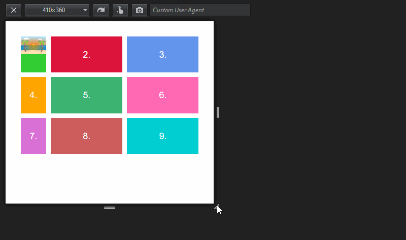
As you can see, the first column retains the smallest width that can be achieved without an overflow. In this example, this will be defined by the minimal width of the 4th and 7th grid cells, which stems from the padding and font-size properties, as the image in the first cell could be shrinked to zero without an overflow.
If the grid cell contained a text string, min-content would be equal to the width of the longest word, as that’s the smallest element that can’t be further shrinked without an overflow. Here’s a great article by BitsOfCode where you can see how min-content and max-content behave when the grid cell contains a text string.
Using min-content and max-content together
If we use min-content and max-content together inside the minmax() function we get a grid column that:
- is responsive
- doesn’t have any overflow
- doesn’t grow wider than its widest element
.container {
    grid-template-columns: minmax(min-content, max-content) 1fr 1fr;
}
We can also use the min-content and max-content keywords together with other length values inside the minmax() function, until the rule makes sense. For instance, minmax(25%, max-content) or minmax(min-content, 300px) would be both valid rules.
auto
Finally, we can also use the auto keyword as an argument of the minmax() function.
When auto is used as a maximum, its value is identical to max-content.
When it’s used as a minimum, its value is specified by the min-width/min-height rule, which means that auto is sometimes identical to min-content, but not always.
In our previous example, min-content does equal to auto, as the minimal width of the first grid column is always smaller than its minimal height. So, the belonging CSS rule:
.container {
    grid-template-columns: minmax(min-content, max-content) 1fr 1fr;
}
could be also written like this:
.container {
    grid-template-columns: minmax(auto, auto) 1fr 1fr;
}
The auto keyword can also be used together with other static and dynamic units (pixels, fr unit, percentages, etc.) inside the minmax() function, for instance minmax(auto, 300px) would be a valid rule.
You can test how the min-content, max-content, and auto keywords work with the minmax() function in the following Codepen demo:
Read Also: Moving Items in CSS Grid Layout [Guide]