Introduction to the CSS Grid Layout Module
It was once tables, then margins and floats, then flexbox and now grid: CSS always steered towards new and better ways to ease the age-old job of coding web layouts. The CSS Grid Layout Model can create and update the layout along two axes: horizontal and vertical, affecting both the width and height of elements.
Read Also: Flexbox Patterns: The Ultimate CSS Flexbox Code Library
The grid layout doesn’t depend on the position of elements in the markup, hence, you can shuffle the placements of elements in markup without altering the layout. In the grid model, a grid container element is divided into grid columns and rows (collectively known as grid tracks) by grid lines. Now let’s see how to create a sample grid.
Browser support
As of writing this article, the CSS Grid Module is only supported by the latest IE browser and Edge . The CSS Grid is in experimental stage in the other major browsers in which you have to enable the support manually:
- Firefox: Press Shift + F2, enter the following command into the GCLI input bar that appeared at the bottom of the browser:
pref set layout.css.grid.enabled true. - Chrome: Browse the
chrome:/0/flagsURL and enableExperimental Web Platform features.
All major browser support is likely to come by early/mid-2017.
Recommended Reading: 15 Graphical Command Line (GCLI) Commands in Firefox for Front-End Developers
A sample grid
To turn an element into a grid container you can use one of these three display properties:
display: grid;– the element is converted to a block grid containerdisplay: inline-grid;– the element is converted to an inline grid containerdisplay: subgrid;– if the element is a grid item it is converted to a subgrid that ignores the grid template and grid gap properties
Just as a table is comprised of multiple table cells, a grid is comprised of multiple grid cells. A grid item is assigned to a set of grid cells that is collectively known as the grid area.
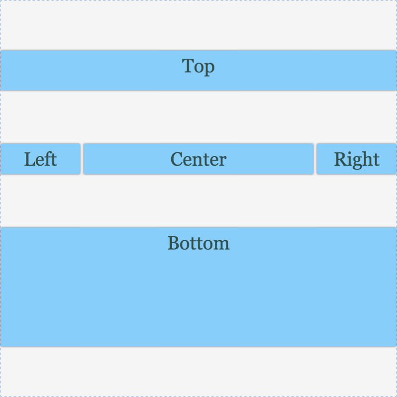
We’re going to create a grid with five sections (grid areas): top, bottom, left, right and centre. The HTML consists of five divs inside a container div.
<div class="grid-container">
  <div class="grid-top">Top</div>
  <div class="grid-left">Left</div>
  <div class="grid-centre">centre</div>
  <div class="grid-right">Right</div>
  <div class="grid-bottom">Bottom</div>
</div>
In the CSS, the grid-template-areas property defines a grid with different grid areas. In its value, a string represents a grid row and every valid name within a string represents a column. To create an empty grid cell you need to use the dot (.) character within a row string.
The grid area names are to be referenced by the grid-area property of the individual grid items.
.grid-container {
  width: 500px;
  height: 500px;
  display: grid;
  grid-template-areas:  "top    top    top"
                        "left   centre right"
                        "bottom bottom bottom";
}
.grid-top {
  grid-area: top;
}
.grid-bottom {
  grid-area: bottom;
}
.grid-left {
  grid-area: left;
}
.grid-right {
  grid-area: right;
}
.grid-centre{
  grid-area: centre;
}
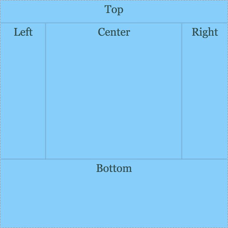
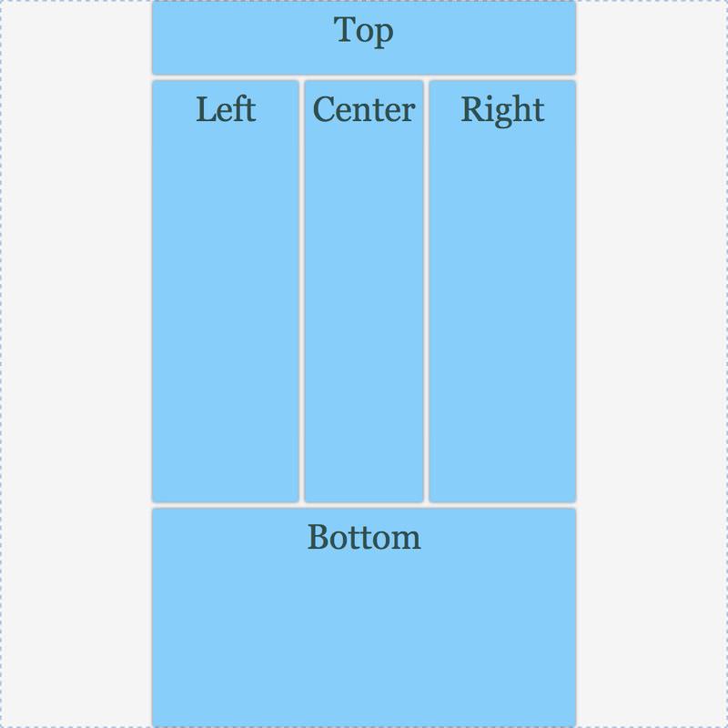
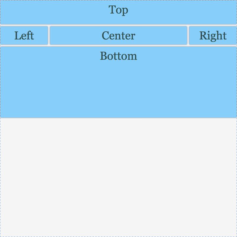
So this code creates a grid with three rows and columns. The top item occupies an area that spans over three columns in the first row and the bottom item spans over three columns in the last row. Each of the left, centre and right items takes one column in the middle row.
Now we need to assign dimensions to these rows and columns. The grid-template-columns and grid-template-rows properties define the size of the grid track (row or column).
.grid-container {
  width: 500px;
  height: 500px;
  display: grid;
  grid-template-areas: "top    top    top"
                       "left   centre right"
                       "bottom bottom bottom";
  grid-template-columns: 100px auto 100px;
  grid-template-rows: 50px  auto 150px;
}
This is how our CSS grid looks now (with some additional styles):
Space between grid items
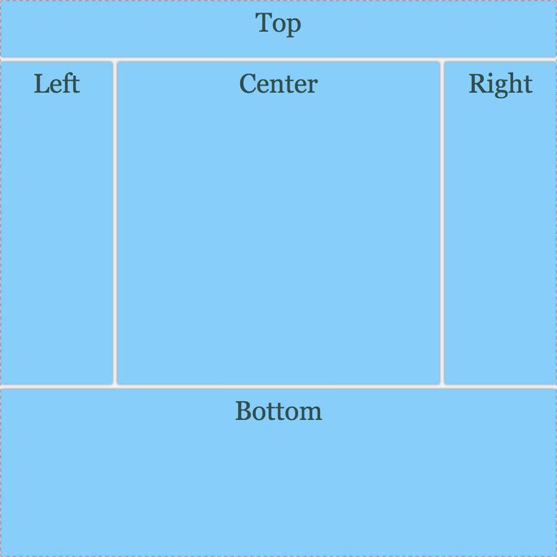
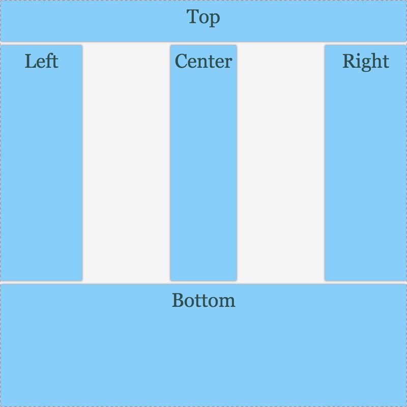
You can add blank space between columns and rows using grid-column-gap and grid-row-gap, or their longhand property grid-gap.
.grid-container {
  width: 500px;
  height: 500px;
  display: grid;
  grid-template-areas: "top    top    top"
                       "left   centre right"
                       "bottom bottom bottom";
  grid-template-columns: 100px auto 100px;
  grid-template-rows: 50px  auto 150px;
  grid-gap: 5px 5px;
}
Below you can see that the grid-gap property added gaps between the grid items indeed.
Align grid content and items
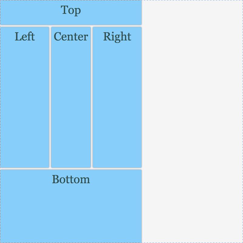
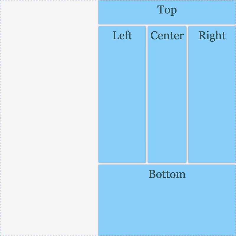
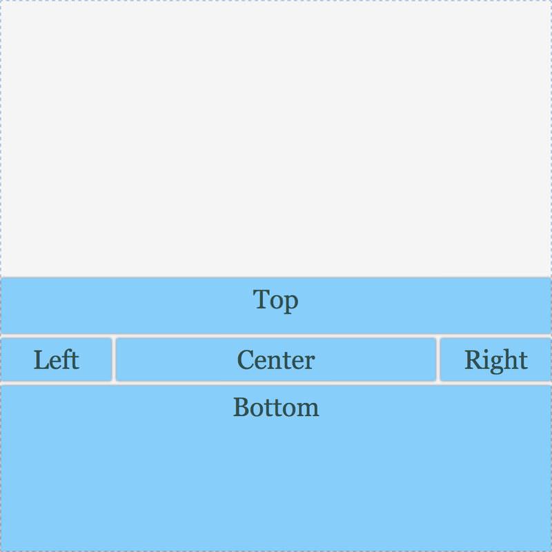
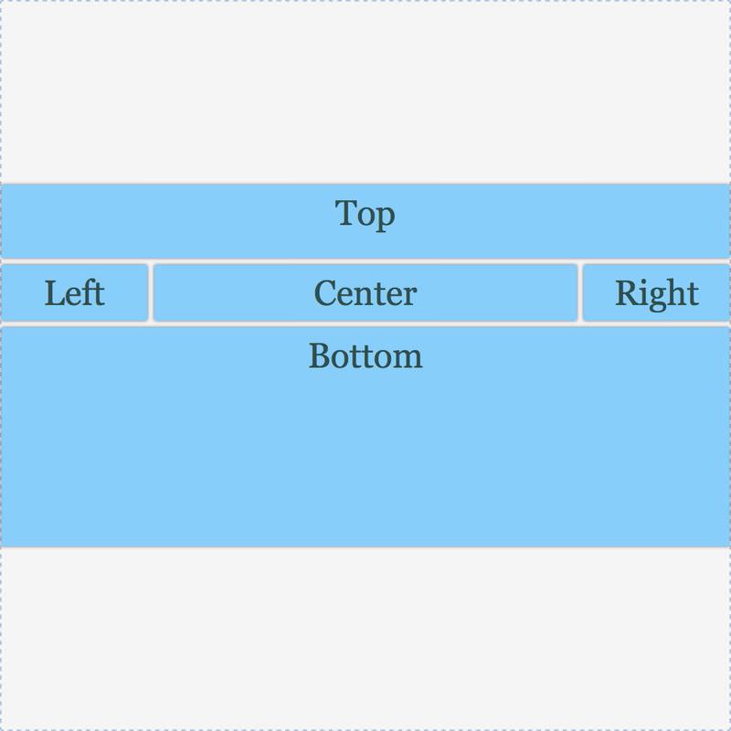
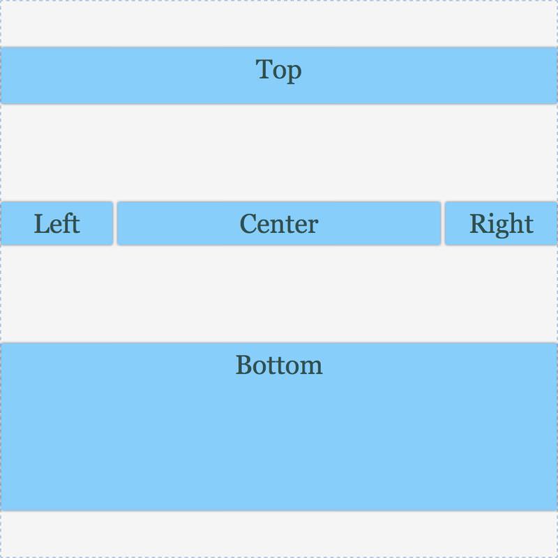
The justify-content property of the grid container (.grid-container) aligns the content of the grid along the inline axis (horizontal axis) and the property align-content, aligns a grid’s content along the block axis (vertical axis). Both properties can have one of these values: start, end, center, space-between, space-around and space-evenly.
Where applicable, the track (row or column) size shrinks to fit the content when aligned. Take a look at the screenshots of grid contents aligned with different values below.
justify-content: start;
justify-content: end;
justify-content: center;
justify-content: space-between;
justify-content: space-around;
justify-content: space-evenly;
align-content: start;
align-content: end;
align-content: center;
align-content: space-between;

align-content: space-around;
align-content: space-evenly;
Both the justify-content and align-content properties align the entire content within a grid.
To align individual items within their grid areas, use the other pair of alignment properties: justify-items and align-items. Both can have one of these value: start, end, center, baseline (align items along the base grid line of the area) and stretch (items fill their entire area).